- Aurelia - Home
- Aurelia - Overview
- Aurelia - Environment Setup
- Aurelia - First Application
- Aurelia - Components
- Aurelia - Component Lifecycle
- Aurelia - Custom Elements
- Aurelia - Dependency Injections
- Aurelia - Configuration
- Aurelia - Plugins
- Aurelia - Data Binding
- Aurelia - Binding Behavior
- Aurelia - Converters
- Aurelia - Events
- Aurelia - Event Aggregator
- Aurelia - Forms
- Aurelia - HTTP
- Aurelia - Refs
- Aurelia - Routing
- Aurelia - History
- Aurelia - Animations
- Aurelia - Dialog
- Aurelia - Localization
- Aurelia - Tools
- Aurelia - Bundling
- Aurelia - Debugging
- Aurelia - Community
- Aurelia - Best Practices
Aurelia - Animations
In this chapter, you will learn how to use CSS animations in Aurelia framework.
Step 1 - View
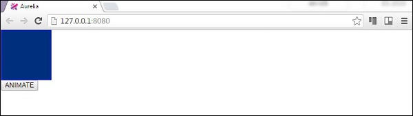
Our view will have one element that will be animated and a button to trigger the animateElement() function.
app.html
<template>
   <div class = "myElement"></div>
   <button click.delegate = "animateElement()">ANIMATE</button>
</template>
Step 2 - View-model
Inside our JavaScript file, we will import CssAnimator plugin and inject it as a dependency. The animateElement function will call the animator to start animation. The animation will be created in the next step.
import {CssAnimator} from 'aurelia-animator-css';
import {inject} from 'aurelia-framework';

@inject(CssAnimator, Element)
export class App {
   constructor(animator, element) {
      this.animator = animator;
      this.element = element;
   }

   animateElement() {
      var myElement = this.element.querySelector('.myElement');
      this.animator.animate(myElement, 'myAnimation');
   }
}
Step 3 − Style
We will write CSS inside styles/styles.css file. .myAnimation-add is the starting point of an animation while .myAnimation-remove is called when the animation is complete.
styles.css
.myElement {
   width:100px;
   height: 100px;
   border:1px solid blue;
}

.myAnimation-add {
   -webkit-animation: changeBack 3s;
   animation: changeBack 3s;
}

.myAnimation-remove {
   -webkit-animation: fadeIn 3s;
   animation: fadeIn 3s;
}

@-webkit-keyframes changeBack {
   0% { background-color: #e6efff; }
   25% { background-color: #4d91ff; }
   50% { background-color: #0058e6; }
   75% { background-color: #003180; }
   100% { background-color: #000a1a; }
}

@keyframes changeBack {
   0% { background-color: #000a1a; }
   25% { background-color: #003180; }
   50% { background-color: #0058e6; }
   75% { background-color: #4d91ff; }
   100% { background-color: #e6efff; }
}
Once the ANIMATE button is clicked, the background color will be changed from light blue to a dark shade. When this animation is complete after three seconds, the element will fade to its starting state.