
Article Categories
- All Categories
-
 Data Structure
-
 Networking
-
 RDBMS
RDBMS
-
 Operating System
-
 Java
Java
-
 MS Excel
-
 iOS
iOS
-
 HTML
HTML
-
 CSS
CSS
-
 Android
-
 Python
-
 C Programming
-
 C++
C++
-
 C#
C#
-
 MongoDB
-
 MySQL
MySQL
-
 Javascript
-
 PHP
PHP
-
 Economics & Finance
Selected Reading
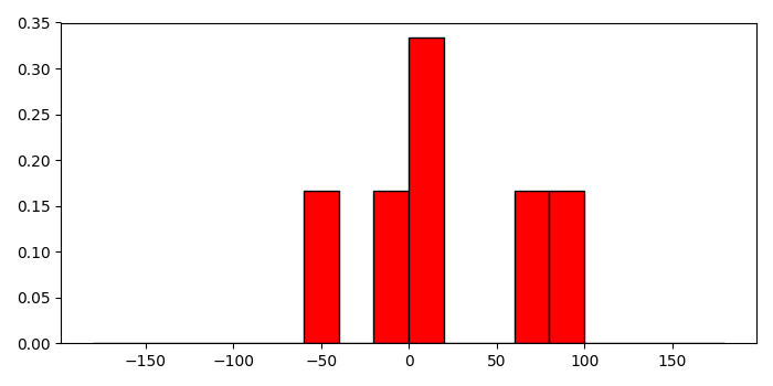
Setting a relative frequency in a Matplotlib histogram
To set a relative frequency in a matplotlib histogram, we can take the following steps −
Create a list of numbers for data and bins.
Compute the histogram of a set of data, using histogram() method.
Get the hist and edges from the histogram.
Find the frequency of the histogram.
Make a bar with bins (step 1) and freq data (step 4).
To display the figure, use show() method.
Example
import numpy as np
from matplotlib import pyplot as plt
plt.rcParams["figure.figsize"] = [7.00, 3.50]
plt.rcParams["figure.autolayout"] = True
a = [-0.125, .15, 8.75, 72.5, -44.245, 88.45]
bins = np.arange(-180, 181, 20)
hist, edges = np.histogram(a, bins)
freq = hist/float(hist.sum())
plt.bar(bins[:-1], freq, width=20, align="edge", ec="k", color='red')
plt.show()
Output

Updated on: 2021-05-08T08:53:34+05:30
2K+ Views

Advertisements