- NumPy - Home
- NumPy - Introduction
- NumPy - Environment
- NumPy Arrays
- NumPy - Ndarray Object
- NumPy - Data Types
- NumPy Creating and Manipulating Arrays
- NumPy - Array Creation Routines
- NumPy - Array Manipulation
- NumPy - Array from Existing Data
- NumPy - Array From Numerical Ranges
- NumPy - Iterating Over Array
- NumPy - Reshaping Arrays
- NumPy - Concatenating Arrays
- NumPy - Stacking Arrays
- NumPy - Splitting Arrays
- NumPy - Flattening Arrays
- NumPy - Transposing Arrays
- NumPy Indexing & Slicing
- NumPy - Indexing & Slicing
- NumPy - Indexing
- NumPy - Slicing
- NumPy - Advanced Indexing
- NumPy - Fancy Indexing
- NumPy - Field Access
- NumPy - Slicing with Boolean Arrays
- NumPy Array Attributes & Operations
- NumPy - Array Attributes
- NumPy - Array Shape
- NumPy - Array Size
- NumPy - Array Strides
- NumPy - Array Itemsize
- NumPy - Broadcasting
- NumPy - Arithmetic Operations
- NumPy - Array Addition
- NumPy - Array Subtraction
- NumPy - Array Multiplication
- NumPy - Array Division
- NumPy Advanced Array Operations
- NumPy - Swapping Axes of Arrays
- NumPy - Byte Swapping
- NumPy - Copies & Views
- NumPy - Element-wise Array Comparisons
- NumPy - Filtering Arrays
- NumPy - Joining Arrays
- NumPy - Sort, Search & Counting Functions
- NumPy - Searching Arrays
- NumPy - Union of Arrays
- NumPy - Finding Unique Rows
- NumPy - Creating Datetime Arrays
- NumPy - Binary Operators
- NumPy - String Functions
- NumPy - Matrix Library
- NumPy - Linear Algebra
- NumPy - Matplotlib
- NumPy - Histogram Using Matplotlib
- NumPy Sorting and Advanced Manipulation
- NumPy - Sorting Arrays
- NumPy - Sorting along an axis
- NumPy - Sorting with Fancy Indexing
- NumPy - Structured Arrays
- NumPy - Creating Structured Arrays
- NumPy - Manipulating Structured Arrays
- NumPy - Record Arrays
- Numpy - Loading Arrays
- Numpy - Saving Arrays
- NumPy - Append Values to an Array
- NumPy - Swap Columns of Array
- NumPy - Insert Axes to an Array
- NumPy Handling Missing Data
- NumPy - Handling Missing Data
- NumPy - Identifying Missing Values
- NumPy - Removing Missing Data
- NumPy - Imputing Missing Data
- NumPy Performance Optimization
- NumPy - Performance Optimization with Arrays
- NumPy - Vectorization with Arrays
- NumPy - Memory Layout of Arrays
- Numpy Linear Algebra
- NumPy - Linear Algebra
- NumPy - Matrix Library
- NumPy - Matrix Addition
- NumPy - Matrix Subtraction
- NumPy - Matrix Multiplication
- NumPy - Element-wise Matrix Operations
- NumPy - Dot Product
- NumPy - Matrix Inversion
- NumPy - Determinant Calculation
- NumPy - Eigenvalues
- NumPy - Eigenvectors
- NumPy - Singular Value Decomposition
- NumPy - Solving Linear Equations
- NumPy - Matrix Norms
- NumPy Element-wise Matrix Operations
- NumPy - Sum
- NumPy - Mean
- NumPy - Median
- NumPy - Min
- NumPy - Max
- NumPy Set Operations
- NumPy - Unique Elements
- NumPy - Intersection
- NumPy - Union
- NumPy - Difference
- NumPy Random Number Generation
- NumPy - Random Generator
- NumPy - Permutations & Shuffling
- NumPy - Uniform distribution
- NumPy - Normal distribution
- NumPy - Binomial distribution
- NumPy - Poisson distribution
- NumPy - Exponential distribution
- NumPy - Rayleigh Distribution
- NumPy - Logistic Distribution
- NumPy - Pareto Distribution
- NumPy - Visualize Distributions With Sea born
- NumPy - Matplotlib
- NumPy - Multinomial Distribution
- NumPy - Chi Square Distribution
- NumPy - Zipf Distribution
- NumPy File Input & Output
- NumPy - I/O with NumPy
- NumPy - Reading Data from Files
- NumPy - Writing Data to Files
- NumPy - File Formats Supported
- NumPy Mathematical Functions
- NumPy - Mathematical Functions
- NumPy - Trigonometric functions
- NumPy - Exponential Functions
- NumPy - Logarithmic Functions
- NumPy - Hyperbolic functions
- NumPy - Rounding functions
- NumPy Fourier Transforms
- NumPy - Discrete Fourier Transform (DFT)
- NumPy - Fast Fourier Transform (FFT)
- NumPy - Inverse Fourier Transform
- NumPy - Fourier Series and Transforms
- NumPy - Signal Processing Applications
- NumPy - Convolution
- NumPy Polynomials
- NumPy - Polynomial Representation
- NumPy - Polynomial Operations
- NumPy - Finding Roots of Polynomials
- NumPy - Evaluating Polynomials
- NumPy Statistics
- NumPy - Statistical Functions
- NumPy - Descriptive Statistics
- NumPy Datetime
- NumPy - Basics of Date and Time
- NumPy - Representing Date & Time
- NumPy - Date & Time Arithmetic
- NumPy - Indexing with Datetime
- NumPy - Time Zone Handling
- NumPy - Time Series Analysis
- NumPy - Working with Time Deltas
- NumPy - Handling Leap Seconds
- NumPy - Vectorized Operations with Datetimes
- NumPy ufunc
- NumPy - ufunc Introduction
- NumPy - Creating Universal Functions (ufunc)
- NumPy - Arithmetic Universal Function (ufunc)
- NumPy - Rounding Decimal ufunc
- NumPy - Logarithmic Universal Function (ufunc)
- NumPy - Summation Universal Function (ufunc)
- NumPy - Product Universal Function (ufunc)
- NumPy - Difference Universal Function (ufunc)
- NumPy - Finding LCM with ufunc
- NumPy - ufunc Finding GCD
- NumPy - ufunc Trigonometric
- NumPy - Hyperbolic ufunc
- NumPy - Set Operations ufunc
- NumPy Useful Resources
- NumPy - Quick Guide
- NumPy - Cheatsheet
- NumPy - Useful Resources
- NumPy - Discussion
- NumPy Compiler
Selected Reading
NumPy - Histogram Using Matplotlib
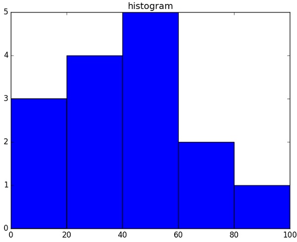
NumPy has a numpy.histogram() function that is a graphical representation of the frequency distribution of data. Rectangles of equal horizontal size corresponding to class interval called bin and variable height corresponding to frequency.
numpy.histogram()
The numpy.histogram() function takes the input array and bins as two parameters. The successive elements in bin array act as the boundary of each bin.
import numpy as np

a = np.array([22,87,5,43,56,73,55,54,11,20,51,5,79,31,27])
np.histogram(a,bins = [0,20,40,60,80,100])
hist,bins = np.histogram(a,bins = [0,20,40,60,80,100])
print hist
print bins
It will produce the following output −
[3 4 5 2 1]
[0 20 40 60 80 100]
plt()
Matplotlib can convert this numeric representation of histogram into a graph. The plt() function of pyplot submodule takes the array containing the data and bin array as parameters and converts into a histogram.
from matplotlib import pyplot as plt
import numpy as np

a = np.array([22,87,5,43,56,73,55,54,11,20,51,5,79,31,27])
plt.hist(a, bins = [0,20,40,60,80,100])
plt.title("histogram")
plt.show()
It should produce the following output −

Advertisements