
Article Categories
- All Categories
-
 Data Structure
-
 Networking
-
 RDBMS
RDBMS
-
 Operating System
-
 Java
Java
-
 MS Excel
-
 iOS
iOS
-
 HTML
HTML
-
 CSS
CSS
-
 Android
-
 Python
-
 C Programming
-
 C++
C++
-
 C#
C#
-
 MongoDB
-
 MySQL
MySQL
-
 Javascript
-
 PHP
PHP
-
 Economics & Finance
Create ggplot2 graph with darker axes labels, lines and titles in R
To create a ggplot2 graph with darker axes labels, darker lines, and dark titles, we can use theme_classic function of ggplot2 package with base_size argument set to a larger value.
For Example, if we have a data frame called df that contains two columns say x and y then we can create the scatterplot between x and y using ggplot2 with darker axes labels, darker lines, and dark titles by using the below command −
ggplot(df,aes(x,y))+geom_point()+theme_classic(base_size=22)
Example
Following snippet creates a sample data frame −
x<-rpois(20,5)
y<-rpois(20,2)
df<-data.frame(x,y)
df
The following dataframe is created
   x y
 1 9 4
 2 2 1
 3 4 4
 4 7 0
 5 7 0
 6 3 1
 7 3 1
 8 3 1
 9 3 0
10 6 1
11 5 1
12 6 4
13 6 1
14 4 1
15 7 1
16 3 3
17 0 3
18 4 4
19 4 2
20 3 1
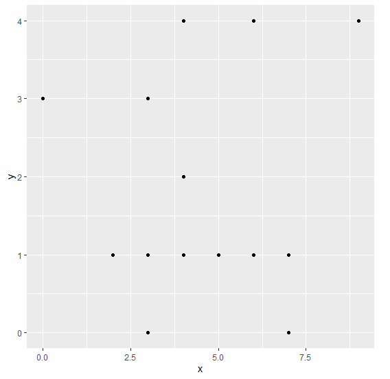
To load ggplot2 package and create scatterplot between x and y on the above created data frame, add the following code to the above snippet −
x<-rpois(20,5)
y<-rpois(20,2)
df<-data.frame(x,y)
library(ggplot2)
ggplot(df,aes(x,y))+geom_point()
Output
If you execute all the above given snippets as a single program, it generates the following Output −
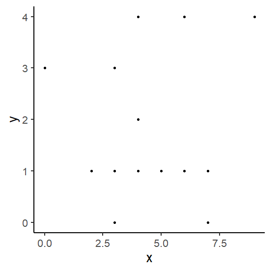
To create scatterplot between x and y with darker axes labels, darker lines, and dark titles on the above created data frame, add the following code to the above snippet −
x<-rpois(20,5)
y<-rpois(20,2)
df<-data.frame(x,y)
library(ggplot2)
ggplot(df,aes(x,y))+geom_point()+theme_classic(base_size=20)
Output
If you execute all the above given snippets as a single program, it generates the following Output −

845 Views
