- Angular7 - Home
- Angular7 - Overview
- Angular7 - Environment Setup
- Angular7 - Project Setup
- Angular7 - Components
- Angular7 - Modules
- Angular7 - Data Binding
- Angular7 - Event Binding
- Angular7 - Templates
- Angular7 - Directives
- Angular7 - Pipes
- Angular7 - Routing
- Angular7 - Services
- Angular7 - Http Client
- Angular7 - CLI Prompts
- Angular7 - Forms
- Materials/CDK-Virtual Scrolling
- Angular7 - Materials/CDK-Drag & Drop
- Angular7 - Animations
- Angular7 - Materials
- Testing & Building Angular7 Project
- Angular7 Useful Resources
- Angular7 - Quick Guide
- Angular7 - Useful Resources
- Angular7 - Discussion
Angular7 - Quick Guide
Angular7 - Overview
Angular 7 is owned by Google and the stable release was done on 18th October 2018. This is the latest version of Angular.
Below is the list of Angular versions released so far −
| Version | Released Date |
|---|---|
| Angular JS | October 2010 |
| Angular 2.0 | Sept 2016 |
| Angular 4.0 | March 2017 |
| Angular 5.0 | November 2017 |
| Angular 6.0 | May 2018 |
| Angular 7.0 | October 2018 |
The release dates for the next two major upcoming versions of Angular are given below −
| Version | Released Date |
|---|---|
| Angular 8.0 | March/April 2019 |
| Angular 9.0 | September/ October 2019 |
Google plans to release the major Angular version every 6 months. The version released so far are backward compatible and can be updated to the newer one very easily.
Let us discuss the new features added to Angular 7.
Angular Update to V7
Angular 7 is a major release where in the angular core framework, Angular CLI, Angular Materials are updated. In case you are using Angular 5 or 6 and want to update to Angular 7, below is the command which will update your app to the recent version of Angular −
ng update @angular/cli @angular/core
Angular CLI
While doing project setup using angular CLI, it prompts you about the built-in features available, i.e., routing and stylesheet support as shown below −
Application Performance
In Angular 7, there is bundle budget added in angular.json as shown below −
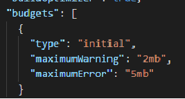
Budgets is a feature added to Angular CLI which allows you to set limit inside your configuration to make sure your application size is within the limit set. You can set the size so that the app can be warned when the limit is crossed.
Angular Material and CDK
The version of Angular Material/CDK is updated in Angular 7. Also there are 2 features added to CDK − virtual scrolling, and drag and drop.
Virtual Scrolling
Virtual scrolling feature shows up the visible dom elements to the user, as the user scrolls, the next list is displayed. This gives faster experience as the full list is not loaded at one go and only loaded as per the visibility on the screen.
Drag and Drop
You can drag and drop elements from a list and place it wherever required within the list. The new feature is very smooth and fast.
Angular7 - Environment Setup
In this chapter, we will discuss the Environment Setup required for Angular 7. To install Angular 7, we require the following −
- Nodejs
- Npm
- Angular CLI
- IDE for writing your code
Nodejs
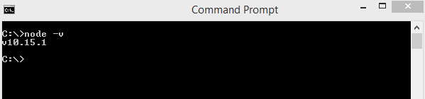
To check if nodejs is installed on your system, type node -v in the terminal. This will help you see the version of nodejs currently installed on your system.
Nodejs has to be greater than 8.x or 10.x, and npm has to be greater than 5.6 or 6.4.
C:\>node
v v10.15.1
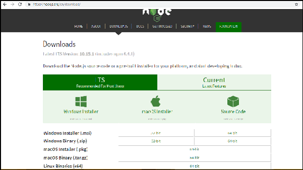
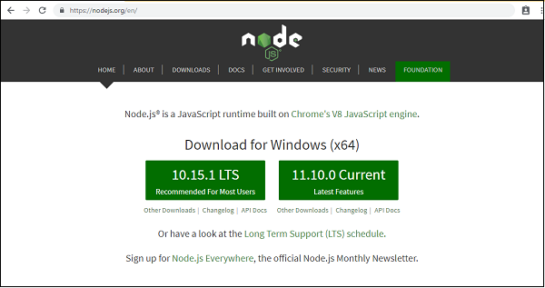
If it does not print anything, install nodejs on your system. To install nodejs, go to the homepage, https://nodejs.org/en/download/of nodejs and install the package based on your OS.
The homepage of nodejs is as follows −
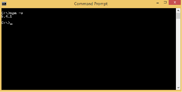
Based on your OS, install the required package. Once nodejs is installed, npm will also get installed along with it. To check if npm is installed or not, type npm v in the terminal as given below. It will display the version of the npm.
C:\>npm
v 6.4.1
Angular 7 installations are very simple with the help of angular CLI. Visit the homepage https://cli.angular.io/ of angular to get the reference of the command.
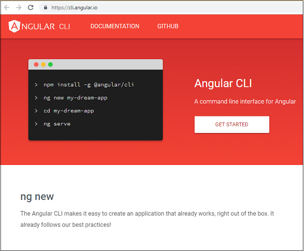
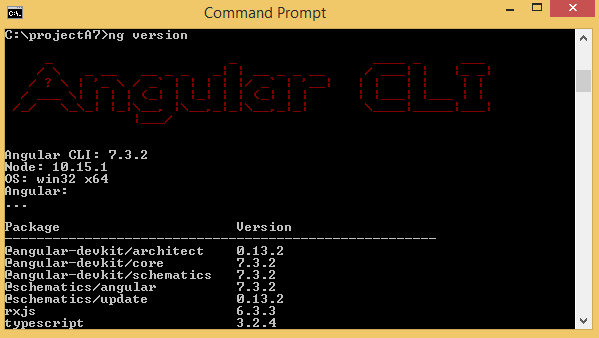
Type npm install g @angular/cli in your command prompt, to install angular cli on your system. It will take a while to install and once done you can check the version using below command −
ng version
It will display version details of angular - cli as well version of others packages as shown below −
We are done with the installation of Angular 7. You can use any IDE of your choice, i.e., WebStorm, Atom, Visual Studio Code to start working with Angular 7.
The details of the project setup are explained in the next chapter.
Angular7 - Project Setup
In this chapter, we shall discuss about the Project Setup in Angular 7.
To get started with the project setup, make sure you have nodejs installed. You can check the version of node in the command line using the command, node v, as shown below −
If you do not get the version, install nodejs from their official site −https://nodejs.org/en/.
Once you have nodejs installed, npm will also get installed with it. To check npm version, run npm -v in command line as shown below −
So we have node version 10 and npm version 6.4.1.
To install Angular 7, go to the site, https://cli.angular.io to install Angular CLI.
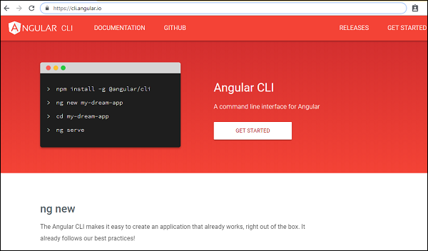
You will see the following commands on the webpage −
npm install -g @angular/cli //command to install angular 7
ng new my-dream-app // name of the project
cd my-dream-app
ng serve
The above commands help to get the project setup in Angular 7.
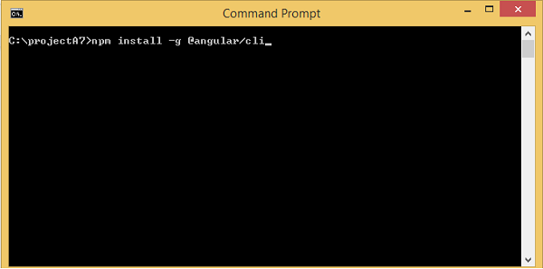
We will create a folder called projectA7 and install angular/cli as shown below −
Once the installation is done, check the details of the packages installed by using the command ng version as shown below −
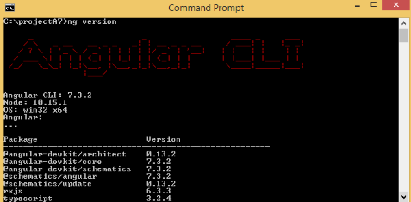
It gives the version for Angular CLI, typescript version and other packages available for Angular 7.
We are done with the installation of Angular 7, now we will start with the project setup.
To create a project in Angular 7, we will use the following command −
ng new projectname
You can use the projectname of your choice. Let us now run the above command in the command line.
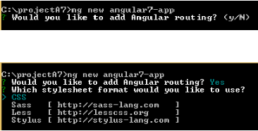
Here, we use the projectname as angular7-app. Once you run the command it will ask you about routing as shown below −
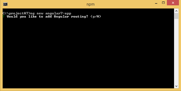
Type y to add routing to your project setup.
The next question is about the stylesheet −
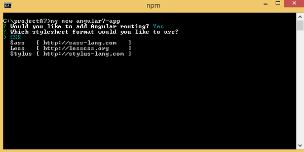
The options available are CSS, Sass, Less and Stylus. In the above screenshot, the arrow is on CSS. To change, you can use arrow keys to select the one required for your project setup. At present, we shall discuss CSS for our project-setup.
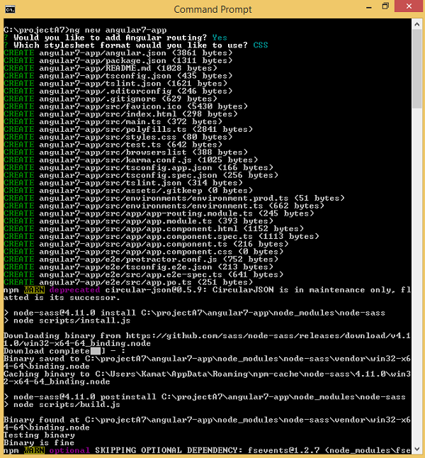
The project angular7-app is created successfully. It installs all the required packages necessary for our project to run in Angular7. Let us now switch to the project created, which is in the directory angular7-app.
Change the directory in the command line using the given line of code −
cd angular7-app
We will use Visual Studio Code IDE for working with Angular 7, you can use any IDE, i.e., Atom, WebStorm, etc.
To download Visual Studio Code, go to https://code.visualstudio.com/ and click Download for Windows.
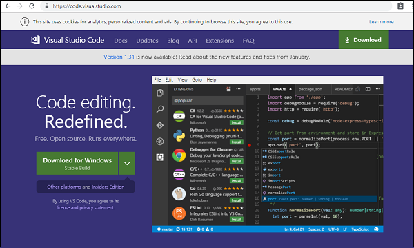
Click Download for Windows for installing the IDE and run the setup to start using IDE.
Following is the Editor −
We have not started any project in it. Let us now take the project we have created using angular-cli.
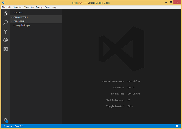
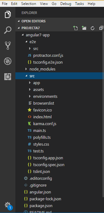
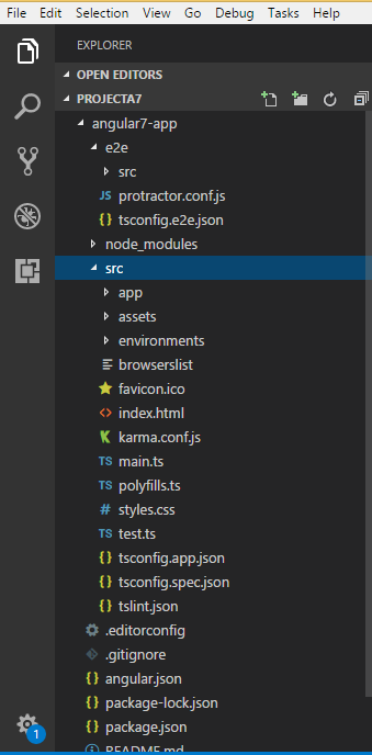
We will consider the angular7-app project. Let us open the angular7-app and see how the folder structure looks like.
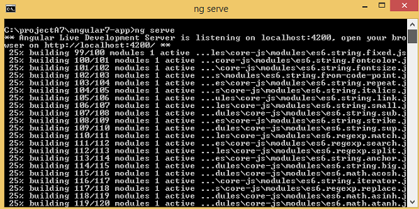
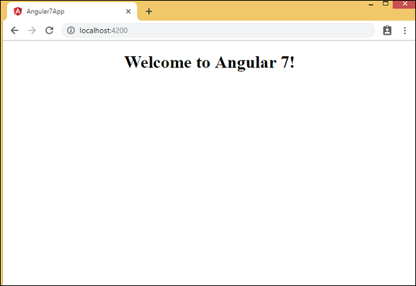
Now that we have the file structure for our project, let us compile our project with the following command −
ng serve
The ng serve command builds the application and starts the web server.
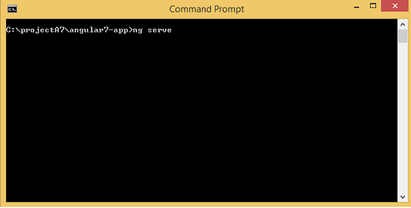
You will see the below when the command starts executing −
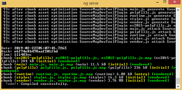
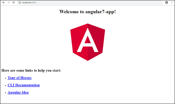
The web server starts on port 4200. Type the url, "http://localhost:4200/" in the browser and see the output. Once the project is compiled, you will receive the following output −
Once you run url, http://localhost:4200/ in the browser, you will be directed to the following screen −
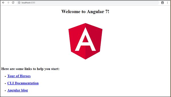
Let us now make some changes to display the following content −
Welcome to Angular 7!
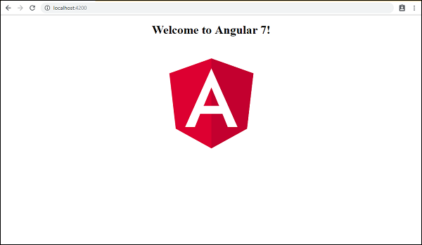
We have made changes in the files − app.component.html and app.component.ts. We will discuss more about this in our subsequent chapters.
Let us complete the project setup. If you see we have used port 4200, which is the default port that angularcli makes use of while compiling. You can change the port if you wish using the following command −
ng serve --host 0.0.0.0 port 4205
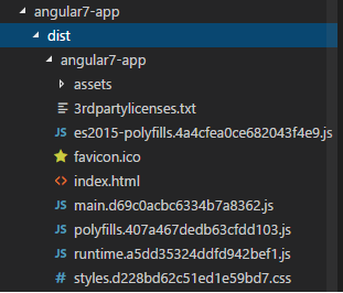
The angular7-app/ folder has the following folder structure−
e2e/ − end to end test folder. Mainly e2e is used for integration testing and helps ensure the application works fine.
node_modules/ − The npm package installed is node_modules. You can open the folder and see the packages available.
src/ − This folder is where we will work on the project using Angular 7.Inside src/ you will app/ folder created during the project setup and holds all the required files required for the project.
The angular7-app/ folder has the following file structure −
angular.json − It basically holds the project name, version of cli, etc.
.editorconfig − This is the config file for the editor.
.gitignore − A .gitignore file should be committed into the repository, in order to share the ignore rules with any other users that clone the repository.
package.json − The package.json file tells which libraries will be installed into node_modules when you run npm install.
At present, if you open the file package.json in the editor, you will get the following modules added in it −
"@angular/animations": "~7.2.0",
"@angular/common": "~7.2.0",
"@angular/compiler": "~7.2.0",
"@angular/core": "~7.2.0",
"@angular/forms": "~7.2.0",
"@angular/platform-browser": "~7.2.0",
"@angular/platform-browser-dynamic": "~7.2.0",
"@angular/router": "~7.2.0",
"core-js": "^2.5.4",
"rxjs": "~6.3.3",
"tslib": "^1.9.0",
"zone.js": "~0.8.26"
In case you need to add more libraries, you can add those over here and run the npm install command.
tsconfig.json − This basically contains the compiler options required during compilation.
tslint.json − This is the config file with rules to be considered while compiling.
The src/ folder is the main folder, which internally has a different file structure.
app
It contains the files described below. These files are installed by angular-cli by default.
app.module.ts
If you open the file, you will see that the code has reference to different libraries, which are imported. Angular-cli has used these default libraries for the import: angular/core, platform-browser.
The names itself explain the usage of the libraries. They are imported and saved into variables such as declarations, imports, providers, and bootstrap.
We can see app-routing.module is also added. This is because we had selected routing at the start of the installation. The module is added by @angular/cli.
Following is the structure of the file −
import { BrowserModule } from '@angular/platform-browser';
import { NgModule } from '@angular/core';
import { AppRoutingModule } from './app-routing.module';
import { AppComponent } from './app.component';

@NgModule({
   declarations: [
      AppComponent
   ],
   imports: [
      BrowserModule,
      AppRoutingModule
   ],
   providers: [],
   bootstrap: [AppComponent]
})
export class AppModule { }
@NgModule is imported from @angular/core and it has object with following properties −
Declarations − In declarations, the reference to the components is stored. The App component is the default component that is created whenever a new project is initiated. We will learn about creating new components in a different section.
Imports − This will have the modules imported as shown above. At present, BrowserModule is part of the imports which is imported from @angular/platform-browser. There is also routing module added AppRoutingModule.
Providers − This will have reference to the services created. The service will be discussed in a subsequent chapter.
Bootstrap − This has reference to the default component created, i.e., AppComponent.
app.component.css − You can write your css over here. Right now, we have added the background color to the div as shown below.
The structure of the file is as follows −
.divdetails {
   background-color: #ccc;
}
app.component.html
The html code will be available in this file.
The structure of the file is as follows −
<!--The content below is only a placeholder and can be replaced.-->
<div style = "text-align:center">
   <h1>Welcome to {{ title }}!</h1>
   <img width = "300" alt = "Angular Logo"
   src = "data:image/svg+xml;base64,PHN2ZyB4bWxucz0iaHR0cDovL3d3dy53My5vcmcvMjAwMC9zdmciIHZp
   ZXdCb3g9IjAgMCAyNTAgMjUwIj4KICAgIDxwYXRoIGZpbGw9IiNERDAwMzEiIGQ9Ik0xMjUgMzBMMzEuOSA
   2My4ybDE0LjIgMTIzLjFMMTI1IDIzMGw3OC45LTQzLjcgMTQuMi0xMjMuMXoiIC8+CiAgICA8cGF0aCBma
   WxsPSIjQzMwMDJGIiBkPSJNMTI1IDMwdjIyLjItLjFWMjMwbDc4LjktNDMuNyAxNC4yLTEyMy4xTDEyNSA
   zMHoiIC8+CiAgICA8cGF0aCAgZmlsbD0iI0ZGRkZGRiIgZD0iTTEyNSA1Mi4xTDY2LjggMTgyLjZoMjEuN2
   wxMS43LTI5LjJoNDkuNGwxMS43IDI5LjJIMTgzTDEyNSA1Mi4xem0xNyA4My4zaC0zNGwxNy00MC45IDE3I
   DQwLjl6IiAvPgogIDwvc3ZnPg=="7>
</div>

<h2>Here are some links to help you start:</h2>
<ul>
   <li>
      <h2><a target = "_blank" rel = "noopener"
         href = "https://angular.io/tutorial">Tour of Heroes</a>
      </h2>
   </li>
   <li>
      <h2><a target = "_blank" rel = "noopener"
         href = https://angular.io/cli">CLI Documentation</>
      </h2>
   </li>
   <li>
      <h2><a target = "_blank" rel = "noopener"
         href = "https://blog.angular.io/">Angular blog</a>
      </h2>
   </li>
</ul>
<router-outlet></router-outlet>
This is the default html code currently available with the project creation.
app.component.spec.ts
These are automatically generated files which contain unit tests for source component.
app.component.ts
The class for the component is defined over here. You can do the processing of the html structure in the .ts file. The processing will include activities such as connecting to the database, interacting with other components, routing, services, etc.
The structure of the file is as follows −
import { Component } from '@angular/core';
@Component({
   selector: 'app-root',
   templateUrl: './app.component.html',
   styleUrls: ['./app.component.css']
})
export class AppComponent {
   title = 'Angular 7';
}
app-routing.module.ts
This file will deal with the routing required for your project. It is connected with the main module, i.e., app.module.ts.
The structure of the file is as follows −
import { NgModule } from '@angular/core';
import { Routes, RouterModule } from '@angular/router';

const routes: Routes = [];
@NgModule({
   imports: [RouterModule.forRoot(routes)],
   exports: [RouterModule]
})
export class AppRoutingModule { }
Assets
You can save your images, js files in this folder.
Environment
This folder has details for the production or the dev environment. The folder contains two files.
- environment.prod.ts
- environment.ts
Both the files have details of whether the final file should be compiled in the production environment or the dev environment.
The additional file structure of angular7-app/ folder includes the following −
favicon.ico
This is a file that is usually found in the root directory of a website.
index.html
This is the file which is displayed in the browser.
<html lang = "en">
   <head>
      <meta charset = "utf-8"7gt;
      <title>Angular7App</title>
      <base href = "/">
      <meta name = "viewport" content = "width=device-width, initial-scale=1">
      <link rel = "icon" type = "image/x-icon" href = "favicon.ico">
   </head>
   <body>
      <app-root></app-root>
   </body>
</html>
The body has <app-root></app-root>. This is the selector which is used in app.component.ts file and will display the details from app.component.html file.
main.ts
main.ts is the file from where we start our project development. It starts with importing the basic module which we need. Right now if you see angular/core, angular/platform-browser-dynamic, app.module and environment is imported by default during angular-cli installation and project setup.
import { enableProdMode } from '@angular/core';
import { platformBrowserDynamic } from '@angular/platform-browser-dynamic';
import { AppModule } from './app/app.module';
import { environment } from './environments/environment';

if (environment.production) {
   enableProdMode();
}
platformBrowserDynamic().bootstrapModule(AppModule).catch(err => console.error(err));
The platformBrowserDynamic().bootstrapModule(AppModule) has the parent module reference AppModule. Hence, when it executes in the browser, the file is called index.html. Index.html internally refers to main.ts which calls the parent module, i.e., AppModule when the following code executes −
platformBrowserDynamic().bootstrapModule(AppModule).catch(err => console.error(err));
When AppModule is called, it calls app.module.ts which further calls the AppComponent based on the bootstrap as follows −
bootstrap: [AppComponent]
In app.component.ts, there is a selector: app-root which is used in the index.html file. This will display the contents present in app.component.html.
The following will be displayed in the browser −
polyfill.ts
This is mainly used for backward compatibility.
styles.css
This is the style file required for the project.
test.ts
Here, the unit test cases for testing the project will be handled.
tsconfig.app.json
This is used during compilation, it has the config details that need to be used to run the application.
tsconfig.spec.json
This helps maintain the details for testing.
typings.d.ts
It is used to manage the Typescript definition.
The final file structure will be as follows −
Angular7 - Components
Major part of the development with Angular 7 is done in the components. Components are basically classes that interact with the .html file of the component, which gets displayed on the browser. We have seen the file structure in one of our previous chapters.
The file structure has the app component and it consists of the following files −
- app.component.css
- app.component.html
- app.component.spec.ts
- app.component.ts
- app.module.ts
And if you have selected angular routing during your project setup, files related to routing will also get added and the files are as follows −
- app-routing.module.ts
The above files are created by default when we created new project using the angular-cli command.
If you open up the app.module.ts file, it has some libraries which are imported and also a declarative which is assigned the appcomponent as follows −
import { BrowserModule } from '@angular/platform-browser';
import { NgModule } from '@angular/core';
import { AppRoutingModule } from './app-routing.module';
import { AppComponent } from './app.component';

@NgModule({
   declarations: [
      AppComponent
   ],
   imports: [
      BrowserModule,
      AppRoutingModule
   ],
   providers: [],
   bootstrap: [AppComponent]
})
export class AppModule { }
The declarations include the AppComponent variable, which we have already imported. This becomes the parent component.
Now, angular-cli has a command to create your own component. However, the app component which is created by default will always remain the parent and the next components created will form the child components.
Let us now run the command to create the component with the below line of code −
ng g component new-cmp
When you run the above command in the command line, you will receive the following output −
C:\projectA7\angular7-app>ng g component new-cmp
CREATE src/app/new-cmp/new-cmp.component.html (26 bytes)
CREATE src/app/new-cmp/new-cmp.component.spec.ts (629 bytes)
CREATE src/app/new-cmp/new-cmp.component.ts (272 bytes)
CREATE src/app/new-cmp/new-cmp.component.css (0 bytes)
UPDATE src/app/app.module.ts (477 bytes)
Now, if we go and check the file structure, we will get the new-cmp new folder created under the src/app folder.
The following files are created in the new-cmp folder −
- new-cmp.component.css css file for the new component is created.
- new-cmp.component.html html file is created.
- new-cmp.component.spec.ts this can be used for unit testing.
- new-cmp.component.ts here, we can define the module, properties, etc.
Changes are added to the app.module.ts file as follows −
import { BrowserModule } from '@angular/platform-browser';
import { NgModule } from '@angular/core';
import { AppRoutingModule } from './app-routing.module';
import { AppComponent } from './app.component';
import { NewCmpComponent } from './new-cmp/new-cmp.component';

// includes the new-cmp component we created
@NgModule({
   declarations: [
      AppComponent,
      NewCmpComponent
      // here it is added in declarations and will behave as a child component
   ],
   imports: [
      BrowserModule,
      AppRoutingModule
   ],
   providers: [],
      bootstrap: [AppComponent]
      //for bootstrap the AppComponent the main app component is given.
})
export class AppModule { }
The new-cmp.component.ts file is generated as follows −,
import { Component, OnInit } from '@angular/core'; // here angular/core is imported.

@Component({
   // this is a declarator which starts with @ sign.
   // The component word marked in bold needs to be the same.
   selector: 'app-new-cmp', // selector to be used inside .html file.
   templateUrl: './new-cmp.component.html',
   // reference to the html file created in the new component.
   styleUrls: ['./new-cmp.component.css'] // reference to the style file.
})
export class NewCmpComponent implements OnInit {
   constructor() { }
   ngOnInit() { }
}
If you see the above new-cmp.component.ts file, it creates a new class called NewCmpComponent, which implements OnInit in which there is a constructor and a method called ngOnInit(). ngOnInit is called by default when the class is executed.
Let us check how the flow works. Now, the app component, which is created by default becomes the parent component. Any component added later becomes the child component.
When we hit the url in the "http://localhost:4200/" browser, it first executes the index.html file which is shown below −
<html lang = "en">

   <head>
      <meta charset = "utf-8">
      <title>Angular7App</title>
      <base href = "/">
      <meta name = "viewport" content = "width = device-width, initial-scale = 1">
      <link rel = "icon" type = "image/x-icon" href = "favicon.ico">
   </head>
   <body>
      <app-root></app-root>
   </body>

</html>
The above is the normal html file and we do not see anything that is printed in the browser. We shall take a look at the tag in the body section.
<app-root></app-root>
This is the root tag created by the Angular by default. This tag has the reference in the main.ts file.
import { enableProdMode } from '@angular/core';
import { platformBrowserDynamic } from '@angular/platform-browser-dynamic';
import { AppModule } from './app/app.module';
import { environment } from './environments/environment';

if (environment.production) {
   enableProdMode();
}
platformBrowserDynamic().bootstrapModule(AppModule).catch(err => console.error(err));
AppModule is imported from the app of the main parent module, and the same is given to the bootstrap Module, which makes the appmodule load.
Let us now see the app.module.ts file −
import { BrowserModule } from '@angular/platform-browser';
import { NgModule } from '@angular/core';
import { AppRoutingModule } from './app-routing.module';
import { AppComponent } from './app.component';
import { NewCmpComponent } from './new-cmp/new-cmp.component';

@NgModule({
   declarations: [
      AppComponent,
      NewCmpComponent
   ],
   imports: [
      BrowserModule,
      AppRoutingModule '
   ],
   providers: [],
   bootstrap: [AppComponent]
})
export class AppModule { }
Here, the AppComponent is the name given, i.e., the variable to store the reference of the app.component.ts and the same is given to the bootstrap. Let us now see the app.component.ts file.
import { Component } from '@angular/core';
@Component({
   selector: 'app-root',
   templateUrl: './app.component.html',
   styleUrls: ['./app.component.css']
})
export class AppComponent {
   title = 'Angular 7';
}
Angular core is imported and referred as the Component and the same is used in the Declarator as −
@Component({
   selector: 'app-root',
   templateUrl: './app.component.html',
   styleUrls: ['./app.component.css']
})
In the declarator reference to the selector, templateUrl and styleUrl are given. The selector here is nothing but the tag which is placed in the index.html file that we saw above.
The class AppComponent has a variable called title, which is displayed in the browser. The @Component uses the templateUrl called app.component.html which is as follows −
<!--The content below is only a placeholder and can be replaced.-->
<div style = "text-align:center">
   <h1> Welcome to {{ title }}! </h1>
</div>
It has just the html code and the variable title in curly brackets. It gets replaced with the value, which is present in the app.component.ts file. This is called binding. We will discuss the concept of binding in the subsequent chapter.
Now that we have created a new component called new-cmp. The same gets included in the app.module.ts file, when the command is run for creating a new component.
app.module.ts has a reference to the new component created.
Let us now check the new files created in new-cmp.
new-cmp.component.ts
import { Component, OnInit } from '@angular/core';
@Component({
   selector: 'app-new-cmp',
   templateUrl: './new-cmp.component.html',
   styleUrls: ['./new-cmp.component.css']
})
export class NewCmpComponent implements OnInit {
   constructor() { }
   ngOnInit() { }
}
Here, we have to import the core too. The reference of the component is used in the declarator.
The declarator has the selector called app-new-cmp and the templateUrl and styleUrl.
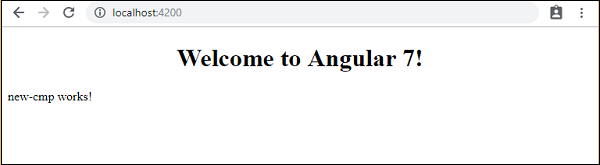
The .html called new-cmp.component.html is as follows−
<p>
   new-cmp works!
</p>
As seen above, we have the html code, i.e., the p tag. The style file is empty as we do not need any styling at present. But when we run the project, we do not see anything related to the new component getting displayed in the browser.
The browser displays the following screen −
We do not see anything related to the new component being displayed. The new component created has a .html file with following details −
<p>
   new-cmp works!
<p>
But we are not getting the same in the browser. Let us now see the changes required to get the new components contents to get displayed in the browser.
The selector 'app-new-cmp' is created for new component from new-cmp.component.ts as shown below −
import { Component, OnInit } from '@angular/core';

@Component({
   selector: 'app-new-cmp',
   templateUrl: './new-cmp.component.html',
   styleUrls: ['./new-cmp.component.css']
})
export class NewCmpComponent implements OnInit {
   constructor() { }
   ngOnInit() { }
}
The selector, i.e., app-new-cmp needs to be added in the app.component.html, i.e., the main parent created by default as follows −
<!--The content below is only a placeholder and can be replaced.-->
<div style = "text-align:center">
   <h1>
      Welcome to {{ title }}!
   </h1>
</div>
<app-new-cmp7></app-new-cmp>
When the <app-new-cmp></app-new-cmp> tag is added, all that is present in the .html file, i.e., new-cmp.component.html of the new component created will get displayed on the browser along with the parent component data.
Let us add some more details to the new component created and see the display in the browser.
new-cmp.component.ts
import { Component, OnInit } from '@angular/core';

@Component({
   selector: 'app-new-cmp',
   templateUrl: './new-cmp.component.html',
   styleUrls: ['./new-cmp.component.css']
})
export class NewCmpComponent implements OnInit {
   newcomponent = "Entered in new component created";
   constructor() { }
   ngOnInit() { }
}
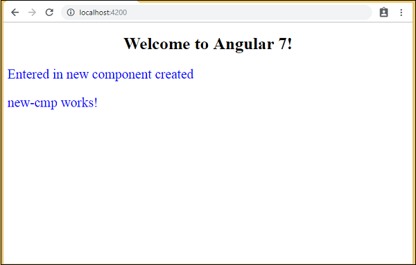
In the class, we have added one variable called newcomponent and the value is Entered in new component created.
The above variable is added in the new-cmp.component.html file as follows −
<p>
   {{newcomponent}}
</p>
<p>
   new-cmp works!
</p>
Now since we have included the <app-new-cmp></app-new-cmp>selector in the app.component.html which is the .html of the parent component, the content present in the new-cmp.component.html file gets displayed on the browser. We will also add some css for the new component in the new-cmp.component.css file as follows −
p {
   color: blue;
   font-size: 25px;
}
So we have added blue color and font-size as 25px for the p tags.
Following screen will be displayed in the browser −
Similarly, we can create components and link the same using selector in the app.component.html file as per our requirements.
Angular7 - Modules
Module in Angular refers to a place where you can group the components, directives, pipes, and services, which are related to the application.
In case you are developing a website, the header, footer, left, center and the right section become part of a module.
To define module, we can use the NgModule. When you create a new project using the Angular cli command, the ngmodule is created in the app.module.ts file by default and it looks as follows −
import { BrowserModule } from '@angular/platform-browser';
import { NgModule } from '@angular/core';
import { AppRoutingModule } from './app-routing.module';
import { AppComponent } from './app.component';
import { NewCmpComponent } from './new-cmp/new-cmp.component';

@NgModule({
   declarations: [
      AppComponent,
      NewCmpComponent
   ],
   imports: [
      BrowserModule,
      AppRoutingModule
   ],
   providers: [],
   bootstrap: [AppComponent]
})
export class AppModule { }
The NgModule needs to be imported as follows −
import { NgModule } from '@angular/core';
The structure for the ngmodule is as shown below −
@NgModule({
   declarations: [
      AppComponent,
      NewCmpComponent
   ],
   imports: [
      BrowserModule,
      AppRoutingModule
   ],
   providers: [],
   bootstrap: [AppComponent]
})
It starts with @NgModule and contains an object which has declarations, imports, providers and bootstrap.
Declaration
It is an array of components created. If any new component gets created, it will be imported first and the reference will be included in declarations as shown below −
declarations: [
   AppComponent,
   NewCmpComponent
]
Import
It is an array of modules required to be used in the application. It can also be used by the components in the Declaration array. For example, right now in the @NgModule, we see the Browser Module imported. In case your application needs forms, you can include the module with the below code −
import { FormsModule } from '@angular/forms';
The import in the @NgModule will be like the following −
imports: [
   BrowserModule,
   FormsModule
]
Providers
This will include the services created.
Bootstrap
This includes the main app component for starting the execution.
Angular7 - Data Binding
Data Binding is available right from AngularJS, and all the versions of Angular released later on. We use curly braces for data binding - {{}}; this process is called interpolation. We have already seen in our previous examples how we declared the value to the variable title and the same is printed in the browser.
The variable in the app.component.html file is referred as {{title}} and the value of title is initialized in the app.component.ts file and in app.component.html, the value is displayed.
Let us now create a dropdown of months in the browser. To do that, we have created an array of months in app.component.ts as follows −
import { Component } from '@angular/core';

@Component({
   selector: 'app-root',
   templateUrl: './app.component.html',
   styleUrls: ['./app.component.css']
})
export class AppComponent {
   title = 'Angular 7';

   // declared array of months.
   months = ["January", "February", "March", "April", "May", "June", "July",
      "August", "September", "October", "November", "December"];
}
The months array that is shown above is to be displayed in a dropdown in the browser.
We have created the normal select tag with option. In option, we have used the for loop. The for loop is used to iterate over the months array, which in turn will create the option tag with the value present in the months.
The syntax for in Angular is as follows −
*ngFor = let I of months
and to get the value of months we are displaying it in −
{{i}}
The two curly brackets help with data binding. You declare the variables in your app.component.ts file and the same will be replaced using the curly brackets.
Following is the output of the above months array in the browser −
The variable that is set in the app.component.ts can be binded inside the app.component.html using the curly brackets. For example: {{}}.
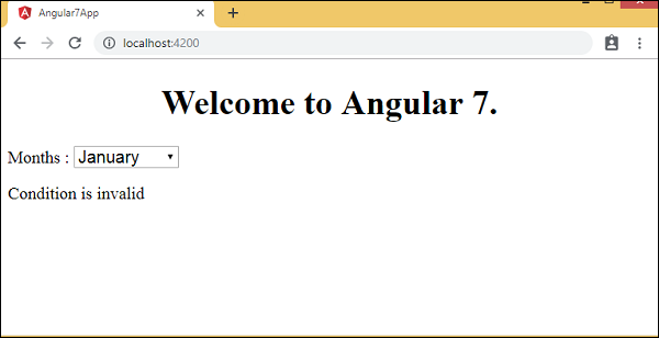
Let us now display the data in the browser based on condition. Here, we have added a variable and assigned the value as true. Using the if statement, we can hide/show the content to be displayed.
Example
import { Component } from '@angular/core';

@Component({
   selector: 'app-root',
   templateUrl: './app.component.html',
   styleUrls: ['./app.component.css']
})
export class AppComponent {
   title = 'Angular 7';

   // declared array of months.
   months = ["January", "February", "March", "April", "May", "June", "July",
      "August", "September", "October", "November", "December"];

   isavailable = true; //variable is set to true
}
app.component.html
<!--The content below is only a placeholder and can be replaced.-->
<div style = "text-align:center">
   <h1> Welcome to {{title}}. </h1>
</div>

<div> Months :
   <select>
      <option *ngFor = "let i of months">{{i}}</option>
   </select>
</div>
<br/>

<div>
   <span *ngIf = "isavailable">Condition is valid.</span>
   //over here based on if condition the text condition is valid is displayed.
   //If the value of isavailable is set to false it will not display the text.
</div>
Output

Let us explain the above example using the IF THEN ELSE condition.
Example
import { Component } from '@angular/core';
@Component({
   selector: 'app-root',
   templateUrl: './app.component.html',
   styleUrls: ['./app.component.css']
})
export class AppComponent {
   title = 'Angular 7';

   // declared array of months.
   months = ["January", "Feburary", "March", "April", "May","June", "July",
      "August", "September", "October", "November", "December"];

   isavailable = false; //variable is set to true
}
In this case, we have made the isavailable variable as false. To print the else condition, we will have to create the ng-template as follows −
<ng-template #condition1>Condition is invalid</ng-template>
The full code is given below −
<!--The content below is only a placeholder and can be replaced.-->
<div style = "text-align:center">
   <h1> Welcome to {{title}}. </h1>
</div>

<div> Months :
   <select>
      <option *ngFor = "let i of months">{{i}}</option>
   </select>
</div>
<br/>

<div>
   <span *ngIf = "isavailable; else condition1">Condition is valid.</span>
   <ng-template #condition1>Condition is invalid</ng-template>
</div>
If is used with the else condition and the variable used is condition1. The same is assigned as an id to the ng-template, and when the available variable is set to false the text Condition is invalid is displayed.
Following screenshot shows the display in the browser −
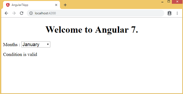
Let us now use the if then else condition.
import { Component } from '@angular/core';
@Component({
   selector: 'app-root',
   templateUrl: './app.component.html',
   styleUrls: ['./app.component.css']
})
export class AppComponent {
   title = 'Angular 7';

   // declared array of months.
   months = ["January", "February", "March", "April", "May", "June", "July",
      "August", "September", "October", "November", "December"];

   isavailable = true; //variable is set to true
}
Now, we will make the variable isavailable as true. In the html, the condition is written in the following way −
<!--The content below is only a placeholder and can be replaced.-->
<div style = "text-align:center">
   <h1> Welcome to {{title}}. </h1>
</div>

<div> Months :
   <select>
      <option *ngFor="let i of months">{{i}}</option>
   </select>
</div>
<br/>

<div>
   <span *ngIf = "isavailable; then condition1 else condition2">
      Condition is valid.
   </span>
   <ng-template #condition1>Condition is valid</ng-template>
   <ng-template #condition2>Condition is invalid</ng-template>
</div>
If the variable is true, then condition1, else condition2. Now, two templates are created with id #condition1 and #condition2.
The display in the browser is as follows −
Angular7 - Event Binding
In this chapter, we will discuss how Event Binding works in Angular 7. When a user interacts with an application in the form of a keyboard movement, a mouse click, or a mouse over, it generates an event. These events need to be handled to perform some kind of action. This is where event binding comes into picture.
Let us consider an example to understand this better.
app.component.html
<!--The content below is only a placeholder and can be replaced.-->
<div style = "text-align:center">
   <h1>Welcome to {{title}}.</h1>
</div>

<div> Months :
   <select>
      <option *ngFor = "let i of months">{{i}}</option>
   </select>
</div>
<br/>

<div>
   <span *ngIf = "isavailable; then condition1 else condition2">
      Condition is valid.
   </span>
   <ng-template #condition1>Condition is valid</ng-template>
   <ng-template #condition2>Condition is invalid</ng-template>
</div>
<button (click) = "myClickFunction($event)">
   Click Me
</button>
In the app.component.html file, we have defined a button and added a function to it using the click event.
Following is the syntax to define a button and add a function to it.
(click) = "myClickFunction($event)"
The function is defined in :app.component.ts
import { Component } from '@angular/core';
@Component({
selector: 'app-root',
templateUrl: './app.component.html',
styleUrls: ['./app.component.css']
})
export class AppComponent {
title = 'Angular 7';
// declared array of months.
months = ["January", "February", "March", "April", "May","June", "July",
"August", "September", "October", "November", "December"];
isavailable = true; //variable is set to true
myClickFunction(event) {
//just added console.log which will display the event details in browser on click of the button.
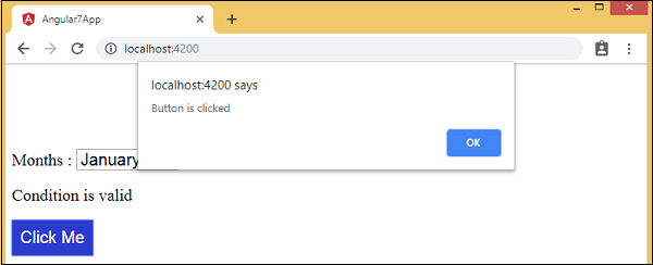
alert("Button is clicked");
console.log(event);
}
}
Upon clicking the button, the control will come to the function myClickFunction and a dialog box will appear, which displays the Button is clicked as shown in the following screenshot −
The styling for button is added in add.component.css −
button {
   background-color: #2B3BCF;
   border: none;
   color: white;
   padding: 10px 10px;
   text-align: center;
   text-decoration: none;
   display: inline-block;
   font-size: 20px;
}
Let us now add the onchange event to the dropdown.
The following line of code will help you add the change event to the dropdown −
app.component.html
<!--The content below is only a placeholder and can be replaced.-->
<div style = "text-align:center">
   <h1>Welcome to {{title}}.</h1>
</div>

<div> Months :
   <select (change) = "changemonths($event)">
      <option *ngFor = "let i of months">{{i}}</option>
   </select>
</div>
<br/>

<div>
   <span *ngIf = "isavailable; then condition1 else condition2">
      Condition is valid.
   </span>
   <ng-template #condition1>Condition is valid</ng-template>
   <ng-template #condition2>Condition is invalid</ng-template>
</div>
<br/>

<button (click) = "myClickFunction($event)">
   Click Me
</button>
The function is declared in the app.component.ts file −
import { Component } from '@angular/core';
@Component({
selector: 'app-root',
templateUrl: './app.component.html',
styleUrls: ['./app.component.css']
})
export class AppComponent {
title = 'Angular 7';
// declared array of months.
months = ["January", "Feburary", "March", "April", "May", "June", "July",
"August", "September", "October", "November", "December"];
isavailable = true; //variable is set to true
myClickFunction(event) {
//just added console.log which will display the event
details in browser on click of the button.
alert("Button is clicked");
console.log(event);
}
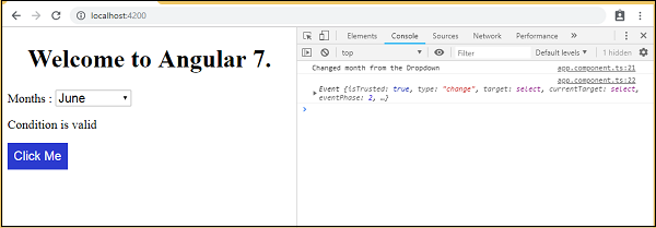
changemonths(event) {
console.log("Changed month from the Dropdown");
console.log(event);
}
}
Select month from the dropdown and you see the console message Changed month from the Dropdown is displayed in the console along with the event.
Let us add an alert message in app.component.ts when the value from the dropdown is changed as shown below −
import { Component } from '@angular/core';
@Component({
selector: 'app-root',
templateUrl: './app.component.html',
styleUrls: ['./app.component.css']
})
export class AppComponent {
title = 'Angular 7';
// declared array of months.
months = ["January", "February", "March", "April", "May", "June", "July",
"August", "September", "October", "November", "December"];
isavailable = true; //variable is set to true
myClickFunction(event) {
//just added console.log which will display the event
details in browser on click of the button.
alert("Button is clicked"); console.log(event);
}
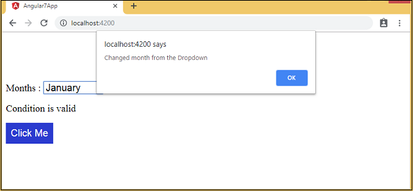
changemonths(event) {
alert("Changed month from the Dropdown");
}
}
When the value in dropdown is changed, a dialog box will appear and the following message will be displayed −
Changed month from the Dropdown.
Angular7 - Templates
Angular 7 uses the <ng-template> as the tag instead of <template>which is used in Angular2. <ng-template> has been in use since the release of Angular 4 , and the earlier version i.e Angular 2 uses <template> for the same purpose. The reason it started to use <ng-template> instead of <template> from Angular 4 onwards is because there is a name conflict between the <template> tag and the html <template> standard tag. It will deprecate completely going ahead. This was one of the major changes made in Angular 4 version.
Let us now use the template along with the if else condition and see the output.
app.component.html
<!--The content below is only a placeholder and can be replaced.-->
<div style = "text-align:center">
<h1>Welcome to {{title}}.</h1>
</div>
<div> Months :
<select (change) = "changemonths($event)" name = "month">
<option *ngFor = "let i of months">{{i}}</option>
</select>
</div>
<br/>
<div>
<span *ngIf = "isavailable;then condition1 else condition2">
Condition is valid.
</span>
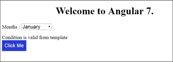
<ng-template #condition1>Condition is valid from template</ng-template>
<ng-template #condition2>Condition is invalid from template</ng-template>
</div>
<button (click) = "myClickFunction($event)">Click Me</button>
For the Span tag, we have added the if statement with the else condition and will call template condition1, else condition2.
The templates are to be called as follows −
<ng-template #condition1>Condition is valid from template</ng-template>
<ng-template #condition2>Condition is invalid from template</ng-template>
If the condition is true, then the condition1 template is called, otherwise condition2.
app.component.ts
import { Component } from '@angular/core';
@Component({
   selector: 'app-root',
   templateUrl: './app.component.html',
   styleUrls: ['./app.component.css']
})
export class AppComponent {
   title = 'Angular 7';

   // declared array of months.
   months = ["January", "February", "March", "April", "May", "June", "July",
      "August", "September", "October", "November", "December"];
   isavailable = false; // variable is set to true

   myClickFunction(event) {
      //just added console.log which will display the event details in browser on click of the button.
      alert("Button is clicked");
      console.log(event);
   }
   changemonths(event) {
      alert("Changed month from the Dropdown");
   }
}
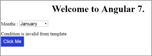
The output in the browser is as follows −
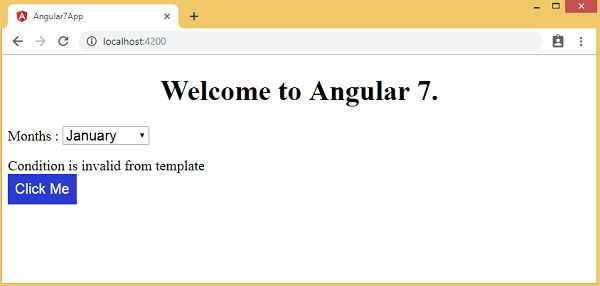
The variable isavailable is false so the condition2 template is printed. If you click the button, the respective template will be called.
app.component.ts
import { Component } from '@angular/core';
@Component({
   selector: 'app-root',
   templateUrl: './app.component.html',
   styleUrls: ['./app.component.css']
})
export class AppComponent {
   title = 'Angular 7';

   // declared array of months.
   months = ["January", "Feburary", "March", "April", "May", "June", "July",
      "August", "September", "October", "November", "December"];

   isavailable = false; //variable is set to true
   myClickFunction(event) {
      this.isavailable = !this.isavailable;
      // variable is toggled onclick of the button
   }
   changemonths(event) {
      alert("Changed month from the Dropdown");
   }
}
The isavailable variable is toggled on click of the button as shown below −
myClickFunction(event) {
   this.isavailable = !this.isavailable;
}
When you click on the button based on the value of the isavailable variable the respective template will be displayed −
If you inspect the browser, you will see that you never get the span tag in the dom. The following example will help you understand the same.
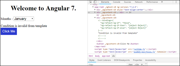
Though in app.component.html we have added span tag and the <ng-template> for the condition as shown below −
<span *ngIf = "isavailable;then condition1 else condition2">
   Condition is valid.
</span>
<ng-template #condition1>Condition is valid from template</ng-template>
<ng-template #condition2>Condition is invalid from template</ng-template>
We do not see the span tag and also the <ng-template> in the dom structure when we inspect the same in browser.
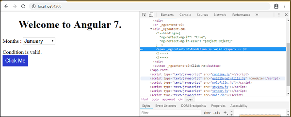
The following line of code in html will help us get the span tag in the dom −
<!--The content below is only a placeholder and can be replaced.-->
<div style = "text-align:center">
   <h1> Welcome to {{title}}. </h1>
</div>

<div> Months :
   <select (change) = "changemonths($event)" name = "month">
      <option *ngFor = "let i of months">{{i}}</option>
   </select>
</div>
<br/>

<div>
   <span *ngIf = "isavailable; else condition2">
      Condition is valid.
   </span>
   <ng-template #condition1>Condition is valid from template </ng-template>
   <ng-template #condition2>Condition is invalid from template</ng-template>
</div>
<button (click) = "myClickFunction($event)">Click Me</button>
If we remove the then condition, we get the Condition is valid message in the browser and the span tag is also available in the dom. For example, in app.component.ts, we have made the isavailable variable as true.
Angular7 - Directives
Directives in Angular is a js class, which is declared as @directive. We have 3 directives in Angular. The directives are listed below −
Component Directives
These form the main class having details of how the component should be processed, instantiated and used at runtime.
Structural Directives
A structure directive basically deals with manipulating the dom elements. Structural directives have a * sign before the directive. For example, *ngIf and *ngFor.
Attribute Directives
Attribute directives deal with changing the look and behavior of the dom element. You can create your own directives as explained in the below section.
How to Create Custom Directives?
In this section, we will discuss about Custom Directives to be used in components. Custom directives are created by us and are not standard.
Let us see how to create the custom directive. We will create the directive using the command line. The command to create the directive using the command line is as follows −
ng g directive nameofthedirective
e.g
ng g directive changeText
It appears in the command line as given in the below code −
C:\projectA7\angular7-app>ng g directive changeText
CREATE src/app/change-text.directive.spec.ts (241 bytes)
CREATE src/app/change-text.directive.ts (149 bytes)
UPDATE src/app/app.module.ts (565 bytes)
The above files, i.e., change-text.directive.spec.ts and change-text.directive.ts get created and the app.module.ts file is updated.
app.module.ts
import { BrowserModule } from'@angular/platform-browser';
import { NgModule } from '@angular/core';
import { AppRoutingModule } from './app-routing.module';
import { AppComponent } from './app.component';
import { NewCmpComponent } from'./new-cmp/new-cmp.component';
import { ChangeTextDirective } from './change-text.directive';

@NgModule({
   declarations: [
      AppComponent,
      NewCmpComponent,
      ChangeTextDirective
   ],
   imports: [
      BrowserModule,
      AppRoutingModule
   ],
   providers: [],
   bootstrap: [AppComponent]
})
export class AppModule { }
The ChangeTextDirective class is included in the declarations in the above file. The class is also imported from the file given below −
change-text.directive
import { Directive } from '@angular/core';

@Directive({
   selector: '[changeText]'
})
export class ChangeTextDirective {
   constructor() { }
}
The above file has a directive and it also has a selector property. Whatever we define in the selector, the same has to match in the view, where we assign the custom directive.
In the app.component.html view, let us add the directive as follows −
<!--The content below is only a placeholder and can be replaced.-->
<div style = "text-align:center">
   <h1> Welcome to {{title}}. </h1>
</div>
<div style = "text-align:center">
   <span changeText >Welcome to {{title}}.</span>
</div>
We will write the changes in change-text.directive.ts file as follows −
change-text.directive.ts
import { Directive, ElementRef} from '@angular/core';
@Directive({
   selector: '[changeText]'
})
export class ChangeTextDirective {
   constructor(Element: ElementRef) {
      console.log(Element);
      Element.nativeElement.innerText = "Text is changed by changeText Directive.";
   }
}
In the above file, there is a class called ChangeTextDirective and a constructor, which takes the element of type ElementRef, which is mandatory. The element has all the details to which the Change Text directive is applied.
We have added the console.log element. The output of the same can be seen in the browser console. The text of the element is also changed as shown above.
Now, the browser will show the following −
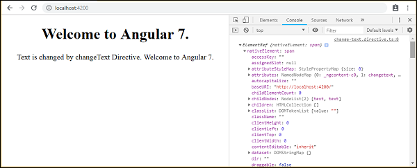
The details of the element on which the directive selector is given in the console. Since we have added the changeText directive to a span tag, the details of the span element is displayed.
Angular7 - Pipes
In this chapter, we will discuss about Pipes in Angular 7. Pipes were earlier called filters in Angular1 and called pipes from Angular2 onwards.
The | character is used to transform data. Following is the syntax for the same −
{{ Welcome to Angular 7 | lowercase}}
It takes integers, strings, arrays, and date as input separated with | to be converted in the format as required and display the same in the browser.
Let us consider a few examples using pipes. Here, we want to display the text given to uppercase. This can be done using pipes as follows −
In the app.component.ts file, we have defined the title variable as follows −
app.component.ts
import { Component } from '@angular/core';
@Component({
   selector: 'app-root',
   templateUrl: './app.component.html',
   styleUrls: ['./app.component.css']
})
export class AppComponent {
   title = 'Angular 7 Project!';
}
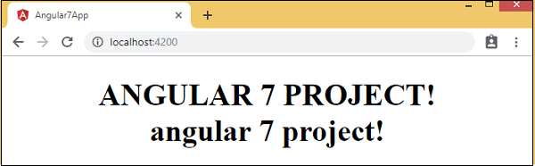
The following line of code goes into the app.component.html file −
<b>{{title | uppercase}}</b><br/>
<b>{{title | lowercase}}</b>
The browser appears as shown in the following screenshot −
Here are some built-in pipes available with angular −
- Lowercasepipe
- Uppercasepipe
- Datepipe
- Currencypipe
- Jsonpipe
- Percentpipe
- Decimalpipe
- Slicepipe
We have already seen the lowercase and uppercase pipes. Let us now see how the other pipes work. The following line of code will help us define the required variables in app.component.ts file −
import { Component } from '@angular/core';
@Component({
   selector: 'app-root',
   templateUrl: './app.component.html',
   styleUrls: ['./app.component.css']
})
export class AppComponent {
   title = 'Angular 7 Project!';
   todaydate = new Date();
   jsonval = {name:'Rox', age:'25', address:{a1:'Mumbai', a2:'Karnataka'}};
   months = ["Jan", "Feb", "Mar", "April", "May", "Jun", "July", "Aug",
      "Sept", "Oct", "Nov", "Dec"];
}
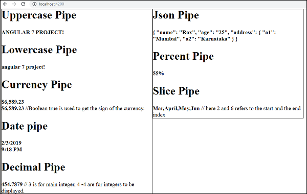
We will use the pipes in the app.component.html file as shown below −
<!--The content below is only a placeholder and can be replaced.-->
<div style = "width:100%;">
   <div style = "width:40%;float:left;border:solid 1px black;">
      <h1>Uppercase Pipe</h1>
      <b>{{title | uppercase}}</b>
      <br/>

      <h1>Lowercase Pipe</h1>
      <b>{{title | lowercase}}</b>
      <h1>Currency Pipe</h1>
      <b>{{6589.23 | currency:"USD"}}</b>
      <br/>

      <b>{{6589.23 | currency:"USD":true}}</b>
      // Boolean true is used to get the sign of the currency.
      <h1>Date pipe</h1>
      <b>{{todaydate | date:'d/M/y'}}</b>
      <br/>

      <b>{{todaydate | date:'shortTime'}}</b>
      <h1>Decimal Pipe</h1>
      <b>{{ 454.78787814 | number: '3.4-4' }}</b>
      // 3 is for main integer, 4 -4 are for integers to be displayed.
   </div>

   <div style = "width:40%;float:left;border:solid 1px black;"<
      <h1<Json Pipe</h1>
      <b>{{ jsonval | json }}</b>
      <h1>Percent Pipe</h1>
      <b>{{00.54565 | percent}}</b>
      <h1>Slice Pipe</h1>
      <b>{{months | slice:2:6}}</b>
      // here 2 and 6 refers to the start and the end index
   </div>
</div>
The following screenshots show the output for each pipe −
How to Create a Custom Pipe?
To create a custom pipe, we have created a new ts file. Here, we want to create the sqrt custom pipe. We have given the same name to the file and it looks as follows −
app.sqrt.ts
import {Pipe, PipeTransform} from '@angular/core';
@Pipe ({
   name : 'sqrt'
})
export class SqrtPipe implements PipeTransform {
   transform(val : number) : number {
      return Math.sqrt(val);
   }
}
To create a custom pipe, we have to import Pipe and Pipe Transform from Angular/core. In the @Pipe directive, we have to give the name to our pipe, which will be used in our .html file. Since, we are creating the sqrt pipe, we will name it sqrt.
As we proceed further, we have to create the class and the class name is SqrtPipe. This class will implement the PipeTransform.
The transform method defined in the class will take argument as the number and will return the number after taking the square root.
Since we have created a new file, we need to add the same in app.module.ts. This is done as follows −
import { BrowserModule } from '@angular/platform-browser';
import { NgModule } from '@angular/core';
import { AppRoutingModule } from './app-routing.module';
import { AppComponent } from './app.component';
import { NewCmpComponent } from './new-cmp/new-cmp.component';
import { ChangeTextDirective } from './change-text.directive';
import { SqrtPipe } from './app.sqrt';

@NgModule({
   declarations: [
      SqrtPipe,
      AppComponent,
      NewCmpComponent,
      ChangeTextDirective
   ],
   imports: [
      BrowserModule,
      AppRoutingModule
   ],
   providers: [],
   bootstrap: [AppComponent]
})
export class AppModule { }
We have created the app.sqrt.ts class. We have to import the same in app.module.ts and specify the path of the file. It also has to be included in the declarations as shown above.
Let us now see the call made to the sqrt pipe in the app.component.html file.
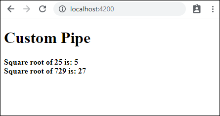
<h1>Custom Pipe</h1>
<b>Square root of 25 is: {{25 | sqrt}}</b>
<br/>
<b>Square root of 729 is: {{729 | sqrt}}</b>
Following is the output −
Angular7 - Routing
Routing basically means navigating between pages. You have seen many sites with links that direct you to a new page. This can be achieved using routing. Here the pages that we are referring to will be in the form of components. We have already seen how to create a component. Let us now create a component and see how to use routing with it.
During the project setup, we have already included the routing module and the same is available in app.module.ts as shown below −
app.module.ts
import { BrowserModule } from '@angular/platform-browser';
import { NgModule } from '@angular/core';
import { AppRoutingModule } from './app-routing.module';
import { AppComponent } from './app.component';
import { NewCmpComponent } from './new-cmp/new-cmp.component';
import { ChangeTextDirective } from './change-text.directive';
import { SqrtPipe } from './app.sqrt';

@NgModule({
   declarations: [
      SqrtPipe,
      AppComponent,
      NewCmpComponent,
      ChangeTextDirective
   ],
   imports: [
      BrowserModule,
      AppRoutingModule
   ],
   providers: [],
   bootstrap: [AppComponent]
})
export class AppModule { }
AppRoutingModule is added as shown above and included in the imports array.
File details of app-routing.module are given below −
import { NgModule } from '@angular/core';
import { Routes, RouterModule } from '@angular/router';

const routes: Routes = [];
@NgModule({
   imports: [
      RouterModule.forRoot(routes)
   ],
   exports: [RouterModule]
})
export class AppRoutingModule { }
Here, we have to note that this file is generated by default when the routing is added during project setup. If not added, the above files have to be added manually.
So in the above file, we have imported Routes and RouterModule from @angular/router.
There is a const routes defined which is of type Routes. It is an array which holds all the routes we need in our project.
The const routes is given to the RouterModule as shown in @NgModule. To display the routing details to the user, we need to add <router-outlet> directive where we want the view to be displayed.
The same is added in app.component.html as shown below−
<h1>Angular 7 Routing Demo</h1>
<router-outlet></router-outlet>
Now let us create 2 components called as Home and Contact Us and navigate between them using routing.
Component Home
First, we shall discuss about Home. Following is the syntax for Component Home −
ng g component home
C:\projectA7\angular7-app>ng g component home CREATE
src/app/home/home.component.html (23 bytes) CREATE
src/app/home/home.component.spec.ts (614 bytes) CREATE
src/app/home/home.component.ts (261 bytes) CREATE
src/app/home/home.component.css (0 bytes) UPDATE
src/app/app.module.ts (692 bytes)
Component Contact Us
Following is the syntax for Component Contact Us −
ng g component contactus
C:\projectA7\angular7-app>ng g component contactus
CREATE src/app/contactus/contactus.component.html (28 bytes)
CREATE src/app/contactus/contactus.component.spec.ts (649 bytes)
CREATE src/app/contactus/contactus.component.ts (281 bytes)
CREATE src/app/contactus/contactus.component.css (0 bytes)
UPDATE src/app/app.module.ts (786 bytes)
We are done with creating components home and contact us. Below are the details of the components in app.module.ts −
import { BrowserModule } from '@angular/platform-browser';
import { NgModule } from '@angular/core';
import { AppRoutingModule } from './app-routing.module';
import { AppComponent } from './app.component';
import { NewCmpComponent } from './new-cmp/new-cmp.component';
import { ChangeTextDirective } from './change-text.directive';
import { SqrtPipe } from './app.sqrt';
import { HomeComponent } from './home/home.component';
import { ContactusComponent } from './contactus/contactus.component';

@NgModule({
   declarations: [
      SqrtPipe,
      AppComponent,
      NewCmpComponent,
      ChangeTextDirective,
      HomeComponent,
      ContactusComponent
   ],
   imports: [
      BrowserModule,
      AppRoutingModule
   ],
   providers: [],
   bootstrap: [AppComponent]
})
export class AppModule { }
Now let us add the routes details in app-routing.module.ts as shown below −
import { NgModule } from '@angular/core';
import { Routes, RouterModule } from '@angular/router';
import { HomeComponent } from './home/home.component';
import { ContactusComponent } from './contactus/contactus.component';

const routes: Routes = [
   {path:"home", component:HomeComponent},
   {path:"contactus", component:ContactusComponent}
];
@NgModule({
   imports: [RouterModule.forRoot(routes)],
   exports: [RouterModule]
})
export class AppRoutingModule { }
The routes array has the component details with path and component. The required component is imported as shown above.
Here, we need to notice that the components we need for routing are imported in app.module.ts and also in app-routing.module.ts. Let us import them in one place, i.e., in app-routing.module.ts.
So we will create an array of component to be used for routing and will export the array in app-routing.module.ts and again import it in app.module.ts. So we have all the components to be used for routing in app-routing.module.ts.
This is how we have done it app-routing.module.ts −
import { NgModule } from '@angular/core';
import { Routes, RouterModule } from '@angular/router';
import { HomeComponent } from './home/home.component';
import { ContactusComponent } from './contactus/contactus.component';

const routes: Routes = [
   {path:"home", component:HomeComponent},
   {path:"contactus", component:ContactusComponent}
];
@NgModule({
   imports: [RouterModule.forRoot(routes)],
   exports: [RouterModule]
})
export class AppRoutingModule { } export const
RoutingComponent = [HomeComponent,ContactusComponent];
The array of components i.e., RoutingComponent is imported in app.module.ts as follows −
import { BrowserModule } from '@angular/platform-browser';
import { NgModule } from '@angular/core';
import { AppRoutingModule , RoutingComponent} from './app-routing.module';
import { AppComponent } from './app.component';
import { NewCmpComponent } from './new-cmp/new-cmp.component';
import { ChangeTextDirective } from './change-text.directive';
import { SqrtPipe } from './app.sqrt';

@NgModule({
   declarations: [
      SqrtPipe,
      AppComponent,
      NewCmpComponent,
      ChangeTextDirective,
      RoutingComponent
   ],
   imports: [
      BrowserModule,
      AppRoutingModule
   ],
   providers: [],
   bootstrap: [AppComponent]
})
export class AppModule { }
So now we are done with defining the routes. We need to display the same to the user, so let us add two buttons, Home and Contact Us in app.component.html and on click of the respective buttons, it will display the component view inside <router-outlet> directive which we have added in add.component.html.
Create button inside app.component.html and give the path to the routes created.
app.component.html
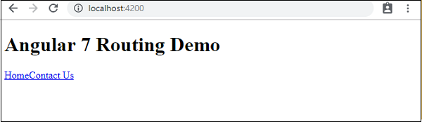
<h1>Angular 7 Routing Demo</h1>
<nav>
   <a routerLink = "/home">Home</a>
   <a routerLink = "/contactus">Contact Us </a>
</nav>
<router-outlet></router-outlet>
In .html, we have added anchor links, Home and Contact us and used routerLink to give the path to the routes we have created in app-routing.module.ts.
Let us now test the same in the browser −
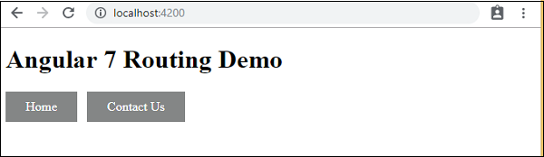
This is how we get it in browser. Let us add some styling to make the links look good.
We have added following css in app.component.css −
a:link, a:visited {
   background-color: #848686;
   color: white;
   padding: 10px 25px;
   text-align: center;
   text-decoration: none;
   display: inline-block;
}
a:hover, a:active {
   background-color: #BD9696;
}
This is the display of the links in the browser −
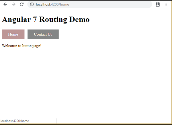
Click on Home link, to see the component details of home as shown below −
Click on Contact Us, to see its component details as given below −
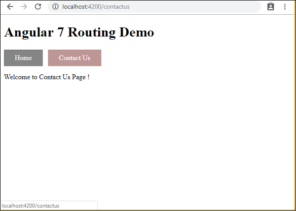
As you click on the link, you will also see the page url in the address bar changing. It appends the path details at the end of the page as seen in the screenshot shown above.
Angular7 - Services
We might come across a situation where we need some code to be used everywhere on the page. For example, it can be for data connection that needs to be shared across components. This is achieved with the help of Services. With services, we can access methods and properties across other components in the entire project.
To create a service, we need to make use of the command line as given below −
ng g service myservice
C:\projectA7\angular7-app>ng g service myservice
CREATE src/app/myservice.service.spec.ts (348 bytes)
CREATE src/app/myservice.service.ts (138 bytes)
The files created in app folder are as follows −
Following are the files created which are shown at the bottom myservice.service.specs.ts and myservice.service.ts.
myservice.service.ts
import { Injectable } from '@angular/core';
@Injectable({
   providedIn: 'root'
})
export class MyserviceService {
   constructor() { }
}
Here, the injectable module is imported from the @angular/core. It contains the @Injectable method and a class called MyserviceService. We will create our service function in this class.
Before creating a new service, we need to include the service created in the main parent app.module.ts.
import { BrowserModule } from '@angular/platform-browser';
import { NgModule } from '@angular/core';
import { AppRoutingModule , RoutingComponent} from './app-routing.module';
import { AppComponent } from './app.component';
import { NewCmpComponent } from './new-cmp/new-cmp.component';
import { ChangeTextDirective } from './change-text.directive';
import { SqrtPipe } from './app.sqrt';
import { MyserviceService } from './myservice.service';

@NgModule({
   declarations: [
      SqrtPipe,
      AppComponent,
      NewCmpComponent,
      ChangeTextDirective,
      RoutingComponent
   ],
   imports: [
      BrowserModule,
      AppRoutingModule
   ],
   providers: [MyserviceService],
   bootstrap: [AppComponent]
})
export class AppModule { }
We have imported the Service with the class name, and the same class is used in the providers. Let us now switch back to the service class and create a service function.
In the service class, we will create a function which will display todays date. We can use the same function in the main parent component app.component.ts and also in the new component new-cmp.component.ts that we created in the previous chapter.
Let us now see how the function looks in the service and how to use it in components.
import { Injectable } from '@angular/core';
@Injectable({
   providedIn: 'root'
})
export class MyserviceService {
   constructor() { }
   showTodayDate() {
      let ndate = new Date();
      return ndate;
   }
}
In the above service file, we have created a function showTodayDate. Now we will return the new Date () created. Let us see how we can access this function in the component class.
app.component.ts
import { Component } from '@angular/core';
import { MyserviceService } from './myservice.service';
@Component({ selector: 'app-root',
   templateUrl: './app.component.html',
   styleUrls: ['./app.component.css']
})
export class AppComponent {
   title = 'Angular 7 Project!';
   todaydate;
   constructor(private myservice: MyserviceService) {}
   ngOnInit() {
      this.todaydate = this.myservice.showTodayDate();
   }
}
The ngOnInit function gets called by default in any component created. The date is fetched from the service as shown above. To fetch more details of the service, we need to first include the service in the component ts file.
We will display the date in the .html file as shown below −
app.component.html
{{todaydate}}
<app-new-cmp></app-new-cmp>
Let us now see how to use the service in the new component created.
new-cmp.component.ts
import { Component, OnInit } from '@angular/core';
import { MyserviceService } from './../myservice.service';

@Component({
   selector: 'app-new-cmp',
   templateUrl: './new-cmp.component.html',
   styleUrls: ['./new-cmp.component.css']
})
export class NewCmpComponent implements OnInit {
   newcomponent = "Entered in new component created";
   todaydate;
   constructor(private myservice: MyserviceService) { }
   ngOnInit() {
      this.todaydate = this.myservice.showTodayDate();
   }
}
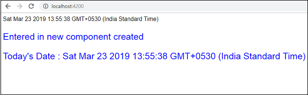
In the new component that we have created, we need to first import the service that we want and access the methods and properties of the same. Check the code highlighted. todaydate is displayed in the component html as follows −
new-cmp.component.html
<p>
   {{newcomponent}}
</p>
<p>
   Today's Date : {{todaydate}}
</p>
The selector of the new component is used in the app.component.html file. The contents from the above html file will be displayed in the browser as shown below −
If you change the property of the service in any component, the same is changed in other components too. Let us now see how this works.
We will define one variable in the service and use it in the parent and the new component. We will again change the property in the parent component and will see if the same is changed in the new component or not.
In myservice.service.ts, we have created a property and used the same in other parent and new component.
import { Injectable } from '@angular/core';
@Injectable({
   providedIn: 'root'
})
export class MyserviceService {
   serviceproperty = "Service Created";
   constructor() { }
   showTodayDate() {
      let ndate = new Date();
      return ndate;
   }
}
Let us now use the serviceproperty variable in other components. In app.component.ts, we are accessing the variable as follows −
import { Component } from '@angular/core';
import { MyserviceService } from './myservice.service';
@Component({
   selector: 'app-root',
   templateUrl: './app.component.html',
   styleUrls: ['./app.component.css']
})
export class AppComponent {
   title = 'Angular 7 Project!';
   todaydate;
   componentproperty;
   constructor(private myservice: MyserviceService) {}
   ngOnInit() {
      this.todaydate = this.myservice.showTodayDate();
      console.log(this.myservice.serviceproperty);
      this.myservice.serviceproperty = "component created";
      // value is changed. this.componentproperty =
      this.myservice.serviceproperty;
   }
}
We will now fetch the variable and work on the console.log. In the next line, we will change the value of the variable to component created. We will do the same in new-cmp.component.ts.
import { Component, OnInit } from '@angular/core';
import { MyserviceService } from './../myservice.service';
@Component({
   selector: 'app-new-cmp',
   templateUrl: './new-cmp.component.html',
   styleUrls: ['./new-cmp.component.css']
})
export class NewCmpComponent implements OnInit {
   todaydate;
   newcomponentproperty; newcomponent = "Entered in
   newcomponent"; constructor(private myservice:
   MyserviceService) {}
   ngOnInit() {
      this.todaydate = this.myservice.showTodayDate();
      this.newcomponentproperty =
      this.myservice.serviceproperty;
   }
}
In the above component, we are not changing anything but directly assigning the property to the component property.
Now when you execute it in the browser, the service property will be changed since the value of it is changed in app.component.ts and the same will be displayed for the new-cmp.component.ts.
Also check the value in the console before it is changed.
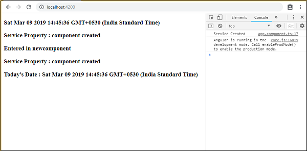
Here is the app.component.html and new-cmp.component.html files −
app.component.html
<h3>{{todaydate}}>/h3>
<h3> Service Property : {{componentproperty}} </h3>
<app-new-cmp></app-new-cmp>
new-cmp.component.html
<h3>{{newcomponent}} </h3>
<h3> Service Property : {{newcomponentproperty}} </h3>
<h3> Today's Date : {{todaydate}} </h3>
Angular7 - Http Client
HttpClient will help us fetch external data, post to it, etc. We need to import the http module to make use of the http service. Let us consider an example to understand how to make use of the http service.
To start using the http service, we need to import the module in app.module.ts as shown below −
import { BrowserModule } from '@angular/platform-browser';
import { NgModule } from '@angular/core';
import { AppRoutingModule , RoutingComponent} from './app-routing.module';
import { AppComponent } from './app.component';
import { NewCmpComponent } from './new-cmp/new-cmp.component';
import { ChangeTextDirective } from './change-text.directive';
import { SqrtPipe } from './app.sqrt';
import { MyserviceService } from './myservice.service';
import { HttpClientModule } from '@angular/common/http';

@NgModule({
   declarations: [
      SqrtPipe,
      AppComponent,
      NewCmpComponent,
      ChangeTextDirective,
      RoutingComponent
   ],
   imports: [
      BrowserModule,
      AppRoutingModule,
      HttpClientModule
   ],
   providers: [MyserviceService],
   bootstrap: [AppComponent]
})
export class AppModule { }
If you see the highlighted code, we have imported the HttpClientModule from @angular/common/http and the same is also added in the imports array.
We will fetch the data from the server using httpclient module declared above. We will do that inside a service we created in the previous chapter and use the data inside the components which we want.
myservice.service.ts
import { Injectable } from '@angular/core';
import { HttpClient } from '@angular/common/http';
@Injectable({
   providedIn: 'root'
})
export class MyserviceService {
   private finaldata = [];
   private apiurl = "http://jsonplaceholder.typicode.com/users";
   constructor(private http: HttpClient) { }
   getData() {
      return this.http.get(this.apiurl);
   }
}
There is a method added called getData that returns the data fetched for the url given.
The method getData is called from app.component.ts as follows −
import { Component } from '@angular/core';
import { MyserviceService } from './myservice.service';
@Component({
   selector: 'app-root',
   templateUrl: './app.component.html',
   styleUrls: ['./app.component.css']
})
export class AppComponent {
   title = 'Angular 7 Project!';
   public persondata = [];
   constructor(private myservice: MyserviceService) {}
   ngOnInit() {
      this.myservice.getData().subscribe((data) => {
         this.persondata = Array.from(Object.keys(data), k=>data[k]);
         console.log(this.persondata);
      });
   }
}
We are calling the method getData which gives back an observable type data. The subscribe method is used on it which has an arrow function with the data we need.
When we check in the browser, the console displays the data as shown below −
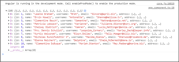
Let us use the data in app.component.html as follows −
<h3>Users Data</h3>
<ul>
   <li *ngFor="let item of persondata; let i = index"<
      {{item.name}}
   </li>
</ul>
Output
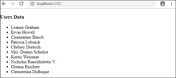
Angular7 - CLI Prompts
Angular CLI makes it easy to start with any Angular project. Angular CLI comes with commands that help us create and start on our project very fast. Let us now go through the commands available to create a project, a component and services, change the port, etc.
To work with Angular CLI, we need to have it installed on our system. Let us use the following command for the same −
npm install -g @angular/cli
To create a new project, we can run the following command in the command line and the project will be created.
ng new PROJECT-NAME
cd PROJECT-NAME
ng serve //
ng serve // will compile and you can see the output of your project in the browser −
http://localhost:4200/
4200 is the default port used when a new project is created. You can change the port with the following command −
ng serve --host 0.0.0.0 --port 4201
Command for Angular Update
In case you want to update your application and its dependencies, you can use the following command −
ng update @angular/cli @angular/core
It will update core framework to the recent version, i.e., Angular 7 and also angular-cli. You can use above command with following options −
Angular Important Command List
The following table lists down a few important commands required while working with Angular 7 projects −
| Sr.No | Commands and Description |
|---|---|
| 1 | Component ng g component new-component |
| 2 | Directive ng g directive new-directive |
| 3 | Pipe ng g pipe new-pipe |
| 4 | Service ng g service new-service |
| 5 | Module ng g module my-module |
| 6 | Test ng test |
| 7 | Build ng build --configuration=production // for production environment ng build --configuration=staging // for stating environment |
Whenever a new module, a component, or a service is created, the reference of the same is updated in the parent module app.module.ts.
Angular7 - Forms
In this chapter, we will see how forms are used in Angular 7. We will discuss two ways of working with forms −
- Template driven form
- Model driven form
Template Driven Form
With a template driven form, most of the work is done in the template. With the model driven form, most of the work is done in the component class.
Let us now consider working on the Template driven form. We will create a simple login form and add the email id, password and submit button in the form. To start with, we need to import to FormsModule from @angular/forms which is done in app.module.ts as follows −
import { BrowserModule } from '@angular/platform-browser';
import { NgModule } from '@angular/core';
import { AppRoutingModule , RoutingComponent} from './app-routing.module';
import { AppComponent } from './app.component';
import { NewCmpComponent } from './new-cmp/new-cmp.component';
import { ChangeTextDirective } from './change-text.directive';
import { SqrtPipe } from './app.sqrt';
import { MyserviceService } from './myservice.service';
import { HttpClientModule } from '@angular/common/http';
import { ScrollDispatchModule } from '@angular/cdk/scrolling';
import { DragDropModule } from '@angular/cdk/drag-drop';
import { FormsModule } from '@angular/forms';

@NgModule({
   declarations: [
      SqrtPipe,
      AppComponent,
      NewCmpComponent,
      ChangeTextDirective,
      RoutingComponent
   ],
   imports: [
      BrowserModule,
      AppRoutingModule,
      HttpClientModule,
      ScrollDispatchModule,
      DragDropModule,
      FormsModule
   ],
   providers: [MyserviceService],
   bootstrap: [AppComponent]
})
export class AppModule { }
So in app.module.ts, we have imported the FormsModule and the same is added in the imports array as shown in the highlighted code.
Let us now create our form in the app.component.html file.
<form #userlogin = "ngForm" (ngSubmit) = "onClickSubmit(userlogin.value)">
   <input type = "text" name = "emailid" placeholder = "emailid" ngModel>
   <br/>
   <input type = "password" name = "passwd" placeholder = "passwd" ngModel>
   <br/>
   <input type = "submit" value = "submit">
</form>
We have created a simple form with input tags having email id, password and the submit button. We have assigned type, name, and placeholder to it.
In template driven forms, we need to create the model form controls by adding the ngModel directive and the name attribute. Thus, wherever we want Angular to access our data from forms, add ngModel to that tag as shown above. Now, if we have to read the emailid and passwd, we need to add the ngModel across it.
If you see, we have also added the ngForm to the #userlogin. The ngForm directive needs to be added to the form template that we have created. We have also added function onClickSubmit and assigned userlogin.value to it.
Let us now create the function in the app.component.ts and fetch the values entered in the form.
import { Component } from '@angular/core';
import { MyserviceService } from './myservice.service';

@Component({
   selector: 'app-root',
   templateUrl: './app.component.html',
   styleUrls: ['./app.component.css']
})
export class AppComponent {
   title = 'Angular 7 Project!';
   constructor(private myservice: MyserviceService) { }
   ngOnInit() { }
   onClickSubmit(data) {
      alert("Entered Email id : " + data.emailid);
   }
}
In the above app.component.ts file, we have defined the function onClickSubmit. When you click on the form submit button, the control will come to the above function.
The css for the login form is added in app.component.css −
input[type = text], input[type = password] {
   width: 40%;
   padding: 12px 20px;
   margin: 8px 0;
   display: inline-block;
   border: 1px solid #B3A9A9;
   box-sizing: border-box;
}
input[type = submit] {
   padding: 12px 20px;
   margin: 8px 0;
   display: inline-block;
   border: 1px solid #B3A9A9;
   box-sizing: border-box;
}
This is how the browser is displayed −
The form looks like as shown below. Let us enter the data in it and in the submit function, the email id is alerted as shown below −
Model Driven Form
In the model driven form, we need to import the ReactiveFormsModule from @angular/forms and use the same in the imports array.
There is a change which goes in app.module.ts.
import { BrowserModule } from '@angular/platform-browser';
import { NgModule } from '@angular/core';
import { AppRoutingModule , RoutingComponent} from './app-routing.module';
import { AppComponent } from './app.component';
import { NewCmpComponent } from './new-cmp/new-cmp.component';
import { ChangeTextDirective } from './change-text.directive';
import { SqrtPipe } from './app.sqrt';
import { MyserviceService } from './myservice.service';
import { HttpClientModule } from '@angular/common/http';
import { ScrollDispatchModule } from '@angular/cdk/scrolling';
import { DragDropModule } from '@angular/cdk/drag-drop';
import { ReactiveFormsModule } from '@angular/forms';

@NgModule({
   declarations: [
      SqrtPipe,
      AppComponent,
      NewCmpComponent,
      ChangeTextDirective,
      RoutingComponent
   ],
   imports: [
      BrowserModule,
      AppRoutingModule,
      HttpClientModule,
      ScrollDispatchModule,
      DragDropModule,
      ReactiveFormsModule
   ],
   providers: [MyserviceService],
   bootstrap: [AppComponent]
})
export class AppModule { }
In app.component.ts, we need to import a few modules for the model driven form. For example, import { FormGroup, FormControl } from '@angular/forms'.
import { Component } from '@angular/core';
import { MyserviceService } from './myservice.service';
import { FormGroup, FormControl } from '@angular/forms';

@Component({
   selector: 'app-root',
   templateUrl: './app.component.html',
   styleUrls: ['./app.component.css']
})
export class AppComponent {
   title = 'Angular 7 Project!';
   emailid;
   formdata;
   constructor(private myservice: MyserviceService) { }
   ngOnInit() {
      this.formdata = new FormGroup({
         emailid: new FormControl("angular@gmail.com"),
         passwd: new FormControl("abcd1234")
      });
   }
   onClickSubmit(data) {this.emailid = data.emailid;}
}
The variable form data is initialized at the start of the class and the same is initialized with FormGroup as shown above. The variables emailid and passwd are initialized with default values to be displayed in the form. You can keep it blank in case you want to.
This is how the values will be seen in the form UI.
We have used formdata to initialize the form values; we need to use the same in the form UI app.component.html.
<div>
   <form [formGroup] = "formdata" (ngSubmit) = "onClickSubmit(formdata.value)" >
      <input type = "text" class = "fortextbox" name = "emailid" placeholder = "emailid"
         formControlName = "emailid">
      <br/>

      <input type = "password" class = "fortextbox" name = "passwd"
         placeholder = "passwd" formControlName = "passwd">
      <br/>

      <input type = "submit" class = "forsubmit" value = "Log In">
   </form>
</div>
<p> Email entered is : {{emailid}} </p>
In the .html file, we have used formGroup in square bracket for the form; for example, [formGroup] = formdata. On submit, the function is called onClickSubmit for which formdata.value is passed.
The input tag formControlName is used. It is given a value that we have used in the app.component.ts file.
On clicking submit, the control will pass to the function onClickSubmit, which is defined in the app.component.ts file.
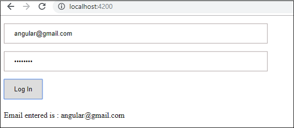
On clicking Login, the value will be displayed as shown in the above screenshot.
Form Validation
Let us now discuss form validation using model driven form. You can use the built-in form validation or also use the custom validation approach. We will use both the approaches in the form. We will continue with the same example that we created in one of our previous sections. With Angular 7, we need to import Validators from @angular/forms as shown below −
import { FormGroup, FormControl, Validators} from '@angular/forms'
Angular has built-in validators such as mandatory field, minlength, maxlength, and pattern. These are to be accessed using the Validators module.
You can just add validators or an array of validators required to tell Angular if a particular field is mandatory. Let us now try the same on one of the input textboxes, i.e., email id. For the email id, we have added the following validation parameters −
- Required
- Pattern matching
This is how a code undergoes validation in app.component.ts.
import { Component } from '@angular/core';
import { FormGroup, FormControl, Validators} from '@angular/forms';

@Component({
   selector: 'app-root',
   templateUrl: './app.component.html',
   styleUrls: ['./app.component.css']
})
export class AppComponent {
   title = 'Angular 4 Project!';
   todaydate;
   componentproperty;
   emailid;
   formdata;
   ngOnInit() {
      this.formdata = new FormGroup({
         emailid: new FormControl("", Validators.compose([
            Validators.required,
            Validators.pattern("[^ @]*@[^ @]*")
         ])),
         passwd: new FormControl("")
      });
   }
   onClickSubmit(data) {this.emailid = data.emailid;}
}
In Validators.compose, you can add the list of things you want to validate on the input field. Right now, we have added the required and the pattern matching parameters to take only valid email.
In the app.component.html, the submit button is disabled if any of the form inputs are not valid. This is done as follows −
<div>
   <form [formGroup] = "formdata" (ngSubmit) = "onClickSubmit(formdata.value)">
      <input type = "text" class = "fortextbox" name = "emailid"
         placeholder = "emailid" formControlName = "emailid">
      <br/>

      <input type = "password" class = "fortextbox" name = "passwd"
         placeholder = "passwd" formControlName = "passwd">
      <br/>

      <input type = "submit" [disabled] = "!formdata.valid" class = "forsubmit"
         value = "Log In">
   </form>
</div>
<p> Email entered is : {{emailid}} </p>
For the submit button, we have added disabled in the square bracket, which is given the following value.
!formdata.valid.
Thus, if the formdata.valid is not valid, the button will remain disabled and the user will not be able to submit it.
Let us see how this works in the browser −
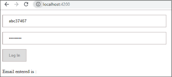
In the above case, the email id entered is invalid, hence the login button is disabled. Let us now try entering the valid email id and see the difference.
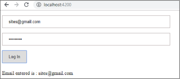
Now, the email id entered is valid. Thus, we can see the login button is enabled and the user will be able to submit it. With this, the email id entered is displayed at the bottom.
Let us now try custom validation with the same form. For custom validation, we can define our own custom function and add the required details in it. We will now see the below example for the same.
import { Component } from '@angular/core';
import { FormGroup, FormControl, Validators} from '@angular/forms';

@Component({
   selector: 'app-root',
   templateUrl: './app.component.html',
   styleUrls: ['./app.component.css']
})
export class AppComponent {
   title = 'Angular 7 Project!';
   todaydate;
   componentproperty;
   emailid;
   formdata;
   ngOnInit() {
      this.formdata = new FormGroup({
         emailid: new FormControl("", Validators.compose([
            Validators.required,
            Validators.pattern("[^ @]*@[^ @]*")
         ])),
         passwd: new FormControl("", this.passwordvalidation)
      });
   }
   passwordvalidation(formcontrol) {
      if (formcontrol.value.length < 5) {
         return {"passwd" : true};
      }
   }
   onClickSubmit(data) {this.emailid = data.emailid;}
}
In the above example, we have created a function passwordvalidation and the same is used in a previous section in the formcontrol - passwd: new FormControl("", this.passwordvalidation).
In the function that we have created, we will check if the length of the characters entered is appropriate. If the characters are less than five, it will return with the passwd true as shown above - return {"passwd" : true};. If the characters are more than five, it will consider it as valid and the login will be enabled.
Let us now see how this is displayed in the browser −
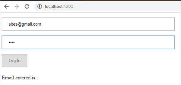
We have entered only three characters in the password and the login is disabled. To enable login, we need more than five characters. Let us now enter a valid length of characters and check.
The login is enabled as both the email id and the password are valid. The email is displayed at the bottom as we log in.
Angular7 - Materials/CDK-Virtual Scrolling
This is one of the new features added to Angular 7 called as Virtual Scrolling. This feature is added to CDK (Component Development Kit). Virtual scrolling shows up the visible dom elements to the user, as the user scrolls, the next list is displayed. This gives faster experience as the full list is not loaded at one go and only loaded as per the visibility on the screen.
Why do we need Virtual Scrolling Module?
Consider you have a UI which has a big list where loading all the data together can have performance issues. The new feature of Angular 7 Virtual Scrolling takes care of loading the elements which are visible to the user. As the user scrolls, the next list of dom elements visible to user is displayed. This gives faster experience and the scrolling is also very smooth.
Let us add the dependency to our project −
npm install @angular/cdk save
We are done with installing the dependency for virtual scrolling module.
We will work on an example to get a better understanding on how we can use virtual scrolling module in our project.
We will first add the virtual scrolling module inside app.module.ts as follows −
import { BrowserModule } from '@angular/platform-browser';
import { NgModule } from '@angular/core';
import { AppRoutingModule , RoutingComponent} from './app-routing.module';
import { AppComponent } from './app.component';
import { NewCmpComponent } from './new-cmp/new-cmp.component';
import { ChangeTextDirective } from './change-text.directive';
import { SqrtPipe } from './app.sqrt';
import { MyserviceService } from './myservice.service';
import { HttpClientModule } from '@angular/common/http';
import { ScrollDispatchModule } from '@angular/cdk/scrolling';

@NgModule({
   declarations: [
      SqrtPipe,
      AppComponent,
      NewCmpComponent,
      ChangeTextDirective,
      RoutingComponent
   ],
   imports: [
      BrowserModule,
      AppRoutingModule,
      HttpClientModule,
      ScrollDispatchModule
   ],
   providers: [MyserviceService],
   bootstrap: [AppComponent]
})
export class AppModule { }
In app.module.ts, we have imported the ScrollDispatchModule and the same is added to imports array as shown in the code above.
Next step is to get data to be displayed on the screen. We will continue to use the service we created in the last chapter.
We will fetch data from the url, https://jsonplaceholder.typicode.com/photos which has data for around 5000 images. We will get the data from it and display to the user using virtual scrolling module.
The details in the url, https://jsonplaceholder.typicode.com/photos are as follows −
It is json data that has image url and thumbnail url. We will show the thumbnail url to the users.
Following is the service which will fetch data −
myservice.service.ts
import { Injectable } from '@angular/core';
import { HttpClient } from '@angular/common/http';

@Injectable({
   providedIn: 'root'
})
export class MyserviceService {
   private finaldata = [];
   private apiurl = "https://jsonplaceholder.typicode.com/photos";
   constructor(private http: HttpClient) { }
   getData() {
      return this.http.get(this.apiurl);
   }
}
We will call the service from app.component.ts as follows −
import { Component } from '@angular/core';
import { MyserviceService } from './myservice.service';

@Component({
   selector: 'app-root',
   templateUrl: './app.component.html',
   styleUrls: ['./app.component.css']
})
export class AppComponent {
   title = 'Angular 7 Project!';
   public albumdetails = [];
   constructor(private myservice: MyserviceService) {}
   ngOnInit() {
      this.myservice.getData().subscribe((data) => {
         this.albumdetails = Array.from(Object.keys(data), k=>data[k]);
         console.log(this.albumdetails);
      });
   }
}
Now the variable albumdetails has all the data from the api and the total count is 5000.
Now that we have the data ready to be displayed, let us work inside app.component.html to display the data.
We need to add the tag, <cdk-virtual-scroll-viewport></cdk-virtual-scroll-viewport> to work with virtual scroll module. The tag needs to be added to .html file where we want the data to be displayed.
Here is the working of <cdk-virtual-scroll-viewport> in app.component.html.
<h3>Angular 7 - Virtual Scrolling</h3>
<cdk-virtual-scroll-viewport [itemSize] = "20">
   <table>
      <thead>
         <tr>
            <td>ID</td>
            <td>ThumbNail</td>
         </tr>
      </thead>
      <tbody>
         <tr *cdkVirtualFor = "let album of albumdetails">
            <td>{{album.id}}</td>
            <td>
               <img src = "{{album.thumbnailUrl}}" width = "100" height = "100"/>
            </td>
         </tr>
      </tbody>
   </table>
</cdk-virtual-scroll-viewport>
We are displaying the id and thumbnail url to the user on the screen. We have mostly used *ngFor so far, but inside <cdk-virtual-scroll-viewport>, we have to use *cdkVirtualFor to loop through the data.
We are looping through albumdetails variable which is populated inside app.component.html. There is a size assigned to the virtual tag [itemSize]="20" which will display the number of items based on the height of the virtual scroll module.
The css related to the virtual scroll module is as follows −
table {
   width: 100%;
}
cdk-virtual-scroll-viewport {
   height: 500px;
}
The height given to the virtual scroll is 500px. The images that fit within that height will be displayed to the user. We are done with adding the necessary code to get our virtual scroll module to be viewed.
The output of Virtual Scroll Module in the browser is as follows −
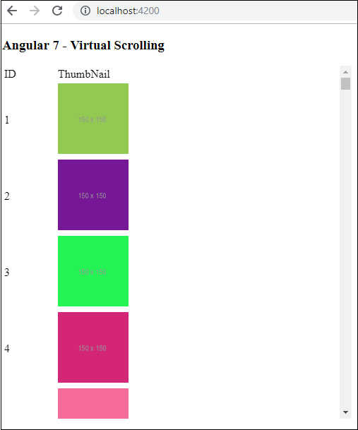
We can see the first 4 images are displayed to the user. We have specified the height of 500px. There is scroll displayed for the table, as the user scrolls, the images which will fit in that height will be displayed as shown below −
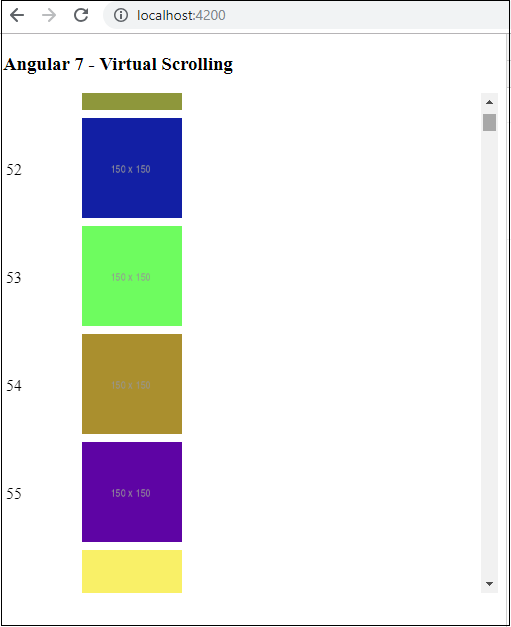
The required images are loaded as the user scrolls. This feature is very useful in terms of performance. At first go, it does not load all the 5000 images, instead as the user scrolls, the urls are called and displayed.
Angular7 - Materials/CDK-Drag and Drop
The new Drag and Drop feature added to Angular 7 CDK helps to drag and drop the elements from the list. We will understand the working of Drag and Drop Module with the help of an example. The feature is added to cdk. We need to first download the dependency as shown below −
npm install @angular/cdk --save

Once the above step is done. Let us import the drag and drop module in app.module.ts as shown below −
import { BrowserModule } from '@angular/platform-browser';
import { NgModule } from '@angular/core';
import { AppRoutingModule , RoutingComponent} from './app-routing.module';
import { AppComponent } from './app.component';
import { NewCmpComponent } from './new-cmp/new-cmp.component';
import { ChangeTextDirective } from './change-text.directive';
import { SqrtPipe } from './app.sqrt';
import { MyserviceService } from './myservice.service';
import { HttpClientModule } from '@angular/common/http';
import { ScrollDispatchModule } from '@angular/cdk/scrolling';
import { DragDropModule } from '@angular/cdk/drag-drop';

@NgModule({
   declarations: [
      SqrtPipe,
      AppComponent,
      NewCmpComponent,
      ChangeTextDirective,
      RoutingComponent
   ],
   imports: [
      BrowserModule,
      AppRoutingModule,
      HttpClientModule,
      ScrollDispatchModule,
      DragDropModule
   ],
   providers: [MyserviceService],
   bootstrap: [AppComponent]
})
export class AppModule { }
The DragDropModule is imported from '@angular/cdk/drag-drop' and the module is added to import array as shown above.
We will use details from the api, (http://jsonplaceholder.typicode.com/users) to be displayed on the screen. We have service which will fetch the data from the api as shown below −
myservice.service.ts
import { Injectable } from '@angular/core';
import { HttpClient } from '@angular/common/http';

@Injectable({
   providedIn: 'root'
})
export class MyserviceService {
   private finaldata = [];
   private apiurl = "http://jsonplaceholder.typicode.com/users";
   constructor(private http: HttpClient) { }
   getData() {
      return this.http.get(this.apiurl);
   }
}
Once done call the service inside app.component.ts as shown below −
import { Component } from '@angular/core';
import { MyserviceService } from './myservice.service';

@Component({
   selector: 'app-root',
   templateUrl: './app.component.html',
   styleUrls: ['./app.component.css']
})
export class AppComponent {
   title = 'Angular 7 Project!';
   public personaldetails = [];
   constructor(private myservice: MyserviceService) {}
   ngOnInit() {
      this.myservice.getData().subscribe((data) => {
         this.personaldetails = Array.from(Object.keys(data), k=>data[k]);
         console.log(this.personaldetails);
      });
   }
}
We have the required data available in personaldetails variable. Now let us use the same to display to the user as shown below −
<h3>Angular 7 - Drag and Drop Module</h3>
<div>
   <div *ngFor="let item of personaldetails; let i = index" class="divlayout>
      {{item.name}}
   </div >
</div>
We have added class = divlayout and the details of the class are in app.component.css.
.divlayout{
   width: 40%;
   background-color: #ccc;
   margin-bottom: 5px;
   padding: 10px 10px;
   border: 3px solid #73AD21;
}
Following screen will be displayed in the browser −
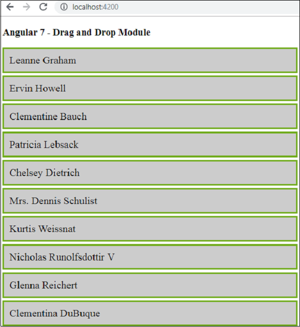
It will not drag and drop anything, we need to add the dragdrop cdk properties in app.component.html as shown below −
<h3>Angular 7 - Drag and Drop Module</h3>
<div cdkDropList
   #personList = "cdkDropList"
   [cdkDropListData] = "personaldetails"
   [cdkDropListConnectedTo] = "[userlist]"
   class = "example-list"
   (cdkDropListDropped) = "onDrop($event)" >

   <div *ngFor = "let item of personaldetails;
      let i = index" class = "divlayout" cdkDrag>
      {{item.name}}
   </div >
</div&t;
The highlighted ones are all the properties required to perform drag and drop. When you check in the browser, it allows you to drag the item. It will not drop it in the list and will remain as it is when you leave the mouse pointer.
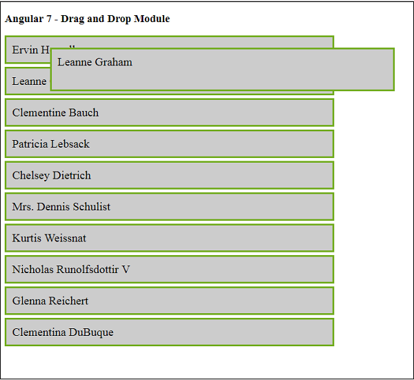
Here it allows to drag the item from the list but once you leave the mouse pointer it will go and settle in the same place. To add the drop feature, we need to add the event onDrop in app.component.ts as shown below −
First we have to import the dragdrap cdk modules as shown below −
import {CdkDragDrop, moveItemInArray, transferArrayItem}
from '@angular/cdk/drag-drop';
Here is the full code in app.component.ts −
import { Component } from '@angular/core';
import { MyserviceService } from './myservice.service';
import {CdkDragDrop, moveItemInArray, transferArrayItem} from '@angular/cdk/drag-drop';

@Component({
   selector: 'app-root',
   templateUrl: './app.component.html',
   styleUrls: ['./app.component.css']
})
export class AppComponent {
   title = 'Angular 7 Project!';
   public personaldetails = [];
   constructor(private myservice: MyserviceService) {}
   ngOnInit() {
      this.myservice.getData().subscribe((data) => {
         this.personaldetails = Array.from(Object.keys(data),
         k=>data[k]);
         console.log(this.personaldetails);
      });
   }
   onDrop(event: CdkDragDrop<string[]>) {
      if (event.previousContainer === event.container) {
         moveItemInArray(event.container.data,
            event.previousIndex, event.currentIndex);
      } else {
         transferArrayItem(event.previousContainer.data,
         event.container.data,
         event.previousIndex,
         event.currentIndex);
      }
   }
}
The function onDrop takes care of dropping the item dragged in the position required.
It makes use of the moveItemInArray and transferArrayItem we have imported from cdk dragdrop module.
Now let us see the demo again in the browser −
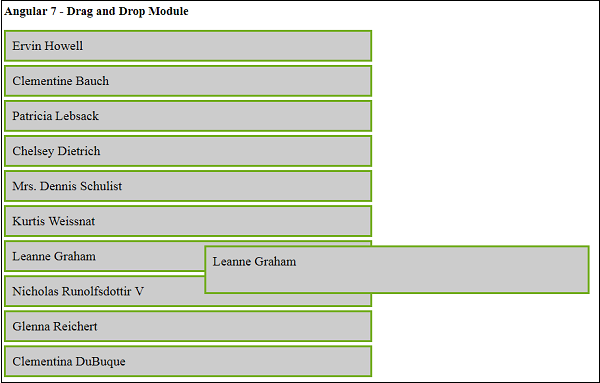
Now it allows you to drag and drop the item in the position required as shown above. The feature works very smoothly without any flicker issues and can be used in your application wherever the need arises.
Angular7 - Animations
Animations add a lot of interaction between the html elements. Animation was available with Angular 2, from Angular 4 onwards animation is no more a part of the @angular/core library, but is a separate package that needs to be imported in app.module.ts.
To start with, we need to import the library with the below line of code −
import { BrowserAnimationsModule } from '@angular/platform-browser/animations';
The BrowserAnimationsModule needs to be added to the import array in app.module.ts as shown below −
import { BrowserModule } from '@angular/platform-browser';
import { NgModule } from '@angular/core';
import { AppRoutingModule , RoutingComponent} from './app-routing.module';
import { AppComponent } from './app.component';
import { NewCmpComponent } from './new-cmp/new-cmp.component';
import { ChangeTextDirective } from './change-text.directive';
import { SqrtPipe } from './app.sqrt';
import { MyserviceService } from './myservice.service';
import { HttpClientModule } from '@angular/common/http';
import { ScrollDispatchModule } from '@angular/cdk/scrolling';
import { DragDropModule } from '@angular/cdk/drag-drop';
import { ReactiveFormsModule } from '@angular/forms';
import { BrowserAnimationsModule } from '@angular/platform-browser/animations';

@NgModule({
   declarations: [
      SqrtPipe,
      AppComponent,
      NewCmpComponent,
      ChangeTextDirective,
      RoutingComponent
   ],
   imports: [
      BrowserModule,
      AppRoutingModule,
      HttpClientModule,
      ScrollDispatchModule,
      DragDropModule,
      ReactiveFormsModule,
      BrowserAnimationsModule
   ],
   providers: [MyserviceService],
   bootstrap: [AppComponent]
})
export class AppModule { }
In app.component.html, we have added the html elements, which are to be animated.
<div>
   <button (click) = "animate()">Click Me</button>
   <div [@myanimation] = "state" class = "rotate">
      <img src = "assets/images/img.png" width = "100" height = "100">
   </div>
</div>
For the main div, we have added a button and a div with an image. There is a click event for which the animate function is called. And for the div, the @myanimation directive is added and given the value as state.
Let us now see the app.component.ts where the animation is defined.
import { Component } from '@angular/core';
import { FormGroup, FormControl, Validators} from '@angular/forms';
import { trigger, state, style, transition, animate } from '@angular/animations';

@Component({
   selector: 'app-root',
   templateUrl: './app.component.html',
   styleUrls: ['./app.component.css'],
   styles:[`
      div {
         margin: 0 auto;
         text-align: center;
         width:200px;
      }
      .rotate {
         width:100px;
         height:100px;
         border:solid 1px red;
      }
   `],
   animations: [
      trigger('myanimation',[
         state('smaller',style({
            transform : 'translateY(100px)'
         })),
         state('larger',style({
            transform : 'translateY(0px)'
         })),
         transition('smaller <=> larger',animate('300ms ease-in'))
      ])
   ]
})
export class AppComponent {
   state: string = "smaller";
   animate() {
      this.state= this.state == 'larger' ? 'smaller' : 'larger';
   }
}
We have to import the animation function that is to be used in the .ts file as shown above.
import { trigger, state, style, transition, animate } from '@angular/animations';
Here we have imported trigger, state, style, transition, and animate from @angular/animations.
Now, we will add the animations property to the @Component () decorator −
animations: [
   trigger('myanimation',[
      state('smaller',style({
         transform : 'translateY(100px)' })),
      state('larger',style({
         transform : 'translateY(0px)' })),
         transition('smaller <=> larger',animate('300ms ease-in'))
   ])
]
Trigger defines the start of the animation. The first param to it is the name of the animation to be given to the html tag to which the animation needs to be applied. The second param are the functions we have imported - state, transition, etc.
The state function involves the animation steps, which the element will transition between. Right now we have defined two states, smaller and larger. For smaller state, we have given the style transform:translateY(100px) and transform:translateY(100px).
Transition function adds animation to the html element. The first argument takes the start and end states, the second argument accepts the animate function. The animate function allows you to define the length, delay, and ease of a transition.
Let us now see the .html file to see how the transition function works −
<div>
   <button (click) = "animate()">Click Me</button>
   <div [@myanimation] = "state" class = "rotate">
      <img src = "assets/images/img.png" width = "100" height = "100">
   </div>
</div>
There is a style property added in the @component directive, which centrally aligns the div. Let us consider the following example to understand the same −
styles:[`
   div{
      margin: 0 auto;
      text-align: center;
      width:200px;
   }
   .rotate{
      width:100px;
      height:100px;
      border:solid 1px red;
   }
`],
Here, a special character [``] is used to add styles to the html element, if any. For the div, we have given the animation name defined in the app.component.ts file.
On the click of a button it calls the animate function, which is defined in the app.component.ts file as follows −
export class AppComponent {
   state: string = "smaller";
   animate() {
      this.state = this.state == larger? 'smaller' : 'larger';
   }
}
The state variable is defined and is given the default value as smaller. The animate function changes the state on click. If the state is larger, it will convert to smaller; and if smaller, it will convert to larger.
This is how the output in the browser (http://localhost:4200/) will look like −
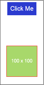
Upon clicking the Click Me button, the position of the image is changed as shown in the following screenshot −
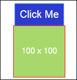
The transform function is applied in the y direction, which is changed from 0 to 100px when we click the Click Me button. The image is stored in the assets/images folder.
Angular7 - Materials
Materials offer a lot of built-in modules for your project. Features such as autocomplete, datepicker, slider, menus, grids, and toolbar are available for use with materials in Angular 7.
To use materials, we need to import the package. Angular 2 also has all the above features but they are available as part of the @angular/core module. From Angular 4, Materials module has been made available with a separate module @angular/materials. This helps the user to import only the required materials in their project.
To start using materials, you need to install two packages: materials and cdk. Material components depend on the animation module for advanced features. Hence you need the animation package for the same, @angular/animations. The package has already been updated in the previous chapter. We have already installed @angular/cdk packages in previous chapters for virtual and drag drop module.
Following is the command to add materials to your project −
npm install --save @angular/material
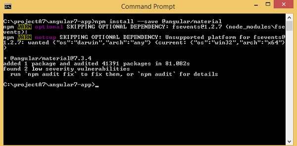
Let us now see the package.json. @angular/material and @angular/cdk are installed.
{
   "name": "angular7-app",
   "version": "0.0.0",
   "scripts": {
      "ng": "ng",
      "start": "ng serve",
      "build": "ng build",
      "test": "ng test",
      "lint": "ng lint",
      "e2e": "ng e2e"
   },
   "private": true,
   "dependencies": {
      "@angular/animations": "~7.2.0",
      "@angular/cdk": "^7.3.4",
      "@angular/common": "~7.2.0",
      "@angular/compiler": "~7.2.0",
      "@angular/core": "~7.2.0",
      "@angular/forms": "~7.2.0",
      "@angular/material": "^7.3.4",
      "@angular/platform-browser": "~7.2.0",
      "@angular/platform-browser-dynamic": "~7.2.0",
      "@angular/router": "~7.2.0",
      "core-js": "^2.5.4",
      "rxjs": "~6.3.3",
      "tslib": "^1.9.0",
      "zone.js": "~0.8.26"
   },
   "devDependencies": {
      "@angular-devkit/build-angular": "~0.13.0",
      "@angular/cli": "~7.3.2",
      "@angular/compiler-cli": "~7.2.0",
      "@angular/language-service": "~7.2.0",
      "@types/node": "~8.9.4",
      "@types/jasmine": "~2.8.8",
      "@types/jasminewd2": "~2.0.3",
      "codelyzer": "~4.5.0",
      "jasmine-core": "~2.99.1",
      "jasmine-spec-reporter": "~4.2.1",
      "karma": "~3.1.1",
      "karma-chrome-launcher": "~2.2.0",
      "karma-coverage-istanbul-reporter": "~2.0.1",
      "karma-jasmine": "~1.1.2",
      "karma-jasmine-html-reporter": "^0.2.2",
      "protractor": "~5.4.0",
      "ts-node": "~7.0.0",
      "tslint": "~5.11.0",
      "typescript": "~3.2.2"
   }
}
We have highlighted the packages that are installed to work with materials.
We will now import the modules in the parent module - app.module.ts as shown below.
import { BrowserModule } from '@angular/platform-browser';
import { NgModule } from '@angular/core';
import { AppRoutingModule , RoutingComponent} from './app-routing.module';
import { AppComponent } from './app.component';
import { NewCmpComponent } from './new-cmp/new-cmp.component';
import { ChangeTextDirective } from './change-text.directive';
import { SqrtPipe } from './app.sqrt';
import { MyserviceService } from './myservice.service';
import { HttpClientModule } from '@angular/common/http';
import { ScrollDispatchModule } from '@angular/cdk/scrolling';
import { DragDropModule } from '@angular/cdk/drag-drop';
import { ReactiveFormsModule } from '@angular/forms';
import { BrowserAnimationsModule } from '@angular/platform-browser/animations';
import { MatButtonModule, MatMenuModule, MatSidenavModule } from '@angular/material';

@NgModule({
   declarations: [
      SqrtPipe,
      AppComponent,
      NewCmpComponent,
      ChangeTextDirective,
      RoutingComponent
   ],
   imports: [
      BrowserModule,
      AppRoutingModule,
      HttpClientModule,
      ScrollDispatchModule,
      DragDropModule,
      ReactiveFormsModule,
      BrowserAnimationsModule,
      MatButtonModule,
      MatMenuModule,
      MatSidenavModule
   ],
   providers: [MyserviceService],
   bootstrap: [AppComponent]
})
export class AppModule { }
In the above file, we have imported the following modules from @angular/materials.
import { MatButtonModule, MatMenuModule, MatSidenavModule } from '@angular/material';
And the same is used in the imports array as shown below −
imports: [
   BrowserModule,
   AppRoutingModule,
   HttpClientModule,
   ScrollDispatchModule,
   DragDropModule,
   ReactiveFormsModule,
   BrowserAnimationsModule,
   MatButtonModule,
   MatMenuModule,
   MatSidenavModule
],
The app.component.ts is as shown below −
import { Component } from '@angular/core';
@Component({
   selector: 'app-root',
   templateUrl: './app.component.html',
   styleUrls: ['./app.component.css']
})
export class AppComponent {
   constructor() {}
}
Let us now add the material-css support in styles.css.
@import "~@angular/material/prebuilt-themes/indigo-pink.css";
Let us now add materials inside app.component.html
Menu
To add menu, <mat-menu></mat-menu> is used. The file and Save As items are added to the button under mat-menu. There is a main button added Menu. The reference of the same is given the <mat-menu> by using [matMenuTriggerFor]="menu" and using the menu with # in<mat-menu>.
app.component.html
<button mat-button [matMenuTriggerFor] = "menu">Menu</button>
<mat-menu #menu = "matMenu">
   <button mat-menu-item> File </button>
   <button mat-menu-item> Save As </button>
</mat-menu>
The below image is displayed in the browser −
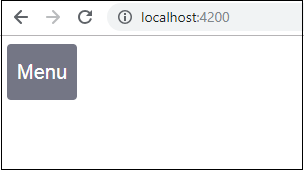
Clicking on Menu will display the items inside it −
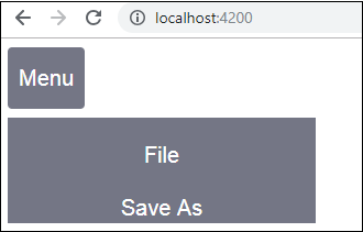
SideNav
To add sidenav, we need <mat-sidenav-container></mat-sidenav-container>. <mat-sidenav></mat-sidenav> is added as a child to the container. There is another div added, which triggers the sidenav by using (click)="sidenav.open()".
app.component.html
<mat-sidenav-container class="example-container" fullscreen>
   <mat-sidenav #sidenav class = "example-sidenav">
      Angular 7
   </mat-sidenav>
   <div class = "example-sidenav-content">
      <button type = "button" mat-button (click) = "sidenav.open()">
         Open sidenav
      </button>
   </div>
</mat-sidenav-container>
app.component.css
.example-container {
   width: 500px;
   height: 300px;
   border: 1px solid rgba(0, 0, 0, 0.5);
}
.example-sidenav {
   padding: 20px;
   width: 150px;
   font-size: 20px;
   border: 1px solid rgba(0, 0, 0, 0.5);
   background-color: #ccc;
   color:white;
}
Following is the display of menu and sidenav in the browser −
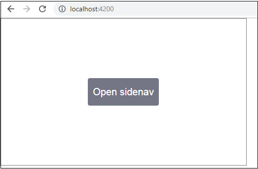
Following panel opens up on the left side if we click on Open Sidenav −
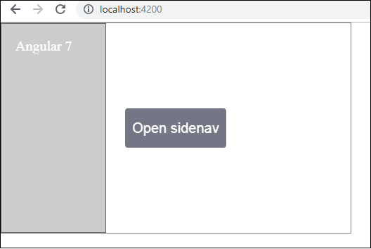
Datepicker
Let us now add a datepicker using materials. To add a datepicker, we need to import the modules required to show the datepicker.
In app.module.ts, we have imported the following module as shown below for datepicker −
import { BrowserModule } from '@angular/platform-browser';
import { NgModule } from '@angular/core';
import { AppRoutingModule , RoutingComponent} from './app-routing.module';
import { AppComponent } from './app.component';
import { NewCmpComponent } from './new-cmp/new-cmp.component';
import { ChangeTextDirective } from './change-text.directive';
import { SqrtPipe } from './app.sqrt';
import { MyserviceService } from './myservice.service';
import { HttpClientModule } from '@angular/common/http';
import { ScrollDispatchModule } from '@angular/cdk/scrolling';
import { DragDropModule } from '@angular/cdk/drag-drop';
import { ReactiveFormsModule } from '@angular/forms';
import { BrowserAnimationsModule } from '@angular/platform-browser/animations';
import { MatDatepickerModule, MatInputModule, MatNativeDateModule } from '@angular/material';

@NgModule({
   declarations: [
      SqrtPipe,
      AppComponent,
      NewCmpComponent,
      ChangeTextDirective,
      RoutingComponent
   ],
   imports: [
      BrowserModule,
      AppRoutingModule,
      HttpClientModule,
      ScrollDispatchModule,
      DragDropModule,
      ReactiveFormsModule,
      BrowserAnimationsModule,
      MatDatepickerModule,
      MatInputModule,
      MatNativeDateModule
   ],
   providers: [MyserviceService],
   bootstrap: [AppComponent]
})
export class AppModule { }
Here, we have imported modules such as MatDatepickerModule, MatInputModule, and MatNativeDateModule.
Now, the app.component.ts is as shown below −
import { Component } from '@angular/core';
@Component({
   selector: 'app-root',
   templateUrl: './app.component.html', s
   tyleUrls: ['./app.component.css']
})
export class AppComponent {
   constructor() {}
}
The app.component.html is as shown below −
<mat-form-field>
   <input matInput [matDatepicker] = "picker" placeholder = "Choose a date">
   <mat-datepicker-toggle matSuffix [for] = "picker"></mat-datepicker-toggle>
   <mat-datepicker #picker></mat-datepicker>
</mat-form-field>
Global css added in style.css −
/* You can add global styles to this file, and also
import other style files */
@import '~@angular/material/prebuilt-themes/deeppurple-amber.css';
body {
   font-family: Roboto, Arial, sans-serif;
   margin: 10;
}
.basic-container {
   padding: 30px;
}
.version-info {
   font-size: 8pt;
   float: right;
}
The datepicker is displayed in the browser as shown below −
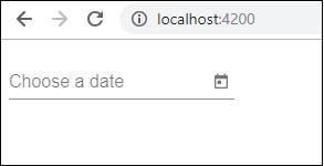
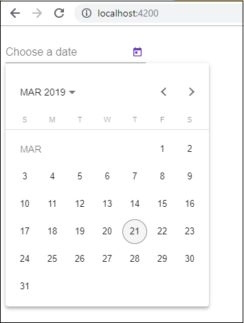
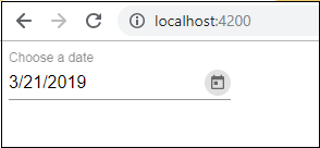
Testing and Building Angular7 Projects
In this chapter will discuss the following topics −
- To test Angular 7 Project
- To build Angular 7 Project
Testing Angular 7 Project
During the project setup, the required packages for testing are already installed. There is a .spec.ts file created for every new component, service, directive, etc. We are going to use jasmine to write our test cases.
For any changes added to your component, services, directives or any other files created, you can include your test cases in the respective .spec.ts files. So most of the unit testing can be covered at the beginning itself.
To run the test cases, the command used is as follows−
ng test
Below is the app.component.spec.ts file for app.component.ts −
import { TestBed, async } from '@angular/core/testing';
import { RouterTestingModule } from '@angular/router/testing';
import { AppComponent } from './app.component';

describe('AppComponent', () => {
   beforeEach(async(() => {
      TestBed.configureTestingModule({
         imports: [
            RouterTestingModule
         ],
         declarations: [
            AppComponent
         ],
      }).compileComponents();
   }));
   it('should create the app', () => {
      const fixture = TestBed.createComponent(AppComponent);
      const app = fixture.debugElement.componentInstance;
      expect(app).toBeTruthy();
   });
   it(`should have as title 'angular7-app'`, () => {
      const fixture = TestBed.createComponent(AppComponent);
      const app = fixture.debugElement.componentInstance;
      expect(app.title).toEqual('angular7-app');
   });
   it('should render title in a h1 tag', () => {
      const fixture = TestBed.createComponent(AppComponent);
      fixture.detectChanges();
      const compiled = fixture.debugElement.nativeElement;
      expect(compiled.querySelector('h1').textContent).toContain(
         'Welcome to angular7-app!');
   })
});
app.component.ts
import { Component } from '@angular/core';
@Component({
   selector: 'app-root',
   templateUrl: './app.component.html',
   styleUrls: ['./app.component.css']
})
export class AppComponent {
   title = 'angular7-app';
}
Now let us run the command to see the test cases running.
The test cases status is shown in the command line as shown above and will also open up in the browser as shown below −
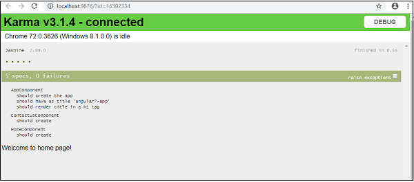
Incase of any failure, it will show the details as follows −
To do that, let us change the app.component.spec.ts as follows −
import { TestBed, async } from '@angular/core/testing';
import { RouterTestingModule } from '@angular/router/testing';
import { AppComponent } from './app.component';

describe('AppComponent', () => {
   beforeEach(async(() => {
      TestBed.configureTestingModule({
         imports: [
            RouterTestingModule
         ],
         declarations: [
            AppComponent
         ],
      }).compileComponents();
   }));
   it('should create the app', () => {
      const fixture = TestBed.createComponent(AppComponent);
      const app = fixture.debugElement.componentInstance;
      expect(app).toBeTruthy();
   });
   it(`should have as title 'angular7-app'`, () => {
      const fixture = TestBed.createComponent(AppComponent);
      const app = fixture.debugElement.componentInstance;
      expect(app.title).toEqual('Angular 7'); // change the
      title from angular7-app to Angular 7
   });
   it('should render title in a h1 tag', () => {
      const fixture = TestBed.createComponent(AppComponent);
      fixture.detectChanges();
      const compiled = fixture.debugElement.nativeElement;
      expect(compiled.querySelector('h1').textContent).toContain(
         'Welcome to angular7-app!');
   });
});
In the above file, the test cases check for the title, Angular 7. But in app.component.ts, we have the title, angular7-app as shown below −
import { Component } from '@angular/core';
@Component({
   selector: 'app-root',
   templateUrl: './app.component.html',
   styleUrls: ['./app.component.css']
})
export class AppComponent {
   title = 'angular7-app';
}
Here the test case will fail and below are the details shown in command line and browser.
In command line
Following screen is displayed in command line −
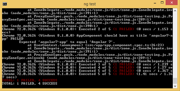
In browser
Following screen is displayed in the browser −
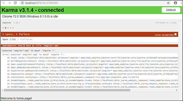
All the failed test-cases for your project will be displayed as shown above in command line and browser.
Similarly, you can write test cases for your services, directives and the new components which will be added to your project.
Building Angular 7 Project
Once you are done with the project in Angular, we need to build it so that it can be used in production or stating.
The configuration for build, i.e., production, staging, development, testing needs to be defined in your src/environments.
At present, we have the following environments defined in src/environment −
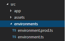
You can add files based on your build to src/environment, i.e., environment.staging.ts, enviornment.testing.ts, etc.
At present, we will try to build for production environment. The file environment.ts contains default environment settings and details of the file as follows −
export const environment = {
   production: false
};
To build the file for production, we need to make the production: true in environment.ts as follows −
export const environment = {
   production: true
};
The default environment file has to be imported inside components as follows −
app.component.ts
import { Component } from '@angular/core';
import { environment } from './../environments/environment';

@Component({
   selector: 'app-root',
   templateUrl: './app.component.html',
   styleUrls: ['./app.component.css']
})
export class AppComponent {
   title = 'angular7-app';
}
The environment replacement from default to production which we are trying to do are defined inside angular.json fileReplacements section as follows −
"production": {
   "fileReplacements": [
      {
         "replace": "src/environments/environment.ts",
         "with": "src/environments/environment.prod.ts"
      }
   ],
}
When the command for build runs, the file gets replaced to src/environments/environment.prod.ts. The additional configuration like staging or testing can be added here as shown in the below example −
"configurations": {
   "production": { ... },
   "staging": {
      "fileReplacements": [
         {
            "replace": "src/environments/environment.ts",
            "with": "src/environments/environment.staging.ts"
         }
      ]
   }
}
So the command to run the build is as follows −
ng build --configuration = production // for production environmnet
ng build --configuration = staging // for stating enviroment
Now let us run the build command for production, the command will create a dist folder inside our project which will have the final files after build.
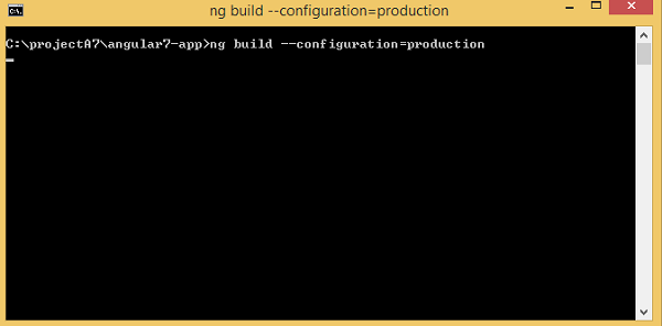
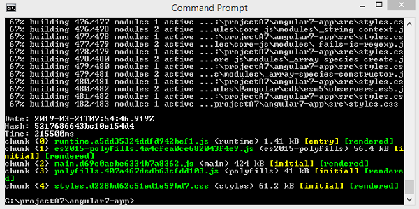
The final files are build inside dist/ folder which can be hosted on the production server at your end.