
Article Categories
- All Categories
-
 Data Structure
-
 Networking
-
 RDBMS
RDBMS
-
 Operating System
-
 Java
Java
-
 MS Excel
-
 iOS
iOS
-
 HTML
HTML
-
 CSS
CSS
-
 Android
-
 Python
-
 C Programming
-
 C++
C++
-
 C#
C#
-
 MongoDB
-
 MySQL
MySQL
-
 Javascript
-
 PHP
PHP
-
 Economics & Finance
Selected Reading
Display flex items vertically and reversed on different screen sizes in Bootstrap 4
Use the column-reverse class on various screen size to display flex item vertically and reversed.
For example: On medium screen size, use md-column-reverse ?
<div class="d-flex flex-md-column-reverse mb-3">
The following is the difference between column and column reverse ?
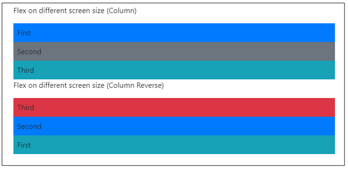
The following is an example to display flex items vertically and reversed on different screen sizes ?
Example
<!DOCTYPE html>
<html lang="en">
  <head>
    <title>Bootstrap Example</title>
    <meta charset="utf-8">
    <meta name="viewport" content="width=device-width, initial-scale=1">
    <link rel="stylesheet" href="https://maxcdn.bootstrapcdn.com/bootstrap/4.1.0/css/bootstrap.min.css">
    <script src="https://ajax.googleapis.com/ajax/libs/jquery/3.3.1/jquery.min.js"></script>
    <script src="https://maxcdn.bootstrapcdn.com/bootstrap/4.1.0/js/bootstrap.min.js"></script>
  </head>
<body>
  <div class="container mt-3">
    <h2>Example</h2>
    <p>Flex on different screen size (Column)</p>
    <div class="d-flex flex-column">
      <div class="p-2 bg-primary">First</div>
      <div class="p-2 bg-secondary">Second</div>
      <div class="p-2 bg-info">Third</div>
    </div>
    <p>Flex on different screen size (Medium - Column Reverse)</p>
    <div class="d-flex flex-md-column-reverse mb-3">
      <div class="p-2 bg-info">First</div>
      <div class="p-2 bg-primary">Second</div>
      <div class="p-2 bg-danger">Third</div>
    </div>
    <p>Flex on different screen size (Large - Column Reverse)</p>
    <div class="d-flex flex-lg-column-reverse mb-3">
      <div class="p-2 bg-info">First</div>
      <div class="p-2 bg-primary">Second</div>
      <div class="p-2 bg-danger">Third</div>
    </div>
  </div>
</body>
</html>

Updated on: 2026-03-11T22:50:42+05:30
249 Views

Advertisements