- Sass - Home
- Sass - Overview
- Sass - Installation
- Sass - Syntax
- Using Sass
- Sass - CSS Extensions
- Sass - Comments
- Sass - Script
- Sass - @-Rules and Directives
- Control Directives & Expressions
- Sass - Mixin Directives
- Sass - Function Directives
- Sass - Output Style
- Extending Sass
- Sass - Interview Questions
- Sass - Quick Guide
- Sass - Cheatsheet
- Sass - Useful Resources
- Sass - Discussion
Selected Reading
Sass - Media Directives
Description
@media directive sets the style rule to different media types. @media directive can be nested inside the selector SASS but it is bubbled up to the top level of the stylesheet.
Example
The following example demonstrates the use of @media in the SCSS file −
media.htm
<!doctype html>
   <head>
      <title>Media directive Example</title>
      <link rel = "stylesheet" href = "media.css" type = "text/css" />
   </head>

   <body class = "container">
      <h2>Example using media directive</h2>
      <img src = "/sass/images/birds.jpg" class = "style">
   </body>
</html>
Next, create file media.scss.
media.scss
h2 {
   color: #77C1EF;
}

.style {
   width: 900px;

   @media screen and (orientation: portrait) {
      width:500px;
      margin-left: 120px;
   }
}
You can tell SASS to watch the file and update the CSS whenever SASS file changes, by using the following command −
sass --watch C:\ruby\lib\sass\media.scss:media.css
Next, execute the above command; it will create the media.css file automatically with the following code −
media.css
h2 {
   color: #77C1EF;
 }

.style {
   width: 900px;
}
@media screen and (orientation: portrait) {
   .style {
      width: 500px;
      margin-left: 120px;
   }
}
Output
Let us carry out the following steps to see how the above given code works −
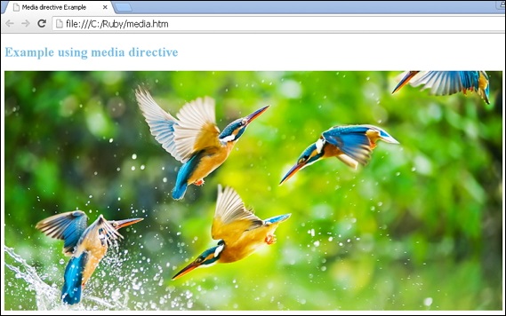
Save the above given html code in media.html file.
Open this HTML file in a browser, an output is displayed as shown below.
sass_rules_and_directives.htm

Advertisements