- Python Pandas - Basics
- Python Pandas - Introduction to Data Structures
- Python Pandas - Index Objects
- Python Pandas - Panel
- Python Pandas - Basic Functionality
- Python Pandas - Indexing & Selecting Data
- Python Pandas - Series
- Python Pandas - Series
- Python Pandas - Slicing a Series Object
- Python Pandas - Attributes of a Series Object
- Python Pandas - Arithmetic Operations on Series Object
- Python Pandas - Converting Series to Other Objects
- Python Pandas - DataFrame
- Python Pandas - DataFrame
- Python Pandas - Accessing DataFrame
- Python Pandas - Slicing a DataFrame Object
- Python Pandas - Modifying DataFrame
- Python Pandas - Removing Rows from a DataFrame
- Python Pandas - Arithmetic Operations on DataFrame
- Python Pandas - IO Tools
- Python Pandas - IO Tools
- Python Pandas - Working with CSV Format
- Python Pandas - Reading & Writing JSON Files
- Python Pandas - Reading Data from an Excel File
- Python Pandas - Writing Data to Excel Files
- Python Pandas - Working with HTML Data
- Python Pandas - Clipboard
- Python Pandas - Working with HDF5 Format
- Python Pandas - Comparison with SQL
- Python Pandas - Data Handling
- Python Pandas - Sorting
- Python Pandas - Reindexing
- Python Pandas - Iteration
- Python Pandas - Concatenation
- Python Pandas - Statistical Functions
- Python Pandas - Descriptive Statistics
- Python Pandas - Working with Text Data
- Python Pandas - Function Application
- Python Pandas - Options & Customization
- Python Pandas - Window Functions
- Python Pandas - Aggregations
- Python Pandas - Merging/Joining
- Python Pandas - MultiIndex
- Python Pandas - Basics of MultiIndex
- Python Pandas - Indexing with MultiIndex
- Python Pandas - Advanced Reindexing with MultiIndex
- Python Pandas - Renaming MultiIndex Labels
- Python Pandas - Sorting a MultiIndex
- Python Pandas - Binary Operations
- Python Pandas - Binary Comparison Operations
- Python Pandas - Boolean Indexing
- Python Pandas - Boolean Masking
- Python Pandas - Data Reshaping & Pivoting
- Python Pandas - Pivoting
- Python Pandas - Stacking & Unstacking
- Python Pandas - Melting
- Python Pandas - Computing Dummy Variables
- Python Pandas - Categorical Data
- Python Pandas - Categorical Data
- Python Pandas - Ordering & Sorting Categorical Data
- Python Pandas - Comparing Categorical Data
- Python Pandas - Handling Missing Data
- Python Pandas - Missing Data
- Python Pandas - Filling Missing Data
- Python Pandas - Interpolation of Missing Values
- Python Pandas - Dropping Missing Data
- Python Pandas - Calculations with Missing Data
- Python Pandas - Handling Duplicates
- Python Pandas - Duplicated Data
- Python Pandas - Counting & Retrieving Unique Elements
- Python Pandas - Duplicated Labels
- Python Pandas - Grouping & Aggregation
- Python Pandas - GroupBy
- Python Pandas - Time-series Data
- Python Pandas - Date Functionality
- Python Pandas - Timedelta
- Python Pandas - Sparse Data Structures
- Python Pandas - Sparse Data
- Python Pandas - Visualization
- Python Pandas - Visualization
- Python Pandas - Additional Concepts
- Python Pandas - Caveats & Gotchas
- Python Pandas Useful Resources
- Python Pandas - Quick Guide
- Python Pandas - Cheatsheet
- Python Pandas - Useful Resources
- Python Pandas - Discussion
Python Pandas - Scatter Matrix
A scatter matrix, also known as a pair plot, is a grid of scatter plots that helps in visualizing relationships between multiple variables at once. Each cell in the matrix represents a scatter plot of two variables, and diagonal plots often represent distributions, like histograms. This plot is useful tool for visualizing the correlation between features in a dataset.
In this tutorial, we will learn about what is the Pandas method for creating scatter matrix and how to customize the scatter matrix according to different needs.
Scatter Matrix in Pandas
Pandas provides a simple method to generate a scatter matrix of a DataFrame using the pandas.plotting.scatter_matrix() function. And it results an NumPy array np.ndarray of scatter plots representing pairwise relationships between columns.
Syntax
The basic syntax for creating a scatter matrix is as follows −
pandas.plotting.scatter_matrix(frame, alpha=0.5, figsize=None, ax=None, grid=False, diagonal='hist', marker='.', density_kwds=None, hist_kwds=None, range_padding=0.05, **kwargs)
Where,
frame: DataFrame, the input dataset that you want to visualize.
alpha: An optional parameter used to specify the amount of transparency applied to the scatter plot (between 0 and 1).
figsize: An optional parameter determines the dimensions of the figure in inches (width, height).
ax: An optional Matplotlib axis object, if provided, the scatter matrix will be drawn on this axis.
grid: If the boolean value True is specifies, then it displays the grid in the scatter matrix.
diagonal: Determines whether to show histograms ('hist') or Kernel Density Estimation plots ('kde') on the diagonal.
marker: Specifies the marker style for the scatter plots (default is '.').
density_kwds: Additional keyword arguments for the KDE plot.
hist_kwds: Additional keyword arguments for the histogram plot.
range_padding: Relative extension of axis range (default is 0.05).
**kwargs: Additional arguments to customize the plot.
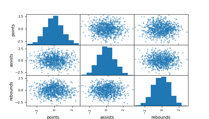
Example
In this example, we will create a scatter matrix using the pandas.plotting.scatter_matrix() function with a sample dataset.
import pandas as pd
import matplotlib.pyplot as plt
import numpy as np

plt.rcParams["figure.figsize"] = [7, 4]

# Sample dataset creation
np.random.seed(0)

#create DataFrame
df = pd.DataFrame({'points': np.random.randn(1000),
                   'assists': np.random.randn(1000),
                   'rebounds': np.random.randn(1000)})

# Create a scatter matrix
pd.plotting.scatter_matrix(df, alpha=0.5, diagonal='hist', grid=True)

# Display the plot
plt.show()
After executing the above code, we get the following output −
Customizing the Scatter Matrix
Pandas allows customization of the scatter matrix by adjusting various parameters of the pandas.plotting.satter_matrix() function.
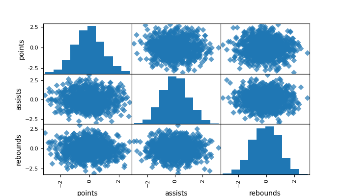
Example: Customize Scatter Matrix Marker Style and Transparency
The following example demonstrates how to customize the scatter matrix marker style and transparency.
import pandas as pd
import matplotlib.pyplot as plt
import numpy as np

plt.rcParams["figure.figsize"] = [7, 4]

# Sample dataset creation
np.random.seed(0)

#create DataFrame
df = pd.DataFrame({'points': np.random.randn(1000),
                   'assists': np.random.randn(1000),
                   'rebounds': np.random.randn(1000)})

# Create a scatter matrix
pd.plotting.scatter_matrix(df, alpha=0.7, diagonal='hist', marker='D', grid=True)

# Display the plot
plt.show()
Following is the output of the above code −
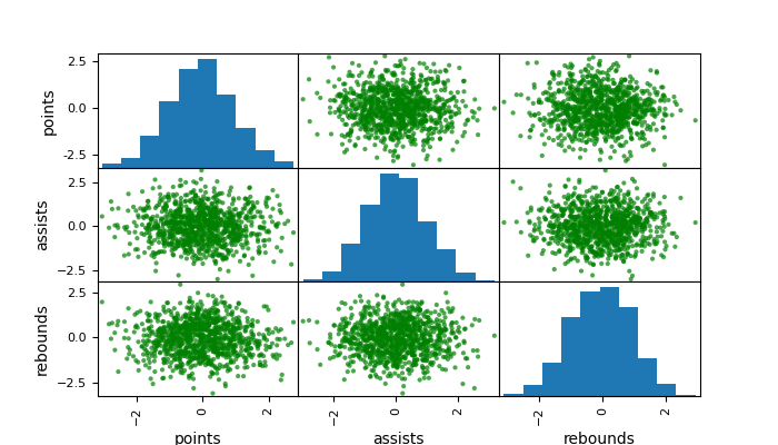
Example: Customizing Scatter Matrix Color
The following example demonstrates customizing the scatter matrix color by using the color parameter of the plotting.scatter_matrix() function.
import pandas as pd
import matplotlib.pyplot as plt
import numpy as np

plt.rcParams["figure.figsize"] = [7, 4]

# Sample dataset creation
np.random.seed(0)

#create DataFrame
df = pd.DataFrame({'points': np.random.randn(1000),
                   'assists': np.random.randn(1000),
                   'rebounds': np.random.randn(1000)})

# Create a scatter matrix
pd.plotting.scatter_matrix(df, alpha=0.7, diagonal='hist', color='green', grid=True)

# Display the plot
plt.show()
Following is the output of the above code −
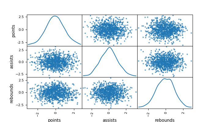
Change the Diagonal Plot of the Scatter Matrix
You can change the default histogram plot to the Kernel Density Estimation (kde) using the diagonal parameter of the plotting.scatter_matrix() function.
Example
The following example demonstrates replacing the histograms on the diagonal with Kernel Density Estimation (kde) plots.
import pandas as pd
import matplotlib.pyplot as plt
import numpy as np

plt.rcParams["figure.figsize"] = [7, 4]

# Sample dataset creation
np.random.seed(0)

#create DataFrame
df = pd.DataFrame({'points': np.random.randn(1000),
                   'assists': np.random.randn(1000),
                   'rebounds': np.random.randn(1000)})

# Create a scatter matrix
pd.plotting.scatter_matrix(df, alpha=0.7, diagonal='kde', grid=True)

# Display the plot
plt.show()
Following is the output of the above code −