- Python Pandas - Basics
- Python Pandas - Introduction to Data Structures
- Python Pandas - Index Objects
- Python Pandas - Panel
- Python Pandas - Basic Functionality
- Python Pandas - Indexing & Selecting Data
- Python Pandas - Series
- Python Pandas - Series
- Python Pandas - Slicing a Series Object
- Python Pandas - Attributes of a Series Object
- Python Pandas - Arithmetic Operations on Series Object
- Python Pandas - Converting Series to Other Objects
- Python Pandas - DataFrame
- Python Pandas - DataFrame
- Python Pandas - Accessing DataFrame
- Python Pandas - Slicing a DataFrame Object
- Python Pandas - Modifying DataFrame
- Python Pandas - Removing Rows from a DataFrame
- Python Pandas - Arithmetic Operations on DataFrame
- Python Pandas - IO Tools
- Python Pandas - IO Tools
- Python Pandas - Working with CSV Format
- Python Pandas - Reading & Writing JSON Files
- Python Pandas - Reading Data from an Excel File
- Python Pandas - Writing Data to Excel Files
- Python Pandas - Working with HTML Data
- Python Pandas - Clipboard
- Python Pandas - Working with HDF5 Format
- Python Pandas - Comparison with SQL
- Python Pandas - Data Handling
- Python Pandas - Sorting
- Python Pandas - Reindexing
- Python Pandas - Iteration
- Python Pandas - Concatenation
- Python Pandas - Statistical Functions
- Python Pandas - Descriptive Statistics
- Python Pandas - Working with Text Data
- Python Pandas - Function Application
- Python Pandas - Options & Customization
- Python Pandas - Window Functions
- Python Pandas - Aggregations
- Python Pandas - Merging/Joining
- Python Pandas - MultiIndex
- Python Pandas - Basics of MultiIndex
- Python Pandas - Indexing with MultiIndex
- Python Pandas - Advanced Reindexing with MultiIndex
- Python Pandas - Renaming MultiIndex Labels
- Python Pandas - Sorting a MultiIndex
- Python Pandas - Binary Operations
- Python Pandas - Binary Comparison Operations
- Python Pandas - Boolean Indexing
- Python Pandas - Boolean Masking
- Python Pandas - Data Reshaping & Pivoting
- Python Pandas - Pivoting
- Python Pandas - Stacking & Unstacking
- Python Pandas - Melting
- Python Pandas - Computing Dummy Variables
- Python Pandas - Categorical Data
- Python Pandas - Categorical Data
- Python Pandas - Ordering & Sorting Categorical Data
- Python Pandas - Comparing Categorical Data
- Python Pandas - Handling Missing Data
- Python Pandas - Missing Data
- Python Pandas - Filling Missing Data
- Python Pandas - Interpolation of Missing Values
- Python Pandas - Dropping Missing Data
- Python Pandas - Calculations with Missing Data
- Python Pandas - Handling Duplicates
- Python Pandas - Duplicated Data
- Python Pandas - Counting & Retrieving Unique Elements
- Python Pandas - Duplicated Labels
- Python Pandas - Grouping & Aggregation
- Python Pandas - GroupBy
- Python Pandas - Time-series Data
- Python Pandas - Date Functionality
- Python Pandas - Timedelta
- Python Pandas - Sparse Data Structures
- Python Pandas - Sparse Data
- Python Pandas - Visualization
- Python Pandas - Visualization
- Python Pandas - Additional Concepts
- Python Pandas - Caveats & Gotchas
- Python Pandas Useful Resources
- Python Pandas - Quick Guide
- Python Pandas - Cheatsheet
- Python Pandas - Useful Resources
- Python Pandas - Discussion
Python Pandas - RadViz Plot
A RadViz plot is a visualization technique that projects high-dimensional data into a 2D space. It works based on a spring-tension minimization algorithm to determine the position of data points. This plot is particularly useful for visualizing relationships between multiple variables and understanding the clusters or groups of data categories.
The RadViz plot in Pandas is a powerful tool for visualizing high-dimensional data in a two-dimensional space. By using its customization options, you can create clear and visually attractive plots to analyze relationships and patterns in multi-variate datasets. In this tutorial, we will learn how to use Python's Pandas library to create RadViz plot and customize it for effective visual analysis.
RadViz Plot in Pandas
Pandas provides a direct function called radviz() function within the plotting module for generating RadViz plot. This function takes a DataFrame with multi-variate data, a column with class labels, and other parameters for customization. And this function returns a matplotlib.axes.Axes object representing the plot.
Each attribute (or column or Series) in the DataFrame is represented as a evenly distributed on a unit circle. Each data point is rendered in the circle according to the normalized values of their attributes (nothing but all numerical columns in the DataFrame are normalized to unit [0,1] interval), resulting in a balanced visualization.
Syntax
Following is the syntax of the plotting.radviz() function −
pandas.plotting.radviz(frame, class_column, ax=None, color=None, colormap=None, **kwds)
Where,
frame: The DataFrame containing the data you want to visualize.
class_column: The column name that contains the categorical labels or categories for each data point.
ax
: A Matplotlib Axes object where the plot will be drawn. If not specified, a new plot will be created.color: A list or tuple of colors to assign to each category.
colormap: A string or a Matplotlib colormap object used to color the plot points.
**kwds: Additional arguments passed to the Matplotlib scatter method.
Creating a Simple RadViz Plot
To create a basic RadViz plot, you can use a DataFrame with several columns and one column as the target category (for coloring).
Example
Here is a simple example of creating a RadViz plot using the plotting.radviz() function.
import pandas as pd
import numpy as np
import matplotlib.pyplot as plt

plt.rcParams["figure.figsize"] = [7, 4]

# Sample DataFrame
data = {'Company': ['IBM', 'Intel', 'Microsoft', 'Apple', 'Google',
                'IBM', 'Intel', 'Microsoft', 'Apple', 'Google'],
'Revenue': np.random.rand(10) * 100,
'Profit': np.random.rand(10) * 50,
'Market_Cap': np.random.rand(10) * 200,
'Employees': np.random.rand(10) * 10
}

df = pd.DataFrame(data)

# Create a RadViz plot
pd.plotting.radviz(df, 'Company')

# Show the plot
plt.title('Basic RadViz Plot')
plt.show()
Following is the output of the above code −

Customizing the RadViz Plot
You can enhance the appearance of the RadViz plot by changing the colors using the color and colormap parameters.
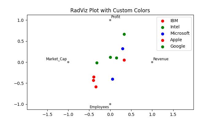
Example: Assigning Custom Colors to the RadViz Plot
This example applies the custom colors to the RadViz plot by using the color parameter of the plotting.radviz() function.
import pandas as pd
import numpy as np
import matplotlib.pyplot as plt

plt.rcParams["figure.figsize"] = [7, 4]

# Sample DataFrame
data = {'Company': ['IBM', 'Intel', 'Microsoft', 'Apple', 'Google',
                'IBM', 'Intel', 'Microsoft', 'Apple', 'Google'],
'Revenue': np.random.rand(10) * 100,
'Profit': np.random.rand(10) * 50,
'Market_Cap': np.random.rand(10) * 200,
'Employees': np.random.rand(10) * 10
}

df = pd.DataFrame(data)

# Create a RadViz plot
pd.plotting.radviz(df, 'Company', color=['red', 'green', 'blue'])

# Show the plot
plt.title('RadViz Plot with Custom Colors')
plt.show()
On executing the above code we will get the following output −
Example: RadViz Plot using a Colormap
This example customizes the Radviz plot by assigning a colormap name to the colormap parameter of the plotting.radviz() function.
import pandas as pd
import numpy as np
import matplotlib.pyplot as plt

plt.rcParams["figure.figsize"] = [7, 4]

# Sample DataFrame
data = {'Company': ['IBM', 'Intel', 'Microsoft', 'Apple', 'Google',
                'IBM', 'Intel', 'Microsoft', 'Apple', 'Google'],
'Revenue': np.random.rand(10) * 100,
'Profit': np.random.rand(10) * 50,
'Market_Cap': np.random.rand(10) * 200,
'Employees': np.random.rand(10) * 10
}

df = pd.DataFrame(data)

# Create a RadViz plot
pd.plotting.radviz(df, 'Company', colormap='viridis')
plt.title('RadViz with Colormap')
plt.show()
Following is the output of the above code −

