- Python Pandas - Basics
- Python Pandas - Introduction to Data Structures
- Python Pandas - Index Objects
- Python Pandas - Panel
- Python Pandas - Basic Functionality
- Python Pandas - Indexing & Selecting Data
- Python Pandas - Series
- Python Pandas - Series
- Python Pandas - Slicing a Series Object
- Python Pandas - Attributes of a Series Object
- Python Pandas - Arithmetic Operations on Series Object
- Python Pandas - Converting Series to Other Objects
- Python Pandas - DataFrame
- Python Pandas - DataFrame
- Python Pandas - Accessing DataFrame
- Python Pandas - Slicing a DataFrame Object
- Python Pandas - Modifying DataFrame
- Python Pandas - Removing Rows from a DataFrame
- Python Pandas - Arithmetic Operations on DataFrame
- Python Pandas - IO Tools
- Python Pandas - IO Tools
- Python Pandas - Working with CSV Format
- Python Pandas - Reading & Writing JSON Files
- Python Pandas - Reading Data from an Excel File
- Python Pandas - Writing Data to Excel Files
- Python Pandas - Working with HTML Data
- Python Pandas - Clipboard
- Python Pandas - Working with HDF5 Format
- Python Pandas - Comparison with SQL
- Python Pandas - Data Handling
- Python Pandas - Sorting
- Python Pandas - Reindexing
- Python Pandas - Iteration
- Python Pandas - Concatenation
- Python Pandas - Statistical Functions
- Python Pandas - Descriptive Statistics
- Python Pandas - Working with Text Data
- Python Pandas - Function Application
- Python Pandas - Options & Customization
- Python Pandas - Window Functions
- Python Pandas - Aggregations
- Python Pandas - Merging/Joining
- Python Pandas - MultiIndex
- Python Pandas - Basics of MultiIndex
- Python Pandas - Indexing with MultiIndex
- Python Pandas - Advanced Reindexing with MultiIndex
- Python Pandas - Renaming MultiIndex Labels
- Python Pandas - Sorting a MultiIndex
- Python Pandas - Binary Operations
- Python Pandas - Binary Comparison Operations
- Python Pandas - Boolean Indexing
- Python Pandas - Boolean Masking
- Python Pandas - Data Reshaping & Pivoting
- Python Pandas - Pivoting
- Python Pandas - Stacking & Unstacking
- Python Pandas - Melting
- Python Pandas - Computing Dummy Variables
- Python Pandas - Categorical Data
- Python Pandas - Categorical Data
- Python Pandas - Ordering & Sorting Categorical Data
- Python Pandas - Comparing Categorical Data
- Python Pandas - Handling Missing Data
- Python Pandas - Missing Data
- Python Pandas - Filling Missing Data
- Python Pandas - Interpolation of Missing Values
- Python Pandas - Dropping Missing Data
- Python Pandas - Calculations with Missing Data
- Python Pandas - Handling Duplicates
- Python Pandas - Duplicated Data
- Python Pandas - Counting & Retrieving Unique Elements
- Python Pandas - Duplicated Labels
- Python Pandas - Grouping & Aggregation
- Python Pandas - GroupBy
- Python Pandas - Time-series Data
- Python Pandas - Date Functionality
- Python Pandas - Timedelta
- Python Pandas - Sparse Data Structures
- Python Pandas - Sparse Data
- Python Pandas - Visualization
- Python Pandas - Visualization
- Python Pandas - Additional Concepts
- Python Pandas - Caveats & Gotchas
- Python Pandas Useful Resources
- Python Pandas - Quick Guide
- Python Pandas - Cheatsheet
- Python Pandas - Useful Resources
- Python Pandas - Discussion
Python Pandas - Lag Plot
Lag plot is a plotting technique used to determine whether a given dataset or time series is random. Random datasets will not display any structure in the lag plot, while non-random datasets may reveals patterns or structures in time series data. It is a type of scatter plot where each point is represented by two consecutive data points in a time series.
A lag plot represents −
The x-axis represents y(t), the value of the data at time t.
The y-axis represents y(t+lag), the value at time t+lag.
In this tutorial, we will learn how to use Python's Pandas library to create log plots with different examples to visualize time series data.
Log Plot in Pandas
Pandas provides a direct function called log_plot() function within the plotting module for generating log plot for time series data. This function takes a Series with time data, and other parameters for customization. This function returns a matplotlib.axes.Axes object representing the plot.
Syntax
Following is the syntax of the lag_plot() function −
pandas.plotting.lag_plot(series, lag=1, ax=None, **kwds)
Where,
series: The time series to visualize. It must be a Pandas Series object.
lag: It is an optional parameter determines the lag length for the scatter plot.
ax: It is also an optional parameter specifies the Matplotlib axis object to draw the plot on.
**kwds: Additional Matplotlib scatter method keyword arguments for customization.
Creating Lag Plot in Pandas
You can create the lag plot in pandas by using the pandas.plotting.lag_plot() function for the time series data.
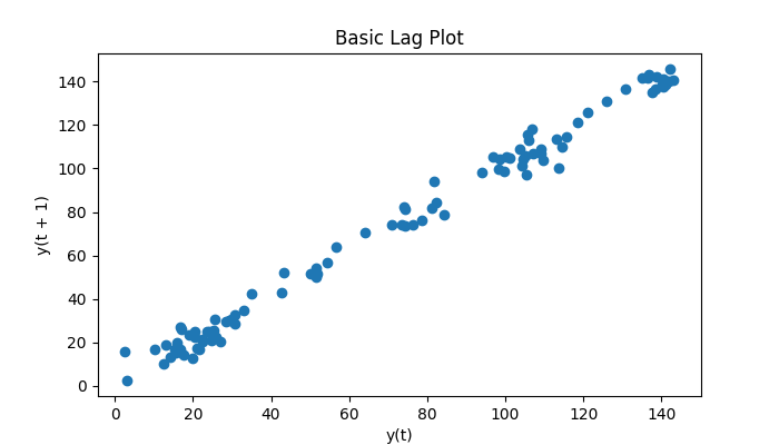
Example
The following example demonstrates creating a lag plot for a time series generated using random numbers.
import pandas as pd
import numpy as np
import matplotlib.pyplot as plt
from pandas.plotting import lag_plot

plt.rcParams["figure.figsize"] = [7, 4]

# Generate a random time series
np.random.seed(5)
x = np.cumsum(np.random.normal(loc=1, scale=5, size=100))
ts = pd.Series(x)

# Generate a lag plot
lag_plot(ts)
plt.title("Basic Lag Plot")
plt.show()
Following is the output of the above code −
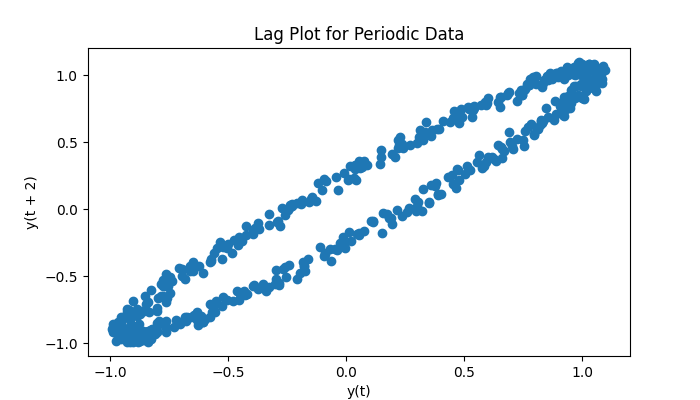
Lag Plot with Cyclic Data
Lag plots are particularly effective for identifying patterns in periodic or cyclic datasets. If the given data is a time series, the lag plot will display the shapes.
Example
Following example creates lag plot for the time series using the plotting.lag_plot() function.
import pandas as pd
import numpy as np
import matplotlib.pyplot as plt
from pandas.plotting import lag_plot

plt.rcParams["figure.figsize"] = [7, 4]

# Create a sine wave with random noise
angles = np.linspace(-10 * np.pi, 10 * np.pi, 500)
s = pd.Series(0.1 * np.random.rand(500) + np.sin(angles))

# Lag plot to visualize the pattern
lag_plot(s, lag=2)
plt.title("Lag Plot for Periodic Data")
plt.show()
Following is the output of the above code −
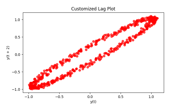
Customizing Lag Plots
Lag plots can be customized using additional Matplotlib scatter function keyword **kwds arguments. You can adjust properties like color, marker type, size, and transparency to enhance the visualization.
Example
Following example demonstrates customizing the lag plot using the additional keyword arguments of the plotting.lag_plot() function.
import pandas as pd
import numpy as np
import matplotlib.pyplot as plt
from pandas.plotting import lag_plot

plt.rcParams["figure.figsize"] = [7, 4]

# Create a sine wave with random noise
angles = np.linspace(-10 * np.pi, 10 * np.pi, 500)
s = pd.Series(0.1 * np.random.rand(500) + np.sin(angles))

# Lag plot to visualize the pattern
lag_plot(s, lag=2, c='red', marker='o', alpha=0.7)
plt.title("Customized Lag Plot")
plt.show()
Following is the output of the above code −