- Python Pandas - Basics
- Python Pandas - Introduction to Data Structures
- Python Pandas - Index Objects
- Python Pandas - Panel
- Python Pandas - Basic Functionality
- Python Pandas - Indexing & Selecting Data
- Python Pandas - Series
- Python Pandas - Series
- Python Pandas - Slicing a Series Object
- Python Pandas - Attributes of a Series Object
- Python Pandas - Arithmetic Operations on Series Object
- Python Pandas - Converting Series to Other Objects
- Python Pandas - DataFrame
- Python Pandas - DataFrame
- Python Pandas - Accessing DataFrame
- Python Pandas - Slicing a DataFrame Object
- Python Pandas - Modifying DataFrame
- Python Pandas - Removing Rows from a DataFrame
- Python Pandas - Arithmetic Operations on DataFrame
- Python Pandas - IO Tools
- Python Pandas - IO Tools
- Python Pandas - Working with CSV Format
- Python Pandas - Reading & Writing JSON Files
- Python Pandas - Reading Data from an Excel File
- Python Pandas - Writing Data to Excel Files
- Python Pandas - Working with HTML Data
- Python Pandas - Clipboard
- Python Pandas - Working with HDF5 Format
- Python Pandas - Comparison with SQL
- Python Pandas - Data Handling
- Python Pandas - Sorting
- Python Pandas - Reindexing
- Python Pandas - Iteration
- Python Pandas - Concatenation
- Python Pandas - Statistical Functions
- Python Pandas - Descriptive Statistics
- Python Pandas - Working with Text Data
- Python Pandas - Function Application
- Python Pandas - Options & Customization
- Python Pandas - Window Functions
- Python Pandas - Aggregations
- Python Pandas - Merging/Joining
- Python Pandas - MultiIndex
- Python Pandas - Basics of MultiIndex
- Python Pandas - Indexing with MultiIndex
- Python Pandas - Advanced Reindexing with MultiIndex
- Python Pandas - Renaming MultiIndex Labels
- Python Pandas - Sorting a MultiIndex
- Python Pandas - Binary Operations
- Python Pandas - Binary Comparison Operations
- Python Pandas - Boolean Indexing
- Python Pandas - Boolean Masking
- Python Pandas - Data Reshaping & Pivoting
- Python Pandas - Pivoting
- Python Pandas - Stacking & Unstacking
- Python Pandas - Melting
- Python Pandas - Computing Dummy Variables
- Python Pandas - Categorical Data
- Python Pandas - Categorical Data
- Python Pandas - Ordering & Sorting Categorical Data
- Python Pandas - Comparing Categorical Data
- Python Pandas - Handling Missing Data
- Python Pandas - Missing Data
- Python Pandas - Filling Missing Data
- Python Pandas - Interpolation of Missing Values
- Python Pandas - Dropping Missing Data
- Python Pandas - Calculations with Missing Data
- Python Pandas - Handling Duplicates
- Python Pandas - Duplicated Data
- Python Pandas - Counting & Retrieving Unique Elements
- Python Pandas - Duplicated Labels
- Python Pandas - Grouping & Aggregation
- Python Pandas - GroupBy
- Python Pandas - Time-series Data
- Python Pandas - Date Functionality
- Python Pandas - Timedelta
- Python Pandas - Sparse Data Structures
- Python Pandas - Sparse Data
- Python Pandas - Visualization
- Python Pandas - Visualization
- Python Pandas - Additional Concepts
- Python Pandas - Caveats & Gotchas
- Python Pandas Useful Resources
- Python Pandas - Quick Guide
- Python Pandas - Cheatsheet
- Python Pandas - Useful Resources
- Python Pandas - Discussion
Python Pandas - Autocorrelation Plot
Autocorrelation plots are useful tool for analyzing time series data, it determines whether a time series is random or not. This is done by calculating the autocorrelations for data values at different time lags. The plot also provides horizontal lines for 95% and 99% confidence levels, with the dashed line indicating the 99% confidence level.
If the time series is random, the autocorrelation values will be close to zero for all time lags. If it's not random, at least one autocorrelation value will be noticeably different from zero.
Pandas provides a convenient function for autocorrelation plots, in this tutorial will learn how to use the autocorrelation_plot() function to create autocorrelation plots using Pandas.
The autocorrelation_plot() Function
The plotting.autocorrelation_plot() function in the Pandas library is useful for generating the autocorrelation plots for time series data. This function returns a Matplotlib axis object containing the autocorrelation plot.
Syntax
Following is the syntax of the autocorrelation_plot() function −
pandas.plotting.autocorrelation_plot(series, ax=None, **kwargs)
Where,
series: The Pandas Series containing the time series data.
ax: Optional, the Matplotlib axis to plot on.
kwargs: : Additional options for customizing Matplotlib's plot.
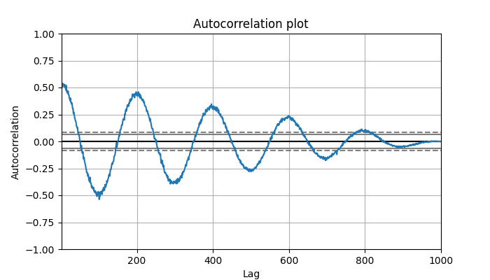
Example: Basic Autocorrelation plot
Here is the basic example of plotting the Autocorrelation plot in Pandas using the plotting.autocorrelation_plot() function.
import numpy as np
import pandas as pd
from pandas.plotting import autocorrelation_plot
import matplotlib.pyplot as plt

# Generate a sample time series
values = np.linspace(-5 * np.pi, 5 * np.pi, num=1000)
ts = pd.Series(0.7 * np.random.rand(1000) + 0.3 * np.sin(values))

# Plot the autocorrelation
plt.figure(figsize=(7, 4))
plt.title('Autocorrelation plot')
autocorrelation_plot(ts)
plt.show()
On executing the above code, you will get the following plot −
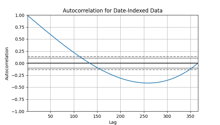
Example: Autocorrelation Plot for Date-Indexed Data
Here is another example of using the plotting.autocorrelation_plot() function for plotting the autocorrelation plot for a date-indexed time series.
import numpy as np
import pandas as pd
from pandas.plotting import autocorrelation_plot
import matplotlib.pyplot as plt

# Create a date range and sample data
date_range = pd.date_range(start='2024-01-01', end='2024-12-31')
values = np.arange(len(date_range))
df = pd.DataFrame(values, index=date_range, columns=["Values"])

# Generate autocorrelation plot

plt.figure(figsize=(7, 4))
autocorrelation_plot(df["Values"])
plt.title("Autocorrelation for Date-Indexed Data")
plt.show()
Following is the output of the above code −
Example: Multiple Autocorrelation Plots by Category
We can plot autocorrelation plots for multiple groups in a DataFrame. Following is the example −
import pandas as pd
import matplotlib.pyplot as plt
from pandas.plotting import autocorrelation_plot

# Create DataFrame
df = pd.DataFrame({
    'category': ['save','save','save','save','save','check','check','check','check','check','run','run','run','run','run'],
    'value': [1.2,1.3,1.5,1.7,1.8, 10,13,17,20,25, 7,8,8.5,9,9.3]
})

# Get unique categories
categories = df['category'].unique()

# Create a figure with subplots
fig, axes = plt.subplots(len(categories), figsize=(7, 4))

# Iterate through each category and plot its autocorrelation
for ax, cat in zip(axes, categories):
    data = df[df['category'] == cat]['value']
    autocorrelation_plot(data.diff().iloc[1:], ax=ax)
    ax.set_title(f"Autocorrelation for Category: {cat}")

# Adjust layout for better visualization
plt.tight_layout()
plt.show()
Following is the output of the above code −

