- NumPy - Home
- NumPy - Introduction
- NumPy - Environment
- NumPy Arrays
- NumPy - Ndarray Object
- NumPy - Data Types
- NumPy Creating and Manipulating Arrays
- NumPy - Array Creation Routines
- NumPy - Array Manipulation
- NumPy - Array from Existing Data
- NumPy - Array From Numerical Ranges
- NumPy - Iterating Over Array
- NumPy - Reshaping Arrays
- NumPy - Concatenating Arrays
- NumPy - Stacking Arrays
- NumPy - Splitting Arrays
- NumPy - Flattening Arrays
- NumPy - Transposing Arrays
- NumPy Indexing & Slicing
- NumPy - Indexing & Slicing
- NumPy - Indexing
- NumPy - Slicing
- NumPy - Advanced Indexing
- NumPy - Fancy Indexing
- NumPy - Field Access
- NumPy - Slicing with Boolean Arrays
- NumPy Array Attributes & Operations
- NumPy - Array Attributes
- NumPy - Array Shape
- NumPy - Array Size
- NumPy - Array Strides
- NumPy - Array Itemsize
- NumPy - Broadcasting
- NumPy - Arithmetic Operations
- NumPy - Array Addition
- NumPy - Array Subtraction
- NumPy - Array Multiplication
- NumPy - Array Division
- NumPy Advanced Array Operations
- NumPy - Swapping Axes of Arrays
- NumPy - Byte Swapping
- NumPy - Copies & Views
- NumPy - Element-wise Array Comparisons
- NumPy - Filtering Arrays
- NumPy - Joining Arrays
- NumPy - Sort, Search & Counting Functions
- NumPy - Searching Arrays
- NumPy - Union of Arrays
- NumPy - Finding Unique Rows
- NumPy - Creating Datetime Arrays
- NumPy - Binary Operators
- NumPy - String Functions
- NumPy - Matrix Library
- NumPy - Linear Algebra
- NumPy - Matplotlib
- NumPy - Histogram Using Matplotlib
- NumPy Sorting and Advanced Manipulation
- NumPy - Sorting Arrays
- NumPy - Sorting along an axis
- NumPy - Sorting with Fancy Indexing
- NumPy - Structured Arrays
- NumPy - Creating Structured Arrays
- NumPy - Manipulating Structured Arrays
- NumPy - Record Arrays
- Numpy - Loading Arrays
- Numpy - Saving Arrays
- NumPy - Append Values to an Array
- NumPy - Swap Columns of Array
- NumPy - Insert Axes to an Array
- NumPy Handling Missing Data
- NumPy - Handling Missing Data
- NumPy - Identifying Missing Values
- NumPy - Removing Missing Data
- NumPy - Imputing Missing Data
- NumPy Performance Optimization
- NumPy - Performance Optimization with Arrays
- NumPy - Vectorization with Arrays
- NumPy - Memory Layout of Arrays
- Numpy Linear Algebra
- NumPy - Linear Algebra
- NumPy - Matrix Library
- NumPy - Matrix Addition
- NumPy - Matrix Subtraction
- NumPy - Matrix Multiplication
- NumPy - Element-wise Matrix Operations
- NumPy - Dot Product
- NumPy - Matrix Inversion
- NumPy - Determinant Calculation
- NumPy - Eigenvalues
- NumPy - Eigenvectors
- NumPy - Singular Value Decomposition
- NumPy - Solving Linear Equations
- NumPy - Matrix Norms
- NumPy Element-wise Matrix Operations
- NumPy - Sum
- NumPy - Mean
- NumPy - Median
- NumPy - Min
- NumPy - Max
- NumPy Set Operations
- NumPy - Unique Elements
- NumPy - Intersection
- NumPy - Union
- NumPy - Difference
- NumPy Random Number Generation
- NumPy - Random Generator
- NumPy - Permutations & Shuffling
- NumPy - Uniform distribution
- NumPy - Normal distribution
- NumPy - Binomial distribution
- NumPy - Poisson distribution
- NumPy - Exponential distribution
- NumPy - Rayleigh Distribution
- NumPy - Logistic Distribution
- NumPy - Pareto Distribution
- NumPy - Visualize Distributions With Sea born
- NumPy - Matplotlib
- NumPy - Multinomial Distribution
- NumPy - Chi Square Distribution
- NumPy - Zipf Distribution
- NumPy File Input & Output
- NumPy - I/O with NumPy
- NumPy - Reading Data from Files
- NumPy - Writing Data to Files
- NumPy - File Formats Supported
- NumPy Mathematical Functions
- NumPy - Mathematical Functions
- NumPy - Trigonometric functions
- NumPy - Exponential Functions
- NumPy - Logarithmic Functions
- NumPy - Hyperbolic functions
- NumPy - Rounding functions
- NumPy Fourier Transforms
- NumPy - Discrete Fourier Transform (DFT)
- NumPy - Fast Fourier Transform (FFT)
- NumPy - Inverse Fourier Transform
- NumPy - Fourier Series and Transforms
- NumPy - Signal Processing Applications
- NumPy - Convolution
- NumPy Polynomials
- NumPy - Polynomial Representation
- NumPy - Polynomial Operations
- NumPy - Finding Roots of Polynomials
- NumPy - Evaluating Polynomials
- NumPy Statistics
- NumPy - Statistical Functions
- NumPy - Descriptive Statistics
- NumPy Datetime
- NumPy - Basics of Date and Time
- NumPy - Representing Date & Time
- NumPy - Date & Time Arithmetic
- NumPy - Indexing with Datetime
- NumPy - Time Zone Handling
- NumPy - Time Series Analysis
- NumPy - Working with Time Deltas
- NumPy - Handling Leap Seconds
- NumPy - Vectorized Operations with Datetimes
- NumPy ufunc
- NumPy - ufunc Introduction
- NumPy - Creating Universal Functions (ufunc)
- NumPy - Arithmetic Universal Function (ufunc)
- NumPy - Rounding Decimal ufunc
- NumPy - Logarithmic Universal Function (ufunc)
- NumPy - Summation Universal Function (ufunc)
- NumPy - Product Universal Function (ufunc)
- NumPy - Difference Universal Function (ufunc)
- NumPy - Finding LCM with ufunc
- NumPy - ufunc Finding GCD
- NumPy - ufunc Trigonometric
- NumPy - Hyperbolic ufunc
- NumPy - Set Operations ufunc
- NumPy Useful Resources
- NumPy - Quick Guide
- NumPy - Cheatsheet
- NumPy - Useful Resources
- NumPy - Discussion
- NumPy Compiler
NumPy - Matplotlib
NumPy and Matplotlib
NumPy is a Python library for numerical computing, providing support for arrays, mathematical functions, and efficient operations on large datasets.
Matplotlib is a Python library for creating static, interactive, and animated visualizations like plots and charts.
They are often used together, as NumPy generates and processes data arrays, while Matplotlib visualizes them. For example, you can use NumPy to create data points and Matplotlib to plot them as graphs.
What is Matplotlib?
Matplotlib is a Python library used to create high-quality plots and charts. It is highly customizable and can produce various types of plots, such as line plots, scatter plots, bar plots, and histograms.
Matplotlib works seamlessly with NumPy, making it easy to visualize numerical data arrays or perform operations before plotting the results.
Setting Up Matplotlib
Before starting with Matplotlib, ensure you have the library installed. You can install it using pip as shown below −
# Install Matplotlib
!pip install matplotlib
Once installed, you can import it alongside NumPy to begin creating visualizations as shown below −
import numpy as np
import matplotlib.pyplot as plt
Now that the libraries are ready, let us dive into various types of visualizations you can create using Matplotlib and NumPy.
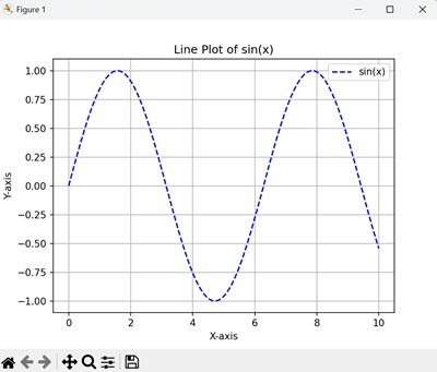
Line Plot
A line plot is one of the simplest and most commonly used visualizations. It is used to show trends or relationships between data points.
Example
In the following example, we are creating a line plot using Matplotlib and NumPy −
import numpy as np
import matplotlib.pyplot as plt

# Generate data using NumPy
# 100 evenly spaced points between 0 and 10
x = np.linspace(0, 10, 100)
# Compute sine values for x
y = np.sin(x)

# Create a line plot
plt.plot(x, y, label='sin(x)', color='blue', linestyle='--')
plt.title('Line Plot of sin(x)')
plt.xlabel('X-axis')
plt.ylabel('Y-axis')
plt.legend()
plt.grid(True)
plt.show()
We can see a line plot displaying a sine wave with labeled axes, a legend, and a grid for better visualization −
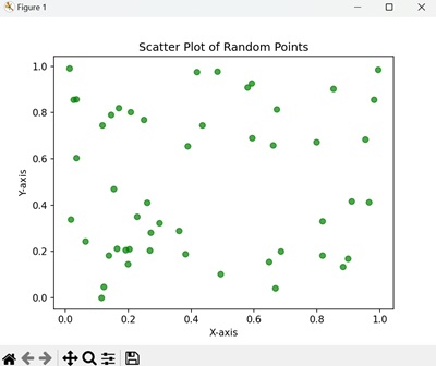
Scatter Plot
Scatter plots are used to display relationships between two variables by showing individual data points. They are useful for identifying patterns, correlations, or outliers in data.
Example
Following is an example of creating a scatter plot showing random points with a transparent green color −
import numpy as np
import matplotlib.pyplot as plt

# Generate random data
x = np.random.rand(50)
y = np.random.rand(50)

# Create a scatter plot
plt.scatter(x, y, color='green', alpha=0.7)
plt.title('Scatter Plot of Random Points')
plt.xlabel('X-axis')
plt.ylabel('Y-axis')
plt.show()
We get the output as shown below −
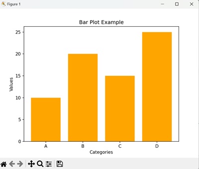
Bar Plot
Bar plots are used to compare different categories or groups. They display data using rectangular bars, where the height represents the value.
Example
Following is an example of creating a bar plot showing the values for each category with orange-colored bars −
import numpy as np
import matplotlib.pyplot as plt

# Data for bar plot
categories = ['A', 'B', 'C', 'D']
values = [10, 20, 15, 25]

# Create a bar plot
plt.bar(categories, values, color='orange')
plt.title('Bar Plot Example')
plt.xlabel('Categories')
plt.ylabel('Values')
plt.show()
The output obtained is as shown below −
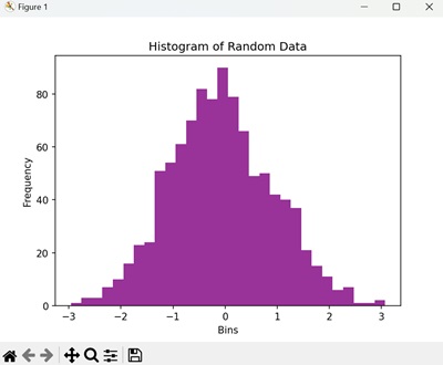
Histogram
Histograms are used to visualize the frequency distribution of a dataset. They divide data into intervals (bins) and show the count of data points in each interval.
Example
Following is an example of creating a histogram displaying the frequency distribution of the randomly generated data −
import numpy as np
import matplotlib.pyplot as plt

# Generate random data
# 1000 samples from a normal distribution
data = np.random.randn(1000)

# Create a histogram
plt.hist(data, bins=30, color='purple', alpha=0.8)
plt.title('Histogram of Random Data')
plt.xlabel('Bins')
plt.ylabel('Frequency')
plt.show()
After executing the above code, we get the following output −
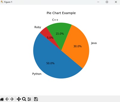
Pie Chart
Pie charts are used to represent data as slices of a circle, showing proportions or percentages. While not always the best for precise comparisons, they can be visually appealing for specific use cases.
Example
Following is an example of creating a pie chart showing the proportion of each programming language in percentages −
import numpy as np
import matplotlib.pyplot as plt

# Data for pie chart
labels = ['Python', 'Java', 'C++', 'Ruby']
sizes = [50, 30, 15, 5]

# Create a pie chart
plt.pie(sizes, labels=labels, autopct='%1.1f%%', startangle=140)
plt.title('Pie Chart Example')
plt.show()
The result produced is as follows −
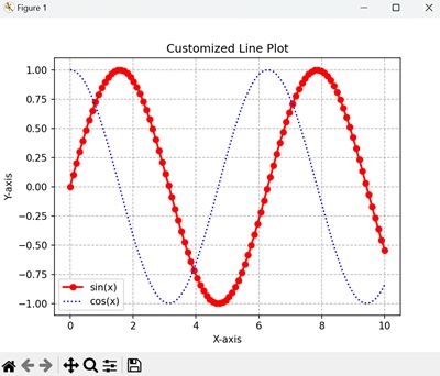
Customizing Matplotlib Visualizations
Matplotlib offers extensive options to customize your visualizations. You can adjust colors, line styles, markers, fonts, and more.
Example
Following is an example of creating a customized plot with different line styles, colors, and markers for sine and cosine waves −
import numpy as np
import matplotlib.pyplot as plt

# Customized line plot
x = np.linspace(0, 10, 100)
y1 = np.sin(x)
y2 = np.cos(x)

plt.plot(x, y1, label='sin(x)', color='red', linewidth=2, marker='o')
plt.plot(x, y2, label='cos(x)', color='blue', linestyle='dotted')
plt.title('Customized Line Plot')
plt.xlabel('X-axis')
plt.ylabel('Y-axis')
plt.legend()
plt.grid(True, linestyle='--', color='gray', alpha=0.6)
plt.show()
We get the output as shown below −
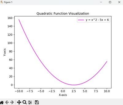
Combining NumPy and Matplotlib
Using NumPy and Matplotlib together can enhance your analysis and visualization workflow. NumPy can be used to preprocess and manipulate data, while Matplotlib can be used to visualize the results.
For instance, you can generate data transformations or statistical analyses using NumPy and then visualize them with Matplotlib.
Example
Following is an example of creating a plot showing a parabolic curve representing the quadratic function −
import numpy as np
import matplotlib.pyplot as plt

# Generate and visualize a quadratic function
x = np.linspace(-10, 10, 200)
y = x**2 - 5*x + 6

plt.plot(x, y, label='y = x^2 - 5x + 6', color='magenta')
plt.title('Quadratic Function Visualization')
plt.xlabel('X-axis')
plt.ylabel('Y-axis')
plt.legend()
plt.show()
The output obtained is as shown below −