
Article Categories
- All Categories
-
 Data Structure
-
 Networking
-
 RDBMS
RDBMS
-
 Operating System
-
 Java
Java
-
 MS Excel
-
 iOS
iOS
-
 HTML
HTML
-
 CSS
CSS
-
 Android
-
 Python
-
 C Programming
-
 C++
C++
-
 C#
C#
-
 MongoDB
-
 MySQL
MySQL
-
 Javascript
-
 PHP
PHP
-
 Economics & Finance
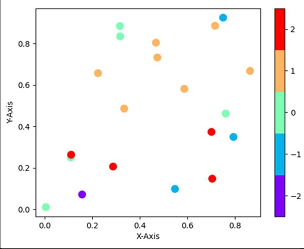
How to make a discrete colorbar for a scatter plot in matplotlib?
Using plt.colorbar(ticks=np.linspace(-2, 2, 5)), we can create a discrete color bar.
Steps
Return random floats in the half open interval, i.e., x, using np.random.random method.
Return random floats in the half open interval, i.e., y, using np.random.random method.
Return random integers from `low` (inclusive) to `high` (exclusive), i.e., z, using np.random.randint(-2, 3, 20) method.
Set the X-axis label using plt.xlabel().
Set the Y-axis label using plt.ylabel().
Use the built-in rainbow colormap.
Generate a colormap index based on discrete intervals.
A scatter plot of *y* vs. *x* with varying marker size and/or color, with x, y and z are created (Steps 1, 2, 3).
Create a colorbar for a ScalarMappable instance, *mappable*.
Use plt.show() to show the figure.
Example
from matplotlib import pyplot as plt
import numpy as np
from matplotlib import colors

x = np.random.random(20)
y = np.random.random(20)
z = np.random.randint(-2, 3, 20)

plt.xlabel('X-axis ')
plt.ylabel('Y-axis ')

cmap = plt.cm.rainbow
norm = colors.BoundaryNorm(np.arange(-2.5, 3, 1), cmap.N)

plt.scatter(x, y, c=z, cmap=cmap, norm=norm, s=100, edgecolor='none')
plt.colorbar(ticks=np.linspace(-2, 2, 5))

plt.show()
Output

8K+ Views
