
Article Categories
- All Categories
-
 Data Structure
-
 Networking
-
 RDBMS
RDBMS
-
 Operating System
-
 Java
Java
-
 MS Excel
-
 iOS
iOS
-
 HTML
HTML
-
 CSS
CSS
-
 Android
-
 Python
-
 C Programming
-
 C++
C++
-
 C#
C#
-
 MongoDB
-
 MySQL
MySQL
-
 Javascript
-
 PHP
PHP
Selected Reading
How to create a flip card with CSS?
To create a flip card with CSS, the code is as follows ?
Example
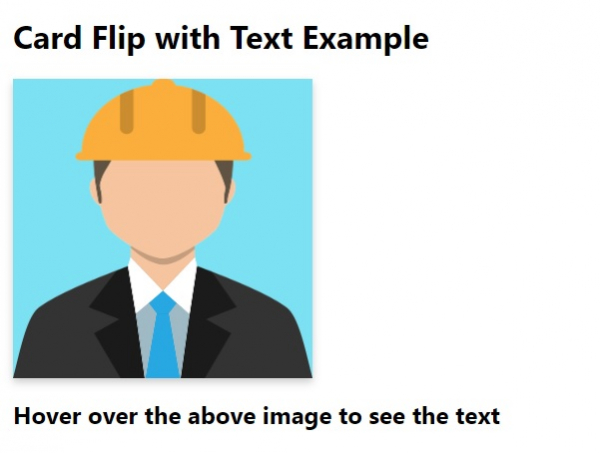
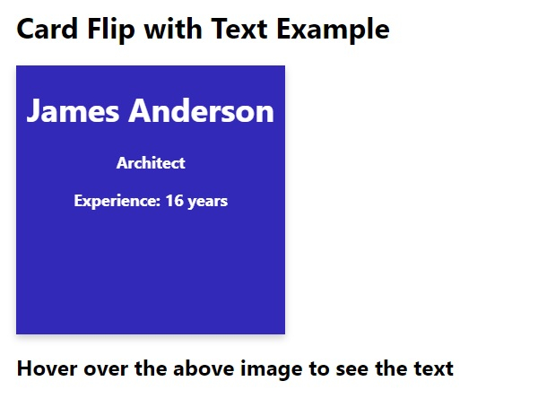
Card Flip with Text Example

James Anderson
Architect
Experience: 16 years
Hover over the above image to see the text
Output
The above code will produce the following output ?
On hovering over the image ?

Updated on: 2026-03-11T22:50:49+05:30
311 Views

Advertisements