
Article Categories
- All Categories
-
 Data Structure
-
 Networking
-
 RDBMS
RDBMS
-
 Operating System
-
 Java
Java
-
 MS Excel
-
 iOS
iOS
-
 HTML
HTML
-
 CSS
CSS
-
 Android
-
 Python
-
 C Programming
-
 C++
C++
-
 C#
C#
-
 MongoDB
-
 MySQL
MySQL
-
 Javascript
-
 PHP
PHP
-
 Economics & Finance
How to create a chart from JSON data using Fetch API in JavaScript?
In this article, we will explore how to create a chart after fetching JSON data using JavaScript's Fetch API. We'll first fetch the data from a remote server, then use that data to create a visual chart using Chart.js library.
What is the Fetch API?
The Fetch API provides a modern interface for making HTTP requests and handling responses. It returns promises, making it easier to work with asynchronous data compared to older methods like XMLHttpRequest.
Syntax
const response = fetch(resource [, init])
Parameters
resource ? The URL or resource path from where the data is fetched.
init ? Optional configuration object containing request options like headers, method, body, etc.
Approach
The process involves these key steps:
Step 1 ? Fetch data from a remote server using the fetch() function.
Step 2 ? Parse the JSON response and extract the required data.
Step 3 ? Use the Chart.js library to create a visual chart with the fetched data.
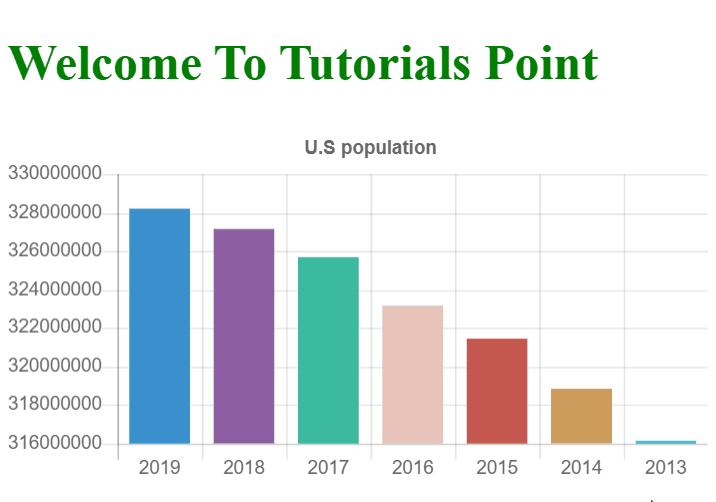
Example: Creating a Population Chart
In this example, we fetch US population data from a public API and create a bar chart to visualize the data over different years.
<!DOCTYPE html>
<html>
<head>
    <meta charset="utf-8">
    <meta name="viewport" content="width=device-width, initial-scale=1">
    <script src="https://cdnjs.cloudflare.com/ajax/libs/Chart.js/2.5.0/Chart.min.js"></script>
    <title>Population Chart</title>
</head>
<body>
    <h1 style="color: green;">
        Welcome To Tutorials Point
    </h1>
    <div style="width: 800px; height: 600px;">
        <canvas id="bar-chart"></canvas>
    </div>

<script>
    getData();

    async function getData() {
        try {
            // Fetch data from the API
            const response = await fetch('https://datausa.io/api/data?drilldowns=Nation&measures=Population');
            const data = await response.json();

            console.log('Fetched data:', data);

            // Extract labels and values from the response
            const labels = [];
            const values = [];

            for (let i = 0; i < data.data.length; i++) {
                labels.push(data.data[i].Year);
                values.push(data.data[i].Population);
            }

            // Create the chart
            new Chart(document.getElementById("bar-chart"), {
                type: 'bar',
                data: {
                    labels: labels,
                    datasets: [{
                        label: "Population (millions)",
                        backgroundColor: [
                            "#3a90cd", "#8e5ea2", "#3bba9f",
                            "#e8c3b9", "#c45850", "#CD9C5C", "#40E0D0"
                        ],
                        data: values
                    }]
                },
                options: {
                    legend: { display: false },
                    title: {
                        display: true,
                        text: 'U.S Population Over Years'
                    },
                    scales: {
                        yAxes: [{
                            ticks: {
                                beginAtZero: true
                            }
                        }]
                    }
                }
            });
        } catch (error) {
            console.error('Error fetching data:', error);
        }
    }
</script>
</body>
</html>
How It Works
The code follows this execution flow:
- Fetch Request: The `fetch()` function makes an HTTP GET request to the DataUSA API
- JSON Parsing: The response is converted to JSON format using `response.json()`
- Data Extraction: We loop through the data array to extract years and population values
- Chart Creation: Chart.js uses the extracted data to render a bar chart
Key Features
Async/Await: Makes the code more readable compared to promises
Error Handling: Try-catch block handles potential fetch errors
Dynamic Data: Chart is populated with real-time data from the API
Interactive Chart: Users can hover over bars to see detailed information
Output
The program generates an interactive bar chart displaying U.S. population data over different years. Users can hover over each bar to see the exact population figure for that year.
Conclusion
Using the Fetch API with Chart.js provides a powerful way to create dynamic, data-driven visualizations. This approach allows you to fetch real-time data and present it in an engaging, interactive format for users.

5K+ Views
