- Excel Charts - Home
- Excel Charts - Introduction
- Excel Charts - Creating Charts
- Excel Charts - Types
- Excel Charts - Column Chart
- Excel Charts - Line Chart
- Excel Charts - Pie Chart
- Excel Charts - Doughnut Chart
- Excel Charts - Bar Chart
- Excel Charts - Area Chart
- Excel Charts - Scatter (X Y) Chart
- Excel Charts - Bubble Chart
- Excel Charts - Stock Chart
- Excel Charts - Surface Chart
- Excel Charts - Radar Chart
- Excel Charts - Combo Chart
- Excel Charts - Chart Elements
- Excel Charts - Chart Styles
- Excel Charts - Chart Filters
- Excel Charts - Fine Tuning
- Excel Charts - Design Tools
- Excel Charts - Quick Formatting
- Excel Charts - Aesthetic Data Labels
- Excel Charts - Format Tools
- Excel Charts - Sparklines
- Excel Charts - PivotCharts
Excel Charts - Bar Chart
Bar charts illustrate the comparisons among individual items. A Bar chart typically displays categories along the vertical (category) axis and values along the horizontal (value) axis.
Follow the steps given below to use a Bar chart.
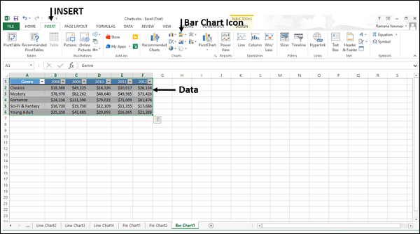
Step 1 − Arrange the data in columns or rows on the worksheet.
Step 2 − Select the data.
Step 3 − On the INSERT tab, in the Charts group, click the Bar chart icon on the Ribbon.
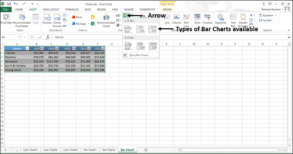
You will see the different types of bar charts available.
A bar chart has the following sub-types −
2-D Bar Charts
Clustered Bar
Stacked Bar
100% Stacked Bar
3-D Bar Charts
3-D Clustered Bar
3-D Stacked Bar
3-D 100% Stacked Bar
Step 4 − Point the mouse on each of the icons. A preview of that chart type will be shown on the worksheet.
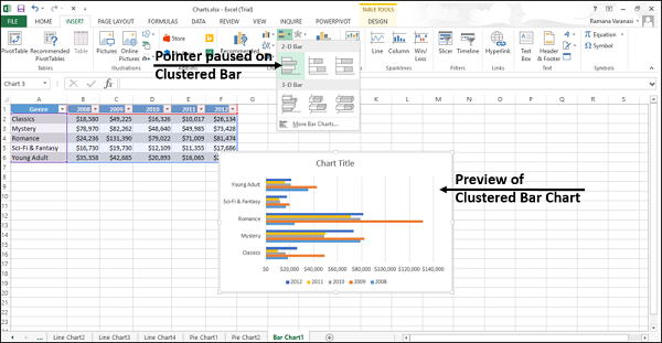
Step 5 − Double-click the chart type that suits your data.
In this chapter, you will understand when each of the Bar chart types is useful.
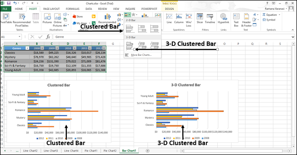
Clustered Bar and 3-D Clustered Bar
These chart types are useful to compare values across a few categories. A Clustered Bar chart shows bars in 2-D format. A 3-D Clustered bar chart shows bars in 3-D perspective, but it does not use a third value axis (depth axis).
You can use Clustered Bar charts when −
- The chart shows duration.
- The category text is long.
Stacked Bar and 3-D Stacked Bar
These charts are useful to compare the parts of a whole across various categories and show the change in parts of a whole unit with respect to time.
A Stacked Bar chart displays values in 2-D horizontal stacked rectangles. A 3-D Stacked Bar chart displays the data by using a 3-D perspective, but it does not use a third value axis (depth axis).
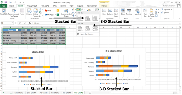
You can use Stacked Bar charts when the category text is long.
100% Stacked Bar and 3-D 100% Stacked Bar
These charts are useful to compare the percentage that each value contributes to the total unit and show the change in percentage that each value contributes with respect to time.
A 100% Stacked bar chart displays Values in 2-D horizontal stacked rectangles. A 3-D 100% Stacked bar chart displays the data by using a 3-D perspective, but it does not use a third value axis (depth axis).
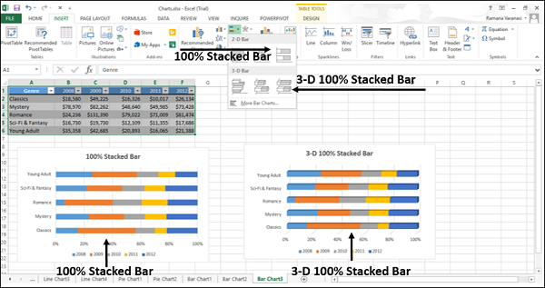
You can use 100% Stacked bar charts when the category text is long.