
Article Categories
- All Categories
-
 Data Structure
-
 Networking
-
 RDBMS
RDBMS
-
 Operating System
-
 Java
Java
-
 MS Excel
-
 iOS
iOS
-
 HTML
HTML
-
 CSS
CSS
-
 Android
-
 Python
-
 C Programming
-
 C++
C++
-
 C#
C#
-
 MongoDB
-
 MySQL
MySQL
-
 Javascript
-
 PHP
PHP
-
 Economics & Finance
How to analyze and use them in trading using Kagi Chart?
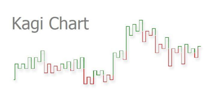
The Kagi chart is a graph that displays the price fluctuations of a certain asset over a period of time. A Kagi chart varies completely from a candlestick chart or other traditional forms of charts as it does not have a time axis, which helps it to display price movements more efficiently. Kagi charts are statistical tool used to help in technical analysis. It has been developed in Japan and used extensively worldwide by traders.
What are the uses of Kagi Charts?
A Kagi chart depicts the Price fluctuations of an item by using a number of vertical lines that are connected together by a number of short horizontal lines. It’s charachteristic feature is the absence of time variable.
While candlestick charts are dependent on time and provide details for every hour, Kagi chart provides a broad overview that is independent of time. Although the Kagi charts have very little information in comparison, they provide quick and easy understanding to investors.
Once you get used to reading and understanding the charts they become easy to understand and can save a lot of your time with charting technique.
Example of Kagi Chart in Trading
The below chart is an example of a typical Kagi chart of Eur/USD reversal rate that clear depicts the Average true rate (ATR) and fixed-point approach parameters. The jump can be observed from 1.4540 to 1.4720 and the fluctuations continue. The trend of reduction is again highlighted when the curve drops sharply at 1.5020 to 1.4700.
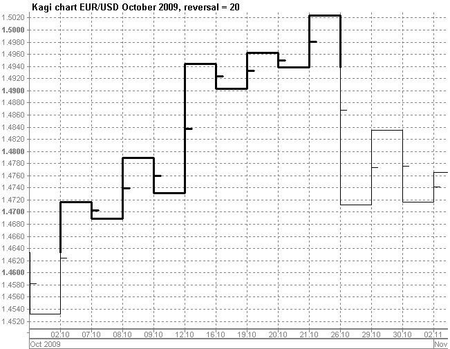
The movement of assets is a basic example of how traders and financial enthusiasts use Kagi Chart over other tools. It is welcomed and preferred over candlestick charts due to its simplicity and easy understanding that it provides traders in one glance. The sampe example could be applied to any price of share that you would want to watch for a particular period of time.
How to use the Kagi chart?
One of the other attributes of the Kagi chart is that the thickness of the lines changes over time. Every time the price grows above the last known high or moves below the previous low, the thickness of the lines changes to reflect this particular change.
Traders use the thickness of lines as a strategy when they have to close in on a deal or buy a particular asset. With the coloring of the chart and they thickness they constantly measure the previous high and keep track of the last known lowest price of the asset in a glance visually. This fluctuation helps the trader to make the call to hold, buy or sell the asset.
393 Views
