
Article Categories
- All Categories
-
 Data Structure
-
 Networking
-
 RDBMS
RDBMS
-
 Operating System
-
 Java
Java
-
 MS Excel
-
 iOS
iOS
-
 HTML
HTML
-
 CSS
CSS
-
 Android
-
 Python
-
 C Programming
-
 C++
C++
-
 C#
C#
-
 MongoDB
-
 MySQL
MySQL
-
 Javascript
-
 PHP
PHP
-
 Economics & Finance
Selected Reading
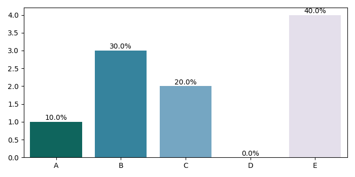
How to add percentages on top of bars in Seaborn using Matplotlib?
To add percentages on top of bars in Seaborn, we can take the following steps −
Create the lists, x, y and percentages to plot using Seaborn.
Using barplot, show point estimates and confidence intervals with bars. Store the returned axis.
Find patches from the returned axis (In step 2).
Iterate the patches (returned in step 3).
Find x and y from the patches to place the percentage value at the top of the bars.
To display the figure, use show() method.
Example
import matplotlib.pyplot as plt
import seaborn as sns
plt.rcParams["figure.figsize"] = [7.00, 3.50]
plt.rcParams["figure.autolayout"] = True
x = ['A', 'B', 'C', 'D', 'E']
y = [1, 3, 2, 0, 4]
percentage = [10, 30, 20, 0, 40]
ax = sns.barplot(x=x, y=y, palette='PuBuGn_r')
patches = ax.patches
for i in range(len(patches)):
   x = patches[i].get_x() + patches[i].get_width()/2
   y = patches[i].get_height()+.05
   ax.annotate('{:.1f}%'.format(percentage[i]), (x, y), ha='center')
plt.show()
Output

Updated on: 2021-05-06T13:33:49+05:30
7K+ Views

Advertisements