- GWT Highcharts - Home
- GWT Highcharts - Overview
- Environment Setup
- Configuration Syntax
- GWT Highcharts - Line Charts
- GWT Highcharts - Area Charts
- GWT Highcharts - Bar Charts
- GWT Highcharts - Column Charts
- GWT Highcharts - Pie Charts
- GWT Highcharts - Scatter Chart
- GWT Highcharts - Dynamic Charts
- GWT Highcharts - Combinations
- GWT Highcharts - 3D Charts
- GWT Highcharts - Map Charts
- GWT Highcharts Useful Resources
- GWT Highcharts - Quick Guide
- GWT Highcharts - Useful Resources
- GWT Highcharts - Discussion
Selected Reading
GWT Highcharts - Spline with inverted Axes
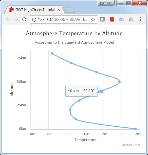
We have already seen the configuration used to draw this chart in Highcharts Configuration Syntax chapter. Let us now consider the following example to further understand a Spline with inverted Axes.
Configurations
Configure the chart type to be spline based. chart.type decides the series type for the chart. Here, the default value is "line". Configure the axes to be inverted. When true x axis is vertical and y axis is horizontal - if a bar series is present in the chart, the same will be inverted. Here, the default value is false.
chart.setType(Series.Type.SPLINE)
.setInverted(true)
Example
HelloWorld.java
package com.tutorialspoint.client;

import org.moxieapps.gwt.highcharts.client.Chart;
import org.moxieapps.gwt.highcharts.client.Color;
import org.moxieapps.gwt.highcharts.client.Legend;
import org.moxieapps.gwt.highcharts.client.Series;
import org.moxieapps.gwt.highcharts.client.ToolTip;
import org.moxieapps.gwt.highcharts.client.ToolTipData;
import org.moxieapps.gwt.highcharts.client.ToolTipFormatter;

import org.moxieapps.gwt.highcharts.client.labels.AxisLabelsData;
import org.moxieapps.gwt.highcharts.client.labels.AxisLabelsFormatter;
import org.moxieapps.gwt.highcharts.client.labels.XAxisLabels;
import org.moxieapps.gwt.highcharts.client.labels.YAxisLabels;

import org.moxieapps.gwt.highcharts.client.plotOptions.AreaPlotOptions;
import org.moxieapps.gwt.highcharts.client.plotOptions.Marker;

import com.google.gwt.core.client.EntryPoint;
import com.google.gwt.user.client.ui.RootPanel;

public class HelloWorld implements EntryPoint {
   public void onModuleLoad() {
      Chart chart = new Chart()
         .setType(Series.Type.SPLINE)
         .setInverted(true)
         .setChartTitleText("Atmosphere Temperature by Altitude")
         .setChartSubtitleText("According to the Standard Atmosphere Model")
         .setLegend(new Legend()
         .setEnabled(false))
         .setToolTip(new ToolTip()
            .setFormatter(new ToolTipFormatter() {
               @Override
               public String format(ToolTipData toolTipData) {
                  return toolTipData.getXAsLong() + " km: " + toolTipData.getYAsDouble() + "C";
               }
            })
         )
         .setLegend(new Legend()
            .setEnabled(false)
         )
         .setAreaPlotOptions(new AreaPlotOptions()
            .setFillColor(new Color()
               .setLinearGradient(0, 0, 0, 1)
               .addColorStop(0, 69, 114, 167)
               .addColorStop(1, 2, 0, 0, 0)
            )
            .setMarker(new Marker()
               .setEnabled(false)
               .setHoverState(new Marker()
                  .setEnabled(true)
                  .setRadius(5)
               )
            )
            .setShadow(false)
            .setHoverStateLineWidth(1)
         );

      chart.getXAxis()
         .setReversed(false)
         .setAxisTitleText("Altitude")
         .setMaxPadding(0.05)
         .setShowLastLabel(true)
         .setLabels(new XAxisLabels()
            .setFormatter(new AxisLabelsFormatter() {
               @Override
               public String format(AxisLabelsData axisLabelsData) {
                  return axisLabelsData.getValueAsLong() + "km";
               }
            })
         );

      chart.getYAxis()
         .setAxisTitleText("Temperature")
         .setLineWidth(2)
         .setLabels(new YAxisLabels()
            .setFormatter(new AxisLabelsFormatter() {
               @Override
               public String format(AxisLabelsData axisLabelsData) {
                  return axisLabelsData.getValueAsLong() + "";
               }
            })
         );

      chart.addSeries(chart.createSeries()
         .setName("Temperature")
         .setPoints(new Number[][]{
            {0, 15}, {10, -50}, {20, -56.5}, {30, -46.5}, {40, -22.1},
            {50, -2.5}, {60, -27.7}, {70, -55.7}, {80, -76.5}
         })
      );
      RootPanel.get().add(chart);
   }
}
Result
Verify the result.
gwt_highcharts_line_charts.htm

Advertisements