- GWT Highcharts - Home
- GWT Highcharts - Overview
- Environment Setup
- Configuration Syntax
- GWT Highcharts - Line Charts
- GWT Highcharts - Area Charts
- GWT Highcharts - Bar Charts
- GWT Highcharts - Column Charts
- GWT Highcharts - Pie Charts
- GWT Highcharts - Scatter Chart
- GWT Highcharts - Dynamic Charts
- GWT Highcharts - Combinations
- GWT Highcharts - 3D Charts
- GWT Highcharts - Map Charts
- GWT Highcharts Useful Resources
- GWT Highcharts - Quick Guide
- GWT Highcharts - Useful Resources
- GWT Highcharts - Discussion
Selected Reading
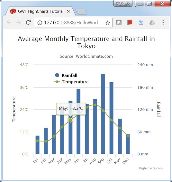
Dual Axes, Line and Column
Following is an example of a chart with Dual Axes, Line and Column.
We have already seen the configuration used to draw a chart in Highcharts Configuration Syntax chapter.
An example of a combination chart having Dual Axes, Line and Column is given below.
Configurations
Let us now see the additional configurations/steps taken.
YAxis
Get multiple yAxis using chart.getYAxis(index) method.
chart.getYAxis(0);
chart.getYAxis(1);
Example
HelloWorld.java
package com.tutorialspoint.client;

import org.moxieapps.gwt.highcharts.client.AxisTitle;
import org.moxieapps.gwt.highcharts.client.Chart;
import org.moxieapps.gwt.highcharts.client.Legend;
import org.moxieapps.gwt.highcharts.client.Series;
import org.moxieapps.gwt.highcharts.client.Style;
import org.moxieapps.gwt.highcharts.client.ToolTip;
import org.moxieapps.gwt.highcharts.client.ToolTipData;
import org.moxieapps.gwt.highcharts.client.ToolTipFormatter;
import org.moxieapps.gwt.highcharts.client.labels.AxisLabelsData;
import org.moxieapps.gwt.highcharts.client.labels.AxisLabelsFormatter;
import org.moxieapps.gwt.highcharts.client.labels.YAxisLabels;
import org.moxieapps.gwt.highcharts.client.plotOptions.ColumnPlotOptions;
import org.moxieapps.gwt.highcharts.client.plotOptions.SplinePlotOptions;

import com.google.gwt.core.client.EntryPoint;
import com.google.gwt.user.client.ui.RootPanel;

public class HelloWorld implements EntryPoint {
   public void onModuleLoad() {
      final Chart chart = new Chart()
         .setChartTitleText("Average Monthly Temperature and Rainfall in Tokyo")
         .setChartSubtitleText("Source: WorldClimate.com")
         .setToolTip(new ToolTip()
            .setFormatter(new ToolTipFormatter() {
               @Override
               public String format(ToolTipData toolTipData) {
                  return toolTipData.getXAsString() + ": " + toolTipData.getYAsDouble() +
                  ("Rainfall".equals(toolTipData.getSeriesName()) ? " mm" : "C");
               }
            })
         )
         .setLegend(new Legend()
            .setLayout(Legend.Layout.VERTICAL)
            .setAlign(Legend.Align.LEFT)
            .setVerticalAlign(Legend.VerticalAlign.TOP)
            .setX(120)
            .setY(100)
            .setFloating(true)
            .setBackgroundColor("#FFFFFF")
         );
         chart.getXAxis()
            .setCategories("Jan", "Feb", "Mar", "Apr", "May", "Jun",
            "Jul", "Aug", "Sep", "Oct", "Nov", "Dec"  );

         // Primary yAxis
         chart.getYAxis(0)
            .setAxisTitle(new AxisTitle()
            .setText("Temperature")
         )
         .setLabels(new YAxisLabels()
            .setStyle(new Style()
               .setColor("#89A54E")
            )
            .setFormatter(new AxisLabelsFormatter() {
               @Override
               public String format(AxisLabelsData axisLabelsData) {
                  return axisLabelsData.getValueAsLong() + "C";
               }
            })
         );

         // Secondary yAxis
         chart.getYAxis(1)
            .setAxisTitle(new AxisTitle()
               .setText("Rainfall")
            )
            .setOpposite(true)
            .setLabels(new YAxisLabels()
               .setStyle(new Style()
                  .setColor("#4572A7")
               )
               .setFormatter(new AxisLabelsFormatter() {
                  @Override
                  public String format(AxisLabelsData axisLabelsData) {
                     return axisLabelsData.getValueAsLong() + " mm";
                  }
               })
            );

         chart.addSeries(chart.createSeries()
            .setName("Rainfall")
            .setType(Series.Type.COLUMN)
            .setPlotOptions(new ColumnPlotOptions()
               .setColor("#4572A7")
            )
            .setYAxis(1)
            .setPoints(new Number[]{
               49.9, 71.5, 106.4, 129.2, 144.0, 176.0, 135.6, 148.5, 216.4, 194.1, 95.6, 54.4
            })
         );
         chart.addSeries(chart.createSeries()
            .setName("Temperature")
            .setType(Series.Type.SPLINE)
            .setPlotOptions(new SplinePlotOptions()
               .setColor("#89A54E")
            )
            .setPoints(new Number[]{
               7.0, 6.9, 9.5, 14.5, 18.2, 21.5, 25.2, 26.5, 23.3, 18.3, 13.9, 9.6
            })
         );
      RootPanel.get().add(chart);
   }
}
Result
Verify the result.
gwt_highcharts_combinations.htm

Advertisements