- GWT Highcharts - Home
- GWT Highcharts - Overview
- Environment Setup
- Configuration Syntax
- GWT Highcharts - Line Charts
- GWT Highcharts - Area Charts
- GWT Highcharts - Bar Charts
- GWT Highcharts - Column Charts
- GWT Highcharts - Pie Charts
- GWT Highcharts - Scatter Chart
- GWT Highcharts - Dynamic Charts
- GWT Highcharts - Combinations
- GWT Highcharts - 3D Charts
- GWT Highcharts - Map Charts
- GWT Highcharts Useful Resources
- GWT Highcharts - Quick Guide
- GWT Highcharts - Useful Resources
- GWT Highcharts - Discussion
Selected Reading
GWT Highcharts - Column with rotated labels
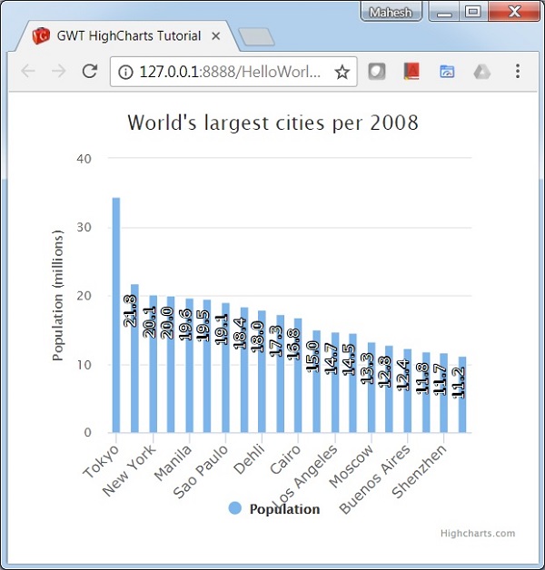
Following is an example of a Column Chart with Rotated Labels.
We have already seen the configuration used to draw a chart in Highcharts Configuration Syntax chapter. Let us now see additional configurations and also how we have added rotation attribute in dataLabels.
An example of a Column Chart with rotated labels is given below.
dataLabels
dataLabels is a wrapper object to handle data labels within charts.
Text rotation in degrees. Note that due to a more complex structure, backgrounds, borders and padding will be lost on a rotated data label. This defaults to 0.
chart.addSeries(chart.createSeries()
   .setName("Population")
   .setPoints(new Number[] { 34.4, 21.8, 20.1, 20, 19.6, 19.5, 19.1, 18.4, 18,
      17.3, 16.8, 15, 14.7, 14.5, 13.3, 12.8, 12.4, 11.8,
      11.7, 11.2  })
   )
   .setColumnPlotOptions(new ColumnPlotOptions()
      .setDataLabels(new DataLabels()
      .setEnabled(true)
      .setRotation(-90)
      .setColor("#FFFFFF")
      .setAlign(Align.RIGHT)
      .setX(-3)
      .setY(10)
      .setFormatter(new DataLabelsFormatter() {
         @Override
         public String format(DataLabelsData dataLabelsData) {
            return NumberFormat.getFormat("0.0").format(dataLabelsData.getYAsDouble());
         }
      })
     .setStyle(new Style()
        .setFont("normal 13px Verdana, sans-serif")
     )
   )
);
Example
HelloWorld.java
package com.tutorialspoint.client;

import org.moxieapps.gwt.highcharts.client.Chart;
import org.moxieapps.gwt.highcharts.client.Series.Type;
import org.moxieapps.gwt.highcharts.client.Style;
import org.moxieapps.gwt.highcharts.client.ToolTip;
import org.moxieapps.gwt.highcharts.client.ToolTipData;
import org.moxieapps.gwt.highcharts.client.ToolTipFormatter;

import org.moxieapps.gwt.highcharts.client.labels.Labels.Align;
import org.moxieapps.gwt.highcharts.client.labels.DataLabels;
import org.moxieapps.gwt.highcharts.client.labels.DataLabelsData;
import org.moxieapps.gwt.highcharts.client.labels.DataLabelsFormatter;
import org.moxieapps.gwt.highcharts.client.labels.XAxisLabels;

import org.moxieapps.gwt.highcharts.client.plotOptions.ColumnPlotOptions;
import org.moxieapps.gwt.highcharts.client.plotOptions.PlotOptions.Stacking;

import com.google.gwt.core.client.EntryPoint;
import com.google.gwt.i18n.client.NumberFormat;
import com.google.gwt.user.client.ui.RootPanel;

public class HelloWorld implements EntryPoint {
   public void onModuleLoad() {
      final Chart chart = new Chart()
         .setType(Type.COLUMN)
         .setChartTitleText("World's largest cities per 2008")
         .setMargin(50, 50, 100, 80)
         .setToolTip(new ToolTip()
         .setFormatter(new ToolTipFormatter() {
            @Override
            public String format(ToolTipData toolTipData) {
               return "<b>" + toolTipData.getXAsString() + "</b><br/>" +
                  "Population in 2008: " +
                  NumberFormat.getFormat("0.0").format(toolTipData.getYAsDouble()) +
                  " millions";
            }
         })
      );

       chart.getXAxis()
         .setCategories("Tokyo", "Jakarta", "New York", "Seoul", "Manila", "Mumbai", "Sao Paulo",
         "Mexico City", "Dehli", "Osaka", "Cairo", "Kolkata", "Los Angeles", "Shanghai",
         "Moscow", "Beijing", "Buenos Aires", "Guangzhou", "Shenzhen", "Istanbul" )
         .setLabels(new XAxisLabels()
         .setRotation(-45)
         .setAlign(Align.RIGHT)
         .setStyle(new Style()
            .setFont("normal 13px Verdana, sans-serif")
         )
      );
      chart.getYAxis()
         .setMin(0)
         .setAxisTitleText("Population (millions)");

      chart.addSeries(chart.createSeries()
         .setName("Population")
         .setPoints(new Number[] { 34.4, 21.8, 20.1, 20, 19.6, 19.5, 19.1, 18.4, 18,
            17.3, 16.8, 15, 14.7, 14.5, 13.3, 12.8, 12.4, 11.8,
            11.7, 11.2  })
      ).setColumnPlotOptions(new ColumnPlotOptions()
         .setDataLabels(new DataLabels()
            .setEnabled(true)
            .setRotation(-90)
            .setColor("#FFFFFF")
            .setAlign(Align.RIGHT)
            .setX(-3)
            .setY(10)
            .setFormatter(new DataLabelsFormatter() {
               @Override
               public String format(DataLabelsData dataLabelsData) {
                  return NumberFormat.getFormat("0.0").format(dataLabelsData.getYAsDouble());
               }
            })
            .setStyle(new Style()
               .setFont("normal 13px Verdana, sans-serif")
            )
         )
      );
      RootPanel.get().add(chart);
   }
}
Result
Verify the result.
gwt_highcharts_column_charts.htm

Advertisements