- Ext.js - Home
- Ext.js - Overview
- Ext.js - Environment Setup
- Ext.js - Naming Convention
- Ext.js - Architecture
- Ext.js - First Program
- Ext.js - Class System
- Ext.js - Containers
- Ext.js - Layouts
- Ext.js - Components
- Ext.js - Drag & Drop
- Ext.js - Themes
- Ext.js - Custom Events and Listeners
- Ext.js - Data
- Ext.js - Fonts
- Ext.js - Style
- Ext.js - Drawing
- Ext.js - Localization
- Ext.js - Accessibility
- Ext.js - Debugging Code
- Ext.js - Methods
Ext.js - UI Components
Grid
Grid in a tabular form of showing data in Ext JS. We can have different properties for the grid such as sorting, pagination, column hide etc.
Grid can be created through two types:
- Static Grid
- Dynamic grid
Static grid is the grid which has different views for all the grids in the page.
Dynamic grids are grids which use same view for all the grids same model and store but the column and data comes based on the conditions basically single store, model, view solves the purpose for different grids.
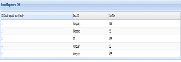
Static Grid
Index.html
<!DOCTYPE html>
<html>
   <head>
      <link rel = "stylesheet" type ="text/css" href= "extjs-4.1.1/resources/css/ext-all.css" />
      <script type ="text/javascript" src = "extjs-4.1.1/ext-all.js"></script>
      <script type ="text/javascript" src = "appFolder/app.js"></script>
   </head>
   <body align = "center">
      <h1> Please click the button </h1>
      <div id = "studentGridPanel" />
   </body>
</html>
app.js
Ext.Loader.setConfig({
   enabled : true
});

// creating instance of Application class
Ext.application({
   name : 'StudentsDetailsApp',
   appFolder : appFolder,
   controllers : ['studentsDetailsController']
});
StudentsDetailsController.js
Ext.define(' StudentsDetailsApp.controller. StudentsDetailsController', {
   extend : 'Ext.app.Controller',
   stores : ['StudentsDetailsStore'],
   models : [' StudentsDetailsModel'],
   views : [' StudentsDetailsGrid'],

   // This method is called on page load.
   onLaunch : function() {
      Ext.create(' StudentsDetailsApp.view. StudentsDetailsGrid');
   }
});
StudentsDetailsGrid.js
Ext.define('StudentsDetailsApp.view.StudentsDetailsGrid',{
   extend : 'Ext.grid.GridPanel',
   alias : 'widget.StudentsDetailsGrid',
   id : 'studentsDetailsGrid',
   store : 'StudentsDetialsStore',
   renderTo : 'studentsDetailsPanel',
   enableColumnResize : true,
   enableColumnMove : true,
   frame : true,
   title: "Student Details Grid",
   collapsible : true,
   initComponent : function(config) {
      this.callParent(arguments);
   },
   layout : 'fit',
   columns : [{
      text : 'ID (Click to populate search field)',
      dataIndex : 'id',
      flex : 1
   },{
      text : 'Dept. ID',
      dataIndex : 'deptId',
      flex : 0.5
   },{
      text : 'Job Title',
      dataIndex : 'jobTitle',
      flex : 1
   }]
});
StudentsDetailsModel.js
Ext.define('StudentsDetailsApp.model.StudentsDetailsModel', {
   extend : 'Ext.data.Model',
   fields : ['id', 'deptId', 'jobTitle']
});
StudentsDetailsStore.js
Ext.define('StudentsDetailsApp.store.StudentsDetailsStore', {
   extend : 'Ext.data.Store',
   model : 'StudentsDetailsApp.model.StudentsDetailsModel',
   storeId : 'StudentsDetailsStore',
   sorters : {property: 'id', direction : 'ASC'},
   data: [
      {id: '1', deptId:'Computer', jobTitle : 'ASE'},
      {id: '2', deptId:'Electronics', jobTitle : 'SE'},
      {id: '3', deptId:'IT', jobTitle : 'ASE'},
      {id: '4', deptId:'Computer', jobTitle : 'SE'},
      {id: '5', deptId:'Computer', jobTitle : 'ASE'}
   ]
});
Output:
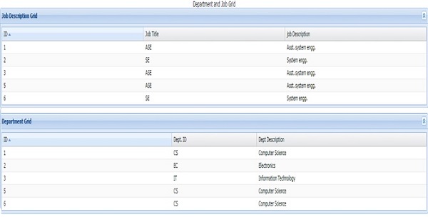
Dynamic Grid Creation:
With the single view/model/store we can create multiple grids and can show columns based on the grid is called dynamic grid creation.
Index.html
<!DOCTYPE html>
<html>
   <head>
      <link rel = "stylesheet" type ="text/css" href= "extjs-4.1.1/resources/css/ext-all.css" />
      <script type ="text/javascript" src = "extjs-4.1.1/ext-all.js"></script>
      <script type ="text/javascript" src = "jobAndDeptApp/ jobAndDeptApp.js"></script>
   </head>
   <body align = "center">
      <p> Department and Job Grid </p>
      <div id = "deptGrid" />
      <div id = "jobGrid" />
   </body>
</html>
jobAndDeptApp.js
Ext.Loader.setConfig({
   enabled : true
});
Ext.application({
   name : ' JobAndDeptApp',
   appFolder : 'jobAndDeptApp ',
   controllers : ['JobAndDeptController']
});
JobAndDeptController.js
Ext.define(' JobAndDeptApp.controller. JobAndDeptController', {
   extend : 'Ext.app.Controller',
   stores : ['JobAndDeptStore'],
   models : ['JobAndDeptModel'],
   views : ['JobAndDeptGrid'],
   mixins : {
      commons : 'JobAndDeptApp.utils. JobAndDeptUtils'
   },

   onLaunch : function() {
      JobAndDeptApp.utils. JobAndDeptUtils.createGrids();
   }
});
JobAndDeptGrid.js
Ext.define('JobAndDeptApp.view.JobAndDeptGrid',	{
   extend : 'Ext.grid.GridPanel',
   alias : 'widget. JobAndDeptGrid',
   store : 'JobAndDeptStore',
   enableColumnResize : true,
   enableColumnMove : true,
   frame : true,
   collapsible : true,
   initComponent : function(config) {
      this.callParent(arguments);
   },
   layout : 'fit',
   columns : [{
      text : 'ID',
      dataIndex : 'id'
   },{
      text : 'Dept. ID',
      dataIndex : 'deptId'
   },{
      text : 'Job Title',
      dataIndex : 'jobTitle'
   },{
      text : 'job Description',
      dataIndex : 'jobDesc'
   },{
      text : 'Dept Description',
      dataIndex : 'deptDesc'
   }]
});
JobAndDeptStore.js
Ext.define('JobAndDeptApp.store. JobAndDeptStore', {
   extend : 'Ext.data.Store',
   model : 'JobAndDeptApp.model. JobAndDeptModel',
   storeId : 'JobAndDeptStore',
   pageSize : 3,
   sorters : {property: 'id', direction : 'ASC'},
   data: [
      {id: '1', deptId:'CS', jobTitle : 'ASE', jobDesc: 'Asst. system engg.', deptDesc : 'Computer Science'},
      {id: '2', deptId:'EC', jobTitle : 'SE', jobDesc: 'System engg.', deptDesc : 'Electronics'},
      {id: '3', deptId:'IT', jobTitle : 'ASE', jobDesc: 'Asst. system engg.', deptDesc : 'Information Technology'},
      {id: '6', deptId:'CS', jobTitle : 'SE', jobDesc: 'System engg.', deptDesc : 'Computer Science'},
      {id: '5', deptId:'CS', jobTitle : 'ASE', jobDesc: 'Asst. system engg.', deptDesc :'Computer Science'}
   ]
});
JobAndDeptModel.js
Ext.define('JobAndDeptApp.model. JobAndDeptModel', {
   extend : 'Ext.data.Model',
   fields : ['id', 'deptId', 'jobTitle', 'jobDesc', 'deptDesc']
});
JobAndDeptUtils.js
Ext.define('JobAndDeptApp.utils. JobAndDeptUtils', {
   statics : {
      createAllGrids : function (gridName, title) {
         Ext.create('JobAndDeptApp.view. JobAndDeptGrid', {
         id : gridName,
         renderTo : gridName,
            title : title
         });

         if(gridName == 'jobGrid') {
            Ext.getCmp(gridName).columns[1].setVisible(false);
            Ext.getCmp(gridName).columns[4].setVisible(false);
         } else {
            Ext.getCmp(gridName).columns[2].setVisible(false);
            Ext.getCmp(gridName).columns[3].setVisible(false);
         }
      },
      createGrids: function(){
         this.createAllGrids('jobGrid' ,'Job Description Grid');
         this.createAllGrids('deptGrid', 'Department Grid');
      }
   }
});
Output:
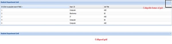
Grid properties:
Collapsible: This property is to add collapse feature to the grid. Add "Collapsible : true" feature in grid properties.
Output:
Sorting: This property is to add sorting feature to the grid. Add Column property"sortable : true" in grid to apply sorting ASC/ DESC. By default it is true, so can be made false if you dont want this feature to appear.
columns : [{
   text : 'ID (Click to populate search field)',
   dataIndex : 'id',
   sortable: true,
   flex : 1
}]
Output:
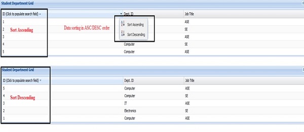
By default soring can be applied with property sorters : {property: 'id', direction : 'ASC'} In store. It will sort grid data based on the property provided in the sorters and the direction given, before rendering data into the grid.
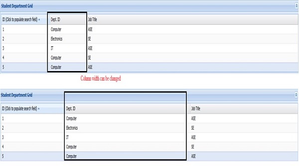
Enable Column resize: Column can be resized(its width can be increased or decreased) using grid properties "enableColumnResize: true" .
Output:
Column hideable: Add Column property "hideable : true" in grid to make column to appear to hide or show. By default it is true, so can be made false if you dont want this feature to appear.
columns : [{
   text : 'ID (Click to populate search field)',
   dataIndex : 'id',
   hideable: true,
   flex : 1
}]
Output:

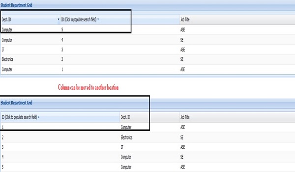
Draggable column: Add Column property "enableColumnMove: true"is grid property with which we can move columns in grid.
Output:
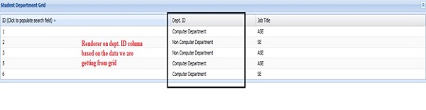
Renderer:This is the property to show customize view of grid data based on the data we get from store.
columns : [{
   text : 'Dept. ID',
   dataIndex : 'deptId',
   flex : 0.5,
   renderer :  function (value, metadata, record, rowIndex, colIndex, store) {
      if (value == "Computer") {
         return "Computer Department";
      } else {
         return "Non Computer Department";
      }
   }
}]
Output:
Cell editing: We can add cell editor plugin for making it editable during run time. Other files will remain same as above example only in grid we have to editor for the columns we want the cell to be editable.
columns : [{
   text : 'ID',
   dataIndex : 'id',
   flex : 1
},{
   text : 'Dept. ID',
   dataIndex : 'deptId',
   flex : 0.5,
   editor: {
      xtype:'textfield',
      allowBlank:false
   }
},{
   text : 'Dept Description',
   dataIndex : 'deptDesc',
   flex : 1
}],
selType: 'cellmodel',
plugins: [
   Ext.create('Ext.grid.plugin.CellEditing', {
      clicksToEdit: 1
   })
]
});
Output:

Message Box
Message box is to show some alert on occurrence of some event. Ext JS has different message box as:
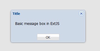
Basic alert:
Ext.Msg.alert('Title', 'Basic message box in ExtJS');
Output:
Prompt for user data:
Ext.Msg.prompt('Name', 'Please enter your name:', function(btn, text){
   if (btn == 'ok'){
      Ext.Msg.alert('Hello', 'Hello'+text);
   }
});
Output:

Output after clicking OK:

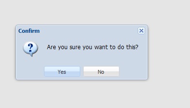
confirm Box:
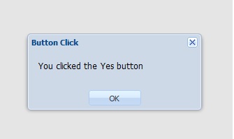
Ext.MessageBox.confirm('Confirm', 'Are you sure you want to do this ?', callbackFunction());

function callbackFunction (){
   Ext. Msg.alert ('Button Click', 'You clicked the Yes button');
};
Output:
Output after clicking OK:
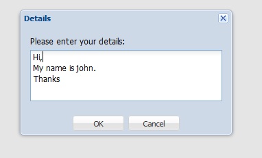
Show alert box with multiline user input:
Ext.MessageBox.show({
   title: 'Details',
   msg: 'Please enter your details:',
   width:300,
   buttons: Ext.MessageBox.OKCANCEL,
   multiline: true,
   fn: callbackFunction
});

function callbackFunction (){
   Ext.Msg.alert('status', 'Details entered succesfully');
}
Output:
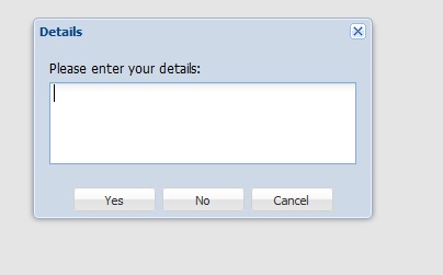
Yes No Cancel Message box:
Ext.MessageBox.show({
   title: 'Details',
   msg: 'Please enter your details:',
   width:300,
   buttons: Ext.MessageBox.YESNOCANCEL,
   multiline: true,
   fn: callbackFunction
});

function callbackFunction (){
   Ext.Msg.alert('status', 'Details entered succesfully');
}
Output:
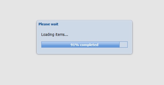
Progress bar
This is used to show the progress of the work done or to show that the back end work still in progress.
Ext.MessageBox.show({
title: 'Please wait',
msg: 'Loading items...',
progressText: 'Initializing...',
width:300,
progress:true,
closable:false
});
var f = function(v) {
return function() {
if(v == 10) {
Ext.MessageBox.hide();
result();
} else {
var i = v/9;
Ext.MessageBox.updateProgress(i, Math.round(100*i)+'% completed');
}
};
};
for(var i = 1; i
Output:
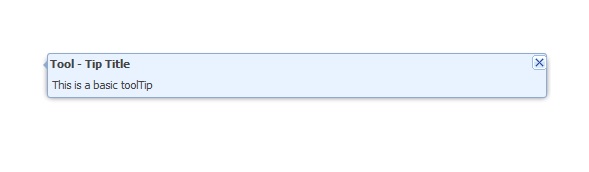
Tool Tip
As its name explain is the small piece of info appears in a small box kind of structure when some event occurs.
toolTip = new Ext.ToolTip({
target : document.getElementById('tooltip'),
id : 'toolTip',
anchor : 'top',
anchortoTarget : true,
html : 'This is a basic toolTip',
title : 'Tool - Tip Title'.
closable : true,
closeAction : 'hide'
});
toolTip.show();
Output:
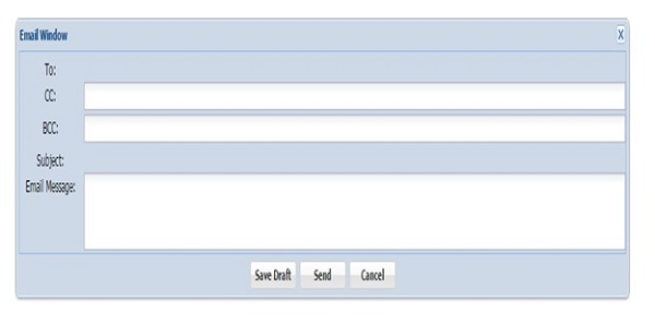
Window
As name explains this UI widget is to create a window.
Creating window in Ext JS:
win = new Ext.Window({
title:'Email Window',
layout:'form',
width:1000,
closeAction:'destroy',
target : document.getElementById('window'),
plain: true,
items: [{
xtype : 'displayfield',
fieldLabel: 'To',
width : 200
},{
xtype : 'textfield',
fieldLabel: 'CC',
width : 200
},{
xtype : 'textfield',
fieldLabel: 'BCC',
width : 200
},{
xtype : 'displayfield',
fieldLabel: 'Subject',
width : 500
},{
xtype : 'textarea',
fieldLabel: 'Email Message'
}],
buttons: [{
text: '<b>Save Draft</b>',
handler: function(){Ext.Msg.alert('Save Draft', 'Your msg is saved');}
},{
text: '<b>Send</b>',
handler: function(){Ext.Msg.alert('Message Sent', 'Your msg is sent');}
},{
text: '<b>Cancel</b>',
handler: function(){win.destroy()}
}],
buttonAlign: 'center',
});
win.show();
Output:
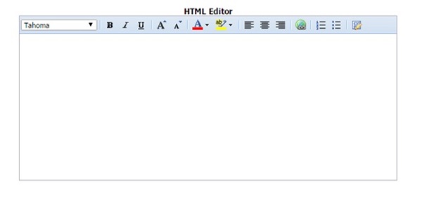
HTML Editor
This Ext JS UI widget is to create a html editor so that user can edit the piece of information it is entering in terms of font, color, size etc.
Ext.create('Ext.form.HtmlEditor', {
width: 580,
height: 250,
renderTo: document.getElementById('editorId');
});
Output:
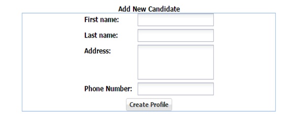
Form
In most of the web application forms are the most important widget to get the information from user such as login form/feedback form so that the value can be saved in the database for future reference.
Ext.create('Ext.form.Panel', {
id : 'newprofile',
renderTo : 'formId',
border: true,
width: 500,
items:[{
xtype: 'textfield',
fieldLabel: ' First name '
},{
xtype: 'textfield',
fieldLabel: ' Last name '
},{
xtype: 'textarea',
fieldLabel: ' Address '
},{
xtype: 'textfield',
fieldLabel: ' Phone Number '
},{
xtype: 'button',
text : ' Create Profile '
}]
});
Output:
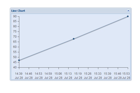
Chart
Chart are used to represent data in pictorial format.
var store = new Ext.data.ArrayStore({
fields: ['tstamp', 'data'],
data: [
[1311844196, 47], // Jul 28 2011 02:09:56 GMT-0700 (Pacific Daylight Time)
[1311846214, 68], // Jul 28 2011 02:43:34 GMT-0700 (Pacific Daylight Time)
[1311848214, 90] // Jul 28 2011 03:16:54 GMT-0700 (Pacific Daylight Time)
]
});
Ext.create('Ext.Window', {
width: 500,
height: 300,
title: 'Line Chart',
renderTo: 'tooltip',
layout: 'fit',
items: {
xtype: 'chart',
store: store,
axes: [{
type: 'Numeric',
position: 'left',
fields: ['data']
},{
type: 'Numeric',
position: 'bottom',
fields: ['tstamp'],
minimum: 1311844196, // Same as the first point
maximum: 1311848214, //Same as the last point
label: {
renderer: function(value) {
var date = new Date(value * 1000);
return Ext.Date.format(date, "H:i") + "\n" + Ext.Date.format(date, "M j") ;
}
}
}],
series: [{
type: 'line',
axis: 'left',
xField: 'tstamp',
yField: 'data',
tips: {
width: "6em",
renderer: function(storeItem, item) {
this.setTitle(storeItem.get('data') + '@' + Ext.Date.format(new Date(storeItem.get('tstamp')*1000), 'H:i'));
}
}
}]
}
}).show();
Output:
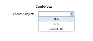
Combo box
var subjectStore = Ext.create('Ext.data.Store', {
fields: ['subject', 'name'],
data : [
{'abbr':'HTML', 'name':'HTML'},
{'abbr':'CSS', 'name':'CSS'},
{'abbr':'JS', 'name':'JavaScript'}
]
});
// Create the combo box, attached to the subject data store
Ext.create('Ext.form.ComboBox', {
fieldLabel: 'Choose Subject',
store: subjectStore,
displayField: 'name',
valueField: 'subject',
renderTo: 'comboBox' // div id to render combo box
});
Output: