- Ext.js - Home
- Ext.js - Overview
- Ext.js - Environment Setup
- Ext.js - Naming Convention
- Ext.js - Architecture
- Ext.js - First Program
- Ext.js - Class System
- Ext.js - Containers
- Ext.js - Layouts
- Ext.js - Components
- Ext.js - Drag & Drop
- Ext.js - Themes
- Ext.js - Custom Events and Listeners
- Ext.js - Data
- Ext.js - Fonts
- Ext.js - Style
- Ext.js - Drawing
- Ext.js - Localization
- Ext.js - Accessibility
- Ext.js - Debugging Code
- Ext.js - Methods
Ext.js - GUI controls
xType defines the type of Ext JS UI component, which is determined during rendering of the component for example element can be a text box for which we have xType as textField or the element can have numeric value only for which we have Numeric xType.
Different types of xType:
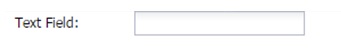
Textfield:
This xType is to represent a text field where user can enter value. Ext JS class for textfield is 'Ext.Form.Field.Text'
{
   xtype: 'textfield',
   fieldLabel: 'Text field'
}
Output:
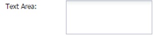
Text area:
This is to represent a text area. Ext JS class for this is 'Ext.form.field.TextArea'
{
   xtype: 'textarea',
   fieldLabel: 'Text Area'
}
Output:
Display field:
This is to represent a display text field. Ext JS class for this is 'Ext.form.Label'
{
   xtype: 'displayfield',
   fieldLabel: 'Display Field''
}
Output:

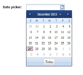
Date field:
This is to represent a date field which has date picker to select date. Ext JS class for this is 'Ext.form.field.Date'
{
   xtype: 'datefield',
   fieldLabel: 'Date picker'
}
Output:
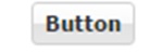
Button:
This is to represent a button. Ext JS class for this is 'Ext.button.Button'
{
   xtype: 'button',
   text : 'Button'
}
Output:
Radio field:
This is to represent a radio field where we can select any one among the all radio buttons or it can be customized to select multiple at a time . Ext JS class for this is 'Ext.form.field.Radio'.
{
   xtype      : 'fieldcontainer',
   fieldLabel : 'Radio field',
   defaultType: 'radiofield',
   defaults: {
      flex: 1
   },
   layout: 'hbox',
   items: [{
      boxLabel  : 'A',
      inputValue: 'a',
      id        : 'radio1'
   },{
      boxLabel  : 'B',
      inputValue: 'b',
      id        : 'radio2'
   },{
      boxLabel  : 'C',
      inputValue: 'c',
      id 	      : 'radio3'
   }]
}
Output:

Checkbox field:
This is to represent a check box field where we can select multiple values at a time. Ext JS class for this is 'Ext.form.field.Checkbox'
{
   xtype: 'fieldcontainer',
   fieldLabel: 'Check Box Field',
   defaultType: 'checkboxfield',
   items: [{
      boxLabel  : 'HTML',
      inputValue: 'html',
      id        : 'checkbox1'
   },{
      boxLabel  : 'CSS',
      inputValue: 'css',
      checked   : true,
      id        : 'checkbox2'
   },{
      boxLabel  : 'JavaScript',
      inputValue: 'js',
      id        : 'checkbox3'
   }]
}
Output:

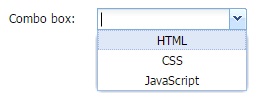
Combobox:
This is to represent a combo box. Combo box contains a list of items. Ext JS class for this is 'Ext.form.field.ComboBox'
{
   xtype : 'combobox',
   fieldLabel: 'Combo box',
   store: store,
   valueField: 'name'
}
// store for drop down values
var store = Ext.create('Ext.data.Store', {
   id : 'statesid',
   fields: ['abbr', 'name'],
   data : [
      {"abbr":"HTML", "name":"HTML"},
      {"abbr":"CSS", "name":"CSS"},
      {"abbr":"JS", "name":"JavaScript"}
   ]
});
Output:
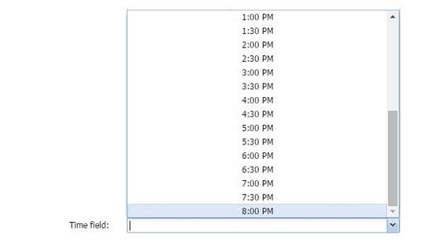
Time field:
This is to represent a time field where max and min time value can be predefined. Ext JS class for this is 'Ext.form.field.Time'
{
   xtype: 'timefield',
   fieldLabel: 'Time field',
   minValue: '6:00 AM',
   maxValue: '8:00 PM',
   increment: 30,
   anchor: '100%'
}
Output:
File field:
This is to represent a file upload field where we can browse and upload files. Ext JS class for this is 'Ext.form.field.File'
{
   xtype: 'filefield',
   fieldLabel: 'File field',
   labelWidth: 50,
   msgTarget: 'side',
   allowBlank: false,
   anchor: '100%',
   buttonText: 'Select File...'
}
Output:

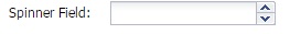
Spinner:
This is to represent a spinner field where list can be spin and added. Ext JS class for this is 'Ext.form.field.Spinner'
{
   xtype: 'spinnerfield',
   fieldLabel: 'Spinner field'
}
Output:
Numeric field:
This is to represent a Numeric field where we can have max and min value predefined. Ext JS class for this is 'Ext.form.field.Number'
{
   xtype: 'numberfield',
   anchor: '100%',
   fieldLabel: 'Numeric field',
   maxValue: 99,
   minValue: 0
}
Output:

Hidden Field:
As name explains this xtype is to keep values hidden.
{
   xtype: 'hiddenfield',
   value: 'value from hidden field'
}
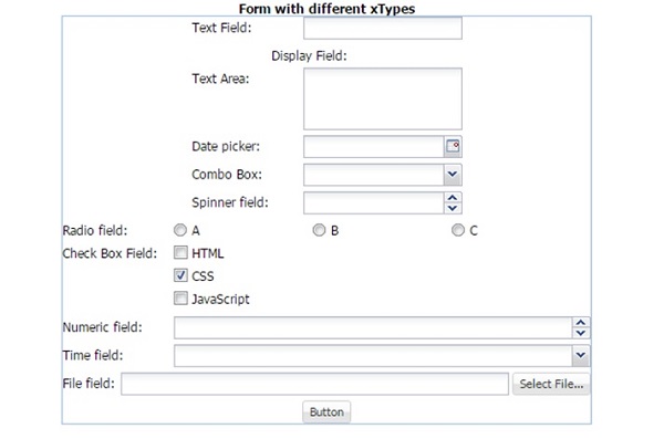
Complete form example with all the different kind of xtypes:
var store = Ext.create('Ext.data.Store', {
   id: 'storeid',
   fields: ['abbr', 'name'],
   data: [{
      'abbr': 'HTML',
      'name': 'HTML'
   },{
      'abbr': 'CSS',
      'name': 'CSS'
   },{
      'abbr': 'JS',
      'name': 'JavaScript'
   }]
});

Ext.create('Ext.form.Panel', {
   id: 'newForm',
   renderTo: 'jobGrid',
   border: true,
   width: 500,
   items: [{
      xtype: 'textfield',
      fieldLabel: 'Text Field'
   },{
      xtype: 'displayfield',
      fieldLabel: 'Display Field'
   },{
      xtype: 'textarea',
      fieldLabel: 'Text Area'
   },{
      xtype: 'datefield',
      fieldLabel: 'Date picker'
   },{
      xtype: 'button',
      text: 'Button'
   },{
      xtype: 'fieldcontainer',
      fieldLabel: 'Radio field',
      defaultType: 'radiofield',
      defaults: {
         flex: 1
      },
      layout: 'hbox',
      items: [{
         boxLabel: 'A',
         inputValue: 'a',
         id: 'radio1'
      },{
         boxLabel: 'B',
         inputValue: 'b',
         id: 'radio2'
      },{
         boxLabel: 'C',
         inputValue: 'c',
         id: 'radio3'
      }]
   },{
      xtype: 'fieldcontainer',
      fieldLabel: 'Check Box Field',
      defaultType: 'checkboxfield',
      items: [{
         boxLabel: 'HTML',
         inputValue: 'html',
         id: 'checkbox1'
      },{
         boxLabel: 'CSS',
         inputValue: 'css',
         checked: true,
         id: 'checkbox2'
      },{
         boxLabel: 'JavaScript',
         inputValue: 'js',
         id: 'checkbox3'
      }]
   },{
      xtype: 'hiddenfield',
      name: 'hidden field ',
      value: 'value from hidden field'
   },{
      xtype: 'numberfield',
      anchor: '100%',
      fieldLabel: 'Numeric Field',
      maxValue: 99,
      minValue: 0
   },{
      xtype: 'spinnerfield',
      fieldLabel: 'Spinner Field'
   },{
      xtype: 'timefield',
      fieldLabel: 'Time field',
      minValue: '6:00 AM',
      maxValue: '8:00 PM',
      increment: 30,
      anchor: '100%'
   },{
      xtype: 'filefield',
      fieldLabel: 'File field',
      labelWidth: 50,
      msgTarget: 'side',
      allowBlank: false,
      anchor: '100%',
      buttonText: 'Select File...'
   },{
      xtype: 'combobox',
      fieldLabel: 'Combo Box',
      store: store,
      valueField: 'abbr'
   }]
});
Output: