- Ext.js - Home
- Ext.js - Overview
- Ext.js - Environment Setup
- Ext.js - Naming Convention
- Ext.js - Architecture
- Ext.js - First Program
- Ext.js - Class System
- Ext.js - Containers
- Ext.js - Layouts
- Ext.js - Components
- Ext.js - Drag & Drop
- Ext.js - Themes
- Ext.js - Custom Events and Listeners
- Ext.js - Data
- Ext.js - Fonts
- Ext.js - Style
- Ext.js - Drawing
- Ext.js - Localization
- Ext.js - Accessibility
- Ext.js - Debugging Code
- Ext.js - Methods
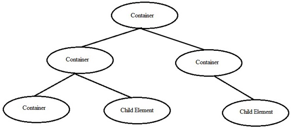
Ext.js - Containers and Layout
Containers
Container in Ext JS is the component where we can add other container or child components. These containers can have multiple layout to arrange the components in the containers. We can add or remove components from container and from its child elements. Ext.container.Container is the base class for all the containers in Ext JS. Ext.panel.Panel, Ext.form.Panel are mostly used containers in Ext JS.
Basic syntax of creating container and adding elements to it:
Ext.onReady(function(){
   // create first child component:
      var child1 = Ext.create('Ext.component',{
      //component properies
      Height: 100,
      Width:100
   });
   // create another child component:
   var child2 = Ext.create('Ext.component',{
      //component properies
      Height: 100,
      Width:100
   });
   // create container and add components to the container
   Ext.create('Ext.container.Container', {
      renderTo: Ext.getBody();
      layout: 'auto' // auto is one of the layout type.
      items: [child1, child2]; // this way we can add differnt child elements to the container as container items.
   });
});
Layouts
Layout is the way the elements are arranged in a container. That could be horizontal, vertical or any other. Ext JS has different layout defined in its library but we can always write custom layouts as well.
Different type of Layouts:
| Layout Type | Description |
|---|---|
| Absolute |
This layout allows to position the items using XY coordinates in the container. |
| Accordion |
This layout allows to place all the items in stack fashion (one on top of other) inside container. |
| Anchor |
This layout gives the privilege to the user to give the size of each element with respect to the container size. |
| Border |
In this layout various panels are nested and separated by borders. |
| Auto |
This is the default layout decides the layout of the elements based on the number of elements. |
| Card(TabPanel) |
This layout arranges different components in tab fashion. Tabs will be displayed on top of the container.Every time only one tab is visible and each tab is considered as different component. |
| Card(Wizard) |
In this layout every time the elements comes for full container space. There would be a bottom tool bar in the wizard for navigation. |
| Column |
This layout is to show multiple columns in the container. We can define fixed or percentage width to the columns. The percentage width will be calculated based on the full size of the container. |
| Fit |
In this layout the container is filled with a single panel and when there is no specific requirement related to the layout then this layout is used. |
| Table |
As name implies this layout arranges the components in container in the HTML table format. |
| vBox |
This layout allows the element to be distributed in the vertical manner. This is one of the mostly used layout. |
| hBox |
This layout allows the element to be distributed in the horizontal manner. |
Syntax of adding layout to the container:
Ext.create('Ext.container.Container', {
   ..
   layout: 'auto' // auto is one of the layout type.
   ..
});

Or

Ext.create('Ext.container.Container', {
   ..
   layout: {
      type : 'vbox',
   }
   ..
});
Basic container with different layout example:
-
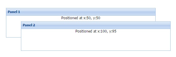
Absolute
Ext.create('Ext.container.Container', { renderTo: Ext.getBody(), layout: 'absolute' , items: [{ title: 'Panel 1', x: 50, y: 50, html: 'Positioned at x:50, y:50', width: 500, height: 100 },{ title: 'Panel 2', x: 100, y: 95, html: 'Positioned at x:100, y:95', width: 500, height: 100 }] }); -
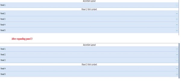
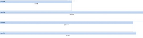
Accordion
Ext.create('Ext.container.Container', { renderTo : Ext.getBody(), layout : 'accordion' , items : [{ title : 'Panel 1', html : 'Panel 1 html content' },{ title : 'Panel 2', html : 'Panel 2 html content' },{ title : 'Panel 3', html : 'Panel 3 html content' },{ title : 'Panel 4', html : 'Panel 4 html content' },{ title : 'Panel 5', html : 'Panel 5 html content' }] }); -
Anchor
Ext.create('Ext.container.Container', { renderTo : Ext.getBody(), layout : 'anchor' , items : [{ title : 'Panel 1', html : 'panel 1', height : 100, anchor : '50%' },{ title : 'Panel 2', html : 'panel 2', height : 100, anchor : '100%' },{ title : 'Panel 3', html : 'panel 3', height : 100, anchor : '-100' },{ title : 'Panel 4', html : 'panel 4', anchor : '-70, 500' }] }); -
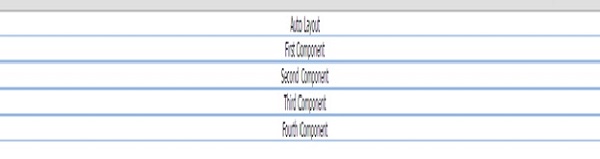
Auto
Ext.create('Ext.container.Container', { renderTo : Ext.getBody(), layout : 'auto' , items : [{ html : 'First Component' },{ html : 'Second Component' },{ html : 'Third Component' },{ html : 'Fourth Component' }] }); -
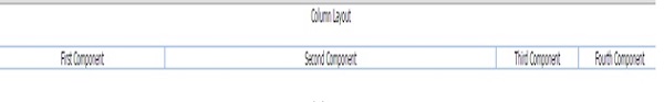
Column
Ext.create('Ext.container.Container', { renderTo : Ext.getBody(), layout : 'column' , items: [{ html : 'First Component', columnWidth : 0.25 },{ html : 'Second Component', columnWidth : 0.50 },{ html : 'Third Component' , columnWidth : 0.125 },{ html : 'Fourth Component', columnWidth : 0.125 }] }); -
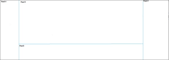
Border
Ext.create('Ext.container.Container', { renderTo : Ext.getBody(), layout : 'border' , items : [{ title : 'panel1', region : 'south' },{ title : 'panel2', region : 'center' },{ title : 'panel3', region : 'east' },{ title : 'panel4', region : 'west' }] }); -
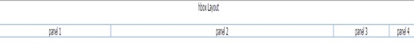
hBox
Ext.create('Ext.container.Container', { renderTo : Ext.getBody(), layout : { type :'hbox' }, items : [{ html : 'panel 1', flex : 1 },{ html : 'panel 2', flex : 2 },{ html : 'panel 3', flex : 0.5 },{ html : 'panel 4', flex : 0.25 }] }); -
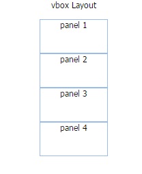
vBox
Ext.create('Ext.container.Container', { renderTo : Ext.getBody(), layout : { type :'vbox', align : 'center' }, items: [{ html: 'panel 1', height: 50, width : 100 },{ html: 'panel 2', height: 50, width : 100 },{ html: 'panel 3', height: 50, width : 100 },{ html: 'panel 4', height: 50, width : 100 }] }); -
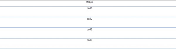
Fit
Ext.create('Ext.container.Container', { renderTo : Ext.getBody(), layout : { type :'fit' }, items : [{ html : 'panel 1', height : 50, width : 100 },{ html : 'panel 2', height : 50, width : 100 },{ html : 'panel 3', height : 50, width : 100 },{ html : 'panel 4', height : 50, width : 100 }] }); -
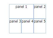
Table
Ext.create('Ext.container.Container', {
   renderTo : Ext.getBody(),
   layout : {
      type :'table',
      columns : 3
   },
   items : [{
      html : 'panel 1',
      height : 50,
      colspan :2
   },{
      html : 'panel 2',
      height : 50
   },{
      html : 'panel 3',
      height : 50
   },{
      html : 'panel 4',
      height : 50
   },{
      html : 'panel 5',
      height : 50
   }]
});
Output:
Output:
Output:
Output:
Output:
Output:
Output:
Output:
Output:
Output: