
Article Categories
- All Categories
-
 Data Structure
-
 Networking
-
 RDBMS
RDBMS
-
 Operating System
-
 Java
Java
-
 MS Excel
-
 iOS
iOS
-
 HTML
HTML
-
 CSS
CSS
-
 Android
-
 Python
-
 C Programming
-
 C++
C++
-
 C#
C#
-
 MongoDB
-
 MySQL
MySQL
-
 Javascript
-
 PHP
PHP
-
 Economics & Finance
Exploratory Data Analysis (EDA) - Types and Tools
Introduction
Exploratory Data Analysis (EDA) is the process of summarization of a dataset by analyzing it. It is used to investigate a dataset and lay down its characteristics. EDA is a fundamental process in many Data Science or Analysis tasks.
Different types of Exploratory Data Analysis
There are broadly two categories of EDA
Univariate Exploratory Data Analysis - In Univariate Data Analysis we use one variable or feature to determine the characteristics of the dataset. We derive the relationships and distribution of data concerning only one feature or variable. In this category, we have the liberty to use either the raw data or follow a graphical approach.
In the Univariate raw data approach or Non-Graphical, we determine the distribution of data based on one variable and study a sample from the population. Also, we may include outlier removal which is a part of this process.
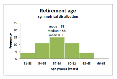
The measure of Central tendency ? Central tendency tried to summarize a whole population or dataset with the help of a single value that represents the central value.
Mean ? It is the average of all the observations. i.e., the sum of all observations divided by the number of observations.
Median ? It is the middle value of the observations or distribution after arranging them in ascending or descending order.
Mode ? It is the most frequently occurring observation.
Let's look into some of the non-graphical approaches.
The three measures are the mean, the median, and the mode.
Variance ? It indicates the spread of the data about the middle or Mean value. It helps us gather info regarding observations concerning central tendencies like mean. It is calculated as the mean of the square of all observations.
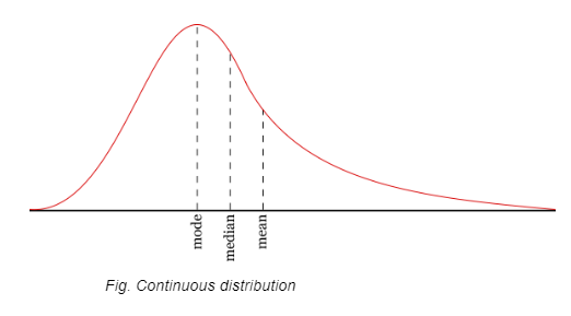
Skewness ? It is the measure of the symmetry of the observations. The distribution can either be left-skewed or right skewed forming a long tail in either case.
Kurtosis ? It measures how much-tailed a particular distribution is concerning a normal distribution. Medium kurtosis is known as mesokurtic and low kurtosis is known as platykurtic.
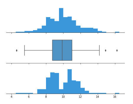
In the Univariate graphical approach, we may use any graphing library to generate graphs like histograms, boxplots, quantile-quantile plots, violin plots, etc. for visualization. Data Scientists often use visualization to discover anomalies and patterns. The graphical method is a more subjective approach to EDA. These are some of the graphical tools to perform univariate analysis.
Histograms ? They represent an actual count of a particular range of values. It shows the frequency of data in the form of rectangles' which is also known as bar graph representation and can be either vertical or horizontal.
Box plots ? Also known as box and whisker plots. They use lines and boxes to show the distribution of data from one or more than one groups. A central line indicates the median value. The extended line captures the rest of the data. They are useful in the way that they can be used to compare groups of data and compare symmetry.
Q-Q plots ? To determine if two datasets come from the same or different distribution, a Q- Q plot is used.
Multivariate Exploratory Data Analysis ? In Multivariate analysis we use more than one variable to show the relationships and visualizations. It is used to show the interaction between different fields.
Multivariate Non-Graphical (raw data) ? Techniques like tabulation of more than two variables. ANOVA test can also play a significant role.
Multivariate Graphical ? In visualization analysis for multivariate statistics, the below plots can be used.
Scatterplot ? It is used to display the relationship between two variables by plotting the data as dots. Additionally, color coding can be intelligently used to show groups within the two features based on a third feature.
Heatmap ? In this visualization technique the values are represented with colors with a legend showing color for different levels of the value. It is a 2d graph.
Bubble plot ? In this graph circles are used to show different values. The radius of the circle on the chart is proportional to the value of the data point.
Programming Language tools used in EDA
Both R and Python languages can be used to perform EDA. These languages are very powerful for EDA and provide some of the best tools out of the box. Let us see some of the utilities of these languages.
R language ? R language was developed by Ross Ihaka and Robert Gentleman. R is a modular programming language with function support. It can be integrated with procedures written in C/C++. R has some of the very powerful tools for data analysis and graphing often used by researchers, data scientists, analysts, etc.
Python language ? Python is a high-level language. It is readable and uses indents to separate blocks of code. It supports several features like structured and object-oriented programming, functions, and paradigms. It is a very simple language and uses fewer lines of code to perform a particular task than other programming languages. Python has many tools for exploratory data analysis and visualization like pandas,matplotlib, seaborn,dask, etc.
Conclusion
Exploratory Data Analysis is the backbone of any Data Analytics or Data Science task. It provides insight into the characters of the data and enables us to take useful and intelligent decisions regarding the data. Due to the availability of some great tools, today EDA is no longer a tedious task but a smooth process.

4K+ Views
