- React Native - Overview
- React Native - Environment Setup
- React Native - App
- React Native - State
- React Native - Props
- React Native - Styling
- React Native - Flexbox
- React Native - ListView
- React Native - Text Input
- React Native - ScrollView
- React Native - Images
- React Native - HTTP
- React Native - Buttons
- React Native - Animations
- React Native - Debugging
- React Native - Router
- React Native - Running IOS
- React Native - Running Android
- Components and APIs
- React Native - View
- React Native - WebView
- React Native - Modal
- React Native - ActivityIndicator
- React Native - Picker
- React Native - Status Bar
- React Native - Switch
- React Native - Text
- React Native - Alert
- React Native - Geolocation
- React Native - AsyncStorage
- React Native Useful Resources
- React Native - Quick Guide
- React Native - Useful Resources
- React Native - Discussion
Selected Reading
React Native - Modal
In this chapter, we will show you how to use the modal component in React Native.
Let us now create a new file: ModalExample.js
We will put logic inside ModalExample. We can update the initial state by running the toggleModal.
After updating the initial state by running the toggleModal, we will set the visible property to our modal. This prop will be updated when the state changes.
The onRequestClose is required for Android devices.
App.js
import React, { Component } from 'react'
import WebViewExample from './modal_example.js'

const Home = () => {
   return (
      <WebViewExample/>
   )
}
export default Home;
modal_example.js
import React, { Component } from 'react';
import { Modal, Text, TouchableHighlight, View, StyleSheet}

from 'react-native'
class ModalExample extends Component {
   state = {
      modalVisible: false,
   }
   toggleModal(visible) {
      this.setState({ modalVisible: visible });
   }
   render() {
      return (
         <View style = {styles.container}>
            <Modal animationType = {"slide"} transparent = {false}
               visible = {this.state.modalVisible}
               onRequestClose = {() => { console.log("Modal has been closed.") } }>

               <View style = {styles.modal}>
                  <Text style = {styles.text}>Modal is open!</Text>

                  <TouchableHighlight onPress = {() => {
                     this.toggleModal(!this.state.modalVisible)}}>

                     <Text style = {styles.text}>Close Modal</Text>
                  </TouchableHighlight>
               </View>
            </Modal>

            <TouchableHighlight onPress = {() => {this.toggleModal(true)}}>
               <Text style = {styles.text}>Open Modal</Text>
            </TouchableHighlight>
         </View>
      )
   }
}
export default ModalExample

const styles = StyleSheet.create ({
   container: {
      alignItems: 'center',
      backgroundColor: '#ede3f2',
      padding: 100
   },
   modal: {
      flex: 1,
      alignItems: 'center',
      backgroundColor: '#f7021a',
      padding: 100
   },
   text: {
      color: '#3f2949',
      marginTop: 10
   }
})
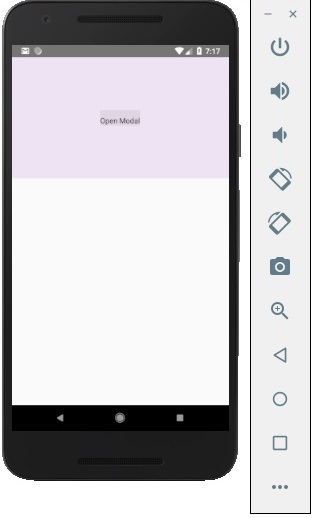
Our starting screen will look like this −
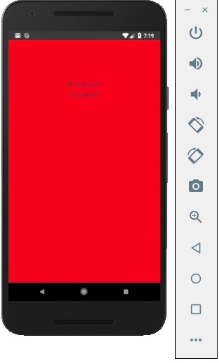
If we click the button, the modal will open.
Advertisements