- Excel Power Pivot - Home
- Excel Power Pivot - Overview
- Excel Power Pivot - Installing
- Excel Power Pivot - Features
- Excel Power Pivot - Loading Data
- Excel Power Pivot - Data Model
- Power Pivot - Managing Data Model
- Excel Power Pivot Table - Creation
- Excel Power Pivot - Basics of DAX
- Power Pivot Table - Exploring Data
- Excel Power Pivot Table - Flattened
- Excel Power Pivot Charts - Creation
- Table & Chart Combinations
- Excel Power Pivot - Hierarchies
- Power Pivot - Aesthetic Reports
- Excel Power Pivot Useful Resources
- Excel Power Pivot - Quick Guide
- Excel Power Pivot - Resources
- Excel Power Pivot - Discussion
Excel Power Pivot Charts - Creation
A PivotChart based on Data Model and created from the Power Pivot window is a Power PivotChart. Though it has some features similar to Excel PivotChart, there are other features that make it more powerful.
In this chapter, you will learn about Power PivotCharts. Henceforth we refer to them as PivotCharts, for simplicity.
Creating a PivotChart
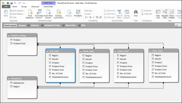
Suppose you want to create a PivotChart based on the following Data Model.
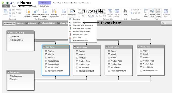
Click the Home tab on the Ribbon in Power Pivot window.
Click PivotTable.
Select PivotChart from the dropdown list.
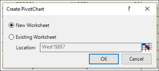
The Create PivotChart dialog box appears. Select New Worksheet and click OK.
An empty PivotChart is created on a new worksheet in the Excel window.
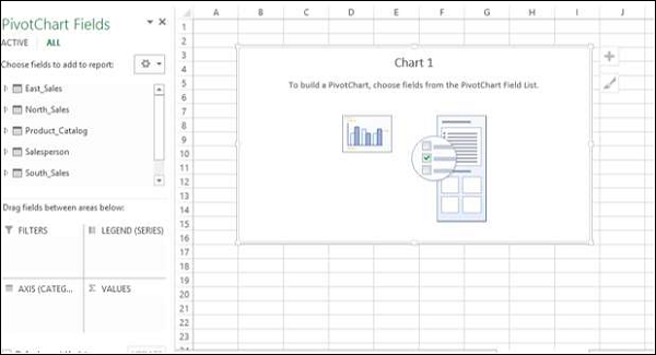
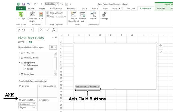
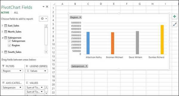
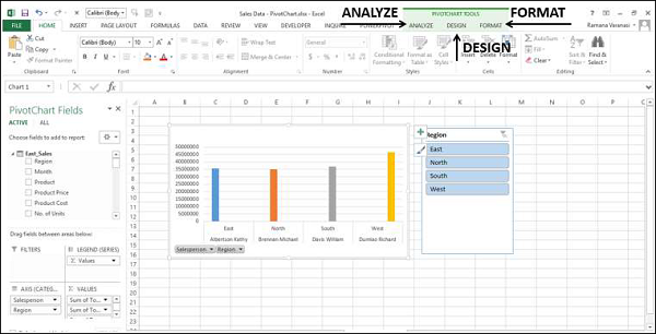
As you can observe, all the tables in the data model are displayed in the PivotChart Fields list.
Click on the Salesperson table in the PivotChart Fields list.
Drag the fields − Salesperson and Region to AXIS area.
Two field buttons for the two selected fields appear on the PivotChart. These are the Axis field buttons. The use of field buttons is to filter data that is displayed on the PivotChart.
Drag TotalSalesAmount from each of the four tables East_Sales, North_Sales, South_Sales and West_Sales to ∑ VALUES area.
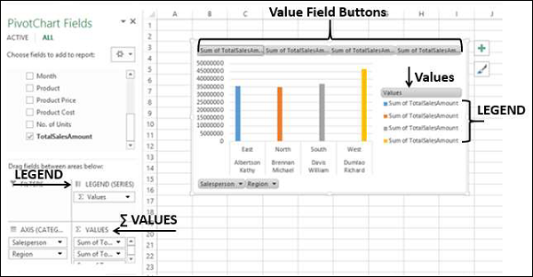
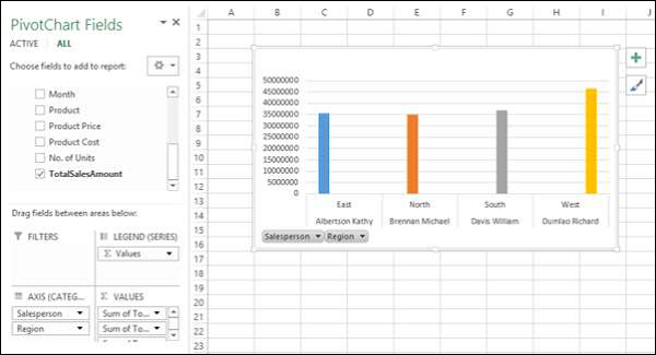
The following appear on the worksheet −
In the PivotChart, column chart is displayed by default.
In the LEGEND area, ∑ VALUES are added.
The Values appear in the Legend in the PivotChart, with title Values.
The Value Field Buttons appear on the PivotChart. You can remove the legend and the value field buttons for a tidier look of the PivotChart.
Click on the
 button at the top right corner of the PivotChart. The Chart Elements dropdown list appears.
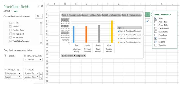
Uncheck the box Legend in the Chart Elements list. The Legend is removed from the PivotChart.
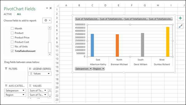
Right click on the value field buttons.
Select Hide Value Field Buttons on Chart from the dropdown list.
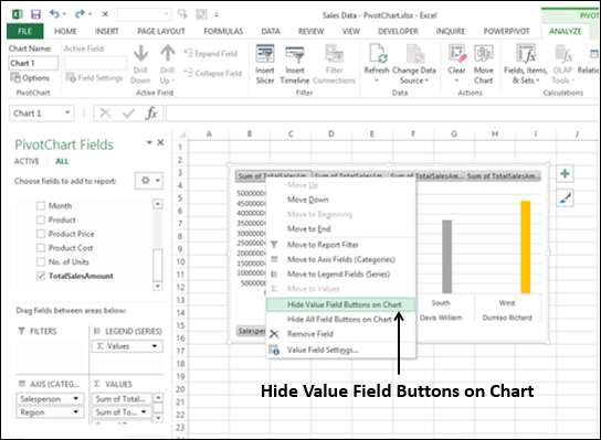
The value field buttons on the chart are removed.
Note − The display of field buttons and/or legend depends on the context of the PivotChart. You need to decide what is required to be displayed.
PivotChart Fields List
As in the case of Power PivotTable, Power PivotChart Fields list also contains two tabs ACTIVE and ALL. Under the ALL tab, all the data tables in the Power Pivot Data Model are displayed. Under the ACTIVE tab, the tables from which the fields are added to PivotChart are displayed.
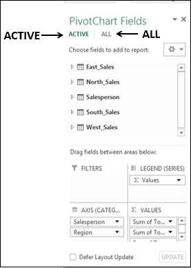
Likewise, the areas are as in the case of Excel PivotChart. There four areas are −
AXIS (Categories)
LEGEND (Series)
∑ VALUES
FILTERS
As you have seen in the previous section, Legend is populated with ∑ Values. Further, field buttons are added to the PivotChart for the ease of filtering the data that is being displayed.
Filters in PivotChart
You can use the Axis field buttons on the chart to filter the data being displayed. Click on the arrow on the Axis field button Region.
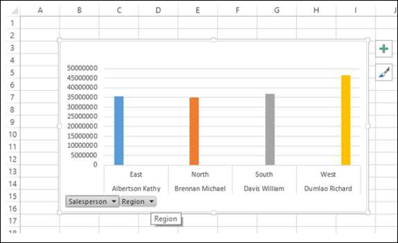
The dropdown list that appears looks as follows −
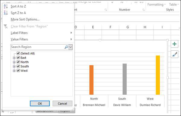
You can select the values that you want to display. Alternatively, you can place the field in FILTERS area for filtering the values.
Drag the field Region to FILTERS area. The Report Filter button - Region appears on the PivotChart.
Click on the arrow on the Report Filter button − Region. The dropdown list that appears looks as follows −
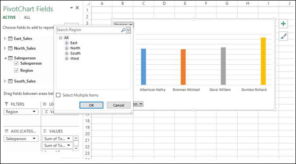
You can select the values that you want to display.
Slicers in PivotChart
Using Slicers is another option to filter data in the Power PivotChart.
Click the ANALYZE tab under PIVOTCHART tools on the Ribbon.
Click Insert Slicer in the Filter group. The Insert Slicer dialog box appears.
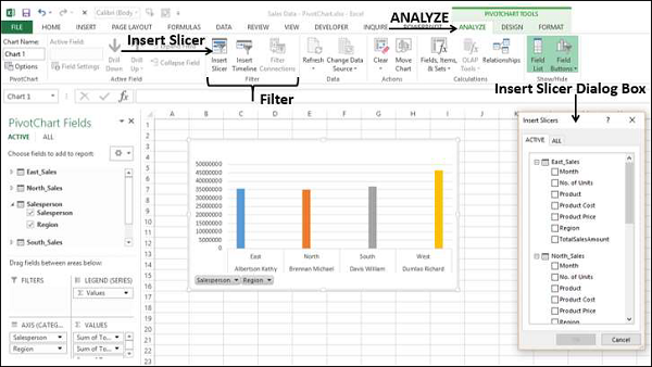
All the tables and the corresponding fields appear in the Insert Slicer dialog box.
Click the field Region in Salesperson table in the Insert Slicer dialog box.
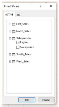
Slicer for the field Region appears on the worksheet.
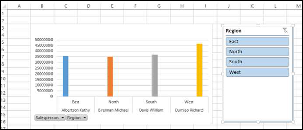
As you can observe, the Region field still exists as an Axis field. You can select the values that you want to display by clicking on the Slicer buttons.
Remember that you are able to do all these in a few minutes and also dynamically because of the Power Pivot Data Model and defined relationships.
PivotChart Tools
In Power PivotChart, the PIVOTCHART TOOLS has three tabs on the Ribbon as against two tabs in Excel PivotChart −
ANALYZE
DESIGN
FORMAT
The third tab − FORMAT is the additional tab in Power PivotChart.
Click the FORMAT tab on the Ribbon.
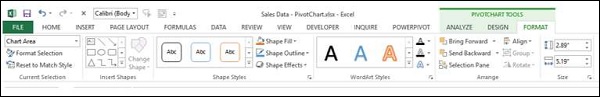
The options on the Ribbon under FORMAT tab are all for adding splendor to your PivotChart. You can use these options judiciously, without getting over bored.
