
Article Categories
- All Categories
-
 Data Structure
-
 Networking
-
 RDBMS
RDBMS
-
 Operating System
-
 Java
Java
-
 MS Excel
-
 iOS
iOS
-
 HTML
HTML
-
 CSS
CSS
-
 Android
-
 Python
-
 C Programming
-
 C++
C++
-
 C#
C#
-
 MongoDB
-
 MySQL
MySQL
-
 Javascript
-
 PHP
PHP
-
 Economics & Finance
Dynamic highlight data point on Excel chart
When there is a large amount of data plotted on a chart, it might be difficult to interpret. Although it is generally considered best practise to plot just the data that is relevant to the problem at hand, there are times when it is necessary to display a large number of data points on a single chart.
If you find yourself in such a predicament, it is a smart idea to have a dynamic chart on hand that emphasises the chosen series in order to make it simpler to understand and evaluate the data.
Actual vs Budget Chart
If you use a chart that has many series and a lot of data plotted on it, it will be difficult to understand. In this case, it is best to use a chart that has just the data that is important to one series. Here, we will explain an approach that can highlight the data points of active series in a dynamic way.
Step 1
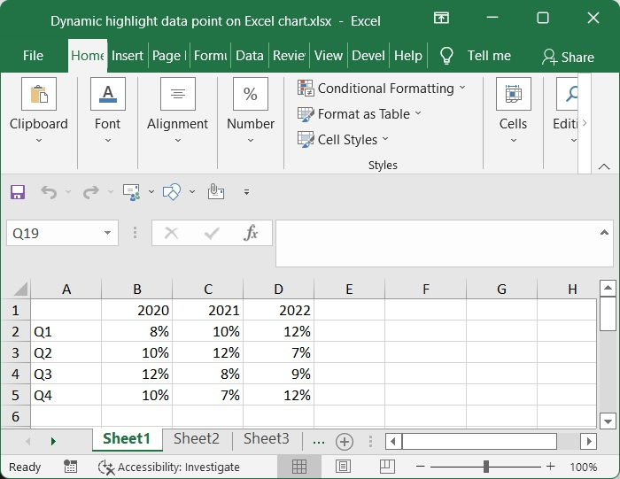
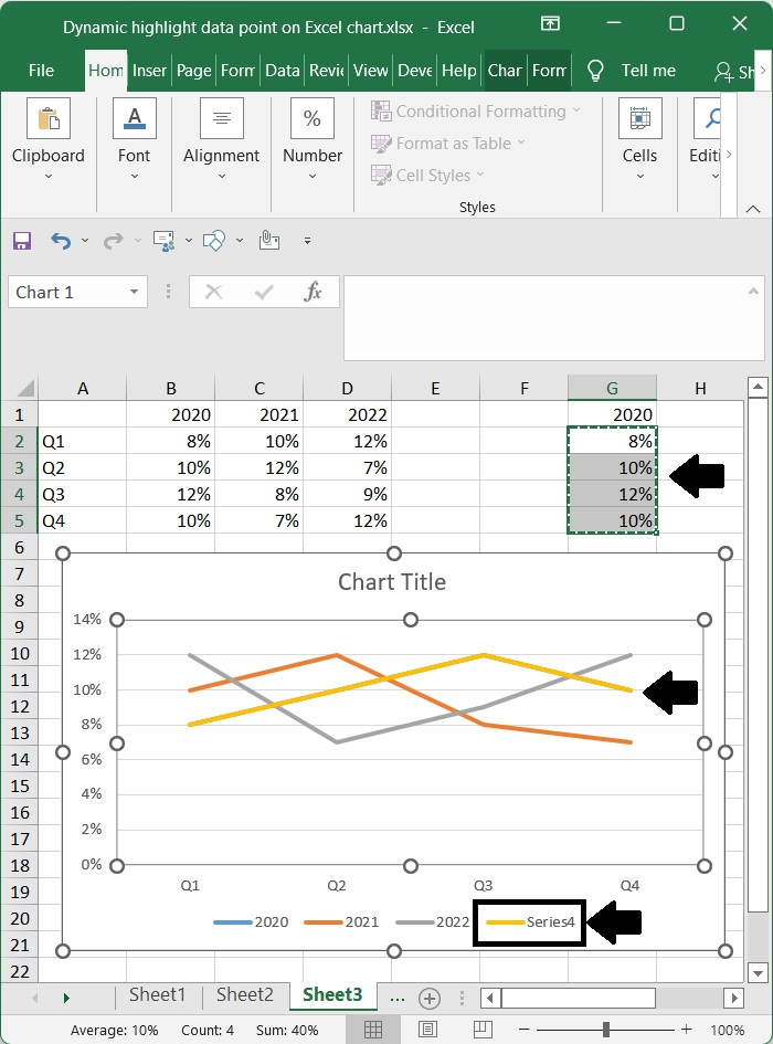
Obtain and organise the necessary data. For the purpose of this figure, I have the percentage increase in quarterly revenue for each year from 2020 to 2022.
Step 2
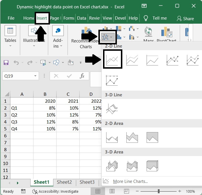
After making sure that the complete set of data is highlighted, go to Insert ? Charts ? Line with Markers. This would result in the addition of a line chart that had three distinct lines for each of the years.
Step 3
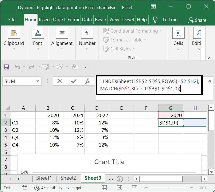
After that, insert the name of one of the series into a field that is now blank. As an example, if Cell G1 has the year 2020, then Cell G2 ought to have the following formula ?
=INDEX($B$2:$D$5,ROWS($H$2:H2),MATCH($G$1,$B$1:$D$1,0))
In this formula, B2:D5 stands for the data range without column or row headers, and H2:H2 stands for the blank cell immediately after the formula. The series name is typed into the column marked as G1, and the data table's data table's range that the series name refers to is the range starting at B1 and ending at D1.
Step 4
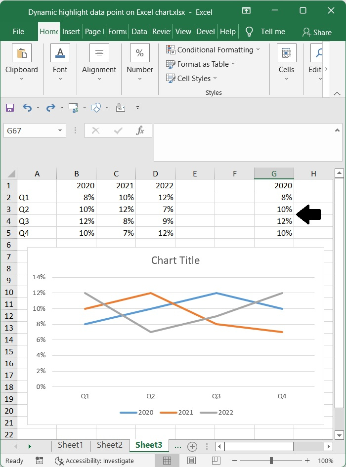
Then, to get all of the necessary data associated with this series, move the auto fill handle to the right or down.
Step 5
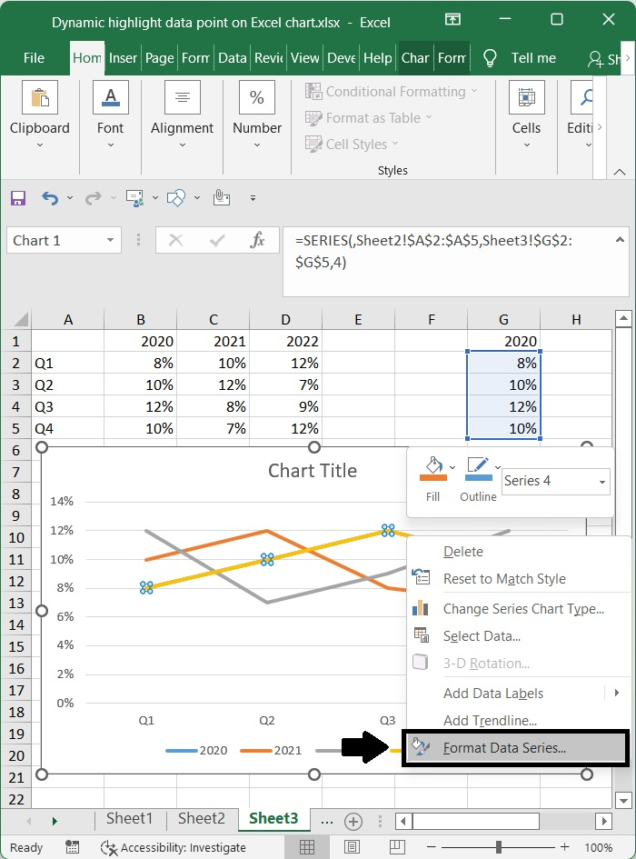
Choose the cells containing the formulas (G2:G5), then use Ctrl + C to copy them. Next, choose the chart, and press Ctrl + V to paste the copied formulas. Finally, take note of which series (series4) causes the colour to change.
Step 6
After that, make a right click on the new series, and then pick Format Data Series from the context menu that appears.
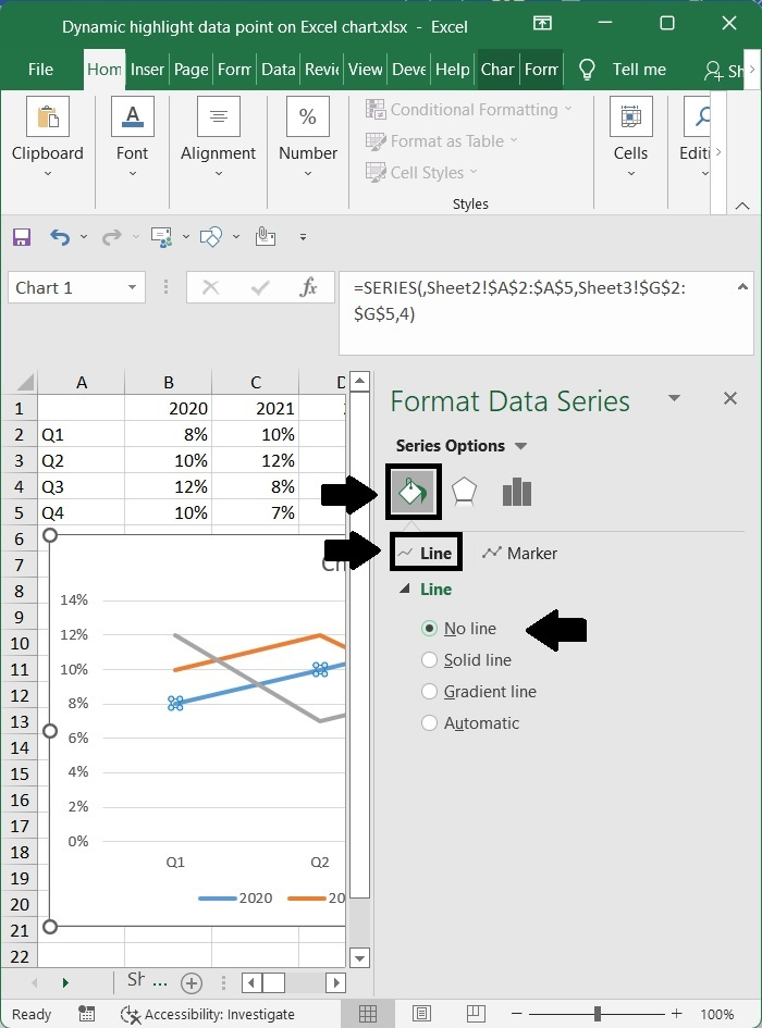
Step 7
In the Format Data Series window, choose the Fill & Line tab, and then check the box next to the No line option in the Line section.
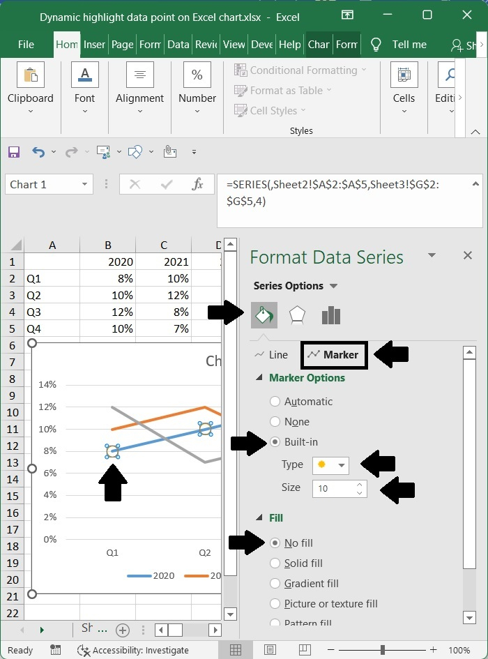
Step 8
Proceed to the Marker section, then choose the Built-in option, then select the circle mark from the Type drop-down list. Next, increase the Size till it reaches 10, and last, check the No fill box in the Fill group.
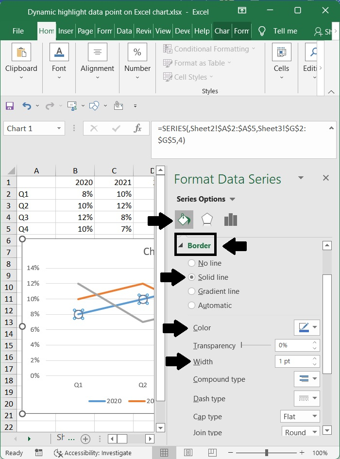
Step 9
Go to the Border group, check the Solid line option, and choose one of the highlighting colours you wish to use. Next, increase the Width to 1, and pick one of the Dash lines you need.
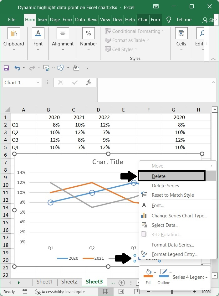
Step 10
The next step is to return to the chart and cross out the name of the new series.
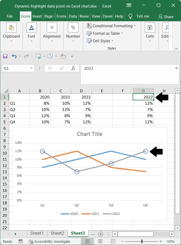
Step 11
When you go to F1 and modify the name of a series, the points on the chart that are highlighted will update themselves accordingly.
Conclusion
In this tutorial, we explained in detail how you can highlight the data points on an Excel chart dynamically.

423 Views
