- Big Data Analytics - Home
- Big Data Analytics - Overview
- Big Data Analytics - Characteristics
- Big Data Analytics - Data Life Cycle
- Big Data Analytics - Architecture
- Big Data Analytics - Methodology
- Big Data Analytics - Core Deliverables
- Big Data Adoption & Planning Considerations
- Big Data Analytics - Key Stakeholders
- Big Data Analytics - Data Analyst
- Big Data Analytics - Data Scientist
- Data Analytics - Problem Definition
- Big Data Analytics - Data Collection
- Big Data Analytics - Cleansing data
- Big Data Analytics - Summarizing
- Big Data Analytics - Data Exploration
- Big Data Analytics - Data Visualization
- Big Data Analytics Methods
- Big Data Analytics - Introduction to R
- Data Analytics - Introduction to SQL
- Big Data Analytics - Charts & Graphs
- Big Data Analytics - Data Tools
- Data Analytics - Statistical Methods
- Advanced Methods
- Machine Learning for Data Analysis
- Naive Bayes Classifier
- K-Means Clustering
- Association Rules
- Big Data Analytics - Decision Trees
- Logistic Regression
- Big Data Analytics - Time Series
- Big Data Analytics - Text Analytics
- Big Data Analytics - Online Learning
- Big Data Analytics Useful Resources
- Big Data Analytics - Quick Guide
- Big Data Analytics - Resources
- Big Data Analytics - Discussion
Big Data Analytics - Quick Guide
Big Data Analytics - Overview
The volume of data that one has to deal has exploded to unimaginable levels in the past decade, and at the same time, the price of data storage has systematically reduced. Private companies and research institutions capture terabytes of data about their users interactions, business, social media, and also sensors from devices such as mobile phones and automobiles. The challenge of this era is to make sense of this sea of data. This is where big data analytics comes into picture.
Big Data Analytics largely involves collecting data from different sources, munge it in a way that it becomes available to be consumed by analysts and finally deliver data products useful to the organization business.

The process of converting large amounts of unstructured raw data, retrieved from different sources to a data product useful for organizations forms the core of Big Data Analytics.
Big Data Analytics - Data Life Cycle
Traditional Data Mining Life Cycle
In order to provide a framework to organize the work needed by an organization and deliver clear insights from Big Data, its useful to think of it as a cycle with different stages. It is by no means linear, meaning all the stages are related with each other. This cycle has superficial similarities with the more traditional data mining cycle as described in CRISP methodology.
CRISP-DM Methodology
The CRISP-DM methodology that stands for Cross Industry Standard Process for Data Mining, is a cycle that describes commonly used approaches that data mining experts use to tackle problems in traditional BI data mining. It is still being used in traditional BI data mining teams.
Take a look at the following illustration. It shows the major stages of the cycle as described by the CRISP-DM methodology and how they are interrelated.

CRISP-DM was conceived in 1996 and the next year, it got underway as a European Union project under the ESPRIT funding initiative. The project was led by five companies: SPSS, Teradata, Daimler AG, NCR Corporation, and OHRA (an insurance company). The project was finally incorporated into SPSS. The methodology is extremely detailed oriented in how a data mining project should be specified.
Let us now learn a little more on each of the stages involved in the CRISP-DM life cycle −
Business Understanding − This initial phase focuses on understanding the project objectives and requirements from a business perspective, and then converting this knowledge into a data mining problem definition. A preliminary plan is designed to achieve the objectives. A decision model, especially one built using the Decision Model and Notation standard can be used.
Data Understanding − The data understanding phase starts with an initial data collection and proceeds with activities in order to get familiar with the data, to identify data quality problems, to discover first insights into the data, or to detect interesting subsets to form hypotheses for hidden information.
Data Preparation − The data preparation phase covers all activities to construct the final dataset (data that will be fed into the modeling tool(s)) from the initial raw data. Data preparation tasks are likely to be performed multiple times, and not in any prescribed order. Tasks include table, record, and attribute selection as well as transformation and cleaning of data for modeling tools.
Modeling − In this phase, various modeling techniques are selected and applied and their parameters are calibrated to optimal values. Typically, there are several techniques for the same data mining problem type. Some techniques have specific requirements on the form of data. Therefore, it is often required to step back to the data preparation phase.
Evaluation − At this stage in the project, you have built a model (or models) that appears to have high quality, from a data analysis perspective. Before proceeding to final deployment of the model, it is important to evaluate the model thoroughly and review the steps executed to construct the model, to be certain it properly achieves the business objectives.
A key objective is to determine if there is some important business issue that has not been sufficiently considered. At the end of this phase, a decision on the use of the data mining results should be reached.
Deployment − Creation of the model is generally not the end of the project. Even if the purpose of the model is to increase knowledge of the data, the knowledge gained will need to be organized and presented in a way that is useful to the customer.
Depending on the requirements, the deployment phase can be as simple as generating a report or as complex as implementing a repeatable data scoring (e.g. segment allocation) or data mining process.
In many cases, it will be the customer, not the data analyst, who will carry out the deployment steps. Even if the analyst deploys the model, it is important for the customer to understand upfront the actions which will need to be carried out in order to actually make use of the created models.
SEMMA Methodology
SEMMA is another methodology developed by SAS for data mining modeling. It stands for Sample, Explore, Modify, Model, and Asses. Here is a brief description of its stages −
Sample − The process starts with data sampling, e.g., selecting the dataset for modeling. The dataset should be large enough to contain sufficient information to retrieve, yet small enough to be used efficiently. This phase also deals with data partitioning.
Explore − This phase covers the understanding of the data by discovering anticipated and unanticipated relationships between the variables, and also abnormalities, with the help of data visualization.
Modify − The Modify phase contains methods to select, create and transform variables in preparation for data modeling.
Model − In the Model phase, the focus is on applying various modeling (data mining) techniques on the prepared variables in order to create models that possibly provide the desired outcome.
Assess − The evaluation of the modeling results shows the reliability and usefulness of the created models.
The main difference between CRISMDM and SEMMA is that SEMMA focuses on the modeling aspect, whereas CRISP-DM gives more importance to stages of the cycle prior to modeling such as understanding the business problem to be solved, understanding and preprocessing the data to be used as input, for example, machine learning algorithms.
Big Data Life Cycle
In todays big data context, the previous approaches are either incomplete or suboptimal. For example, the SEMMA methodology disregards completely data collection and preprocessing of different data sources. These stages normally constitute most of the work in a successful big data project.
A big data analytics cycle can be described by the following stage −
- Business Problem Definition
- Research
- Human Resources Assessment
- Data Acquisition
- Data Munging
- Data Storage
- Exploratory Data Analysis
- Data Preparation for Modeling and Assessment
- Modeling
- Implementation
In this section, we will throw some light on each of these stages of big data life cycle.
Business Problem Definition
This is a point common in traditional BI and big data analytics life cycle. Normally it is a non-trivial stage of a big data project to define the problem and evaluate correctly how much potential gain it may have for an organization. It seems obvious to mention this, but it has to be evaluated what are the expected gains and costs of the project.
Research
Analyze what other companies have done in the same situation. This involves looking for solutions that are reasonable for your company, even though it involves adapting other solutions to the resources and requirements that your company has. In this stage, a methodology for the future stages should be defined.
Human Resources Assessment
Once the problem is defined, its reasonable to continue analyzing if the current staff is able to complete the project successfully. Traditional BI teams might not be capable to deliver an optimal solution to all the stages, so it should be considered before starting the project if there is a need to outsource a part of the project or hire more people.
Data Acquisition
This section is key in a big data life cycle; it defines which type of profiles would be needed to deliver the resultant data product. Data gathering is a non-trivial step of the process; it normally involves gathering unstructured data from different sources. To give an example, it could involve writing a crawler to retrieve reviews from a website. This involves dealing with text, perhaps in different languages normally requiring a significant amount of time to be completed.
Data Munging
Once the data is retrieved, for example, from the web, it needs to be stored in an easyto-use format. To continue with the reviews examples, lets assume the data is retrieved from different sites where each has a different display of the data.
Suppose one data source gives reviews in terms of rating in stars, therefore it is possible to read this as a mapping for the response variable y ∈ {1, 2, 3, 4, 5}. Another data source gives reviews using two arrows system, one for up voting and the other for down voting. This would imply a response variable of the form y ∈ {positive, negative}.
In order to combine both the data sources, a decision has to be made in order to make these two response representations equivalent. This can involve converting the first data source response representation to the second form, considering one star as negative and five stars as positive. This process often requires a large time allocation to be delivered with good quality.
Data Storage
Once the data is processed, it sometimes needs to be stored in a database. Big data technologies offer plenty of alternatives regarding this point. The most common alternative is using the Hadoop File System for storage that provides users a limited version of SQL, known as HIVE Query Language. This allows most analytics task to be done in similar ways as would be done in traditional BI data warehouses, from the user perspective. Other storage options to be considered are MongoDB, Redis, and SPARK.
This stage of the cycle is related to the human resources knowledge in terms of their abilities to implement different architectures. Modified versions of traditional data warehouses are still being used in large scale applications. For example, teradata and IBM offer SQL databases that can handle terabytes of data; open source solutions such as postgreSQL and MySQL are still being used for large scale applications.
Even though there are differences in how the different storages work in the background, from the client side, most solutions provide a SQL API. Hence having a good understanding of SQL is still a key skill to have for big data analytics.
This stage a priori seems to be the most important topic, in practice, this is not true. It is not even an essential stage. It is possible to implement a big data solution that would be working with real-time data, so in this case, we only need to gather data to develop the model and then implement it in real time. So there would not be a need to formally store the data at all.
Exploratory Data Analysis
Once the data has been cleaned and stored in a way that insights can be retrieved from it, the data exploration phase is mandatory. The objective of this stage is to understand the data, this is normally done with statistical techniques and also plotting the data. This is a good stage to evaluate whether the problem definition makes sense or is feasible.
Data Preparation for Modeling and Assessment
This stage involves reshaping the cleaned data retrieved previously and using statistical preprocessing for missing values imputation, outlier detection, normalization, feature extraction and feature selection.
Modelling
The prior stage should have produced several datasets for training and testing, for example, a predictive model. This stage involves trying different models and looking forward to solving the business problem at hand. In practice, it is normally desired that the model would give some insight into the business. Finally, the best model or combination of models is selected evaluating its performance on a left-out dataset.
Implementation
In this stage, the data product developed is implemented in the data pipeline of the company. This involves setting up a validation scheme while the data product is working, in order to track its performance. For example, in the case of implementing a predictive model, this stage would involve applying the model to new data and once the response is available, evaluate the model.
Big Data Analytics - Methodology
In terms of methodology, big data analytics differs significantly from the traditional statistical approach of experimental design. Analytics starts with data. Normally we model the data in a way to explain a response. The objectives of this approach is to predict the response behavior or understand how the input variables relate to a response. Normally in statistical experimental designs, an experiment is developed and data is retrieved as a result. This allows to generate data in a way that can be used by a statistical model, where certain assumptions hold such as independence, normality, and randomization.
In big data analytics, we are presented with the data. We cannot design an experiment that fulfills our favorite statistical model. In large-scale applications of analytics, a large amount of work (normally 80% of the effort) is needed just for cleaning the data, so it can be used by a machine learning model.
We dont have a unique methodology to follow in real large-scale applications. Normally once the business problem is defined, a research stage is needed to design the methodology to be used. However general guidelines are relevant to be mentioned and apply to almost all problems.
One of the most important tasks in big data analytics is statistical modeling, meaning supervised and unsupervised classification or regression problems. Once the data is cleaned and preprocessed, available for modeling, care should be taken in evaluating different models with reasonable loss metrics and then once the model is implemented, further evaluation and results should be reported. A common pitfall in predictive modeling is to just implement the model and never measure its performance.
Big Data Analytics - Core Deliverables
As mentioned in the big data life cycle, the data products that result from developing a big data product are in most of the cases some of the following −
Machine learning implementation − This could be a classification algorithm, a regression model or a segmentation model.
Recommender system − The objective is to develop a system that recommends choices based on user behavior. Netflix is the characteristic example of this data product, where based on the ratings of users, other movies are recommended.
Dashboard − Business normally needs tools to visualize aggregated data. A dashboard is a graphical mechanism to make this data accessible.
Ad-Hoc analysis − Normally business areas have questions, hypotheses or myths that can be answered doing ad-hoc analysis with data.
Big Data Analytics - Key Stakeholders
In large organizations, in order to successfully develop a big data project, it is needed to have management backing up the project. This normally involves finding a way to show the business advantages of the project. We dont have a unique solution to the problem of finding sponsors for a project, but a few guidelines are given below −
Check who and where are the sponsors of other projects similar to the one that interests you.
Having personal contacts in key management positions helps, so any contact can be triggered if the project is promising.
Who would benefit from your project? Who would be your client once the project is on track?
Develop a simple, clear, and exiting proposal and share it with the key players in your organization.
The best way to find sponsors for a project is to understand the problem and what would be the resulting data product once it has been implemented. This understanding will give an edge in convincing the management of the importance of the big data project.
Big Data Analytics - Data Analyst
A data analyst has reporting-oriented profile, having experience in extracting and analyzing data from traditional data warehouses using SQL. Their tasks are normally either on the side of data storage or in reporting general business results. Data warehousing is by no means simple, it is just different to what a data scientist does.
Many organizations struggle hard to find competent data scientists in the market. It is however a good idea to select prospective data analysts and teach them the relevant skills to become a data scientist. This is by no means a trivial task and would normally involve the person doing a master degree in a quantitative field, but it is definitely a viable option. The basic skills a competent data analyst must have are listed below −
- Business understanding
- SQL programming
- Report design and implementation
- Dashboard development
Big Data Analytics - Data Scientist
The role of a data scientist is normally associated with tasks such as predictive modeling, developing segmentation algorithms, recommender systems, A/B testing frameworks and often working with raw unstructured data.
The nature of their work demands a deep understanding of mathematics, applied statistics and programming. There are a few skills common between a data analyst and a data scientist, for example, the ability to query databases. Both analyze data, but the decision of a data scientist can have a greater impact in an organization.
Here is a set of skills a data scientist normally need to have −
- Programming in a statistical package such as: R, Python, SAS, SPSS, or Julia
- Able to clean, extract, and explore data from different sources
- Research, design, and implementation of statistical models
- Deep statistical, mathematical, and computer science knowledge
In big data analytics, people normally confuse the role of a data scientist with that of a data architect. In reality, the difference is quite simple. A data architect defines the tools and the architecture the data would be stored at, whereas a data scientist uses this architecture. Of course, a data scientist should be able to set up new tools if needed for ad-hoc projects, but the infrastructure definition and design should not be a part of his task.
Big Data Analytics - Problem Definition
Through this tutorial, we will develop a project. Each subsequent chapter in this tutorial deals with a part of the larger project in the mini-project section. This is thought to be an applied tutorial section that will provide exposure to a real-world problem. In this case, we would start with the problem definition of the project.
Project Description
The objective of this project would be to develop a machine learning model to predict the hourly salary of people using their curriculum vitae (CV) text as input.
Using the framework defined above, it is simple to define the problem. We can define X = {x1, x2, , xn} as the CVs of users, where each feature can be, in the simplest way possible, the amount of times this word appears. Then the response is real valued, we are trying to predict the hourly salary of individuals in dollars.
These two considerations are enough to conclude that the problem presented can be solved with a supervised regression algorithm.
Problem Definition
Problem Definition is probably one of the most complex and heavily neglected stages in the big data analytics pipeline. In order to define the problem a data product would solve, experience is mandatory. Most data scientist aspirants have little or no experience in this stage.
Most big data problems can be categorized in the following ways −
- Supervised classification
- Supervised regression
- Unsupervised learning
- Learning to rank
Let us now learn more about these four concepts.
Supervised Classification
Given a matrix of features X = {x1, x2, ..., xn} we develop a model M to predict different classes defined as y = {c1, c2, ..., cn}. For example: Given transactional data of customers in an insurance company, it is possible to develop a model that will predict if a client would churn or not. The latter is a binary classification problem, where there are two classes or target variables: churn and not churn.
Other problems involve predicting more than one class, we could be interested in doing digit recognition, therefore the response vector would be defined as: y = {0, 1, 2, 3, 4, 5, 6, 7, 8, 9}, a-state-of-the-art model would be convolutional neural network and the matrix of features would be defined as the pixels of the image.
Supervised Regression
In this case, the problem definition is rather similar to the previous example; the difference relies on the response. In a regression problem, the response y ∈ ℜ, this means the response is real valued. For example, we can develop a model to predict the hourly salary of individuals given the corpus of their CV.
Unsupervised Learning
Management is often thirsty for new insights. Segmentation models can provide this insight in order for the marketing department to develop products for different segments. A good approach for developing a segmentation model, rather than thinking of algorithms, is to select features that are relevant to the segmentation that is desired.
For example, in a telecommunications company, it is interesting to segment clients by their cellphone usage. This would involve disregarding features that have nothing to do with the segmentation objective and including only those that do. In this case, this would be selecting features as the number of SMS used in a month, the number of inbound and outbound minutes, etc.
Learning to Rank
This problem can be considered as a regression problem, but it has particular characteristics and deserves a separate treatment. The problem involves given a collection of documents we seek to find the most relevant ordering given a query. In order to develop a supervised learning algorithm, it is needed to label how relevant an ordering is, given a query.
It is relevant to note that in order to develop a supervised learning algorithm, it is needed to label the training data. This means that in order to train a model that will, for example, recognize digits from an image, we need to label a significant amount of examples by hand. There are web services that can speed up this process and are commonly used for this task such as amazon mechanical turk. It is proven that learning algorithms improve their performance when provided with more data, so labeling a decent amount of examples is practically mandatory in supervised learning.
Big Data Analytics - Data Collection
Data collection plays the most important role in the Big Data cycle. The Internet provides almost unlimited sources of data for a variety of topics. The importance of this area depends on the type of business, but traditional industries can acquire a diverse source of external data and combine those with their transactional data.
For example, lets assume we would like to build a system that recommends restaurants. The first step would be to gather data, in this case, reviews of restaurants from different websites and store them in a database. As we are interested in raw text, and would use that for analytics, it is not that relevant where the data for developing the model would be stored. This may sound contradictory with the big data main technologies, but in order to implement a big data application, we simply need to make it work in real time.
Twitter Mini Project
Once the problem is defined, the following stage is to collect the data. The following miniproject idea is to work on collecting data from the web and structuring it to be used in a machine learning model. We will collect some tweets from the twitter rest API using the R programming language.
First of all create a twitter account, and then follow the instructions in the twitteR package vignette to create a twitter developer account. This is a summary of those instructions −
Go to https://x.com/?lang=en and log in.
After filling in the basic info, go to the "Settings" tab and select "Read, Write and Access direct messages".
Make sure to click on the save button after doing this
In the "Details" tab, take note of your consumer key and consumer secret
In your R session, youll be using the API key and API secret values
Finally run the following script. This will install the twitteR package from its repository on github.
install.packages(c("devtools", "rjson", "bit64", "httr"))

# Make sure to restart your R session at this point
library(devtools)
install_github("geoffjentry/twitteR")
We are interested in getting data where the string "big mac" is included and finding out which topics stand out about this. In order to do this, the first step is collecting the data from twitter. Below is our R script to collect required data from twitter. This code is also available in bda/part1/collect_data/collect_data_twitter.R file.
rm(list = ls(all = TRUE)); gc() # Clears the global environment
library(twitteR)
Sys.setlocale(category = "LC_ALL", locale = "C")

### Replace the xxxs with the values you got from the previous instructions

# consumer_key = "xxxxxxxxxxxxxxxxxxxx"
# consumer_secret = "xxxxxxxxxxxxxxxxxxxxxxxxxxxxxxxxxxxxxxxx"

# access_token = "xxxxxxxxxx-xxxxxxxxxxxxxxxxxxxxxxxxxxxxxxxxxxxxxxxxxxxxxxxxx"

# access_token_secret= "xxxxxxxxxxxxxxxxxxxxxxxxxxxxxxxxxxxxxxxxxxxxxxxxx"

# Connect to twitter rest API
setup_twitter_oauth(consumer_key, consumer_secret, access_token, access_token_secret)

# Get tweets related to big mac
tweets <- searchTwitter(big mac, n = 200, lang = en)
df <- twListToDF(tweets)

# Take a look at the data
head(df)

# Check which device is most used
sources <- sapply(tweets, function(x) x$getStatusSource())
sources <- gsub("</a>", "", sources)
sources <- strsplit(sources, ">")
sources <- sapply(sources, function(x) ifelse(length(x) > 1, x[2], x[1]))
source_table = table(sources)
source_table = source_table[source_table > 1]
freq = source_table[order(source_table, decreasing = T)]
as.data.frame(freq)

#                       Frequency
# Twitter for iPhone       71
# Twitter for Android      29
# Twitter Web Client       25
# recognia                 20
Big Data Analytics - Cleansing Data
Once the data is collected, we normally have diverse data sources with different characteristics. The most immediate step would be to make these data sources homogeneous and continue to develop our data product. However, it depends on the type of data. We should ask ourselves if it is practical to homogenize the data.
Maybe the data sources are completely different, and the information loss will be large if the sources would be homogenized. In this case, we can think of alternatives. Can one data source help me build a regression model and the other one a classification model? Is it possible to work with the heterogeneity on our advantage rather than just lose information? Taking these decisions are what make analytics interesting and challenging.
In the case of reviews, it is possible to have a language for each data source. Again, we have two choices −
Homogenization − It involves translating different languages to the language where we have more data. The quality of translations services is acceptable, but if we would like to translate massive amounts of data with an API, the cost would be significant. There are software tools available for this task, but that would be costly too.
Heterogenization − Would it be possible to develop a solution for each language? As it is simple to detect the language of a corpus, we could develop a recommender for each language. This would involve more work in terms of tuning each recommender according to the amount of languages available but is definitely a viable option if we have a few languages available.
Twitter Mini Project
In the present case we need to first clean the unstructured data and then convert it to a data matrix in order to apply topics modelling on it. In general, when getting data from twitter, there are several characters we are not interested in using, at least in the first stage of the data cleansing process.
For example, after getting the tweets we get these strange characters: "<ed><U+00A0><U+00BD><ed><U+00B8><U+008B>". These are probably emoticons, so in order to clean the data, we will just remove them using the following script. This code is also available in bda/part1/collect_data/cleaning_data.R file.
rm(list = ls(all = TRUE)); gc() # Clears the global environment
source('collect_data_twitter.R')
# Some tweets
head(df$text)

[1] "Im not a big fan of turkey but baked Mac &
cheese <ed><U+00A0><U+00BD><ed><U+00B8><U+008B>"
[2] "@Jayoh30 Like no special sauce on a big mac. HOW"
### We are interested in the text - Lets clean it!

# We first convert the encoding of the text from latin1 to ASCII
df$text <- sapply(df$text,function(row) iconv(row, "latin1", "ASCII", sub = ""))

# Create a function to clean tweets
clean.text <- function(tx) {
  tx <- gsub("htt.{1,20}", " ", tx, ignore.case = TRUE)
  tx = gsub("[^#[:^punct:]]|@|RT", " ", tx, perl = TRUE, ignore.case = TRUE)
  tx = gsub("[[:digit:]]", " ", tx, ignore.case = TRUE)
  tx = gsub(" {1,}", " ", tx, ignore.case = TRUE)
  tx = gsub("^\\s+|\\s+$", " ", tx, ignore.case = TRUE)
  return(tx)
}

clean_tweets <- lapply(df$text, clean.text)

# Cleaned tweets
head(clean_tweets)
[1] " WeNeedFeminlsm MAC s new make up line features men woc and big girls "
[1] " TravelsPhoto What Happens To Your Body One Hour After A Big Mac "
The final step of the data cleansing mini project is to have cleaned text we can convert to a matrix and apply an algorithm to. From the text stored in the clean_tweets vector we can easily convert it to a bag of words matrix and apply an unsupervised learning algorithm.
Big Data Analytics - Summarizing Data
Reporting is very important in big data analytics. Every organization must have a regular provision of information to support its decision making process. This task is normally handled by data analysts with SQL and ETL (extract, transfer, and load) experience.
The team in charge of this task has the responsibility of spreading the information produced in the big data analytics department to different areas of the organization.
The following example demonstrates what summarization of data means. Navigate to the folder bda/part1/summarize_data and inside the folder, open the summarize_data.Rproj file by double clicking it. Then, open the summarize_data.R script and take a look at the code, and follow the explanations presented.
# Install the following packages by running the following code in R.
pkgs = c('data.table', 'ggplot2', 'nycflights13', 'reshape2')
install.packages(pkgs)
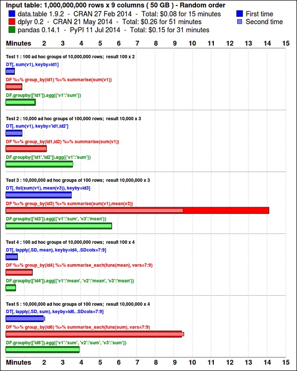
The ggplot2 package is great for data visualization. The data.table package is a great option to do fast and memory efficient summarization in R. A recent benchmark shows it is even faster than pandas, the python library used for similar tasks.
Take a look at the data using the following code. This code is also available in bda/part1/summarize_data/summarize_data.Rproj file.
library(nycflights13)
library(ggplot2)
library(data.table)
library(reshape2)

# Convert the flights data.frame to a data.table object and call it DT
DT <- as.data.table(flights)

# The data has 336776 rows and 16 columns
dim(DT)

# Take a look at the first rows
head(DT)

#   year    month  day   dep_time  dep_delay  arr_time  arr_delay  carrier
# 1: 2013     1     1      517       2         830         11       UA
# 2: 2013     1     1      533       4         850         20       UA
# 3: 2013     1     1      542       2         923         33       AA
# 4: 2013     1     1      544      -1        1004        -18       B6
# 5: 2013     1     1      554      -6         812        -25       DL
# 6: 2013     1     1      554      -4         740         12       UA

#     tailnum  flight  origin   dest    air_time   distance    hour   minute
# 1:  N14228   1545     EWR      IAH      227        1400       5       17
# 2:  N24211   1714     LGA      IAH      227        1416       5       33
# 3:  N619AA   1141     JFK      MIA      160        1089       5       42
# 4:  N804JB    725     JFK      BQN      183        1576       5       44
# 5:  N668DN    461     LGA      ATL      116        762        5       54
# 6:  N39463   1696     EWR      ORD      150        719        5       54
The following code has an example of data summarization.
### Data Summarization
# Compute the mean arrival delay
DT[, list(mean_arrival_delay = mean(arr_delay, na.rm = TRUE))]
#        mean_arrival_delay
# 1:           6.895377
# Now, we compute the same value but for each carrier
mean1 = DT[, list(mean_arrival_delay = mean(arr_delay, na.rm = TRUE)),
   by = carrier]
print(mean1)
#      carrier    mean_arrival_delay
# 1:      UA          3.5580111
# 2:      AA          0.3642909
# 3:      B6          9.4579733
# 4:      DL          1.6443409
# 5:      EV         15.7964311
# 6:      MQ         10.7747334
# 7:      US          2.1295951
# 8:      WN          9.6491199
# 9:      VX          1.7644644
# 10:     FL         20.1159055
# 11:     AS         -9.9308886
# 12:     9E          7.3796692
# 13:     F9         21.9207048
# 14:     HA         -6.9152047
# 15:     YV         15.5569853
# 16:     OO         11.9310345

# Now lets compute to means in the same line of code
mean2 = DT[, list(mean_departure_delay = mean(dep_delay, na.rm = TRUE),
   mean_arrival_delay = mean(arr_delay, na.rm = TRUE)),
   by = carrier]
print(mean2)

#       carrier    mean_departure_delay   mean_arrival_delay
# 1:      UA            12.106073          3.5580111
# 2:      AA             8.586016          0.3642909
# 3:      B6            13.022522          9.4579733
# 4:      DL             9.264505          1.6443409
# 5:      EV            19.955390         15.7964311
# 6:      MQ            10.552041         10.7747334
# 7:      US             3.782418          2.1295951
# 8:      WN            17.711744          9.6491199
# 9:      VX            12.869421          1.7644644
# 10:     FL            18.726075         20.1159055
# 11:     AS             5.804775         -9.9308886
# 12:     9E            16.725769          7.3796692
# 13:     F9            20.215543         21.9207048
# 14:     HA             4.900585         -6.9152047
# 15:     YV            18.996330         15.5569853
# 16:     OO            12.586207         11.9310345

### Create a new variable called gain
# this is the difference between arrival delay and departure delay
DT[, gain:= arr_delay - dep_delay]

# Compute the median gain per carrier
median_gain = DT[, median(gain, na.rm = TRUE), by = carrier]
print(median_gain)
Big Data Analytics - Data Exploration
Exploratory data analysis is a concept developed by John Tuckey (1977) that consists on a new perspective of statistics. Tuckeys idea was that in traditional statistics, the data was not being explored graphically, is was just being used to test hypotheses. The first attempt to develop a tool was done in Stanford, the project was called prim9. The tool was able to visualize data in nine dimensions, therefore it was able to provide a multivariate perspective of the data.
In recent days, exploratory data analysis is a must and has been included in the big data analytics life cycle. The ability to find insight and be able to communicate it effectively in an organization is fueled with strong EDA capabilities.
Based on Tuckeys ideas, Bell Labs developed the S programming language in order to provide an interactive interface for doing statistics. The idea of S was to provide extensive graphical capabilities with an easy-to-use language. In todays world, in the context of Big Data, R that is based on the S programming language is the most popular software for analytics.
The following program demonstrates the use of exploratory data analysis.
The following is an example of exploratory data analysis. This code is also available in part1/eda/exploratory_data_analysis.R file.
library(nycflights13)
library(ggplot2)
library(data.table)
library(reshape2)
# Using the code from the previous section
# This computes the mean arrival and departure delays by carrier.
DT <- as.data.table(flights)
mean2 = DT[, list(mean_departure_delay = mean(dep_delay, na.rm = TRUE),
mean_arrival_delay = mean(arr_delay, na.rm = TRUE)),
by = carrier]
# In order to plot data in R usign ggplot, it is normally needed to reshape the data
# We want to have the data in long format for plotting with ggplot
dt = melt(mean2, id.vars = carrier)
# Take a look at the first rows
print(head(dt))
# Take a look at the help for ?geom_point and geom_line to find similar examples
# Here we take the carrier code as the x axis
# the value from the dt data.table goes in the y axis
# The variable column represents the color
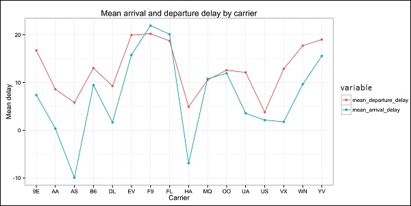
p = ggplot(dt, aes(x = carrier, y = value, color = variable, group = variable)) +
geom_point() + # Plots points
geom_line() + # Plots lines
theme_bw() + # Uses a white background
labs(list(title = 'Mean arrival and departure delay by carrier',
x = 'Carrier', y = 'Mean delay'))
print(p)
# Save the plot to disk
ggsave('mean_delay_by_carrier.png', p,
width = 10.4, height = 5.07)
The code should produce an image such as the following −
Big Data Analytics - Data Visualization
In order to understand data, it is often useful to visualize it. Normally in Big Data applications, the interest relies in finding insight rather than just making beautiful plots. The following are examples of different approaches to understanding data using plots.
To start analyzing the flights data, we can start by checking if there are correlations between numeric variables. This code is also available in bda/part1/data_visualization/data_visualization.R file.
# Install the package corrplot by running
install.packages('corrplot')

# then load the library
library(corrplot)

# Load the following libraries
library(nycflights13)
library(ggplot2)
library(data.table)
library(reshape2)

# We will continue working with the flights data
DT <- as.data.table(flights)
head(DT) # take a look

# We select the numeric variables after inspecting the first rows.
numeric_variables = c('dep_time', 'dep_delay',
   'arr_time', 'arr_delay', 'air_time', 'distance')

# Select numeric variables from the DT data.table
dt_num = DT[, numeric_variables, with = FALSE]

# Compute the correlation matrix of dt_num
cor_mat = cor(dt_num, use = "complete.obs")

print(cor_mat)
### Here is the correlation matrix
#              dep_time   dep_delay   arr_time   arr_delay    air_time    distance
# dep_time   1.00000000  0.25961272 0.66250900  0.23230573 -0.01461948 -0.01413373
# dep_delay  0.25961272  1.00000000 0.02942101  0.91480276 -0.02240508 -0.02168090
# arr_time   0.66250900  0.02942101 1.00000000  0.02448214  0.05429603  0.04718917
# arr_delay  0.23230573  0.91480276 0.02448214  1.00000000 -0.03529709 -0.06186776
# air_time  -0.01461948 -0.02240508 0.05429603 -0.03529709  1.00000000  0.99064965
# distance  -0.01413373 -0.02168090 0.04718917 -0.06186776  0.99064965  1.00000000

# We can display it visually to get a better understanding of the data
corrplot.mixed(cor_mat, lower = "circle", upper = "ellipse")

# save it to disk
png('corrplot.png')
print(corrplot.mixed(cor_mat, lower = "circle", upper = "ellipse"))
dev.off()
This code generates the following correlation matrix visualization −
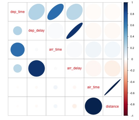
We can see in the plot that there is a strong correlation between some of the variables in the dataset. For example, arrival delay and departure delay seem to be highly correlated. We can see this because the ellipse shows an almost lineal relationship between both variables, however, it is not simple to find causation from this result.
We cant say that as two variables are correlated, that one has an effect on the other. Also we find in the plot a strong correlation between air time and distance, which is fairly reasonable to expect as with more distance, the flight time should grow.
We can also do univariate analysis of the data. A simple and effective way to visualize distributions are box-plots. The following code demonstrates how to produce box-plots and trellis charts using the ggplot2 library. This code is also available in bda/part1/data_visualization/boxplots.R file.
source('data_visualization.R')
### Analyzing Distributions using box-plots
# The following shows the distance as a function of the carrier

p = ggplot(DT, aes(x = carrier, y = distance, fill = carrier)) + # Define the carrier
   in the x axis and distance in the y axis
   geom_box-plot() + # Use the box-plot geom
   theme_bw() + # Leave a white background - More in line with tufte's
      principles than the default
   guides(fill = FALSE) + # Remove legend
   labs(list(title = 'Distance as a function of carrier', # Add labels
      x = 'Carrier', y = 'Distance'))
p
# Save to disk
png(boxplot_carrier.png)
print(p)
dev.off()

# Let's add now another variable, the month of each flight
# We will be using facet_wrap for this
p = ggplot(DT, aes(carrier, distance, fill = carrier)) +
   geom_box-plot() +
   theme_bw() +
   guides(fill = FALSE) +
   facet_wrap(~month) + # This creates the trellis plot with the by month variable
   labs(list(title = 'Distance as a function of carrier by month',
      x = 'Carrier', y = 'Distance'))
p
# The plot shows there aren't clear differences between distance in different months

# Save to disk
png('boxplot_carrier_by_month.png')
print(p)
dev.off()
Big Data Analytics - Introduction to R
This section is devoted to introduce the users to the R programming language. R can be downloaded from the cran website. For Windows users, it is useful to install rtools and the rstudio IDE.
The general concept behind R is to serve as an interface to other software developed in compiled languages such as C, C++, and Fortran and to give the user an interactive tool to analyze data.
Navigate to the folder of the book zip file bda/part2/R_introduction and open the R_introduction.Rproj file. This will open an RStudio session. Then open the 01_vectors.R file. Run the script line by line and follow the comments in the code. Another useful option in order to learn is to just type the code, this will help you get used to R syntax. In R comments are written with the # symbol.
In order to display the results of running R code in the book, after code is evaluated, the results R returns are commented. This way, you can copy paste the code in the book and try directly sections of it in R.
# Create a vector of numbers
numbers = c(1, 2, 3, 4, 5)
print(numbers)

# [1] 1 2 3 4 5
# Create a vector of letters
ltrs = c('a', 'b', 'c', 'd', 'e')
# [1] "a" "b" "c" "d" "e"

# Concatenate both
mixed_vec = c(numbers, ltrs)
print(mixed_vec)
# [1] "1" "2" "3" "4" "5" "a" "b" "c" "d" "e"
Lets analyze what happened in the previous code. We can see it is possible to create vectors with numbers and with letters. We did not need to tell R what type of data type we wanted beforehand. Finally, we were able to create a vector with both numbers and letters. The vector mixed_vec has coerced the numbers to character, we can see this by visualizing how the values are printed inside quotes.
The following code shows the data type of different vectors as returned by the function class. It is common to use the class function to "interrogate" an object, asking him what his class is.
### Evaluate the data types using class

### One dimensional objects
# Integer vector
num = 1:10
class(num)
# [1] "integer"

# Numeric vector, it has a float, 10.5
num = c(1:10, 10.5)
class(num)
# [1] "numeric"

# Character vector
ltrs = letters[1:10]
class(ltrs)
# [1] "character"

# Factor vector
fac = as.factor(ltrs)
class(fac)
# [1] "factor"
R supports two-dimensional objects also. In the following code, there are examples of the two most popular data structures used in R: the matrix and data.frame.
# Matrix
M = matrix(1:12, ncol = 4)
#      [,1] [,2] [,3] [,4]
# [1,]    1    4    7   10
# [2,]    2    5    8   11
# [3,]    3    6    9   12
lM = matrix(letters[1:12], ncol = 4)
#     [,1] [,2] [,3] [,4]
# [1,] "a"  "d"  "g"  "j"
# [2,] "b"  "e"  "h"  "k"
# [3,] "c"  "f"  "i"  "l"

# Coerces the numbers to character
# cbind concatenates two matrices (or vectors) in one matrix
cbind(M, lM)
#     [,1] [,2] [,3] [,4] [,5] [,6] [,7] [,8]
# [1,] "1"  "4"  "7"  "10" "a"  "d"  "g"  "j"
# [2,] "2"  "5"  "8"  "11" "b"  "e"  "h"  "k"
# [3,] "3"  "6"  "9"  "12" "c"  "f"  "i"  "l"

class(M)
# [1] "matrix"
class(lM)
# [1] "matrix"

# data.frame
# One of the main objects of R, handles different data types in the same object.
# It is possible to have numeric, character and factor vectors in the same data.frame

df = data.frame(n = 1:5, l = letters[1:5])
df
#   n l
# 1 1 a
# 2 2 b
# 3 3 c
# 4 4 d
# 5 5 e
As demonstrated in the previous example, it is possible to use different data types in the same object. In general, this is how data is presented in databases, APIs part of the data is text or character vectors and other numeric. In is the analyst job to determine which statistical data type to assign and then use the correct R data type for it. In statistics we normally consider variables are of the following types −
- Numeric
- Nominal or categorical
- Ordinal
In R, a vector can be of the following classes −
- Numeric - Integer
- Factor
- Ordered Factor
R provides a data type for each statistical type of variable. The ordered factor is however rarely used, but can be created by the function factor, or ordered.
The following section treats the concept of indexing. This is a quite common operation, and deals with the problem of selecting sections of an object and making transformations to them.
# Let's create a data.frame
df = data.frame(numbers = 1:26, letters)
head(df)
#      numbers  letters
# 1       1       a
# 2       2       b
# 3       3       c
# 4       4       d
# 5       5       e
# 6       6       f

# str gives the structure of a data.frame, its a good summary to inspect an object
str(df)
#   'data.frame': 26 obs. of  2 variables:
#   $ numbers: int  1 2 3 4 5 6 7 8 9 10 ...
#   $ letters: Factor w/ 26 levels "a","b","c","d",..: 1 2 3 4 5 6 7 8 9 10 ...

# The latter shows the letters character vector was coerced as a factor.
# This can be explained by the stringsAsFactors = TRUE argumnet in data.frame
# read ?data.frame for more information

class(df)
# [1] "data.frame"

### Indexing
# Get the first row
df[1, ]
#     numbers  letters
# 1       1       a

# Used for programming normally - returns the output as a list
df[1, , drop = TRUE]
# $numbers
# [1] 1
#
# $letters
# [1] a
# Levels: a b c d e f g h i j k l m n o p q r s t u v w x y z

# Get several rows of the data.frame
df[5:7, ]
#      numbers  letters
# 5       5       e
# 6       6       f
# 7       7       g

### Add one column that mixes the numeric column with the factor column
df$mixed = paste(df$numbers, df$letters, sep = )

str(df)
# 'data.frame': 26 obs. of  3 variables:
# $ numbers: int  1 2 3 4 5 6 7 8 9 10 ...
# $ letters: Factor w/ 26 levels "a","b","c","d",..: 1 2 3 4 5 6 7 8 9 10 ...
# $ mixed  : chr  "1a" "2b" "3c" "4d" ...

### Get columns
# Get the first column
df[, 1]
# It returns a one dimensional vector with that column

# Get two columns
df2 = df[, 1:2]
head(df2)

#      numbers  letters
# 1       1       a
# 2       2       b
# 3       3       c
# 4       4       d
# 5       5       e
# 6       6       f

# Get the first and third columns
df3 = df[, c(1, 3)]
df3[1:3, ]

#      numbers  mixed
# 1       1     1a
# 2       2     2b
# 3       3     3c

### Index columns from their names
names(df)
# [1] "numbers" "letters" "mixed"
# This is the best practice in programming, as many times indeces change, but
variable names dont
# We create a variable with the names we want to subset
keep_vars = c("numbers", "mixed")
df4 = df[, keep_vars]

head(df4)
#      numbers  mixed
# 1       1     1a
# 2       2     2b
# 3       3     3c
# 4       4     4d
# 5       5     5e
# 6       6     6f

### subset rows and columns
# Keep the first five rows
df5 = df[1:5, keep_vars]
df5

#      numbers  mixed
# 1       1     1a
# 2       2     2b
# 3       3     3c
# 4       4     4d
# 5       5     5e

# subset rows using a logical condition
df6 = df[df$numbers < 10, keep_vars]
df6

#      numbers  mixed
# 1       1     1a
# 2       2     2b
# 3       3     3c
# 4       4     4d
# 5       5     5e
# 6       6     6f
# 7       7     7g
# 8       8     8h
# 9       9     9i
Big Data Analytics - Introduction to SQL
SQL stands for structured query language. It is one of the most widely used languages for extracting data from databases in traditional data warehouses and big data technologies. In order to demonstrate the basics of SQL we will be working with examples. In order to focus on the language itself, we will be using SQL inside R. In terms of writing SQL code this is exactly as would be done in a database.
The core of SQL are three statements: SELECT, FROM and WHERE. The following examples make use of the most common use cases of SQL. Navigate to the folder bda/part2/SQL_introduction and open the SQL_introduction.Rproj file. Then open the 01_select.R script. In order to write SQL code in R we need to install the sqldf package as demonstrated in the following code.
# Install the sqldf package
install.packages('sqldf')

# load the library
library('sqldf')
library(nycflights13)

# We will be working with the fligths dataset in order to introduce SQL

# Lets take a look at the table
str(flights)
# Classes 'tbl_d', 'tbl' and 'data.frame': 336776 obs. of  16 variables:

# $ year     : int  2013 2013 2013 2013 2013 2013 2013 2013 2013 2013 ...
# $ month    : int  1 1 1 1 1 1 1 1 1 1 ...
# $ day      : int  1 1 1 1 1 1 1 1 1 1 ...
# $ dep_time : int  517 533 542 544 554 554 555 557 557 558 ...
# $ dep_delay: num  2 4 2 -1 -6 -4 -5 -3 -3 -2 ...
# $ arr_time : int  830 850 923 1004 812 740 913 709 838 753 ...
# $ arr_delay: num  11 20 33 -18 -25 12 19 -14 -8 8 ...
# $ carrier  : chr  "UA" "UA" "AA" "B6" ...

# $ tailnum  : chr  "N14228" "N24211" "N619AA" "N804JB" ...
# $ flight   : int  1545 1714 1141 725 461 1696 507 5708 79 301 ...
# $ origin   : chr  "EWR" "LGA" "JFK" "JFK" ...
# $ dest     : chr  "IAH" "IAH" "MIA" "BQN" ...
# $ air_time : num  227 227 160 183 116 150 158 53 140 138 ...
# $ distance : num  1400 1416 1089 1576 762 ...
# $ hour     : num  5 5 5 5 5 5 5 5 5 5 ...
# $ minute   : num  17 33 42 44 54 54 55 57 57 58 ...
The select statement is used to retrieve columns from tables and do calculations on them. The simplest SELECT statement is demonstrated in ej1. We can also create new variables as shown in ej2.
### SELECT statement
ej1 = sqldf("
   SELECT
   dep_time
   ,dep_delay
   ,arr_time
   ,carrier
   ,tailnum
   FROM
   flights
")

head(ej1)
#    dep_time   dep_delay  arr_time  carrier  tailnum
# 1      517         2      830      UA       N14228
# 2      533         4      850      UA       N24211
# 3      542         2      923      AA       N619AA
# 4      544        -1     1004      B6       N804JB
# 5      554        -6      812      DL       N668DN
# 6      554        -4      740      UA       N39463

# In R we can use SQL with the sqldf function. It works exactly the same as in
a database

# The data.frame (in this case flights) represents the table we are querying
and goes in the FROM statement
# We can also compute new variables in the select statement using the syntax:

# old_variables as new_variable
ej2 = sqldf("
   SELECT
   arr_delay - dep_delay as gain,
   carrier
   FROM
   flights
")

ej2[1:5, ]
#    gain   carrier
# 1    9      UA
# 2   16      UA
# 3   31      AA
# 4  -17      B6
# 5  -19      DL
One of the most common used features of SQL is the group by statement. This allows to compute a numeric value for different groups of another variable. Open the script 02_group_by.R.
### GROUP BY

# Computing the average
ej3 = sqldf("
  SELECT
   avg(arr_delay) as mean_arr_delay,
   avg(dep_delay) as mean_dep_delay,
   carrier
   FROM
   flights
   GROUP BY
   carrier
")

#    mean_arr_delay   mean_dep_delay carrier
# 1       7.3796692      16.725769      9E
# 2       0.3642909       8.586016      AA
# 3      -9.9308886       5.804775      AS
# 4       9.4579733      13.022522      B6
# 5       1.6443409       9.264505      DL
# 6      15.7964311      19.955390      EV
# 7      21.9207048      20.215543      F9
# 8      20.1159055      18.726075      FL
# 9      -6.9152047       4.900585      HA
# 10     10.7747334      10.552041      MQ
# 11     11.9310345      12.586207      OO
# 12      3.5580111      12.106073      UA
# 13      2.1295951       3.782418      US
# 14      1.7644644      12.869421      VX
# 15      9.6491199      17.711744      WN
# 16     15.5569853      18.996330      YV

# Other aggregations
ej4 = sqldf("
   SELECT
   avg(arr_delay) as mean_arr_delay,
   min(dep_delay) as min_dep_delay,
   max(dep_delay) as max_dep_delay,
   carrier
   FROM
   flights
   GROUP BY
   carrier
")

# We can compute the minimun, mean, and maximum values of a numeric value
ej4
#      mean_arr_delay    min_dep_delay   max_dep_delay   carrier
# 1       7.3796692           -24           747          9E
# 2       0.3642909           -24          1014          AA
# 3      -9.9308886           -21           225          AS
# 4       9.4579733           -43           502          B6
# 5       1.6443409           -33           960         DL
# 6      15.7964311           -32           548         EV
# 7      21.9207048           -27           853         F9
# 8      20.1159055           -22           602         FL
# 9      -6.9152047           -16          1301         HA
# 10     10.7747334           -26          1137         MQ
# 11     11.9310345           -14           154         OO
# 12      3.5580111           -20           483         UA
# 13      2.1295951           -19           500         US
# 14      1.7644644           -20           653         VX
# 15      9.6491199           -13           471         WN
# 16     15.5569853           -16           387         YV

### We could be also interested in knowing how many observations each carrier has
ej5 = sqldf("
   SELECT
   carrier, count(*) as count
   FROM
   flights
   GROUP BY
   carrier
")

ej5
#      carrier  count
# 1       9E    18460
# 2       AA   32729
# 3       AS   714
# 4       B6   54635
# 5       DL   48110
# 6       EV   54173
# 7       F9   685
# 8       FL   3260
# 9       HA   342
# 10      MQ   26397
# 11      OO   32
# 12      UA   58665
# 13      US   20536
# 14      VX   5162
# 15      WN   12275
# 16      YV   601
The most useful feature of SQL are joins. A join means that we want to combine table A and table B in one table using one column to match the values of both tables. There are different types of joins, in practical terms, to get started these will be the most useful ones: inner join and left outer join.
# Lets create two tables: A and B to demonstrate joins.
A = data.frame(c1 = 1:4, c2 = letters[1:4])
B = data.frame(c1 = c(2,4,5,6), c2 = letters[c(2:5)])

A
# c1 c2
# 1  a
# 2  b
# 3  c
# 4  d

B
# c1 c2
# 2  b
# 4  c
# 5  d
# 6  e

### INNER JOIN
# This means to match the observations of the column we would join the tables by.
inner = sqldf("
   SELECT
   A.c1, B.c2
   FROM
   A INNER JOIN B
   ON A.c1 = B.c1
")

# Only the rows that match c1 in both A and B are returned
inner
# c1 c2
#  2  b
#  4  c

### LEFT OUTER JOIN
# the left outer join, sometimes just called left join will return the
# first all the values of the column used from the A table
left = sqldf("
  SELECT
   A.c1, B.c2
  FROM
   A LEFT OUTER JOIN B
   ON A.c1 = B.c1
")

# Only the rows that match c1 in both A and B are returned
left
#   c1    c2
#    1  <NA>
#    2    b
#    3  <NA>
#    4    c
Big Data Analytics - Charts & Graphs
The first approach to analyzing data is to visually analyze it. The objectives at doing this are normally finding relations between variables and univariate descriptions of the variables. We can divide these strategies as −
- Univariate analysis
- Multivariate analysis
Univariate Graphical Methods
Univariate is a statistical term. In practice, it means we want to analyze a variable independently from the rest of the data. The plots that allow to do this efficiently are −
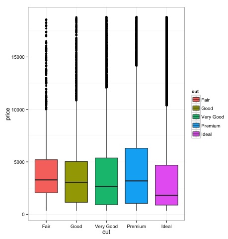
Box-Plots
Box-Plots are normally used to compare distributions. It is a great way to visually inspect if there are differences between distributions. We can see if there are differences between the price of diamonds for different cut.
# We will be using the ggplot2 library for plotting
library(ggplot2)
data("diamonds")

# We will be using the diamonds dataset to analyze distributions of numeric variables
head(diamonds)

#    carat   cut       color  clarity  depth  table   price    x     y     z
# 1  0.23    Ideal       E      SI2    61.5    55     326     3.95  3.98  2.43
# 2  0.21    Premium     E      SI1    59.8    61     326     3.89  3.84  2.31
# 3  0.23    Good        E      VS1    56.9    65     327     4.05  4.07  2.31
# 4  0.29    Premium     I      VS2    62.4    58     334     4.20  4.23  2.63
# 5  0.31    Good        J      SI2    63.3    58     335     4.34  4.35  2.75
# 6  0.24    Very Good   J      VVS2   62.8    57     336     3.94  3.96  2.48

### Box-Plots
p = ggplot(diamonds, aes(x = cut, y = price, fill = cut)) +
   geom_box-plot() +
   theme_bw()
print(p)
We can see in the plot there are differences in the distribution of diamonds price in different types of cut.
Histograms
source('01_box_plots.R')
# We can plot histograms for each level of the cut factor variable using
facet_grid
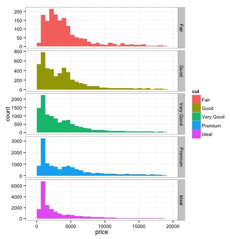
p = ggplot(diamonds, aes(x = price, fill = cut)) +
geom_histogram() +
facet_grid(cut ~ .) +
theme_bw()
p
# the previous plot doesnt allow to visuallize correctly the data because of
the differences in scale
# we can turn this off using the scales argument of facet_grid
p = ggplot(diamonds, aes(x = price, fill = cut)) +
geom_histogram() +
facet_grid(cut ~ ., scales = 'free') +
theme_bw()
p
png('02_histogram_diamonds_cut.png')
print(p)
dev.off()
The output of the above code will be as follows −
Multivariate Graphical Methods
Multivariate graphical methods in exploratory data analysis have the objective of finding relationships among different variables. There are two ways to accomplish this that are commonly used: plotting a correlation matrix of numeric variables or simply plotting the raw data as a matrix of scatter plots.
In order to demonstrate this, we will use the diamonds dataset. To follow the code, open the script bda/part2/charts/03_multivariate_analysis.R.
library(ggplot2)
data(diamonds)

# Correlation matrix plots
keep_vars = c('carat', 'depth', 'price', 'table')
df = diamonds[, keep_vars]
# compute the correlation matrix
M_cor = cor(df)

#          carat       depth      price      table
# carat 1.00000000  0.02822431  0.9215913  0.1816175
# depth 0.02822431  1.00000000 -0.0106474 -0.2957785
# price 0.92159130 -0.01064740  1.0000000  0.1271339
# table 0.18161755 -0.29577852  0.1271339  1.0000000

# plots
heat-map(M_cor)
The code will produce the following output −
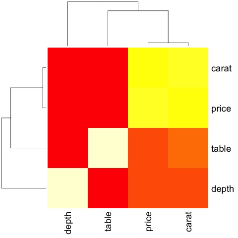
This is a summary, it tells us that there is a strong correlation between price and caret, and not much among the other variables.
A correlation matrix can be useful when we have a large number of variables in which case plotting the raw data would not be practical. As mentioned, it is possible to show the raw data also −
library(GGally)
ggpairs(df)
We can see in the plot that the results displayed in the heat-map are confirmed, there is a 0.922 correlation between the price and carat variables.
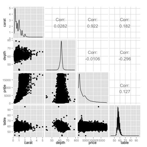
It is possible to visualize this relationship in the price-carat scatterplot located in the (3, 1) index of the scatterplot matrix.
Big Data Analytics - Data Analysis Tools
There are a variety of tools that allow a data scientist to analyze data effectively. Normally the engineering aspect of data analysis focuses on databases, data scientist focus in tools that can implement data products. The following section discusses the advantages of different tools with a focus on statistical packages data scientist use in practice most often.
R Programming Language
R is an open source programming language with a focus on statistical analysis. It is competitive with commercial tools such as SAS, SPSS in terms of statistical capabilities. It is thought to be an interface to other programming languages such as C, C++ or Fortran.
Another advantage of R is the large number of open source libraries that are available. In CRAN there are more than 6000 packages that can be downloaded for free and in Github there is a wide a variety of R packages available.
In terms of performance, R is slow for intensive operations, given the large amount of libraries available the slow sections of the code are written in compiled languages. But if you are intending to do operations that require writing deep for loops, then R wouldnt be your best alternative. For data analysis purpose, there are nice libraries such as data.table, glmnet, ranger, xgboost, ggplot2, caret that allow to use R as an interface to faster programming languages.
Python for data analysis
Python is a general purpose programming language and it contains a significant number of libraries devoted to data analysis such as pandas, scikit-learn, theano, numpy and scipy.
Most of whats available in R can also be done in Python but we have found that R is simpler to use. In case you are working with large datasets, normally Python is a better choice than R. Python can be used quite effectively to clean and process data line by line. This is possible from R but its not as efficient as Python for scripting tasks.
For machine learning, scikit-learn is a nice environment that has available a large amount of algorithms that can handle medium sized datasets without a problem. Compared to Rs equivalent library (caret), scikit-learn has a cleaner and more consistent API.
Julia
Julia is a high-level, high-performance dynamic programming language for technical computing. Its syntax is quite similar to R or Python, so if you are already working with R or Python it should be quite simple to write the same code in Julia. The language is quite new and has grown significantly in the last years, so it is definitely an option at the moment.
We would recommend Julia for prototyping algorithms that are computationally intensive such as neural networks. It is a great tool for research. In terms of implementing a model in production probably Python has better alternatives. However, this is becoming less of a problem as there are web services that do the engineering of implementing models in R, Python and Julia.
SAS
SAS is a commercial language that is still being used for business intelligence. It has a base language that allows the user to program a wide variety of applications. It contains quite a few commercial products that give non-experts users the ability to use complex tools such as a neural network library without the need of programming.
Beyond the obvious disadvantage of commercial tools, SAS doesnt scale well to large datasets. Even medium sized dataset will have problems with SAS and make the server crash. Only if you are working with small datasets and the users arent expert data scientist, SAS is to be recommended. For advanced users, R and Python provide a more productive environment.
SPSS
SPSS, is currently a product of IBM for statistical analysis. It is mostly used to analyze survey data and for users that are not able to program, it is a decent alternative. It is probably as simple to use as SAS, but in terms of implementing a model, it is simpler as it provides a SQL code to score a model. This code is normally not efficient, but its a start whereas SAS sells the product that scores models for each database separately. For small data and an unexperienced team, SPSS is an option as good as SAS is.
The software is however rather limited, and experienced users will be orders of magnitude more productive using R or Python.
Matlab, Octave
There are other tools available such as Matlab or its open source version (Octave). These tools are mostly used for research. In terms of capabilities R or Python can do all thats available in Matlab or Octave. It only makes sense to buy a license of the product if you are interested in the support they provide.
Big Data Analytics - Statistical Methods
When analyzing data, it is possible to have a statistical approach. The basic tools that are needed to perform basic analysis are −
- Correlation analysis
- Analysis of Variance
- Hypothesis Testing
When working with large datasets, it doesnt involve a problem as these methods arent computationally intensive with the exception of Correlation Analysis. In this case, it is always possible to take a sample and the results should be robust.
Correlation Analysis
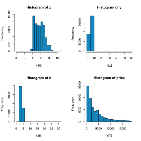
Correlation Analysis seeks to find linear relationships between numeric variables. This can be of use in different circumstances. One common use is exploratory data analysis, in section 16.0.2 of the book there is a basic example of this approach. First of all, the correlation metric used in the mentioned example is based on the Pearson coefficient. There is however, another interesting metric of correlation that is not affected by outliers. This metric is called the spearman correlation.
The spearman correlation metric is more robust to the presence of outliers than the Pearson method and gives better estimates of linear relations between numeric variable when the data is not normally distributed.
library(ggplot2)

# Select variables that are interesting to compare pearson and spearman
correlation methods.
x = diamonds[, c('x', 'y', 'z', 'price')]

# From the histograms we can expect differences in the correlations of both
metrics.
# In this case as the variables are clearly not normally distributed, the
spearman correlation

# is a better estimate of the linear relation among numeric variables.
par(mfrow = c(2,2))
colnm = names(x)
for(i in 1:4) {
   hist(x[[i]], col = 'deepskyblue3', main = sprintf('Histogram of %s', colnm[i]))
}
par(mfrow = c(1,1))
From the histograms in the following figure, we can expect differences in the correlations of both metrics. In this case, as the variables are clearly not normally distributed, the spearman correlation is a better estimate of the linear relation among numeric variables.
In order to compute the correlation in R, open the file bda/part2/statistical_methods/correlation/correlation.R that has this code section.
## Correlation Matrix - Pearson and spearman
cor_pearson <- cor(x, method = 'pearson')
cor_spearman <- cor(x, method = 'spearman')

### Pearson Correlation
print(cor_pearson)
#            x          y          z        price
# x      1.0000000  0.9747015  0.9707718  0.8844352
# y      0.9747015  1.0000000  0.9520057  0.8654209
# z      0.9707718  0.9520057  1.0000000  0.8612494
# price  0.8844352  0.8654209  0.8612494  1.0000000

### Spearman Correlation
print(cor_spearman)
#              x          y          z      price
# x      1.0000000  0.9978949  0.9873553  0.9631961
# y      0.9978949  1.0000000  0.9870675  0.9627188
# z      0.9873553  0.9870675  1.0000000  0.9572323
# price  0.9631961  0.9627188  0.9572323  1.0000000
Chi-squared Test
The chi-squared test allows us to test if two random variables are independent. This means that the probability distribution of each variable doesnt influence the other. In order to evaluate the test in R we need first to create a contingency table, and then pass the table to the chisq.test R function.
For example, lets check if there is an association between the variables: cut and color from the diamonds dataset. The test is formally defined as −
- H0: The variable cut and diamond are independent
- H1: The variable cut and diamond are not independent
We would assume there is a relationship between these two variables by their name, but the test can give an objective "rule" saying how significant this result is or not.
In the following code snippet, we found that the p-value of the test is 2.2e-16, this is almost zero in practical terms. Then after running the test doing a Monte Carlo simulation, we found that the p-value is 0.0004998 which is still quite lower than the threshold 0.05. This result means that we reject the null hypothesis (H0), so we believe the variables cut and color are not independent.
library(ggplot2)

# Use the table function to compute the contingency table
tbl = table(diamonds$cut, diamonds$color)
tbl

#              D    E    F    G    H    I    J
# Fair       163  224  312  314  303  175  119
# Good       662  933  909  871  702  522  307
# Very Good 1513 2400 2164 2299 1824 1204  678
# Premium   1603 2337 2331 2924 2360 1428  808
# Ideal     2834 3903 3826 4884 3115 2093  896

# In order to run the test we just use the chisq.test function.
chisq.test(tbl)

# Pearsons Chi-squared test
# data:  tbl
# X-squared = 310.32, df = 24, p-value < 2.2e-16
# It is also possible to compute the p-values using a monte-carlo simulation
# It's needed to add the simulate.p.value = TRUE flag and the amount of
simulations
chisq.test(tbl, simulate.p.value = TRUE, B = 2000)

# Pearsons Chi-squared test with simulated p-value (based on 2000 replicates)
# data:  tbl
# X-squared = 310.32, df = NA, p-value = 0.0004998
T-test
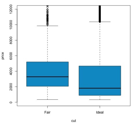
The idea of t-test is to evaluate if there are differences in a numeric variable # distribution between different groups of a nominal variable. In order to demonstrate this, I will select the levels of the Fair and Ideal levels of the factor variable cut, then we will compare the values a numeric variable among those two groups.
data = diamonds[diamonds$cut %in% c('Fair', 'Ideal'), ]

data$cut = droplevels.factor(data$cut) # Drop levels that arent used from the
cut variable
df1 = data[, c('cut', 'price')]

# We can see the price means are different for each group
tapply(df1$price, df1$cut, mean)
# Fair    Ideal
# 4358.758 3457.542
The t-tests are implemented in R with the t.test function. The formula interface to t.test is the simplest way to use it, the idea is that a numeric variable is explained by a group variable.
For example: t.test(numeric_variable ~ group_variable, data = data). In the previous example, the numeric_variable is price and the group_variable is cut.
From a statistical perspective, we are testing if there are differences in the distributions of the numeric variable among two groups. Formally the hypothesis test is described with a null (H0) hypothesis and an alternative hypothesis (H1).
H0: There are no differences in the distributions of the price variable among the Fair and Ideal groups
H1 There are differences in the distributions of the price variable among the Fair and Ideal groups
The following can be implemented in R with the following code −
t.test(price ~ cut, data = data)

# Welch Two Sample t-test
#
# data:  price by cut
# t = 9.7484, df = 1894.8, p-value < 2.2e-16
# alternative hypothesis: true difference in means is not equal to 0
# 95 percent confidence interval:
#   719.9065 1082.5251
# sample estimates:
#   mean in group Fair mean in group Ideal
#   4358.758            3457.542

# Another way to validate the previous results is to just plot the
distributions using a box-plot
plot(price ~ cut, data = data, ylim = c(0,12000),
   col = 'deepskyblue3')
We can analyze the test result by checking if the p-value is lower than 0.05. If this is the case, we keep the alternative hypothesis. This means we have found differences of price among the two levels of the cut factor. By the names of the levels we would have expected this result, but we wouldnt have expected that the mean price in the Fail group would be higher than in the Ideal group. We can see this by comparing the means of each factor.
The plot command produces a graph that shows the relationship between the price and cut variable. It is a box-plot; we have covered this plot in section 16.0.1 but it basically shows the distribution of the price variable for the two levels of cut we are analyzing.
Analysis of Variance
Analysis of Variance (ANOVA) is a statistical model used to analyze the differences among group distribution by comparing the mean and variance of each group, the model was developed by Ronald Fisher. ANOVA provides a statistical test of whether or not the means of several groups are equal, and therefore generalizes the t-test to more than two groups.
ANOVAs are useful for comparing three or more groups for statistical significance because doing multiple two-sample t-tests would result in an increased chance of committing a statistical type I error.
In terms of providing a mathematical explanation, the following is needed to understand the test.
xij = x + (xi x) + (xij x)
This leads to the following model −
xij = μ + αi + ∈ij
where μ is the grand mean and αi is the ith group mean. The error term ∈ij is assumed to be iid from a normal distribution. The null hypothesis of the test is that −
α1 = α2 = = αk
In terms of computing the test statistic, we need to compute two values −
- Sum of squares for between group difference −
$$SSD_B = \sum_{i}^{k} \sum_{j}^{n}(\bar{x_{\bar{i}}} - \bar{x})^2$$
- Sums of squares within groups
$$SSD_W = \sum_{i}^{k} \sum_{j}^{n}(\bar{x_{\bar{ij}}} - \bar{x_{\bar{i}}})^2$$
where SSDB has a degree of freedom of k1 and SSDW has a degree of freedom of Nk. Then we can define the mean squared differences for each metric.
MSB = SSDB / (k - 1)
MSw = SSDw / (N - k)
Finally, the test statistic in ANOVA is defined as the ratio of the above two quantities
F = MSB / MSw
which follows a F-distribution with k1 and Nk degrees of freedom. If null hypothesis is true, F would likely be close to 1. Otherwise, the between group mean square MSB is likely to be large, which results in a large F value.
Basically, ANOVA examines the two sources of the total variance and sees which part contributes more. This is why it is called analysis of variance although the intention is to compare group means.
In terms of computing the statistic, it is actually rather simple to do in R. The following example will demonstrate how it is done and plot the results.
library(ggplot2)
# We will be using the mtcars dataset

head(mtcars)
#                    mpg  cyl disp  hp drat  wt  qsec   vs am  gear carb
# Mazda RX4         21.0   6  160 110 3.90 2.620 16.46  0  1    4    4
# Mazda RX4 Wag     21.0   6  160 110 3.90 2.875 17.02  0  1    4    4
# Datsun 710        22.8   4  108  93 3.85 2.320 18.61  1  1    4    1
# Hornet 4 Drive    21.4   6  258 110 3.08 3.215 19.44  1  0    3    1
# Hornet Sportabout 18.7   8  360 175 3.15 3.440 17.02  0  0    3    2
# Valiant           18.1   6  225 105 2.76 3.460 20.22  1  0    3    1

# Let's see if there are differences between the groups of cyl in the mpg variable.
data = mtcars[, c('mpg', 'cyl')]
fit = lm(mpg ~ cyl, data = mtcars)
anova(fit)

# Analysis of Variance Table
# Response: mpg
#           Df Sum Sq Mean Sq F value    Pr(>F)
# cyl        1 817.71  817.71  79.561 6.113e-10 ***
# Residuals 30 308.33   10.28
# Signif. codes:  0 *** 0.001 ** 0.01 * 0.05 .
# Plot the distribution
plot(mpg ~ as.factor(cyl), data = mtcars, col = 'deepskyblue3')
The code will produce the following output −
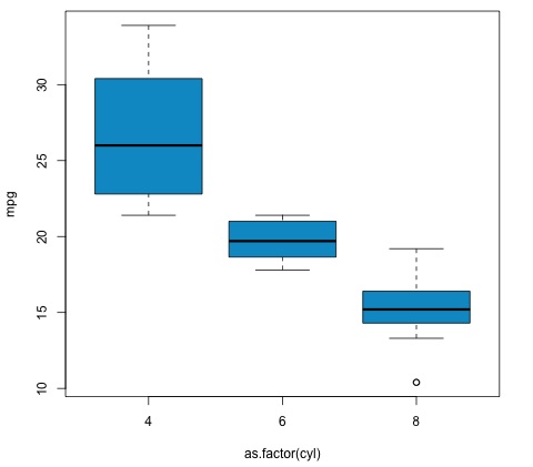
The p-value we get in the example is significantly smaller than 0.05, so R returns the symbol '***' to denote this. It means we reject the null hypothesis and that we find differences between the mpg means among the different groups of the cyl variable.
Machine Learning for Data Analysis
Machine learning is a subfield of computer science that deals with tasks such as pattern recognition, computer vision, speech recognition, text analytics and has a strong link with statistics and mathematical optimization. Applications include the development of search engines, spam filtering, Optical Character Recognition (OCR) among others. The boundaries between data mining, pattern recognition and the field of statistical learning are not clear and basically all refer to similar problems.
Machine learning can be divided in two types of task −
- Supervised Learning
- Unsupervised Learning
Supervised Learning
Supervised learning refers to a type of problem where there is an input data defined as a matrix X and we are interested in predicting a response y. Where X = {x1, x2, , xn} has n predictors and has two values y = {c1, c2}.
An example application would be to predict the probability of a web user to click on ads using demographic features as predictors. This is often called to predict the click through rate (CTR). Then y = {click, doesnt click} and the predictors could be the used IP address, the day he entered the site, the users city, country among other features that could be available.
Unsupervised Learning
Unsupervised learning deals with the problem of finding groups that are similar within each other without having a class to learn from. There are several approaches to the task of learning a mapping from predictors to finding groups that share similar instances in each group and are different with each other.
An example application of unsupervised learning is customer segmentation. For example, in the telecommunications industry a common task is to segment users according to the usage they give to the phone. This would allow the marketing department to target each group with a different product.
Big Data Analytics - Naive Bayes Classifier
Naive Bayes is a probabilistic technique for constructing classifiers. The characteristic assumption of the naive Bayes classifier is to consider that the value of a particular feature is independent of the value of any other feature, given the class variable.
Despite the oversimplified assumptions mentioned previously, naive Bayes classifiers have good results in complex real-world situations. An advantage of naive Bayes is that it only requires a small amount of training data to estimate the parameters necessary for classification and that the classifier can be trained incrementally.
Naive Bayes is a conditional probability model: given a problem instance to be classified, represented by a vector x = (x1, , xn) representing some n features (independent variables), it assigns to this instance probabilities for each of K possible outcomes or classes.
$$p(C_k|x_1,....., x_n)$$
The problem with the above formulation is that if the number of features n is large or if a feature can take on a large number of values, then basing such a model on probability tables is infeasible. We therefore reformulate the model to make it simpler. Using Bayes theorem, the conditional probability can be decomposed as −
$$p(C_k|x) = \frac{p(C_k)p(x|C_k)}{p(x)}$$
This means that under the above independence assumptions, the conditional distribution over the class variable C is −
$$p(C_k|x_1,....., x_n)\: = \: \frac{1}{Z}p(C_k)\prod_{i = 1}^{n}p(x_i|C_k)$$
where the evidence Z = p(x) is a scaling factor dependent only on x1, , xn, that is a constant if the values of the feature variables are known. One common rule is to pick the hypothesis that is most probable; this is known as the maximum a posteriori or MAP decision rule. The corresponding classifier, a Bayes classifier, is the function that assigns a class label $\hat{y} = C_k$ for some k as follows −
$$\hat{y} = argmax\: p(C_k)\prod_{i = 1}^{n}p(x_i|C_k)$$
Implementing the algorithm in R is a straightforward process. The following example demonstrates how train a Naive Bayes classifier and use it for prediction in a spam filtering problem.
The following script is available in the bda/part3/naive_bayes/naive_bayes.R file.
# Install these packages
pkgs = c("klaR", "caret", "ElemStatLearn")
install.packages(pkgs)
library('ElemStatLearn')
library("klaR")
library("caret")

# Split the data in training and testing
inx = sample(nrow(spam), round(nrow(spam) * 0.9))
train = spam[inx,]
test = spam[-inx,]

# Define a matrix with features, X_train
# And a vector with class labels, y_train
X_train = train[,-58]
y_train = train$spam
X_test = test[,-58]
y_test = test$spam
# Train the model
nb_model = train(X_train, y_train, method = 'nb',
   trControl = trainControl(method = 'cv', number = 3))

# Compute
preds = predict(nb_model$finalModel, X_test)$class
tbl = table(y_test, yhat = preds)
sum(diag(tbl)) / sum(tbl)
# 0.7217391
As we can see from the result, the accuracy of the Naive Bayes model is 72%. This means the model correctly classifies 72% of the instances.
Big Data Analytics - K-Means Clustering
k-means clustering aims to partition n observations into k clusters in which each observation belongs to the cluster with the nearest mean, serving as a prototype of the cluster. This results in a partitioning of the data space into Voronoi cells.
Given a set of observations (x1, x2, , xn), where each observation is a d-dimensional real vector, k-means clustering aims to partition the n observations into k groups G = {G1, G2, , Gk} so as to minimize the within-cluster sum of squares (WCSS) defined as follows −
$$argmin \: \sum_{i = 1}^{k} \sum_{x \in S_{i}}\parallel x - \mu_{i}\parallel ^2$$
The later formula shows the objective function that is minimized in order to find the optimal prototypes in k-means clustering. The intuition of the formula is that we would like to find groups that are different with each other and each member of each group should be similar with the other members of each cluster.
The following example demonstrates how to run the k-means clustering algorithm in R.
library(ggplot2)
# Prepare Data
data = mtcars

# We need to scale the data to have zero mean and unit variance
data <- scale(data)

# Determine number of clusters
wss <- (nrow(data)-1)*sum(apply(data,2,var))
for (i in 2:dim(data)[2]) {
   wss[i] <- sum(kmeans(data, centers = i)$withinss)
}

# Plot the clusters
plot(1:dim(data)[2], wss, type = "b", xlab = "Number of Clusters",
   ylab = "Within groups sum of squares")
In order to find a good value for K, we can plot the within groups sum of squares for different values of K. This metric normally decreases as more groups are added, we would like to find a point where the decrease in the within groups sum of squares starts decreasing slowly. In the plot, this value is best represented by K = 6.
Now that the value of K has been defined, it is needed to run the algorithm with that value.
# K-Means Cluster Analysis
fit <- kmeans(data, 5) # 5 cluster solution

# get cluster means
aggregate(data,by = list(fit$cluster),FUN = mean)

# append cluster assignment
data <- data.frame(data, fit$cluster)
Big Data Analytics - Association Rules
Let I = i1, i2, ..., in be a set of n binary attributes called items. Let D = t1, t2, ..., tm be a set of transactions called the database. Each transaction in D has a unique transaction ID and contains a subset of the items in I. A rule is defined as an implication of the form X ⇒ Y where X, Y ⊆ I and X ∩ Y = ∅.
The sets of items (for short item-sets) X and Y are called antecedent (left-hand-side or LHS) and consequent (right-hand-side or RHS) of the rule.
To illustrate the concepts, we use a small example from the supermarket domain. The set of items is I = {milk, bread, butter, beer} and a small database containing the items is shown in the following table.
| Transaction ID | Items |
|---|---|
| 1 | milk, bread |
| 2 | bread, butter |
| 3 | beer |
| 4 | milk, bread, butter |
| 5 | bread, butter |
An example rule for the supermarket could be {milk, bread} ⇒ {butter} meaning that if milk and bread is bought, customers also buy butter. To select interesting rules from the set of all possible rules, constraints on various measures of significance and interest can be used. The best-known constraints are minimum thresholds on support and confidence.
The support supp(X) of an item-set X is defined as the proportion of transactions in the data set which contain the item-set. In the example database in Table 1, the item-set {milk, bread} has a support of 2/5 = 0.4 since it occurs in 40% of all transactions (2 out of 5 transactions). Finding frequent item-sets can be seen as a simplification of the unsupervised learning problem.
The confidence of a rule is defined conf(X ⇒ Y ) = supp(X ∪ Y )/supp(X). For example, the rule {milk, bread} ⇒ {butter} has a confidence of 0.2/0.4 = 0.5 in the database in Table 1, which means that for 50% of the transactions containing milk and bread the rule is correct. Confidence can be interpreted as an estimate of the probability P(Y|X), the probability of finding the RHS of the rule in transactions under the condition that these transactions also contain the LHS.
In the script located in bda/part3/apriori.R the code to implement the apriori algorithm can be found.
# Load the library for doing association rules
# install.packages(arules)
library(arules)

# Data preprocessing
data("AdultUCI")
AdultUCI[1:2,]
AdultUCI[["fnlwgt"]] <- NULL
AdultUCI[["education-num"]] <- NULL

AdultUCI[[ "age"]] <- ordered(cut(AdultUCI[[ "age"]], c(15,25,45,65,100)),
   labels = c("Young", "Middle-aged", "Senior", "Old"))
AdultUCI[[ "hours-per-week"]] <- ordered(cut(AdultUCI[[ "hours-per-week"]],
   c(0,25,40,60,168)), labels = c("Part-time", "Full-time", "Over-time", "Workaholic"))
AdultUCI[[ "capital-gain"]] <- ordered(cut(AdultUCI[[ "capital-gain"]],
   c(-Inf,0,median(AdultUCI[[ "capital-gain"]][AdultUCI[[ "capitalgain"]]>0]),Inf)),
   labels = c("None", "Low", "High"))
AdultUCI[[ "capital-loss"]] <- ordered(cut(AdultUCI[[ "capital-loss"]],
   c(-Inf,0, median(AdultUCI[[ "capital-loss"]][AdultUCI[[ "capitalloss"]]>0]),Inf)),
   labels = c("none", "low", "high"))
In order to generate rules using the apriori algorithm, we need to create a transaction matrix. The following code shows how to do this in R.
# Convert the data into a transactions format
Adult <- as(AdultUCI, "transactions")
Adult
# transactions in sparse format with
# 48842 transactions (rows) and
# 115 items (columns)

summary(Adult)
# Plot frequent item-sets
itemFrequencyPlot(Adult, support = 0.1, cex.names = 0.8)

# generate rules
min_support = 0.01
confidence = 0.6
rules <- apriori(Adult, parameter = list(support = min_support, confidence = confidence))

rules
inspect(rules[100:110, ])
# lhs                             rhs                      support     confidence  lift
# {occupation = Farming-fishing} => {sex = Male}        0.02856148  0.9362416   1.4005486
# {occupation = Farming-fishing} => {race = White}      0.02831579  0.9281879   1.0855456
# {occupation = Farming-fishing} => {native-country     0.02671881  0.8758389   0.9759474
                                       = United-States}
Big Data Analytics - Decision Trees
A Decision Tree is an algorithm used for supervised learning problems such as classification or regression. A decision tree or a classification tree is a tree in which each internal (nonleaf) node is labeled with an input feature. The arcs coming from a node labeled with a feature are labeled with each of the possible values of the feature. Each leaf of the tree is labeled with a class or a probability distribution over the classes.
A tree can be "learned" by splitting the source set into subsets based on an attribute value test. This process is repeated on each derived subset in a recursive manner called recursive partitioning. The recursion is completed when the subset at a node has all the same value of the target variable, or when splitting no longer adds value to the predictions. This process of top-down induction of decision trees is an example of a greedy algorithm, and it is the most common strategy for learning decision trees.
Decision trees used in data mining are of two main types −
Classification tree − when the response is a nominal variable, for example if an email is spam or not.
Regression tree − when the predicted outcome can be considered a real number (e.g. the salary of a worker).
Decision trees are a simple method, and as such has some problems. One of this issues is the high variance in the resulting models that decision trees produce. In order to alleviate this problem, ensemble methods of decision trees were developed. There are two groups of ensemble methods currently used extensively −
Bagging decision trees − These trees are used to build multiple decision trees by repeatedly resampling training data with replacement, and voting the trees for a consensus prediction. This algorithm has been called random forest.
Boosting decision trees − Gradient boosting combines weak learners; in this case, decision trees into a single strong learner, in an iterative fashion. It fits a weak tree to the data and iteratively keeps fitting weak learners in order to correct the error of the previous model.
# Install the party package
# install.packages('party')
library(party)
library(ggplot2)

head(diamonds)
# We will predict the cut of diamonds using the features available in the
diamonds dataset.
ct = ctree(cut ~ ., data = diamonds)

# plot(ct, main="Conditional Inference Tree")
# Example output
# Response:  cut
# Inputs:  carat, color, clarity, depth, table, price, x, y, z

# Number of observations:  53940
#
# 1) table <= 57; criterion = 1, statistic = 10131.878
#   2) depth <= 63; criterion = 1, statistic = 8377.279
#     3) table <= 56.4; criterion = 1, statistic = 226.423
#       4) z <= 2.64; criterion = 1, statistic = 70.393
#         5) clarity <= VS1; criterion = 0.989, statistic = 10.48
#           6) color <= E; criterion = 0.997, statistic = 12.829
#             7)*  weights = 82
#           6) color > E

#Table of prediction errors
table(predict(ct), diamonds$cut)
#            Fair  Good Very Good Premium Ideal
# Fair       1388   171        17       0    14
# Good        102  2912       499      26    27
# Very Good    54   998      3334     249   355
# Premium      44   711      5054   11915  1167
# Ideal        22   114      3178    1601 19988
# Estimated class probabilities
probs = predict(ct, newdata = diamonds, type = "prob")
probs = do.call(rbind, probs)
head(probs)
Big Data Analytics - Logistic Regression
Logistic regression is a classification model in which the response variable is categorical. It is an algorithm that comes from statistics and is used for supervised classification problems. In logistic regression we seek to find the vector β of parameters in the following equation that minimize the cost function.
$$logit(p_i) = ln \left ( \frac{p_i}{1 - p_i} \right ) = \beta_0 + \beta_1x_{1,i} + ... + \beta_kx_{k,i}$$
The following code demonstrates how to fit a logistic regression model in R. We will use here the spam dataset to demonstrate logistic regression, the same that was used for Naive Bayes.
From the predictions results in terms of accuracy, we find that the regression model achieves a 92.5% accuracy in the test set, compared to the 72% achieved by the Naive Bayes classifier.
library(ElemStatLearn)
head(spam)

# Split dataset in training and testing
inx = sample(nrow(spam), round(nrow(spam) * 0.8))
train = spam[inx,]
test = spam[-inx,]

# Fit regression model
fit = glm(spam ~ ., data = train, family = binomial())
summary(fit)

# Call:
#   glm(formula = spam ~ ., family = binomial(), data = train)
#

# Deviance Residuals:
#   Min       1Q   Median       3Q      Max
# -4.5172  -0.2039   0.0000   0.1111   5.4944
# Coefficients:
# Estimate Std. Error z value Pr(>|z|)
# (Intercept) -1.511e+00  1.546e-01  -9.772  < 2e-16 ***
# A.1         -4.546e-01  2.560e-01  -1.776 0.075720 .
# A.2         -1.630e-01  7.731e-02  -2.108 0.035043 *
# A.3          1.487e-01  1.261e-01   1.179 0.238591
# A.4          2.055e+00  1.467e+00   1.401 0.161153
# A.5          6.165e-01  1.191e-01   5.177 2.25e-07 ***
# A.6          7.156e-01  2.768e-01   2.585 0.009747 **
# A.7          2.606e+00  3.917e-01   6.652 2.88e-11 ***
# A.8          6.750e-01  2.284e-01   2.955 0.003127 **
# A.9          1.197e+00  3.362e-01   3.559 0.000373 ***
# Signif. codes:  0 *** 0.001 ** 0.01 * 0.05 . 0.1  1

### Make predictions
preds = predict(fit, test, type = response)
preds = ifelse(preds > 0.5, 1, 0)
tbl = table(target = test$spam, preds)
tbl

#         preds
# target    0   1
# email   535  23
# spam     46 316
sum(diag(tbl)) / sum(tbl)
# 0.925
Big Data Analytics - Time Series Analysis
Time series is a sequence of observations of categorical or numeric variables indexed by a date, or timestamp. A clear example of time series data is the time series of a stock price. In the following table, we can see the basic structure of time series data. In this case the observations are recorded every hour.
| Timestamp | Stock - Price |
|---|---|
| 2015-10-11 09:00:00 | 100 |
| 2015-10-11 10:00:00 | 110 |
| 2015-10-11 11:00:00 | 105 |
| 2015-10-11 12:00:00 | 90 |
| 2015-10-11 13:00:00 | 120 |
Normally, the first step in time series analysis is to plot the series, this is normally done with a line chart.
The most common application of time series analysis is forecasting future values of a numeric value using the temporal structure of the data. This means, the available observations are used to predict values from the future.
The temporal ordering of the data, implies that traditional regression methods are not useful. In order to build robust forecast, we need models that take into account the temporal ordering of the data.
The most widely used model for Time Series Analysis is called Autoregressive Moving Average (ARMA). The model consists of two parts, an autoregressive (AR) part and a moving average (MA) part. The model is usually then referred to as the ARMA(p, q) model where p is the order of the autoregressive part and q is the order of the moving average part.
Autoregressive Model
The AR(p) is read as an autoregressive model of order p. Mathematically it is written as −
$$X_t = c + \sum_{i = 1}^{P} \phi_i X_{t - i} + \varepsilon_{t}$$
where {φ1, , φp} are parameters to be estimated, c is a constant, and the random variable εt represents the white noise. Some constraints are necessary on the values of the parameters so that the model remains stationary.
Moving Average
The notation MA(q) refers to the moving average model of order q −
$$X_t = \mu + \varepsilon_t + \sum_{i = 1}^{q} \theta_i \varepsilon_{t - i}$$
where the θ1, ..., θq are the parameters of the model, is the expectation of Xt, and the εt, εt 1, ... are, white noise error terms.
Autoregressive Moving Average
The ARMA(p, q) model combines p autoregressive terms and q moving-average terms. Mathematically the model is expressed with the following formula −
$$X_t = c + \varepsilon_t + \sum_{i = 1}^{P} \phi_iX_{t - 1} + \sum_{i = 1}^{q} \theta_i \varepsilon_{t-i}$$
We can see that the ARMA(p, q) model is a combination of AR(p) and MA(q) models.
To give some intuition of the model consider that the AR part of the equation seeks to estimate parameters for Xt i observations of in order to predict the value of the variable in Xt. It is in the end a weighted average of the past values. The MA section uses the same approach but with the error of previous observations, εt i. So in the end, the result of the model is a weighted average.
The following code snippet demonstrates how to implement an ARMA(p, q) in R.
# install.packages("forecast")
library("forecast")

# Read the data
data = scan('fancy.dat')
ts_data <- ts(data, frequency = 12, start = c(1987,1))
ts_data
plot.ts(ts_data)
Plotting the data is normally the first step to find out if there is a temporal structure in the data. We can see from the plot that there are strong spikes at the end of each year.
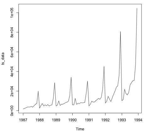
The following code fits an ARMA model to the data. It runs several combinations of models and selects the one that has less error.
# Fit the ARMA model
fit = auto.arima(ts_data)
summary(fit)

# Series: ts_data
# ARIMA(1,1,1)(0,1,1)[12]
#    Coefficients:
#    ar1     ma1    sma1
# 0.2401  -0.9013  0.7499
# s.e.  0.1427   0.0709  0.1790

#
# sigma^2 estimated as 15464184:  log likelihood = -693.69
# AIC = 1395.38   AICc = 1395.98   BIC = 1404.43

# Training set error measures:
#                 ME        RMSE      MAE        MPE        MAPE      MASE       ACF1
# Training set   328.301  3615.374  2171.002  -2.481166  15.97302  0.4905797 -0.02521172
Big Data Analytics - Text Analytics
In this chapter, we will be using the data scraped in the part 1 of the book. The data has text that describes profiles of freelancers, and the hourly rate they are charging in USD. The idea of the following section is to fit a model that given the skills of a freelancer, we are able to predict its hourly salary.
The following code shows how to convert the raw text that in this case has skills of a user in a bag of words matrix. For this we use an R library called tm. This means that for each word in the corpus we create variable with the amount of occurrences of each variable.
library(tm)
library(data.table)

source('text_analytics/text_analytics_functions.R')
data = fread('text_analytics/data/profiles.txt')
rate = as.numeric(data$rate)
keep = !is.na(rate)
rate = rate[keep]

### Make bag of words of title and body
X_all = bag_words(data$user_skills[keep])
X_all = removeSparseTerms(X_all, 0.999)
X_all

# <<DocumentTermMatrix (documents: 389, terms: 1422)>>
#   Non-/sparse entries: 4057/549101
# Sparsity           : 99%
# Maximal term length: 80
# Weighting          : term frequency - inverse document frequency (normalized) (tf-idf)

### Make a sparse matrix with all the data
X_all <- as_sparseMatrix(X_all)
Now that we have the text represented as a sparse matrix we can fit a model that will give a sparse solution. A good alternative for this case is using the LASSO (least absolute shrinkage and selection operator). This is a regression model that is able to select the most relevant features to predict the target.
train_inx = 1:200
X_train = X_all[train_inx, ]
y_train = rate[train_inx]
X_test = X_all[-train_inx, ]
y_test = rate[-train_inx]

# Train a regression model
library(glmnet)
fit <- cv.glmnet(x = X_train, y = y_train,
   family = 'gaussian', alpha = 1,
   nfolds = 3, type.measure = 'mae')
plot(fit)

# Make predictions
predictions = predict(fit, newx = X_test)
predictions = as.vector(predictions[,1])
head(predictions)

# 36.23598 36.43046 51.69786 26.06811 35.13185 37.66367
# We can compute the mean absolute error for the test data
mean(abs(y_test - predictions))
# 15.02175
Now we have a model that given a set of skills is able to predict the hourly salary of a freelancer. If more data is collected, the performance of the model will improve, but the code to implement this pipeline would be the same.
Big Data Analytics - Online Learning
Online learning is a subfield of machine learning that allows to scale supervised learning models to massive datasets. The basic idea is that we dont need to read all the data in memory to fit a model, we only need to read each instance at a time.
In this case, we will show how to implement an online learning algorithm using logistic regression. As in most of supervised learning algorithms, there is a cost function that is minimized. In logistic regression, the cost function is defined as −
$$J(\theta) \: = \: \frac{-1}{m} \left [ \sum_{i = 1}^{m}y^{(i)}log(h_{\theta}(x^{(i)})) + (1 - y^{(i)}) log(1 - h_{\theta}(x^{(i)})) \right ]$$
where J(θ) represents the cost function and hθ(x) represents the hypothesis. In the case of logistic regression it is defined with the following formula −
$$h_\theta(x) = \frac{1}{1 + e^{\theta^T x}}$$
Now that we have defined the cost function we need to find an algorithm to minimize it. The simplest algorithm for achieving this is called stochastic gradient descent. The update rule of the algorithm for the weights of the logistic regression model is defined as −
$$\theta_j : = \theta_j - \alpha(h_\theta(x) - y)x$$
There are several implementations of the following algorithm, but the one implemented in the vowpal wabbit library is by far the most developed one. The library allows training of large scale regression models and uses small amounts of RAM. In the creators own words it is described as: "The Vowpal Wabbit (VW) project is a fast out-of-core learning system sponsored by Microsoft Research and (previously) Yahoo! Research".
We will be working with the titanic dataset from a kaggle competition. The original data can be found in the bda/part3/vw folder. Here, we have two files −
- We have training data (train_titanic.csv), and
- unlabeled data in order to make new predictions (test_titanic.csv).
In order to convert the csv format to the vowpal wabbit input format use the csv_to_vowpal_wabbit.py python script. You will obviously need to have python installed for this. Navigate to the bda/part3/vw folder, open the terminal and execute the following command −
python csv_to_vowpal_wabbit.py
Note that for this section, if you are using windows you will need to install a Unix command line, enter the cygwin website for that.
Open the terminal and also in the folder bda/part3/vw and execute the following command −
vw train_titanic.vw -f model.vw --binary --passes 20 -c -q ff --sgd --l1
0.00000001 --l2 0.0000001 --learning_rate 0.5 --loss_function logistic
Let us break down what each argument of the vw call means.
-f model.vw − means that we are saving the model in the model.vw file for making predictions later
--binary − Reports loss as binary classification with -1,1 labels
--passes 20 − The data is used 20 times to learn the weights
-c − create a cache file
-q ff − Use quadratic features in the f namespace
--sgd − use regular/classic/simple stochastic gradient descent update, i.e., nonadaptive, non-normalized, and non-invariant.
--l1 --l2 − L1 and L2 norm regularization
--learning_rate 0.5 − The learning rate as defined in the update rule formula
The following code shows the results of running the regression model in the command line. In the results, we get the average log-loss and a small report of the algorithm performance.
-loss_function logistic
creating quadratic features for pairs: ff
using l1 regularization = 1e-08
using l2 regularization = 1e-07

final_regressor = model.vw
Num weight bits = 18
learning rate = 0.5
initial_t = 1
power_t = 0.5
decay_learning_rate = 1
using cache_file = train_titanic.vw.cache
ignoring text input in favor of cache input
num sources = 1

average    since         example   example  current  current  current
loss       last          counter   weight    label   predict  features
0.000000   0.000000          1      1.0    -1.0000   -1.0000       57
0.500000   1.000000          2      2.0     1.0000   -1.0000       57
0.250000   0.000000          4      4.0     1.0000    1.0000       57
0.375000   0.500000          8      8.0    -1.0000   -1.0000       73
0.625000   0.875000         16     16.0    -1.0000    1.0000       73
0.468750   0.312500         32     32.0    -1.0000   -1.0000       57
0.468750   0.468750         64     64.0    -1.0000    1.0000       43
0.375000   0.281250        128    128.0     1.0000   -1.0000       43
0.351562   0.328125        256    256.0     1.0000   -1.0000       43
0.359375   0.367188        512    512.0    -1.0000    1.0000       57
0.274336   0.274336       1024   1024.0    -1.0000   -1.0000       57 h
0.281938   0.289474       2048   2048.0    -1.0000   -1.0000       43 h
0.246696   0.211454       4096   4096.0    -1.0000   -1.0000       43 h
0.218922   0.191209       8192   8192.0     1.0000    1.0000       43 h

finished run
number of examples per pass = 802
passes used = 11
weighted example sum = 8822
weighted label sum = -2288
average loss = 0.179775 h
best constant = -0.530826
best constants loss = 0.659128
total feature number = 427878
Now we can use the model.vw we trained to generate predictions with new data.
vw -d test_titanic.vw -t -i model.vw -p predictions.txt
The predictions generated in the previous command are not normalized to fit between the [0, 1] range. In order to do this, we use a sigmoid transformation.
# Read the predictions
preds = fread('vw/predictions.txt')

# Define the sigmoid function
sigmoid = function(x) {
   1 / (1 + exp(-x))
}
probs = sigmoid(preds[[1]])

# Generate class labels
preds = ifelse(probs > 0.5, 1, 0)
head(preds)
# [1] 0 1 0 0 1 0
