
Article Categories
- All Categories
-
 Data Structure
-
 Networking
-
 RDBMS
RDBMS
-
 Operating System
-
 Java
Java
-
 MS Excel
-
 iOS
iOS
-
 HTML
HTML
-
 CSS
CSS
-
 Android
-
 Python
-
 C Programming
-
 C++
C++
-
 C#
C#
-
 MongoDB
-
 MySQL
MySQL
-
 Javascript
-
 PHP
PHP
-
 Economics & Finance
Selected Reading
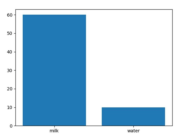
Plot a bar using matplotlib using a dictionary
First, we can define our dictionary and then, convert that dictionary into keys and values. Finally, we can use the data to plot a bar chart.
Steps
Create a dictionary, i.e., data, where milk and water are the keys.
Get the list of keys of the dictionary.
Get the list of values of the dictionary.
Plot the bar using plt.bar().
Using plt.show(), show the figure.
Example
<span class="kwd">import</span><span class="pln"> matplotlib</span><span class="pun">.</span><span class="pln">pyplot </span><span class="kwd">as</span><span class="pln"> plt

data </span><span class="pun">=</span><span class="pln"> </span><span class="pun">{</span><span class="str">'milk'</span><span class="pun">:</span><span class="pln"> </span><span class="lit">60</span><span class="pun">,</span><span class="pln"> </span><span class="str">'water'</span><span class="pun">:</span><span class="pln"> </span><span class="lit">10</span><span class="pun">}</span><span class="pln">
names </span><span class="pun">=</span><span class="pln"> list</span><span class="pun">(</span><span class="pln">data</span><span class="pun">.</span><span class="pln">keys</span><span class="pun">())</span><span class="pln">
values </span><span class="pun">=</span><span class="pln"> list</span><span class="pun">(</span><span class="pln">data</span><span class="pun">.</span><span class="pln">values</span><span class="pun">())</span><span class="pln">

plt</span><span class="pun">.</span><span class="pln">bar</span><span class="pun">(</span><span class="pln">range</span><span class="pun">(</span><span class="pln">len</span><span class="pun">(</span><span class="pln">data</span><span class="pun">)),</span><span class="pln"> values</span><span class="pun">,</span><span class="pln"> tick_label</span><span class="pun">=</span><span class="pln">names</span><span class="pun">)</span><span class="pln">
plt</span><span class="pun">.</span><span class="pln">show</span><span class="pun">()</span>
Output

Updated on: 2023-09-14T13:55:39+05:30
35K+ Views

Advertisements