
Article Categories
- All Categories
-
 Data Structure
-
 Networking
-
 RDBMS
RDBMS
-
 Operating System
-
 Java
Java
-
 MS Excel
-
 iOS
iOS
-
 HTML
HTML
-
 CSS
CSS
-
 Android
-
 Python
-
 C Programming
-
 C++
C++
-
 C#
C#
-
 MongoDB
-
 MySQL
MySQL
-
 Javascript
-
 PHP
PHP
-
 Economics & Finance
Selected Reading
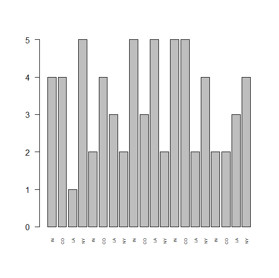
How to show all X-axis labels in a bar graph created by using barplot function in R?
In base R, the barplot function easily creates a barplot but if the number of bars is large or we can say that if the categories we have for X-axis are large then some of the X-axis labels are not shown in the plot. Therefore, if we want them in the plot then we need to use las and cex.names.
Example
Consider the below data and bar graph −
> x<-sample(1:5,20,replace=TRUE)
> names(x)<-rep(c("IN","CO","LA","NY"),times=5)
> barplot(x)
Output

Showing all the X-axis labels −
> barplot(x,las=2,cex.names=0.5)
Output

Updated on: 2026-03-11T22:50:51+05:30
800 Views

Advertisements