
Article Categories
- All Categories
-
 Data Structure
-
 Networking
-
 RDBMS
RDBMS
-
 Operating System
-
 Java
Java
-
 MS Excel
-
 iOS
iOS
-
 HTML
HTML
-
 CSS
CSS
-
 Android
-
 Python
-
 C Programming
-
 C++
C++
-
 C#
C#
-
 MongoDB
-
 MySQL
MySQL
-
 Javascript
-
 PHP
PHP
-
 Economics & Finance
Selected Reading
How to represent the legend in a plot created by using plot function with colored straight lines or stars in R?
A legend helps us to differentiate between the type of values or any another division of values in a data set. These legends can be represented in many ways and two of these ways are straight lines and stars. To represent the legend in a plot created by using plot function with colored straight lines or stars, we need to correct lty and pch arguments.
Example
Consider the below vectors −
set.seed(199)
x<-rnorm(10,2,1)
y<-rnorm(10,2,0.04)
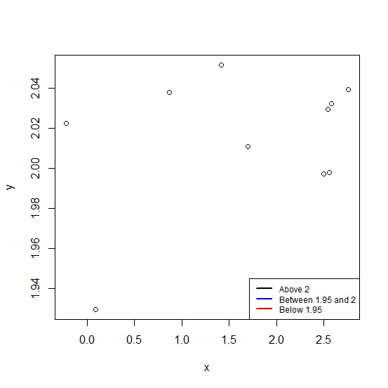
Creating the plot between x and y with colored lines legend values −
plot(x,y) legend("bottomright",legend=c("Above 2","Between 1.95 and 2","Below 1.95"), + lwd=2,cex=0.75,col=c("black","blue","red"),lty=c(1,1,1))
Output
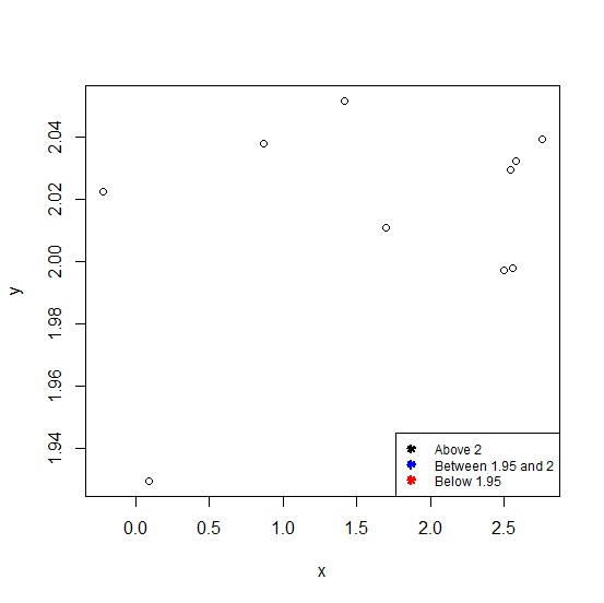
Creating the plot between x and y with colored stars legend values −
plot(x,y) legend("bottomright",legend=c("Above 2","Between 1.95 and 2","Below 1.95"), + lwd=2,cex=0.75,col=c("black","blue","red"),lty=c(NA,NA,NA),pch=c(8,8,8))
Output

Updated on: 2020-10-08T14:48:44+05:30
302 Views

Advertisements