
Article Categories
- All Categories
-
 Data Structure
-
 Networking
-
 RDBMS
RDBMS
-
 Operating System
-
 Java
Java
-
 MS Excel
-
 iOS
iOS
-
 HTML
HTML
-
 CSS
CSS
-
 Android
-
 Python
-
 C Programming
-
 C++
C++
-
 C#
C#
-
 MongoDB
-
 MySQL
MySQL
-
 Javascript
-
 PHP
PHP
-
 Economics & Finance
How to plot ROC curve in Python?
The ROC (Receiver Operating Characteristic) curve is a graphical plot used to evaluate binary classification models. It shows the trade-off between true positive rate (sensitivity) and false positive rate (1-specificity) at various threshold settings.
Python's sklearn.metrics module provides the plot_roc_curve() method to easily visualize ROC curves for classification models.
Steps to Plot ROC Curve
Generate a random binary classification dataset using
make_classification()methodSplit the data into training and testing sets using
train_test_split()methodTrain a classifier (like SVM) on the training data using
fit()methodPlot the ROC curve using
plot_roc_curve()methodDisplay the plot using
plt.show()method
Example
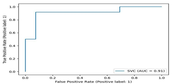
Here's how to create and plot an ROC curve for a Support Vector Machine classifier ?
import matplotlib.pyplot as plt
from sklearn import datasets, metrics, model_selection, svm

# Generate binary classification dataset
X, y = datasets.make_classification(random_state=0)

# Split data into training and testing sets
X_train, X_test, y_train, y_test = model_selection.train_test_split(X, y, random_state=0)

# Create and train SVM classifier
clf = svm.SVC(random_state=0)
clf.fit(X_train, y_train)

# Plot ROC curve
metrics.plot_roc_curve(clf, X_test, y_test)
plt.show()
Understanding ROC Curve Components
The ROC curve displays several key metrics ?
import matplotlib.pyplot as plt
from sklearn import datasets, metrics, model_selection, svm

# Generate dataset and train model
X, y = datasets.make_classification(random_state=42)
X_train, X_test, y_train, y_test = model_selection.train_test_split(X, y, random_state=42)

clf = svm.SVC(probability=True, random_state=42)
clf.fit(X_train, y_train)

# Get predictions and probabilities
y_pred = clf.predict(X_test)
y_pred_proba = clf.predict_proba(X_test)[:, 1]

# Calculate ROC curve points
fpr, tpr, thresholds = metrics.roc_curve(y_test, y_pred_proba)
auc_score = metrics.roc_auc_score(y_test, y_pred_proba)

print(f"AUC Score: {auc_score:.3f}")
print(f"Number of thresholds: {len(thresholds)}")
AUC Score: 0.966
Number of thresholds: 26
Key Metrics
| Metric | Description | Interpretation |
|---|---|---|
| AUC | Area Under Curve | Higher values (closer to 1.0) indicate better model performance |
| TPR | True Positive Rate | Sensitivity - correctly identified positive cases |
| FPR | False Positive Rate | 1 - Specificity - incorrectly identified positive cases |
Output
The ROC curve plot shows the classifier's performance across different threshold values. A perfect classifier would have an AUC of 1.0, while a random classifier would have an AUC of 0.5.
Conclusion
ROC curves are essential for evaluating binary classifiers, with AUC scores providing a single metric for model comparison. Use plot_roc_curve() for quick visualization and roc_curve() for detailed analysis of threshold effects.

7K+ Views
