
Article Categories
- All Categories
-
 Data Structure
-
 Networking
-
 RDBMS
RDBMS
-
 Operating System
-
 Java
Java
-
 MS Excel
-
 iOS
iOS
-
 HTML
HTML
-
 CSS
CSS
-
 Android
-
 Python
-
 C Programming
-
 C++
C++
-
 C#
C#
-
 MongoDB
-
 MySQL
MySQL
-
 Javascript
-
 PHP
PHP
-
 Economics & Finance
Selected Reading
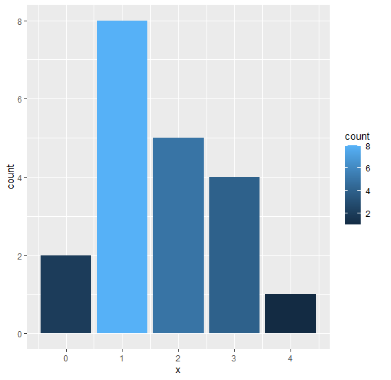
How to fill bars of a bar plot created using ggplot2 with colors based on frequency?
To fill bars in a bar plot using ggplot2 in R with colors based on frequency, we can use fill argument with count.
For Example, if we have a data frame called df that contains a single column X that contains repeated values and we want to create bar plot of values in X based on their frequencies then we can use the below command −
ggplot(df)+geom_bar(aes(X,fill=..count..))
Example
Consider the data frame given below −
x<-rpois(20,2)
df<-data.frame(x)
df
The following dataframe is created
   x
 1 1
 2 2
 3 2
 4 3
 5 1
 6 0
 7 3
 8 3
 9 3
10 2
11 1
12 1
13 1
14 2
15 1
16 1
17 0
18 2
19 4
20 1
To load the ggplot2 package and create bar chart filled with colors based on frequency of values in x on the above created data frame, add the following code to the above snippet −
x<-rpois(20,2)
df<-data.frame(x)
library(ggplot2)
ggplot(df)+geom_bar(aes(x,fill=..count..))
Output
If you execute all the above given snippets as a single program, it generates the following Output −

Updated on: 2021-11-12T03:05:54+05:30
941 Views

Advertisements