
Article Categories
- All Categories
-
 Data Structure
-
 Networking
-
 RDBMS
RDBMS
-
 Operating System
-
 Java
Java
-
 MS Excel
-
 iOS
iOS
-
 HTML
HTML
-
 CSS
CSS
-
 Android
-
 Python
-
 C Programming
-
 C++
C++
-
 C#
C#
-
 MongoDB
-
 MySQL
MySQL
-
 Javascript
-
 PHP
PHP
-
 Economics & Finance
How To Create A Half Pie Chart In Excel?
Pie charts are a popular way to visually represent data, and sometimes you may want to use a half pie chart to save space or emphasize a particular portion of your data. Creating a half pie chart in Excel is relatively straightforward, and this tutorial will guide you through the process step-by-step. Whether you are a beginner or an experienced Excel user, by the end of this tutorial, you will have a clear understanding of how to create a half pie chart in Excel and be able to apply this skill to your own data visualization projects. So let's get started!
Create A Half Pie Chart
Here, we will first create a PIE chart and then format the chart to complete the task. So let us see a simple process to know how you can create a half pie chart in Excel.
Step 1
Consider an Excel sheet where the data is similar to the below image. Note that the data must contain a total row.
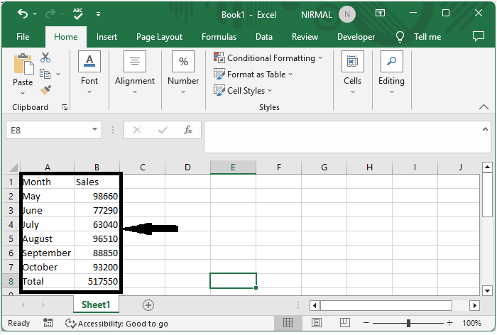
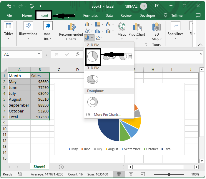
First, select the range of cells, then click on insert and select a pie chart.
Select data > Insert > Pie chart.
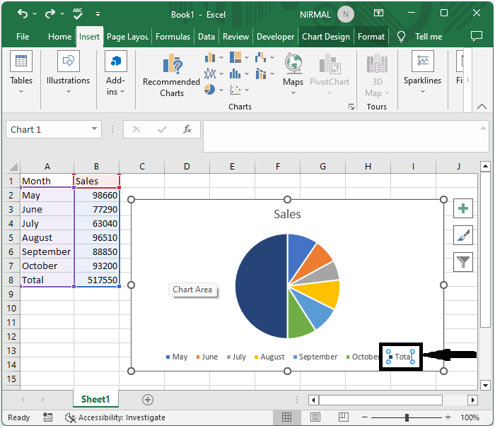
Step 2
Then double-click on the total in the chat ledger and delete it.
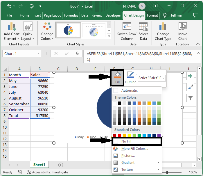
Step 3
Now right-click on the total part of the chart and click on fill and select no fill.
Right click > Fill > No fill.
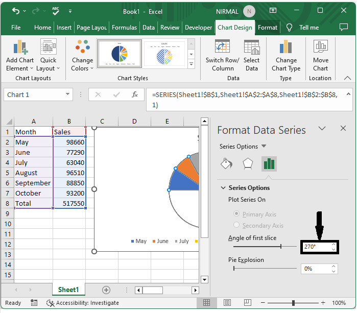
Step 4
Finally, right-click on the chart and select format data series, changing the angle of the first slice to 270 degrees to complete the task.
Right click > Format data series > Angel of first slice.
Conclusion
In this tutorial, we have used a simple example to demonstrate how you can create a half pie chart in Excel to highlight a particular set of data.

6K+ Views
