
Article Categories
- All Categories
-
 Data Structure
-
 Networking
-
 RDBMS
RDBMS
-
 Operating System
-
 Java
Java
-
 MS Excel
-
 iOS
iOS
-
 HTML
HTML
-
 CSS
CSS
-
 Android
-
 Python
-
 C Programming
-
 C++
C++
-
 C#
C#
-
 MongoDB
-
 MySQL
MySQL
-
 Javascript
-
 PHP
PHP
-
 Economics & Finance
How to Create a Chart by Count Of Values in Excel?
Charts are a great way to visualise data and draw conclusions from it. They give you a pictorial representation of your data, which makes it simpler to see patterns, trends, and connections. Making a chart depending on the number of values in your Excel spreadsheet is one typical use case. When you want to see the frequency or distribution of each value in a column of data with varying values, this might be especially helpful.
You will be guided step-by-step through the process of making an Excel chart by count of values in this tutorial. This course will provide you the abilities to efficiently show your data in a straightforward and visually appealing manner, regardless of how experienced an Excel user you are. So let's dive in and learn more about Excel charts!
Create a Chart by Count of Values
Here, we will first count the occurrence of each item and then create a chart. So let us see a simple process to learn how you can create a chart by counting values in Excel.
Step 1
Consider an Excel sheet where the data in the sheet is similar to below image.
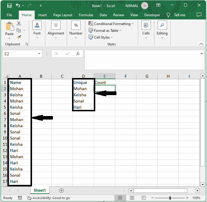
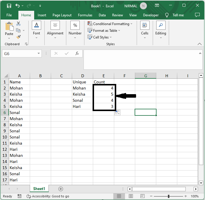
First, click on an empty cell and enter the formula as =COUNTIF($A$2:$A$17,D2) and click enter. Then drag down using the autofill handle. In the formula A2:A12 is the range of cells.
Empty Cell > Formulas > Enter > Drag.
Step 2
Then select the range of cells, then click on bar chart under Insert.
Select Cells > Insert > Bar Chart.
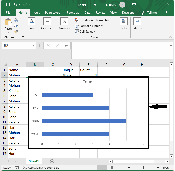
This is how you can create a chart by counting values in Excel.
Conclusion
In this tutorial, we have used a simple example to demonstrate how you can create a chart by counting values in Excel to highlight a particular set of data.

16K+ Views
