
Article Categories
- All Categories
-
 Data Structure
-
 Networking
-
 RDBMS
RDBMS
-
 Operating System
-
 Java
Java
-
 MS Excel
-
 iOS
iOS
-
 HTML
HTML
-
 CSS
CSS
-
 Android
-
 Python
-
 C Programming
-
 C++
C++
-
 C#
C#
-
 MongoDB
-
 MySQL
MySQL
-
 Javascript
-
 PHP
PHP
-
 Economics & Finance
Selected Reading
How to create a bar chart for single vector using ggplot2 in R?
To create a bar chart for single vector using ggplot2 in R, we can follow the below steps −
- First of all, create a vector and melt it using melt function of reshape2 package and save the melted data.
- Then, create the bar chart with melted data using ggplot2.
Create the vector and melt it
Creating the vector and using melt function of reshape2 to melt the data in vector −
x<-rpois(10,5)
library(reshape2)
x_melted<-melt(x)
x_melted
On executing, the above script generates the below output(this output will vary on your system due to randomization)−
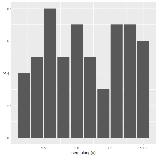
value
1 4
2 5
3 8
4 5
5 7
6 5
7 3
8 7
9 7
10 6
Create the bar chart
Using melted data to create the bar chart and using seq_along function to display X-axis values −
x<-rpois(10,5)
library(reshape2)
x_melted<-melt(x)
library(ggplot2)
ggplot(x_melted,aes(x=seq_along(x),y=x))+geom_bar(stat="identity")
Output

Updated on: 2021-08-13T11:04:55+05:30
774 Views

Advertisements