
Article Categories
- All Categories
-
 Data Structure
-
 Networking
-
 RDBMS
RDBMS
-
 Operating System
-
 Java
Java
-
 MS Excel
-
 iOS
iOS
-
 HTML
HTML
-
 CSS
CSS
-
 Android
-
 Python
-
 C Programming
-
 C++
C++
-
 C#
C#
-
 MongoDB
-
 MySQL
MySQL
-
 Javascript
-
 PHP
PHP
-
 Economics & Finance
Selected Reading
How to change the automatic sorting of X-axis of a bar plot using ggplot2 in R?
If there is a category for which the frequency is significantly different from others then the X-axis labels of the bar plot using ggplot2 are automatically sorted to present the values alternatively. We might want to keep the original sequence of categories that is available in the categorical variable. Therefore, we can store the categorical variable as a factor and then create the bar plot.
Example
Consider the below data frame −
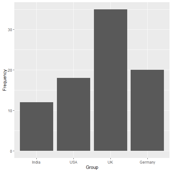
> Group<-c("India","USA","UK","Germany")
> Frequency<-c(12,18,35,20)
> df<-data.frame(Group,Frequency)
> df
Group Frequency
1 India   12
2 USA     18
3 UK      35
4 Germany 20
> library(ggplot2)
> ggplot(df,aes(Group,Frequency))+geom_bar(stat="identity")
Output
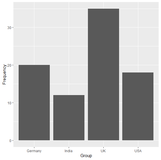
Here, we can see that Germany is the last category in Group variable but we might want to create the plot with the same sequence as we have in our variable. This can be done as shown below −
> df$Group<-factor(df$Group, levels = df$Group)
> ggplot(df,aes(Group,Frequency))+geom_bar(stat="identity")
Output

Updated on: 2020-08-12T13:11:47+05:30
1K+ Views

Advertisements