
Article Categories
- All Categories
-
 Data Structure
-
 Networking
-
 RDBMS
RDBMS
-
 Operating System
-
 Java
Java
-
 MS Excel
-
 iOS
iOS
-
 HTML
HTML
-
 CSS
CSS
-
 Android
-
 Python
-
 C Programming
-
 C++
C++
-
 C#
C#
-
 MongoDB
-
 MySQL
MySQL
-
 Javascript
-
 PHP
PHP
-
 Economics & Finance
How to change legend for multiple histograms using ggplot2 in R?
If we create histogram for multiple categories using ggplot2 then the legend is generated automatically based on the categories. And if we want to change that legend or create a histogram with different legend values having different colors for histograms then scale_fill_manual function can be used as shown in the below example.
Example
Following snippet creates a sample data frame −
Height<-c(sample(140:160,2000,replace=TRUE),sample(165:180,2000,replace=TRUE))
Gender<-c(rep("Female",2000),rep("Male",2000))
df<-data.frame(Gender,Height)
head(df,20)
Output
The following dataframe is created −
   Gender Height
1  Female  148
2  Female  154
3  Female  149
4  Female  152
5  Female  159
6  Female  150
7  Female  144
8  Female  150
9  Female  154
10 Female  149
11 Female  145
12 Female  159
13 Female  157
14 Female  150
15 Female  152
16 Female  144
17 Female  146
18 Female  142
19 Female  144
20 Female  160
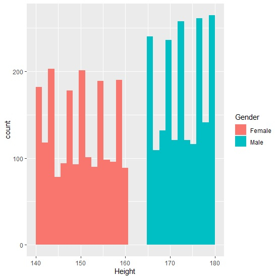
To load ggplot2 package and create histogram of Height for categories in Gender, add the following code to the above snippet −
library(ggplot2)
ggplot(df,aes(Height,fill=Gender))+geom_histogram(bins=30)
Output
If you execute all the above given snippets as a single program, it generates the following Output −
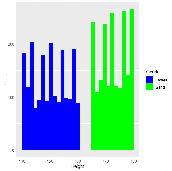
To create histogram of Height for categories in Gender by manually defining the legend values and the histograms color, add the following code to the above snippet −
ggplot(df,aes(Height,fill=Gender))+geom_histogram(bins=30)+scale_fill_manual(name="Gender",values=c("blue","green"),labels=c("Ladies","Gents"))
Output
If you execute all the above given snippets as a single program, it generates the following Output −

2K+ Views
