
Article Categories
- All Categories
-
 Data Structure
-
 Networking
-
 RDBMS
RDBMS
-
 Operating System
-
 Java
Java
-
 MS Excel
-
 iOS
iOS
-
 HTML
HTML
-
 CSS
CSS
-
 Android
-
 Python
-
 C Programming
-
 C++
C++
-
 C#
C#
-
 MongoDB
-
 MySQL
MySQL
-
 Javascript
-
 PHP
PHP
-
 Economics & Finance
How can Tensorflow and pre-trained model be used to visualize the data using Python?
TensorFlow and pre-trained models can be used to visualize training data using the matplotlib library. This is particularly useful for monitoring model performance during transfer learning, where we adapt a pre-trained network for a new task like image classification.
Read More: What is TensorFlow and how Keras work with TensorFlow to create Neural Networks?
Transfer learning allows us to use a pre-trained model (like MobileNet V2) trained on large datasets and adapt it for specific tasks. We can use Convolutional Neural Networks to build learning models that leverage these pre-trained features.
Read More: How can a customized model be pre-trained?
Visualizing Training Progress
After training a model with transfer learning, we can visualize the training and validation metrics to understand model performance and detect overfitting ?
import matplotlib.pyplot as plt

print("Visualizing the data")
plt.figure(figsize=(8, 8))

# Plot training and validation accuracy
plt.subplot(2, 1, 1)
plt.plot(acc, label='Training Accuracy')
plt.plot(val_acc, label='Validation Accuracy')
plt.ylim([0.8, 1])
plt.plot([initial_epochs-1, initial_epochs-1], plt.ylim(), label='Start Fine Tuning')
plt.legend(loc='lower right')
plt.title('Training and Validation Accuracy')

# Plot training and validation loss
plt.subplot(2, 1, 2)
plt.plot(loss, label='Training Loss')
plt.plot(val_loss, label='Validation Loss')
plt.ylim([0, 1.0])
plt.plot([initial_epochs-1, initial_epochs-1], plt.ylim(), label='Start Fine Tuning')
plt.legend(loc='upper right')
plt.title('Training and Validation Loss')
plt.xlabel('epoch')
plt.show()
Code credit − https://www.tensorflow.org/tutorials/images/transfer_learning
Output
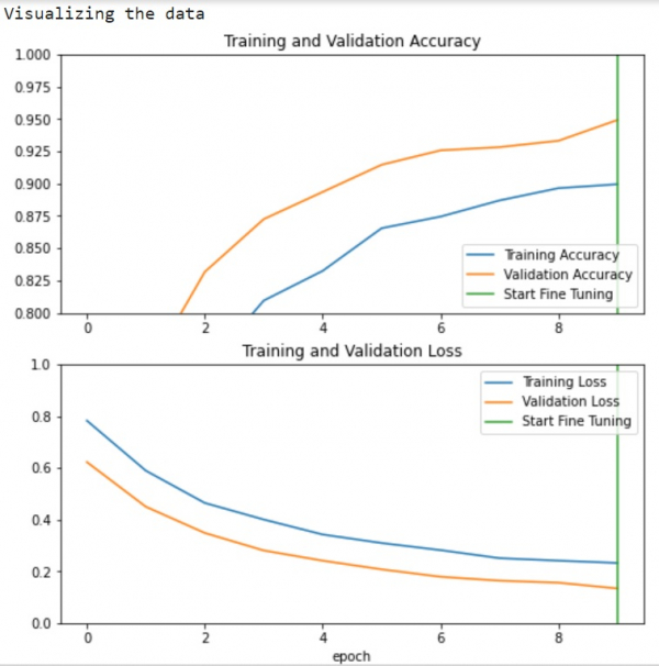
Understanding the Visualization
The learning curves show training and validation accuracy/loss over epochs.
The vertical line marks where fine-tuning begins after initial training.
Higher validation loss compared to training loss indicates some overfitting.
Overfitting may occur when the training dataset is smaller than the original pre-trained model's dataset.
After fine-tuning, the model achieves approximately 98% accuracy on the validation set.
Key Benefits
This visualization approach helps identify:
Overfitting: When validation metrics plateau or worsen while training metrics improve
Optimal stopping point: Where to halt training before overfitting occurs
Fine-tuning effectiveness: How much improvement occurs after unfreezing pre-trained layers
Conclusion
Visualizing training metrics with matplotlib provides crucial insights into model performance during transfer learning. These plots help identify overfitting and determine optimal training duration for pre-trained models.

363 Views
