
Article Categories
- All Categories
-
 Data Structure
-
 Networking
-
 RDBMS
RDBMS
-
 Operating System
-
 Java
Java
-
 MS Excel
-
 iOS
iOS
-
 HTML
HTML
-
 CSS
CSS
-
 Android
-
 Python
-
 C Programming
-
 C++
C++
-
 C#
C#
-
 MongoDB
-
 MySQL
MySQL
-
 Javascript
-
 PHP
PHP
-
 Economics & Finance
Gantt Chart in plotly
A Gantt chart is a popular way of representing a project schedule. It is a type of bar chart that illustrates a project timeline, including the start and end dates of tasks and their dependencies. Gantt charts are widely used in project management to visually represent project plans and track progress. In this article, we'll explore how to create Gantt charts in Python using the Plotly library.
Installation
First, install the Plotly library using pip ?
pip install plotly
Syntax
The basic syntax for creating a Gantt chart in Plotly uses the px.timeline() function ?
import plotly.express as px

fig = px.timeline(df, x_start="Start_Date", x_end="End_Date", y="Task_Name")
fig.show()
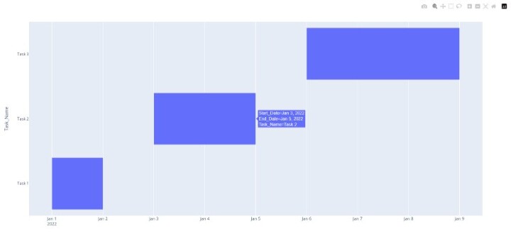
Basic Gantt Chart Example
Let's create a simple Gantt chart with three tasks ?
import plotly.express as px
import pandas as pd

# Create sample data
df = pd.DataFrame({
   "Task_Name": ["Task 1", "Task 2", "Task 3"],
   "Start_Date": ["2022-01-01", "2022-01-03", "2022-01-06"],
   "End_Date": ["2022-01-02", "2022-01-05", "2022-01-09"]
})

# Create the Gantt chart
fig = px.timeline(df, x_start="Start_Date", x_end="End_Date", y="Task_Name")
fig.update_yaxes(categoryorder="total ascending")
fig.show()

print(df)
  Task_Name Start_Date    End_Date
0    Task 1 2022-01-01  2022-01-02
1    Task 2 2022-01-03  2022-01-05
2    Task 3 2022-01-06  2022-01-09
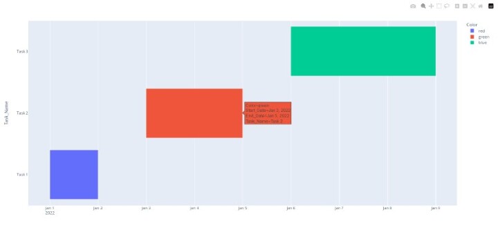
Adding Custom Colors
You can customize the appearance by adding colors to different tasks ?
import plotly.express as px
import pandas as pd

# Create data with color column
df = pd.DataFrame({
   "Task_Name": ["Task 1", "Task 2", "Task 3"],
   "Start_Date": ["2022-01-01", "2022-01-03", "2022-01-06"],
   "End_Date": ["2022-01-02", "2022-01-05", "2022-01-09"],
   "Resource": ["Team A", "Team B", "Team A"]
})

# Create colored Gantt chart
fig = px.timeline(df, x_start="Start_Date", x_end="End_Date", y="Task_Name", color="Resource")
fig.update_yaxes(categoryorder="total ascending")
fig.show()

print(df)
  Task_Name Start_Date    End_Date Resource
0    Task 1 2022-01-01  2022-01-02   Team A
1    Task 2 2022-01-03  2022-01-05   Team B
2    Task 3 2022-01-06  2022-01-09   Team A
Key Parameters
| Parameter | Description | Example |
|---|---|---|
x_start |
Column name for start dates | "Start_Date" |
x_end |
Column name for end dates | "End_Date" |
y |
Column name for task names | "Task_Name" |
color |
Column for color grouping | "Resource" |
Real-World Project Example
Here's a more realistic project management example ?
import plotly.express as px
import pandas as pd

# Create realistic project data
project_data = pd.DataFrame({
   "Task": ["Planning", "Design", "Development", "Testing", "Deployment"],
   "Start": ["2024-01-01", "2024-01-15", "2024-02-01", "2024-03-15", "2024-04-01"],
   "Finish": ["2024-01-14", "2024-01-31", "2024-03-14", "2024-03-31", "2024-04-07"],
   "Team": ["Management", "Design", "Development", "QA", "DevOps"]
})

# Create professional Gantt chart
fig = px.timeline(project_data, x_start="Start", x_end="Finish", y="Task", color="Team")
fig.update_layout(title="Software Development Project Timeline")
fig.update_yaxes(categoryorder="array", categoryarray=project_data["Task"][::-1])
fig.show()

print("Project Timeline:")
print(project_data)
Project Timeline:
        Task       Start      Finish        Team
0    Planning  2024-01-01  2024-01-14  Management
1      Design  2024-01-15  2024-01-31      Design
2 Development  2024-02-01  2024-03-14 Development
3     Testing  2024-03-15  2024-03-31          QA
4  Deployment  2024-04-01  2024-04-07      DevOps
Applications
Gantt charts are versatile tools used in various scenarios ?
Project Management Track project phases and milestones
Resource Planning Visualize team workload and allocation
Event Planning Coordinate activities and deadlines
Software Development Manage sprints and releases
Conclusion
Plotly's Gantt charts provide an effective way to visualize project timelines in Python. Use px.timeline() with start/end dates and task names to create interactive charts. The color parameter helps group tasks by teams or categories for better project management insights.

2K+ Views
