
Article Categories
- All Categories
-
 Data Structure
-
 Networking
-
 RDBMS
RDBMS
-
 Operating System
-
 Java
Java
-
 MS Excel
-
 iOS
iOS
-
 HTML
HTML
-
 CSS
CSS
-
 Android
-
 Python
-
 C Programming
-
 C++
C++
-
 C#
C#
-
 MongoDB
-
 MySQL
MySQL
-
 Javascript
-
 PHP
PHP
-
 Economics & Finance
Change the color of X-axis line for a graph using ggplot2.
To change the color of X-axis line for a graph using ggplot2, we can use theme function where we can set the axis.line.x.bottom argument color to desired color with element_line.
Check out the below Example to understand how it can be done. This might be required when we want to highlight the X-axis for viewers.
Example
Following snippet creates a sample data frame −
x<-sample(0:9,20,replace=TRUE)
y<-sample(0:9,20,replace=TRUE)
df<-data.frame(x,y)
df
The following dataframe is created
   x y
1  4 5
2  5 0
3  5 3
4  7 4
5  1 9
6  0 6
7  6 0
8  9 7
9  6 5
10 5 3
11 2 8
12 3 2
13 5 1
14 1 2
15 8 2
16 6 5
17 5 2
18 1 2
19 9 4
20 9 2
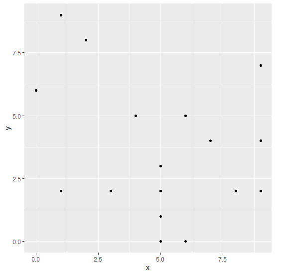
To create ggplot2 package and to create a scatterplot between x and y on the above created data frame, add the following code to the above snippet −
x<-sample(0:9,20,replace=TRUE)
y<-sample(0:9,20,replace=TRUE)
df<-data.frame(x,y)
library(ggplot2)
ggplot(df,aes(x,y))+geom_point()
Output
If you execute all the above given snippets as a single program, it generates the following Output −
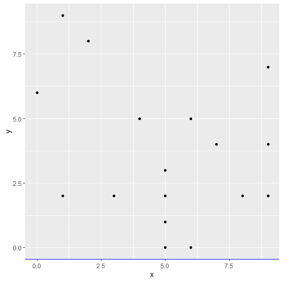
To create a scatterplot between x and y with blue colored X-axis line on the above created data frame, add the following code to the above snippet −
x<-sample(0:9,20,replace=TRUE)
y<-sample(0:9,20,replace=TRUE)
df<-data.frame(x,y)
library(ggplot2)
ggplot(df,aes(x,y))+geom_point()+theme(axis.line.x.bottom=element_line(color="blue"))
Output
If you execute all the above given snippets as a single program, it generates the following Output −

7K+ Views
