
Article Categories
- All Categories
-
 Data Structure
-
 Networking
-
 RDBMS
RDBMS
-
 Operating System
-
 Java
Java
-
 MS Excel
-
 iOS
iOS
-
 HTML
HTML
-
 CSS
CSS
-
 Android
-
 Python
-
 C Programming
-
 C++
C++
-
 C#
C#
-
 MongoDB
-
 MySQL
MySQL
-
 Javascript
-
 PHP
PHP
-
 Economics & Finance
Selected Reading
Adding extra axis ticks using Matplotlib
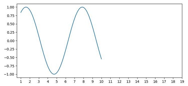
To add extra ticks in matplotlib, we can take the following Steps −
Create x and y points using numpy.
Plot x and y points over the plot, where x ticks could be from 1 to 10 (100 data points) on the curve.
To add extra ticks, use xticks() method and increase the range of ticks to 1 to 20 from 1 to 10.
To display the figure, use the show() method.
Example
import numpy as np
from matplotlib import pyplot as plt
plt.rcParams["figure.figsize"] = [7.50, 3.50]
plt.rcParams["figure.autolayout"] = True
x = np.linspace(1, 10, 100)
y = np.sin(x)
plt.plot(x, y)
plt.xticks(range(1, 20))
plt.show()
Output

Updated on: 2021-04-09T13:08:02+05:30
15K+ Views

Advertisements