- Angular Highcharts - Home
- Angular Highcharts - Overview
- Environment Setup
- Configuration Syntax
- Angular Highcharts - Line Charts
- Angular Highcharts - Area Charts
- Angular Highcharts - Bar Charts
- Angular Highcharts - Column Charts
- Angular Highcharts - Pie Charts
- Angular Highcharts - Scatter Chart
- Angular Highcharts - Dynamic Charts
- Angular Highcharts - Combinations
- Angular Highcharts - 3D Charts
- Angular Highcharts - Map Charts
Selected Reading
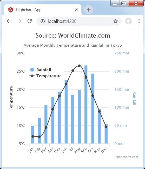
Dual Axes, Line and Column
Following is an example of a chart with Dual Axes, Line and Column.
We have already seen the configuration used to draw a chart in Highcharts Configuration Syntax chapter.
An example of a combination chart having Dual Axes, Line and Column is given below.
Example
app.component.ts
import { Component } from '@angular/core';
import * as Highcharts from 'highcharts';
@Component({
   selector: 'app-root',
   templateUrl: './app.component.html',
   styleUrls: ['./app.component.css']
})
export class AppComponent {
   highcharts = Highcharts;
   chartOptions = {
      chart : {
         zoomType: 'xy'
      },
      title : {
         text: 'Source: WorldClimate.com'
      },
      subtitle : {
         text: 'Average Monthly Temperature and Rainfall in Tokyo'
      },
      xAxis : {
         categories: ['Jan', 'Feb', 'Mar', 'Apr', 'May', 'Jun',
                 'Jul', 'Aug', 'Sep', 'Oct', 'Nov', 'Dec'],
         crosshair: true
      },
      yAxis : [
         { // Primary yAxis
            labels: {
               format: '{value}\xB0C',
                  style: {
                     color: Highcharts.getOptions().colors[1]
                  }
            },
            title: {
               text: 'Temperature',
               style: {
                  color: Highcharts.getOptions().colors[1]
               }
            }
         },
         { // Secondary yAxis
            title: {
               text: 'Rainfall',
               style: {
                  color: Highcharts.getOptions().colors[0]
               }
            },
            labels: {
               format: '{value} mm',
               style: {
                  color: Highcharts.getOptions().colors[0]
               }
            },
            opposite: true
         }
      ],
      tooltip: {
         shared: true
      },
      legend: {
         layout: 'vertical',
         align: 'left',
         x: 60,
         verticalAlign: 'top',
         y: 100,
         floating: true,

         backgroundColor: (
            Highcharts.theme && Highcharts.theme.legendBackgroundColor)
            || '#FFFFFF'
      },
      series : [
         {
            name: 'Rainfall',
            type: 'column',
            yAxis: 1,
            data: [49.9, 71.5, 106.4, 129.2, 144.0, 176.0, 135.6, 148.5,
                    216.4, 194.1, 95.6, 54.4],
            tooltip: {
               valueSuffix: ' mm'
            }
         },
         {
            name: 'Temperature',
            type: 'spline',
            data: [7.0, 6.9, 9.5, 14.5, 18.2, 21.5, 25.2, 26.5, 23.3, 18.3, 13.9, 9.6],
            tooltip: {
               valueSuffix: '\xB0C'
            }
         }
      ]
   };
}
Result
Verify the result.
angular_highcharts_combinations.htm

Advertisements