- Angular Highcharts - Home
- Angular Highcharts - Overview
- Environment Setup
- Configuration Syntax
- Angular Highcharts - Line Charts
- Angular Highcharts - Area Charts
- Angular Highcharts - Bar Charts
- Angular Highcharts - Column Charts
- Angular Highcharts - Pie Charts
- Angular Highcharts - Scatter Chart
- Angular Highcharts - Dynamic Charts
- Angular Highcharts - Combinations
- Angular Highcharts - 3D Charts
- Angular Highcharts - Map Charts
Selected Reading
Angular Highcharts - Column Range
Following is an example of a Column Chart using ranges.
We have already seen the configuration used to draw a chart in Highcharts Configuration Syntax chapter.
An example of a Column Chart using ranges is given below.
Configurations
Let us now see additional configurations.
chart
Configure the chart type to be 'columnrange' based. chart.type decides the series type for the chart. Default value is "line".
var chart = {
   type: 'columnrange',
   inverted: true
};
Example
app.component.ts
import { Component } from '@angular/core';
import * as Highcharts from 'highcharts';
import addMore from "highcharts/highcharts-more";
addMore(Highcharts)
@Component({
selector: 'app-root',
templateUrl: './app.component.html',
styleUrls: ['./app.component.css']
})
export class AppComponent {
highcharts = Highcharts;
chartOptions = {
chart : {
type: 'columnrange',
inverted:true
},
title : {
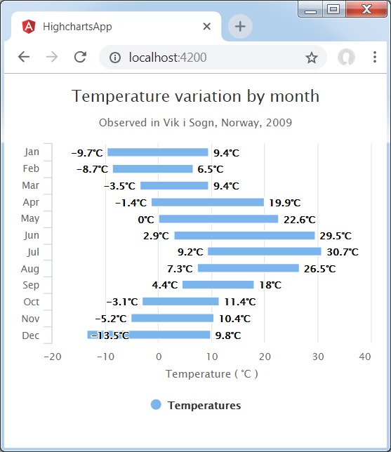
text: 'Temperature variation by month'
},
subtitle : {
text: 'Observed in Vik i Sogn, Norway, 2009'
},
xAxis : {
categories: ['Jan','Feb','Mar','Apr','May','Jun','Jul','Aug','Sep','Oct','Nov','Dec']
},
yAxis : {
title: {
text: 'Temperature ( \xB0C )'
}
},
tooltip: {
headerFormat: '<span style = "font-size:10px">{point.key}</span><table>',
pointFormat: '<tr><td style = "color:{series.color};padding:0">{series.name}: </td>' +
'<td style = "padding:0"><b>{point.y:.1f} mm</b></td></tr>',
footerFormat: '</table>',
shared: true,
useHTML: true
},
plotOptions : {
columnrange: {
dataLabels: {
enabled: true,
formatter: function () {
return this.y + '\xB0C';
}
}
}
},
credits : {
enabled: false
},
series : [{
name: 'Temperatures',
data: [
[-9.7, 9.4],
[-8.7, 6.5],
[-3.5, 9.4],
[-1.4, 19.9],
[0.0, 22.6],
[2.9, 29.5],
[9.2, 30.7],
[7.3, 26.5],
[4.4, 18.0],
[-3.1, 11.4],
[-5.2, 10.4],
[-13.5, 9.8]
]
}]
};
}
Result
Verify the result.
angular_highcharts_column_charts.htm

Advertisements