- Angular Highcharts - Home
- Angular Highcharts - Overview
- Environment Setup
- Configuration Syntax
- Angular Highcharts - Line Charts
- Angular Highcharts - Area Charts
- Angular Highcharts - Bar Charts
- Angular Highcharts - Column Charts
- Angular Highcharts - Pie Charts
- Angular Highcharts - Scatter Chart
- Angular Highcharts - Dynamic Charts
- Angular Highcharts - Combinations
- Angular Highcharts - 3D Charts
- Angular Highcharts - Map Charts
Column with stacked percentage
Following is an example of a stacked column Chart with percentages.
We have already seen the configuration used to draw a chart in Highcharts Configuration Syntax chapter. Let us now see additional configurations and also how we have added stacking attribute in plotoptions.
An example of a stacked column Chart with percentages is given below.
plotOptions
The plotOptions is a wrapper object for configurations objects for each series type. The configuration objects for each series can also be overridden for each series item as given in the series array. This is to stack the values of each series on top of each other. This is to stack the values of each series on top of each other.
Configure the stacking of the chart using plotOptions.column.stacking as "percent". Possible values are null which disables stacking, "normal" stacks by value and "percent" stacks the chart by percentages.
var plotOptions = {
   series: {
      stacking: 'percent'
   }
};
Example
app.component.ts
import { Component } from '@angular/core';
import * as Highcharts from 'highcharts';
@Component({
   selector: 'app-root',
   templateUrl: './app.component.html',
   styleUrls: ['./app.component.css']
})
export class AppComponent {
   highcharts = Highcharts;
   chartOptions = {
      chart: {
         type: 'column'
      },
      title: {
         text: 'Historic World Population by Region'
      },
      subtitle : {
         text: 'Source: Wikipedia.org'
      },
      legend : {
         layout: 'vertical',
         align: 'left',
         verticalAlign: 'top',
         x: 250,
         y: 100,
         floating: true,
         borderWidth: 1,

         backgroundColor: (
            (Highcharts.theme && Highcharts.theme.legendBackgroundColor) ||
               '#FFFFFF'), shadow: true
       },
       xAxis:{
         categories: ['Africa', 'America', 'Asia', 'Europe', 'Oceania'], title: {
            text: null
         }
      },
      yAxis : {
         min: 0,
         title: {
            text: 'Population (millions)', align: 'high'
         },
         labels: {
            overflow: 'justify'
         }
      },
      tooltip : {
         valueSuffix: ' millions'
      },
      plotOptions : {
         column: {
            dataLabels: {
               enabled: true
            }
         },
         series: {
            stacking: 'percent'
         }
      },
      credits:{
         enabled: false
      },
      series: [
         {
            name: 'Year 1800',
            data: [107, 31, 635, 203, 2]
         },
         {
            name: 'Year 1900',
            data: [133, 156, 947, 408, 6]
         },
         {
            name: 'Year 2008',
            data: [973, 914, 4054, 732, 34]
         }
      ]
   };
}
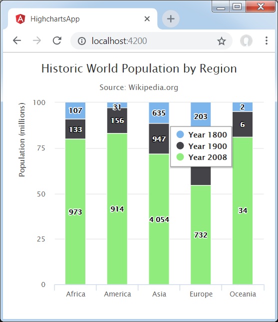
Result
Verify the result.