
Article Categories
- All Categories
-
 Data Structure
-
 Networking
-
 RDBMS
RDBMS
-
 Operating System
-
 Java
Java
-
 MS Excel
-
 iOS
iOS
-
 HTML
HTML
-
 CSS
CSS
-
 Android
-
 Python
-
 C Programming
-
 C++
C++
-
 C#
C#
-
 MongoDB
-
 MySQL
MySQL
-
 Javascript
-
 PHP
PHP
Creating Media Dependent Style Sheets using CSS
Media dependent stylesheets are basic stylesheets only but apply to html document only when mediatype matches device type on which document is visible.
We can create media dependent stylesheets by following methods ?
- Using @media At-rules
- Using @import At-rules
- Using HTML element with media attribute
Example
Let?s see an example for creating media dependent stylesheets ?
HTML Document
CSS document (screen.css)
div {
height: 50px;
width: 100px;
border-radius: 20%;
border: 2px solid blueviolet;
box-shadow: 22px 12px 3px 3px lightblue;
position: absolute;
left: 30%;
top: 20px;
}
CSS document (print.css)
div {
   height: 50px;
   width: 100px;
   border-radius: 20%;
   border: 2px solid #dc3545;
   box-shadow: 22px 12px 3px 3px #dc3545;
   position: absolute;
   left: 30%;
   top: 20px;
}
Output
This will produce the following output ?
When document is visible in a screen mediatype ?

When document is visible in a print mediatype ?

Example
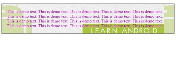
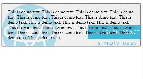
Let?s see another example for creating media dependent stylesheets ?
This is demo text. This is demo text. This is demo text. This is demo text. This is demo text. This is demo text. This is demo text. This is demo text. This is demo text. This is demo text. This is demo text. This is demo text. This is demo text. This is demo text. This is demo text. This is demo text. This is demo text. This is demo text. This is demo text. This is demo text.
Output
This will produce the following output ?
When screen size is above 500px ?
When screen size is below 500px ?

357 Views
