
Article Categories
- All Categories
-
 Data Structure
-
 Networking
-
 RDBMS
RDBMS
-
 Operating System
-
 Java
Java
-
 MS Excel
-
 iOS
iOS
-
 HTML
HTML
-
 CSS
CSS
-
 Android
-
 Python
-
 C Programming
-
 C++
C++
-
 C#
C#
-
 MongoDB
-
 MySQL
MySQL
-
 Javascript
-
 PHP
PHP
-
 Economics & Finance
Selected Reading
Avoid wrapping flex-items in Bootstrap
Use the flex-nowrap class in Bootstrap 4 to avoid wrapping the flex items.
Here you can see the difference between wrap and nowrap ?
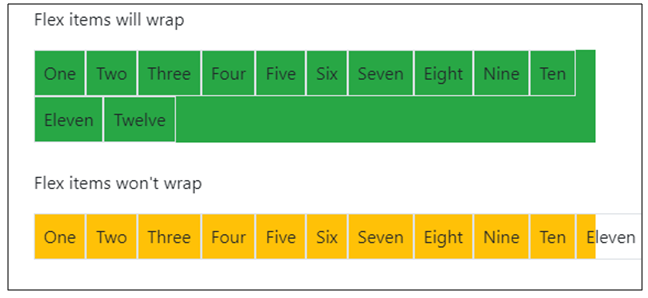
Above the flex-items are not wrapped. This is achieved using the flex-nowrap class in Bootstrap 4 ?
<div class="d-flex flex-nowrap bg-primary">
  <div class="p-2 border">One</div>
  <div class="p-2 border">Two</div>
  <div class="p-2 border">Three</div>
  <div class="p-2 border">Four</div>
  <div class="p-2 border">Five</div>
  <div class="p-2 border">Six</div>
  <div class="p-2 border">Seven</div>
  <div class="p-2 border">Eight</div>
  <div class="p-2 border">Nine</div>
</div>
The following is an example to avoid wrapping flex items ?
Example
<!DOCTYPE html>
<html lang="en">
  <head>
    <title>Bootstrap Example</title>
    <meta charset="utf-8">
    <meta name="viewport" content="width=device-width, initial-scale=1">
    <link rel="stylesheet" href="https://maxcdn.bootstrapcdn.com/bootstrap/4.1.0/css/bootstrap.min.css">
    <script src="https://ajax.googleapis.com/ajax/libs/jquery/3.3.1/jquery.min.js"></script>
    <script src="https://maxcdn.bootstrapcdn.com/bootstrap/4.1.0/js/bootstrap.min.js"></script>
  </head>
<body>
  <div class="container mt-3">
    <h3>FLEX WRAP AND NOWRAP</h3>
    <p>Flex items will wrap</p>
    <div class="d-flex flex-wrap bg-primary">
      <div class="p-2 border">One</div>
      <div class="p-2 border">Two</div>
      <div class="p-2 border">Three</div>
      <div class="p-2 border">Four</div>
      <div class="p-2 border">Five</div>
      <div class="p-2 border">Six</div>
      <div class="p-2 border">Seven</div>
      <div class="p-2 border">Eight</div>
      <div class="p-2 border">Nine</div>
    </div><br>
    <p>Flex items won't wrap</p>
    <div class="d-flex flex-nowrap bg-primary">
      <div class="p-2 border">One</div>
      <div class="p-2 border">Two</div>
      <div class="p-2 border">Three</div>
      <div class="p-2 border">Four</div>
      <div class="p-2 border">Five</div>
      <div class="p-2 border">Six</div>
      <div class="p-2 border">Seven</div>
      <div class="p-2 border">Eight</div>
      <div class="p-2 border">Nine</div>
    </div><br>
  </div>
</body>
</html>

Updated on: 2026-03-11T22:50:42+05:30
3K+ Views

Advertisements