
Article Categories
- All Categories
-
 Data Structure
-
 Networking
-
 RDBMS
RDBMS
-
 Operating System
-
 Java
Java
-
 MS Excel
-
 iOS
iOS
-
 HTML
HTML
-
 CSS
CSS
-
 Android
-
 Python
-
 C Programming
-
 C++
C++
-
 C#
C#
-
 MongoDB
-
 MySQL
MySQL
-
 Javascript
-
 PHP
PHP
-
 Economics & Finance
Selected Reading
Align flex items from everywhere in Bootstrap
Use the .justify-content-* class in Bootstrap to align flex items from start, end, center, between, etc.
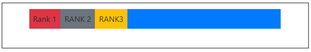
For justify-content-start, the justified flex items would be aligned like −
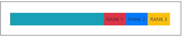
For justify-content-end, the justified flex items would be aligned like −
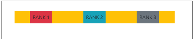
For justify-content-around, the justified flex items would be aligned like −
Let us see how to justify content −
Example
<!DOCTYPE html>
<html lang="en">
<head>
  <title>Bootstrap Example</title>
  <meta charset="utf-8">
  <meta name="viewport" content="width=device-width, initial-scale=1">
  <link rel="stylesheet" href="https://maxcdn.bootstrapcdn.com/bootstrap/4.1.0/css/bootstrap.min.css">
  <script src="https://ajax.googleapis.com/ajax/libs/jquery/3.3.1/jquery.min.js"></script>
  <script src="https://maxcdn.bootstrapcdn.com/bootstrap/4.1.0/js/bootstrap.min.js"></script>
</head>
<body>
  <div class="container mt-3">
    <div class="d-flex justify-content-start bg-primary mb-5">
      <div class="p-2 bg-danger">Rank 1</div>
      <div class="p-2 bg-secondary">RANK 2</div>
      <div class="p-2 bg-warning">RANK3</div>
    </div>
    <div class="d-flex justify-content-end bg-info mb-5">
      <div class="p-2 bg-danger">RANK 1</div>
      <div class="p-2 bg-primary">RANK 2</div>
      <div class="p-2 bg-warning">RANK 3</div>
    </div>
    <div class="d-flex justify-content-around bg-warning mb-5">
      <div class="p-2 bg-danger">RANK 1</div>
      <div class="p-2 bg-info">RANK 2</div>
      <div class="p-2 bg-secondary">RANK 3</div>
    </div>
  </div>
</body>
</html>

Updated on: 2026-03-11T23:14:18+05:30
231 Views

Advertisements