
Article Categories
- All Categories
-
 Data Structure
-
 Networking
-
 RDBMS
RDBMS
-
 Operating System
-
 Java
Java
-
 MS Excel
-
 iOS
iOS
-
 HTML
HTML
-
 CSS
CSS
-
 Android
-
 Python
-
 C Programming
-
 C++
C++
-
 C#
C#
-
 MongoDB
-
 MySQL
MySQL
-
 Javascript
-
 PHP
PHP
-
 Economics & Finance
Selected Reading
Align flex items around on different screen sizes in Bootstrap
To align flex items around on different screen sizes, use the justify-content-*-around class.
You can achieve the following result that justifies content on small and medium screen sizes ?
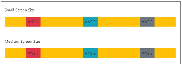
To implement the justify-content-*-around class in Bootstrap ?
Example
<!DOCTYPE html>
<html lang="en">
  <head>
    <title>Bootstrap Example</title>
    <meta charset="utf-8">
    <meta name="viewport" content="width=device-width, initial-scale=1">
    <link rel="stylesheet" href="https://maxcdn.bootstrapcdn.com/bootstrap/4.1.0/css/bootstrap.min.css">
    <script src="https://ajax.googleapis.com/ajax/libs/jquery/3.3.1/jquery.min.js"></script>
    <script src="https://maxcdn.bootstrapcdn.com/bootstrap/4.1.0/js/bootstrap.min.js"></script>
  </head>

<body>

  <div class="container mt-3">
    <p>Default</p>
    <div class="d-flex justify-content-around bg-warning mb-5">
      <div class="p-2 bg-danger">ANS 1</div>
      <div class="p-2 bg-info">ANS 2</div>
      <div class="p-2 bg-secondary">ANS 3</div>
    </div>
    <p>Small Screen Size</p>
    <div class="d-flex justify-content-sm-around bg-warning mb-5">
      <div class="p-2 bg-danger">ANS 1</div>
      <div class="p-2 bg-info">ANS 2</div>
      <div class="p-2 bg-secondary">ANS 3</div>
    </div>
    <p>Medium Screen Size</p>
    <div class="d-flex justify-content-md-around bg-warning mb-5">
      <div class="p-2 bg-danger">ANS 1</div>
      <div class="p-2 bg-info">ANS 2</div>
      <div class="p-2 bg-secondary">ANS 3</div>
    </div>
    <p>Large Screen Size</p>
    <div class="d-flex justify-content-lg-around bg-warning mb-5">
      <div class="p-2 bg-danger">ANS 1</div>
      <div class="p-2 bg-info">ANS 2</div>
      <div class="p-2 bg-secondary">ANS 3</div>
    </div>
  </div>

</body>
</html>

Updated on: 2026-03-11T22:50:42+05:30
254 Views

Advertisements